18 Charcoal Packaging Design Ideas | Modern, Premium & Market-Ready Concepts
Charcoal packaging is not just about holding a product — it’s about communicating quality, safety, and performance before the bag is even opened. As a packaging specialist who studies material behavior, print finishes, logistics handling, and retail psychology, I can confidently say that poor charcoal packaging directly affects sales, storage life, and brand trust.
Charcoal products face unique challenges: dust control, moisture resistance, weight handling, clear labeling, and strong visual contrast. A successful charcoal packaging design must solve these functional problems while still standing out on crowded retail shelves or online marketplaces. That’s where thoughtful design, correct material choice, and clear information hierarchy matter.
In this article, I’ve curated 18 charcoal packaging design ideas that are not just visually appealing but practical, production-ready, and market-tested in concept. These designs reflect real industry needs — from BBQ charcoal and activated charcoal to eco-friendly and export-grade packaging. If you’re a brand owner, designer, or manufacturer looking to create packaging that feels premium, reliable, and professional, this guide will give you clear direction.
List of Top charcoal package designs
1. The Raw Industrial Concept

This design leans into a utilitarian aesthetic that speaks to the grit and authenticity of traditional grilling. By utilizing a high-resolution kraft-paper texture as the primary background, the packaging immediately establishes an organic, eco-friendly feel.
The focal point is the central charcoal explosion, which creates a sense of raw energy and movement. This is brilliantly contrasted by the “CHARCOAL” typography, which features a lava-like ember texture inside the lettering. The addition of subtle splatter effects across the canvas gives the design a tactile, “straight-from-the-earth” quality that sets it apart from more clinical, mass-market brands.
2. The Modern Silhouette Concept

This design shifts toward a more structured and premium look. By framing the kraft texture within a bold black border, the design gains a clean, modern silhouette that pops against retail shelves.
The highlight of this concept is the vibrant glowing ember nestled within the charcoal mound, which serves as a powerful visual metaphor for the “Medium Roast” heat promised inside. The use of a sinusoidal (wave) die-cut shape for the label area adds a sophisticated, contemporary touch, while the clean “1kg” serif typography provides a professional, high-end finish. It’s a perfect blend of rustic materials and polished graphic composition
3. The High-Heat Gradient

This design takes a bold, warm approach by replacing the black frame with a vibrant orange and red gradient. This color choice evokes the feeling of a literal fire, making the packaging feel “hot” to the touch. It maintains the wavy label transition and the glowing 1kg focal point, but the overall mood is much more energetic and approachable. This version is perfect for a brand that wants to emphasize rapid lighting and intense heat through its visual identity.
4. The Cinematic Ember

This design moves away from the rustic kraft paper in favor of a deep black canvas, creating a high-contrast, cinematic feel. The base of the package is anchored by a photorealistic bed of glowing coals, which provides an immediate “wow” factor. The typography is clean and centered, with the bright red “1kg” badge acting as a glowing bullseye. This design feels professional and high-tech, positioning the charcoal as a premium fuel for serious chefs.
5. The Solar Flare

This variation utilizes a striking orange header and footer to frame the dark, photorealistic charcoal imagery. This creates a “solar flare” effect that draws the eye directly to the center of the pack. The combination of the dark, textured coal and the bright, solid orange bars provides a perfect balance of realism and graphic boldness, making it highly legible even from a distance.
6. The Radiant Core

In the series focuses on intense luminosity. By placing a bright red-to-orange radial gradient behind the central text, the product appears to be radiating heat from the inside out. This “glow” effect, paired with the photorealistic embers at the base, creates a powerful sense of efficiency and temperature, suggesting that this charcoal reaches peak heat faster than the competition.
7. The Minimalist Ember

This design in the series strips away heavy gradients in favor of a clean, cream-colored background contrasted against a deep black frame. By keeping the top half light and the bottom half anchored by the glowing charcoal photography, the design feels airy yet grounded. It is a minimalist take that relies on high-quality imagery and plenty of white space to convey a “pure” product experience.
8. The Linear Contrast

Building on the minimalist theme, this variation introduces bold red horizontal stripes at the top and bottom of the pack. These lines act as a visual “shelf-stopper,” adding a geometric structure that directs the eye straight to the central branding. The combination of the cream background and rhythmic red lines gives the product a modern, energetic feel.
9. The Black Friday Special
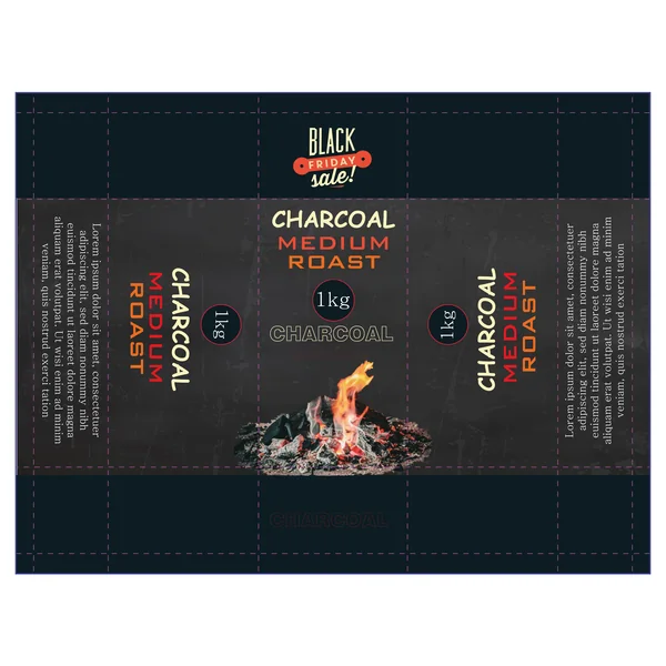
Specifically tailored for promotions, this design utilizes a dark, textured background that feels premium and industrial. The addition of a “Black Friday Sale!” badge adds urgency, while the central flame graphic creates a literal representation of the product’s purpose. It’s an excellent example of how to adapt a core brand identity for seasonal marketing.
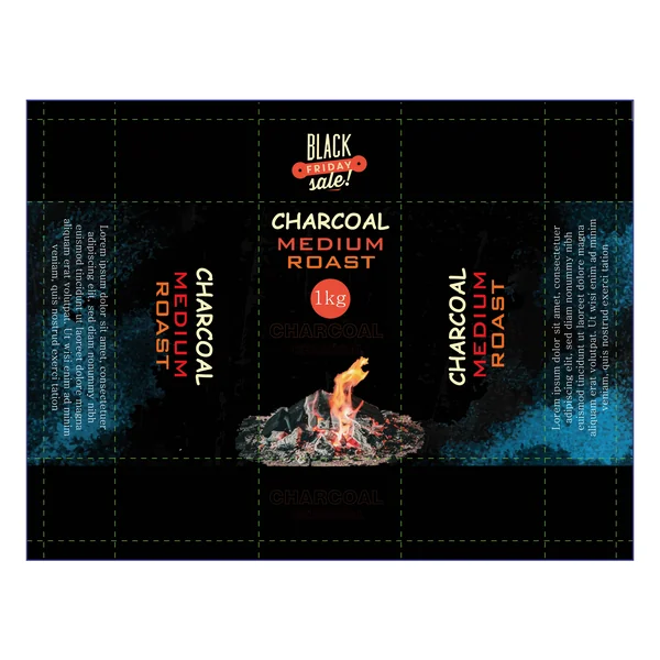
10. The Solar Promotion

Specifically tailored for marketing impact, this design utilizes a vibrant orange header and footer to frame the dark, industrial core. The addition of a “Black Friday Sale!” badge adds urgency, while the central flame graphic creates a literal representation of the product’s purpose. It’s an excellent example of how to adapt a core brand identity for seasonal marketing while maintaining maximum visibility.
11. The Contrast Minimalist

This design in the series balances the grit of the charcoal with a stark, minimalist frame. By surrounding the dark, textured center with a wide, cream-colored border, the design feels sophisticated and “boutique.” The “Black Friday” badge is rendered in a lighter palette to match, proving that promotional packaging can still feel elegant and high-end.
12. The Earthy Industrial

This design in the series returns to a more grounded, clay-toned palette. This muted, earthy background color provides a warm, natural feel that contrasts beautifully with the dark charcoal imagery and the vibrant flame focal point. It’s a perfect middle ground for a brand that wants to appear authentic and rugged without being overly aggressive.
13. The Electric Night
This design in the series introduces a striking cyan “glow” effect against a deep black background. This cool-toned lighting contrast makes the central orange flame pop with incredible intensity, giving the packaging a modern, almost high-tech energy. It breaks away from traditional “warm only” palettes to create a unique visual identity that commands attention through color theory.
14. The “Inferno” Master Blend
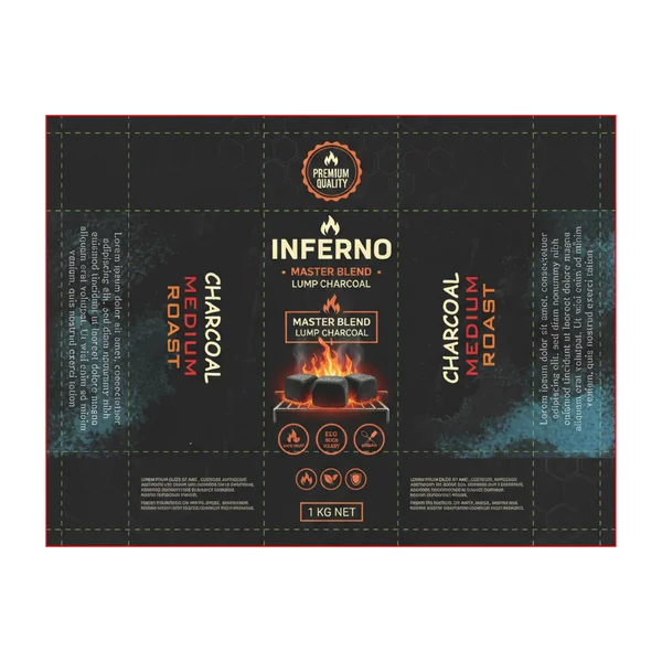
This design in the series moves toward a highly illustrative and icon-driven layout. Featuring a photorealistic “Inferno” graphic of glowing briquettes on a grill, it speaks directly to the end-user experience. The use of a hexagonal pattern overlay and clean, circular badges for “Eco-Friendly” and “Premium Quality” gives the product a professional, certified look that builds immediate consumer trust.
15. The Premium Gold Standard

This design in the series represents the pinnacle of luxury in the category. Featuring a deep charcoal-textured background and metallic gold flame accents, this package is designed for the “Premium Grill” market. The elegant gold hexagonal logo and refined typography elevate charcoal from a simple commodity to a luxury culinary tool.
16. The Artisanal Smoke

This iteration focuses on the craft and origin of the product. Using a dark, moody background with subtle smoke trails and realistic wood charcoal pieces at the center, this “Artisanal Blend” feels sophisticated and grounded. The typography features a fire-textured fill, beautifully tying the text to the visual theme of heat and transformation.
17. The Radiant Briquette

This design in the series maximizes visual energy with an intense, bright red-to-orange gradient background. It utilizes a bold shield-style logo featuring crossed grill forks, emphasizing its artisanal nature. With massive flame graphics and rising smoke, this package is designed to be the most aggressive and eye-catching “shelf-stopper” in the entire collection.
18. The Volcanic Glow

This design in the series, titled “Volcanic Glow,” balances clean minimalism with illustrative flair. Against a sleek black background, it features a stylized pile of charcoal topped with a vibrant, illustrated flame. The addition of professional grill icons at the base and refined “Premium Hardwood” subtitles gives the product a sophisticated, expert-level feel.