Cutlery Packaging Design Ideas That Elevate Your Brand Presentation
Cutlery packaging design is no longer just about protection—it’s about presentation, brand storytelling, and first impressions. Whether you’re packaging luxury flatware, eco-friendly cutlery, or everyday dining essentials, the right packaging design can instantly influence how customers perceive your brand.
In this blog, we’ve curated 20 inspiring cutlery packaging design ideas that showcase smart structure, premium finishes, sustainable materials, and creative branding approaches. From minimalist boxes to innovative eco packaging, these designs highlight how thoughtful packaging can turn simple cutlery into a memorable product experience.
20 Creative Cutlery Package Designs for Premium Brand Presentation
1. The Modern-Eco Vibe
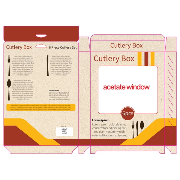
This design embraces a warm, earth-toned palette that instantly communicates a “natural” or “eco-friendly” brand identity. The use of a textured, kraft-like background provides a tactile, organic feel, while the bold diagonal stripes in yellow and burgundy add a sharp, modern edge. Featuring a large acetate window, the packaging prioritizes transparency, allowing the quality of the 6-piece cutlery set to speak for itself before the box is even opened.
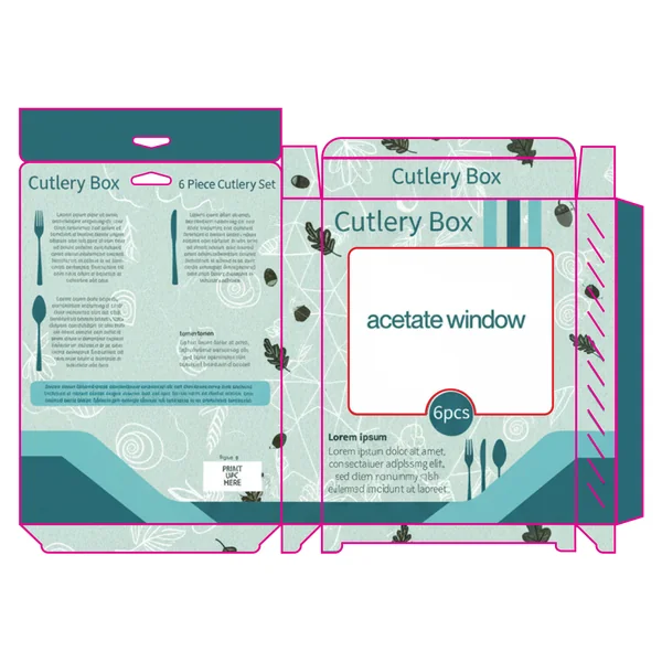
2. The Botanical & Organic Concept
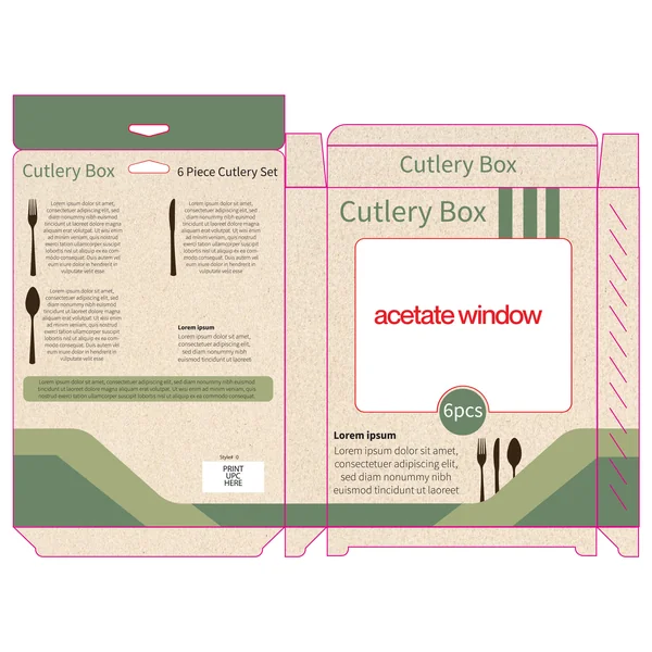
This variation leans heavily into a botanical, earthy aesthetic. By replacing the warm reds with a palette of sage, forest green, and moss, the design immediately feels more health-conscious and sustainable. It’s a perfect match for bamboo cutlery, eco-friendly wooden sets, or high-end garden-party collections.
The kraft-paper texture acts as a neutral canvas, allowing the green geometric waves to flow across the bottom of the box, creating a sense of movement. This design doesn’t just sell a product; it sells a lifestyle of conscious, “green” living. The large acetate window remains the hero, ensuring that the natural materials of the cutlery are the first thing the customer notices.
3. The Golden Harvest (Tan & Ochre)
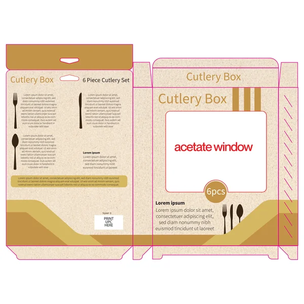
This third iteration uses a warm, monochromatic palette of ochre and tan. It is the most “neutral” of the set, offering a timeless look that fits seamlessly into any kitchen decor. By using shades that closely mimic the natural tones of wood and wheat, this design feels incredibly premium yet accessible.
The sweeping wave at the bottom, paired with the minimalist vertical bars at the top, creates a balanced visual flow. This specific colorway is ideal for a classic stainless steel collection, as the golden tones provide a warm contrast to the cool metallic finish of the cutlery visible through the acetate window.
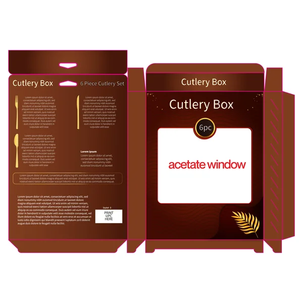
4. The Bold Gourmet (Crimson & Chocolate)
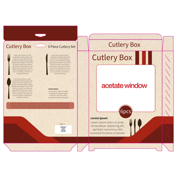
The final design leans into deep, rich tones of crimson and dark chocolate brown. This combination evokes a sense of luxury and fine dining, making it a strong candidate for premium “steakhouse style” cutlery or holiday gift sets. The dark base creates a striking frame for the acetate window, making the metallic shine of the cutlery pop.
5. The Royal Modern (Purple & Indigo)
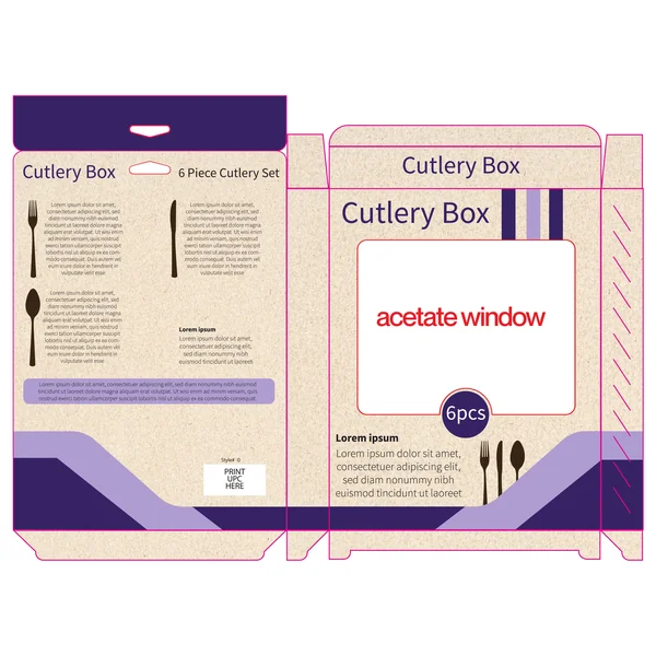
The most unique of the set, this palette uses shades of purple and indigo to create a sense of modernity and elegance. Purple is traditionally associated with quality and luxury; when paired with the raw texture of the box, it creates a “modern-industrial” vibe that stands out in a market usually dominated by reds and greens.
6. The Midnight Onyx & Gold (Luxury Edition)
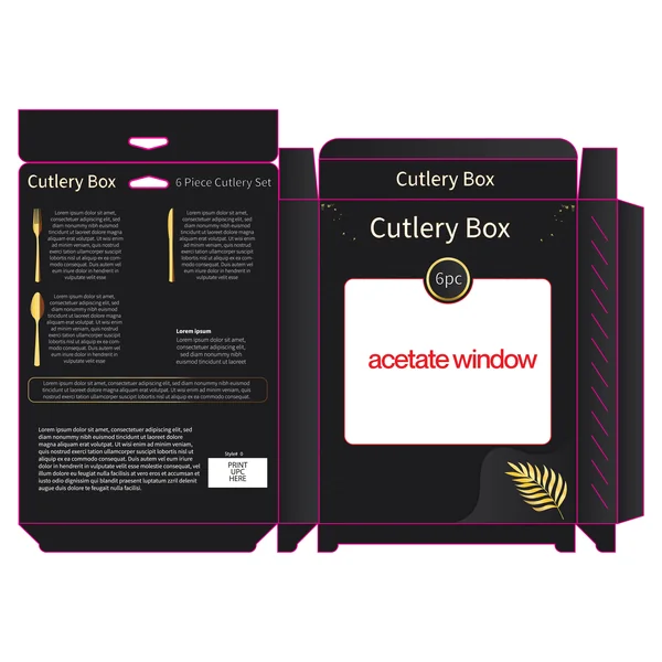
This design pivots away from the natural kraft texture to a deep matte black finish, instantly elevating the product to a luxury tier. The use of gold leaf accents—seen in the delicate leaf motif and the “6pc” seal—creates a striking “black and gold” aesthetic that feels sophisticated and exclusive.
The addition of subtle, wavy tonal patterns in the background adds a layer of tactile mystery, while the sharp magenta dieline accents provide a pop of contemporary flair. This is the ultimate packaging for a high-end gift set or a professional chef’s collection, where the goal is to make a bold statement on the shelf.
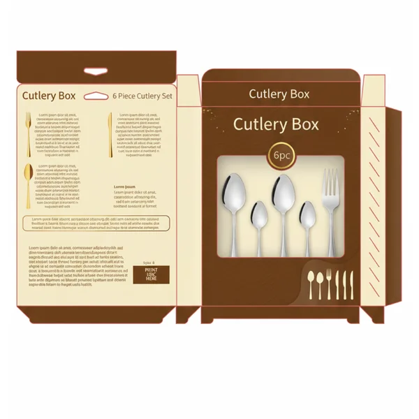
7. The Elegant Earth Tone Box
This design utilizes a deep chocolate and mahogany color palette to evoke a sense of premium quality and warmth. By pairing rich gradients with gold leaf accents, the packaging positions the cutlery as more than just a kitchen tool—it’s a lifestyle gift.
Key Features:
Acetate Window: The large central cutout is designed to give consumers a direct view of the product’s finish, building immediate trust and tactile interest.
Iconographic Layout: The back panel uses clean, gold-lined silhouettes of the fork, knife, and spoon, making the set’s contents instantly identifiable at a glance.
Sophisticated Typography: The use of clean, white sans-serif fonts ensures high readability against the dark background, maintaining a modern and high-end feel.
Retail Ready: The integrated hang-tab design makes this versatile for both shelf display and vertical pegboard merchandising.
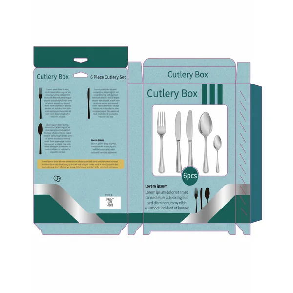
8. The Fresh & Organic Concept
In contrast to the luxury approach, this design uses a refreshing mint and teal palette to target a more modern, eco-conscious, or casual lifestyle audience. The use of nature-inspired illustrations—like floating leaves and acorns—gives the packaging an organic, “earth-friendly” personality that stands out on a retail shelf.
Key Highlights:
Playful Patterns: The background features subtle line-art textures (leaves and swirls) that add depth without cluttering the brand message.
Geometric Accents: Sharp teal diagonal bands provide a structural, modern contrast to the soft organic illustrations.
Dynamic Information Flow: Placing the “6pcs” badge at the bottom of the window creates a unique visual anchor that draws the eye toward the product itself.
Light & Airy Feel: The lighter color scheme makes the packaging feel approachable and fresh, perfect for picnic sets or everyday sustainable dining.
9. The Modern Metallic Minimalist
This design strikes a balance between professional utility and modern style. It uses a cool teal and silver-grey palette to communicate a sense of precision, cleanliness, and durability.
Metallic Accents: A bold, silver-toned diagonal band adds a “stainless steel” feel to the packaging, mirroring the product inside.
Direct Product Visualization: Unlike the window-only versions, this design uses high-fidelity product renders on the front to showcase exactly how the 6-piece set looks when polished.
Structured Layout: Vertical dark teal stripes on the top right add a rhythmic, architectural feel that suggests order and quality.
Information-Forward: The back panel is organized with clear sections for product storytelling and technical specifications, making it ideal for informed shoppers.
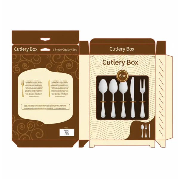
10. The Sophisticated Golden Gift
This design refines the “warm premium” concept by using a creme and cocoa color palette. The softer background colors allow the golden accents and the silver cutlery to pop with a high-end, celebratory feel.
Curated Display: The window design showcases the cutlery in a specific arrangement, emphasizing the variety of the set.
Luxe Details: Tiny gold sparkles and a golden leaf motif at the bottom right add a “gift-wrapped” quality to the box.
Elegant Layout: The back panel features detailed golden icons for each piece, accompanied by descriptive text blocks for a curated shopping experience.
Integrated Branding: The “6pc” seal is rendered in a wax-seal style gold badge, further reinforcing the luxury gift positioning.
11. The Modern Duo-Tone
This layout focuses on bold architectural lines and high contrast to create a professional, kitchen-ready appearance. It feels sturdy and dependable, ideal for high-street retail environments.
Asymmetric Color Blocking: The use of large cream and dark brown sections creates a bold visual break that makes the “6pc” branding pop.
Gold Leaf Detail: A single, detailed golden leaf on the bottom right adds a touch of organic class to an otherwise geometric and structured design.
Clear Branding: The “Cutlery Box” title is featured prominently in a clean sans-serif font, ensuring brand recognition from a distance.
Enhanced Information Architecture: The back panel is meticulously organized with dedicated spaces for product descriptions, UPC codes, and set quantities, making it highly functional for retailers.
12. Modern Retail Contrast: The 6-Piece Cutlery Box
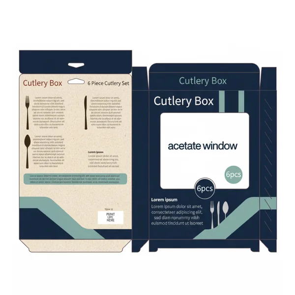
This design utilizes a bold, high-contrast color palette to create an immediate shelf presence. By pairing a deep navy blue with a muted sage green accent, the packaging feels contemporary yet sophisticated.
Key Design Features:
The Acetate Window: The central focus is a large viewing window, designed to showcase the actual product finish and quality—a critical trust-builder for consumers in the homeware space.
Informative Back Panel: The reverse side uses a clean, kraft-textured background to distinguish technical information from the branding. The use of simple cutlery silhouettes makes it easy for the customer to identify the set contents at a glance.
Balanced Typography: Large, sans-serif headings ensure brand clarity, while structured columns of text provide a professional, organized look that doesn’t feel cluttered.
Retail Functionality: The inclusion of a hang-hole tab makes this design versatile for both shelf stacking and pegboard displays.
13. The Royal Navy & Gold Vanguard
This final design moves away from earth tones and into the territory of bold, regal sophistication. By utilizing a deep navy blue and vibrant gold-yellow palette, it creates a visual “pop” that is both authoritative and high-energy.
Textured Backdrop: The background features a subtle, damask-style floral pattern that adds a layer of heritage and classic luxury to the modern color scheme.
Geometric Energy: Sharp, angular gold and dark blue bands slash across the bottom of the packaging, giving it a sense of precision and contemporary flair.
High-Impact Window: The large, clean acetate window is framed by a minimalist white border, ensuring that the focus remains entirely on the quality of the cutlery inside.
Balanced Information: The back panel uses a clean, two-column text layout paired with dark cutlery silhouettes, making it incredibly easy for the consumer to read product benefits while maintaining a sleek aesthetic.
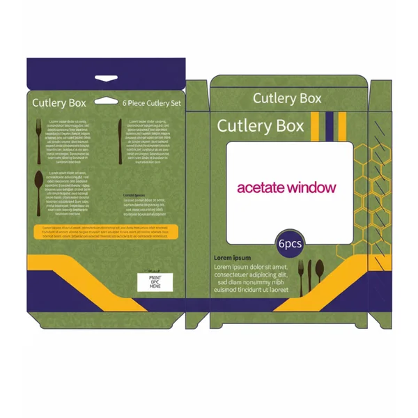
14. The “Geometric Vibrant” (Green & Amber)
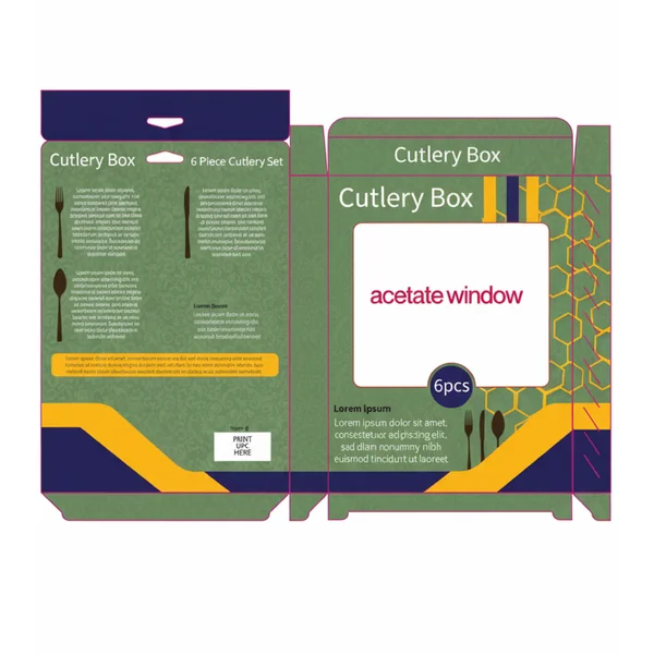
This version is designed to break through the visual noise of a crowded retail shelf. It’s energetic, youthful, and focuses on pattern and movement.
Dynamic Patterns: The use of a honeycomb/hexagonal geometric overlay adds a layer of depth and technical precision, suggesting that the cutlery inside is expertly crafted.
High-Energy Palette: Combining forest green with bright amber yellow creates a warm, inviting “kitchen-centric” feel. It moves away from “formal dining” and toward “joyful hosting.”
Action Lines: The diagonal yellow stripe across the bottom creates a sense of movement, leading the eye directly toward the product count and branding.
15. The “Midnight Gold” Premium Concept
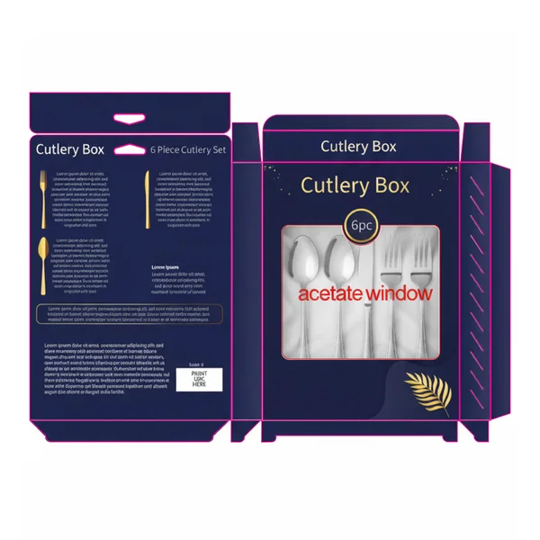
This is your luxury tier design. It moves away from retail “information” and toward a high-end “gifting” experience.
Elegant Graphics: By replacing flat colors with a deep, midnight-blue gradient and delicate gold leaf illustrations, the packaging immediately communicates a higher price point.
Stardust Accents: The subtle “sparkle” effect around the brand name mimics the light reflecting off high-polished stainless steel or silver.
Gold Foil Potential: This design is built for premium printing finishes like gold foil stamping on the “6pc” seal and the leaf icon, creating a tactile experience for the customer.
16. The “Vintage Heritage” Cocoa Concept
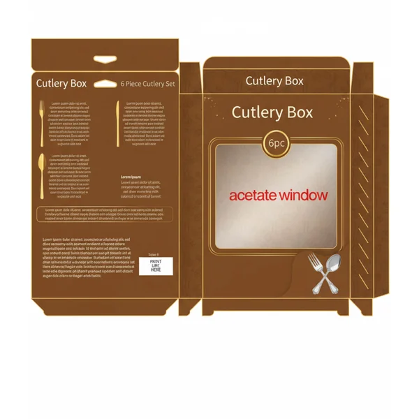
This design is all about warmth, tradition, and the comfort of a home-cooked meal. It’s an ideal fit for a brand that prides itself on classic craftsmanship and timeless style.
Warm Color Palette: The rich cocoa-brown tones evoke a sense of reliability and rustic charm. It stands out by feeling “cozy” rather than “clinical,” making it perfect for traditional wooden-handled or classic stainless sets.
Subtle Patterning: The side panels and background feature a faint, tonal illustrative pattern that adds depth and a “designer touch” without distracting from the main product window.
Heritage Branding: The clean, white serif typography paired with a simple “crossed fork and spoon” icon gives the brand an established, trustworthy feel—like a company that has been around for generations.
17. The Classic Bistro Sleeve
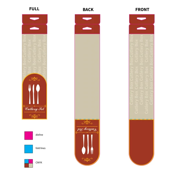
This packaging concept leans into a warm, traditional aesthetic that feels right at home in a cozy café or a rustic kitchen. The use of a deep terracotta and cream palette creates an immediate sense of comfort and reliability. By utilizing a slim, vertical sleeve with a die-cut hanging tab, the design maximizes shelf efficiency while keeping the focus on the product’s elegance through clean white silhouettes. The delicate gold filigree accents add a touch of “premium” flair to an otherwise functional and approachable design.
18. The Midnight Premium Sleeve
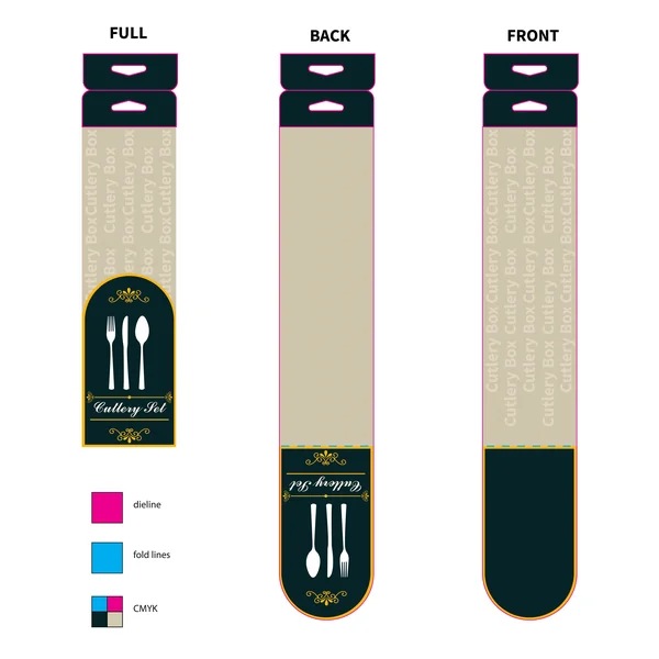
By swapping the warm tones for a deep charcoal and gold contrast, Design 20 shifts the narrative toward modern luxury. This version feels sophisticated and “high-end,” making it an ideal choice for premium stainless steel sets or gift-ready kitchenware.
High-End Aesthetic: The dark background makes the gold accents and white typography pop, creating a “black-tie” look for everyday objects.
Textural Contrast: The subtle vertical striping on the cream body mimics the look of high-quality paper or wood grain, adding a tactile feel to the visual design.
Consistency: Like its counterpart, it uses a smart die-cut fold system that ensures the branding remains visible whether the product is hanging on a hook or stacked on a shelf.
19. The Sage Botanical
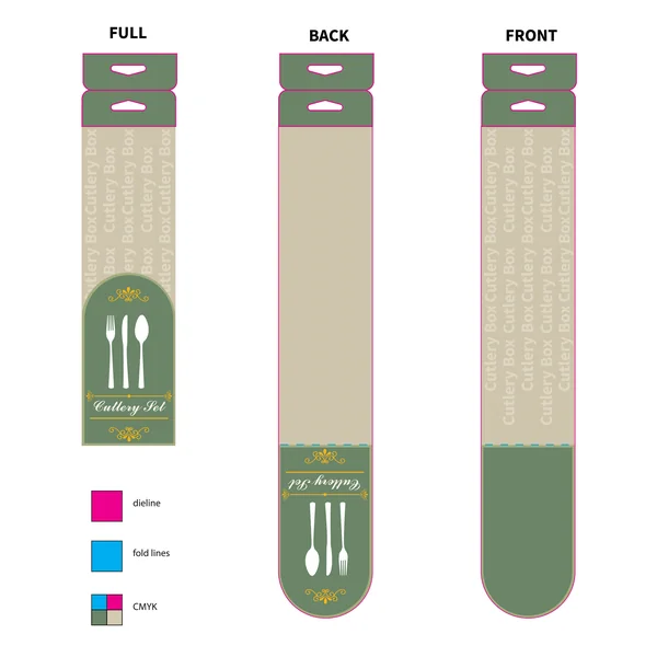
This utilizes a muted sage green, evoking a sense of organic quality and freshness. This “earth-tone” approach is very on-trend for brands focusing on sustainability or natural materials.
Vibe: Calm, organic, and eco-conscious.
Key Detail: The green tone softens the overall look, making it feel approachable and gentle compared to the high-contrast of the black or red versions.
Best For: Bamboo cutlery sets, eco-friendly lines, or outdoor dining collections.
20. The Industrial Slate
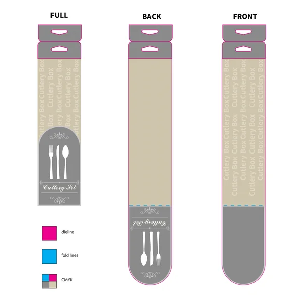
The final variation features a cool slate gray, offering a neutral and contemporary industrial feel. It is sleek and understated, allowing the gold filigree details to provide a subtle, elegant contrast without being overwhelming.
Aesthetic: Minimalist, urban, and gender-neutral.
Target Market: Modern minimalist homes or sleek, contemporary restaurant supply.