Olive Oil Packaging Design: 22 Inspiring Ideas for Modern Brands
Olive oil packaging design is more than just a bottle—it’s the first impression of quality, origin, and craftsmanship. In a market where shelves are crowded with similar products, the right packaging can instantly communicate authenticity, premium value, or a modern lifestyle.
From minimalist glass bottles to bold typographic labels and heritage-inspired tins, great olive oil packaging balances aesthetics with storytelling. In this blog, we’ve curated outstanding olive oil package designs that showcase how thoughtful design choices can elevate a brand, attract customers, and stand out in competitive retail spaces.
Whether you’re a brand owner, packaging designer, or simply looking for inspiration, these examples highlight how design, material, color, and typography work together to create memorable olive oil packaging.
22 Olive Oil Packaging Design Ideas That Blend Elegance & Brand Story
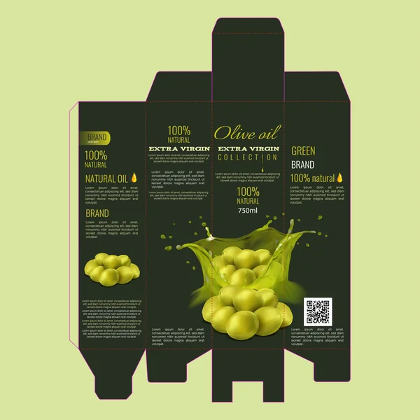
1. The “Fresh Harvest” Concept

This packaging layout utilizes a vibrant, monochromatic green color palette to immediately communicate the “100% Natural” message of the brand. The standout feature is the dynamic central graphic, which uses a high-action “splash” effect to symbolize freshness and the cold-pressing process.
By wrapping the imagery around the corners of the box, the design creates a seamless visual experience on the shelf, regardless of which angle the consumer sees first. The typography balances a sophisticated, cursive “Olive Oil” script with bold, authoritative slab-serifs for the “Extra Virgin” classification, effectively mixing premium elegance with clinical trust. This is a perfect example of how to use literal product imagery to evoke sensory appeal.
2. The “Aurora Luxury” Collection

In a bold departure from traditional green packaging, the Aurora Luxury concept uses a deep midnight-purple background to create a sense of exclusivity and “after-dark” elegance. The use of gold foil-style typography against the dark backdrop provides a high-contrast, premium feel that targets a gourmet audience. The central imagery features a hyper-realistic oil splash and pristine olives, which pop brilliantly against the dark canvas, emphasizing the “liquid gold” quality of the product. This design is a masterclass in using color psychology to move olive oil from a basic pantry staple to a luxury gift item.
3. The “Golden Harvest” Variation

While similar in layout to the “Fresh Harvest” design, this variation shifts the color palette toward a warm olive-gold. This subtle change in hue significantly alters the consumer’s perception, moving away from “raw and zesty” and toward a smooth, buttery flavor profile. The background color mimics the actual liquid state of high-quality oil, creating a powerful visual connection between the packaging and the product inside. The design retains the high-impact splash graphic, but when set against this sun-drenched tone, it evokes the feeling of a late-summer Mediterranean harvest.
4. The “Aurora Minimalist” Edit

Building on the luxury theme, this variation of the Aurora brand introduces a refined, minimalist layout with cleaner typography and more breathing room. The central olive splash is framed by a delicate golden arc, drawing the eye directly to the product’s origin. By simplifying the front-of-pack information and using a bold, serif logo, this design appeals to a modern, sophisticated consumer who values “quiet luxury” and premium craftsmanship.
5. The “Noir Nature” Hybrid
This design offers a striking contrast by pairing a dark charcoal interior frame with the vibrant greens of the first concept. This “hybrid” approach uses the dark panels to ground the design, making the central olive splash appear more luminous and three-dimensional. It is an excellent choice for a brand that wants to maintain its organic roots while appearing more professional and sophisticated on the shelf.
6. The “Vintage Gold” Collection

This iteration leans into a full-bleed golden-yellow aesthetic, evoking a sense of heritage and traditional Mediterranean sunlight. By removing the darker contrast panels, the design feels more open and airy. The use of high-saturation olives against the golden backdrop creates a “hyper-fresh” look that highlights the “Extra Virgin” classification as the primary selling point.
7. The “Aurum” Geometric Elite

The “Aurum” design introduces a sophisticated geometric split, using a sharp diagonal gold-foil section to create a modern, architectural feel. Unlike the other designs, it features a singular, suspended olive centerpiece that suggests precision and purity. The inclusion of a “Scan for Traceability” QR code area emphasizes transparency and tech-forward branding, making it ideal for a premium market that values both luxury and product origin data.
8. The “Midnight Orchard” Premium

This design is a sophisticated evolution of the organic theme, utilizing a deep forest-green background to create a sense of mystery and high-end quality. Unlike the literal “splash” of the earlier versions, this layout features a refined golden oil ripple at the base, which grounds the design and directs the eye upward toward the hanging olive branch. The use of gold-toned typography against the dark backdrop provides a luxurious “Black Label” feel, making it the perfect choice for an premium, extra virgin oil that prides itself on depth and complexity of flavor.
9. The Golden Heritage Edition

The final design in the series returns to a warm, sun-soaked yellow palette, evoking the traditional heritage of Mediterranean harvests. By pairing the elegant hanging olive branch with the shimmering golden oil ripple, this packaging emphasizes the purity and “liquid gold” nature of the product. The open, airy background makes the typography highly legible, appealing to a consumer who values transparency, tradition, and a product that feels right at home in a bright, modern kitchen.
10. The “Estate Reserve” Collection

This design moves away from abstract splashes and focuses on traditional product realism. Featuring a high-quality glass carafe illustration, it emphasizes the “Premium Harvest” and “Artisanal Quality” of the oil. The deep navy background and thin gold borders create a regal, classic aesthetic that appeals to traditionalists. By showcasing both green and black olives, the packaging suggests a complex, balanced blend, while the gold-foil olive branch logo adds a final touch of timeless elegance.
11. The “Botanical Essential” Edit

This design marks a shift toward a clean, apothecary-inspired aesthetic. By utilizing a soft, cream-colored background and deep navy typography, it moves away from high-action splashes and toward minimalist clinical purity. The central focus is a delicate, golden-etched olive branch rising from a calm, blue liquid ripple, signaling a product that is as much about wellness and “botanical” benefit as it is about flavor. It is a perfect example of “Essential” branding—appealing to the modern, health-conscious consumer who seeks simplicity, transparency, and laboratory-grade quality.
12. The “Aurum Green” Hybrid

This final concept serves as a masterful synthesis of the entire collection. It pairs the energetic lime-green background of the “Fresh Harvest” series with the sophisticated black sidebar branding seen in the premium “Aurum” edits. By featuring both a literal olive splash and a refined hanging botanical branch, the design appeals to two different types of consumers: those looking for a high-impact, fresh product and those who appreciate “Premium Selection” status. The gold “Premium” seal acts as a focal point, providing a final stamp of authority and quality that rounds out this versatile portfolio.
13. The “Prestige” Signature Blend

This design moves into the realm of dark, textured elegance. By utilizing a deep charcoal background with a subtle, tonal leaf pattern, the packaging gains a tactile quality even on a 2D surface. The “Signature Blend” messaging is supported by a sophisticated gold crest and geometric framing around the central olive cluster, signaling a product that is curated and high-caliber. It successfully bridges the gap between the energetic “splash” imagery of the mass-market designs and the “quiet luxury” of the minimalist collections, making it a standout choice for a premium reserve line.
16. The Golden Hour (Sage & Earth)

This variation softens the aesthetic by using a muted sage green and a more expansive landscape illustration. The lighting in the artwork is brighter—evoking a clear “Golden Hour” in the groves—which makes the product feel approachable, fresh, and organic. The layout provides ample space for brand storytelling and nutritional details without feeling cluttered. It strikes a beautiful balance between rustic charm and modern cleanliness, making it highly effective for an organic “everyday luxury” brand that prides itself on transparency and natural purity.
17. Modern Extra Virgin (White & Gold)

This design breaks away from the illustrative landscapes for a bold, contemporary retail look. It focuses on dynamic action and clean space rather than tradition.
The Vibe: Professional, energetic, and clean.
Design Note: The white-to-gold gradient background feels bright and “light,” appealing to the health-conscious consumer. By using a high-action “splash” graphic of fresh green olives, the design emphasizes flavor and vitality. The thin, modern fonts and five-star “Collection” branding make this tin look perfect for a modern supermarket shelf.
18. The Midnight Collection (Matte Black)

This final design uses a striking black background to create a sense of ultimate exclusivity and “Ultra-Premium” status.
The Vibe: Bold, luxurious, and dramatic.
Design Analysis: Against the black backdrop, the neon-green olive splash and gold “Collection” text become the absolute heroes of the composition. This high-contrast approach is designed for the modern luxury market, where the packaging is meant to look as good in a professional kitchen as it does on a retail display.
19. The Pure Essence (White & Minimalist)
This final concept leans into minimalism and elegance. By utilizing a clean white upper half and a glowing gold base, it directs all focus to the vertical olive branch and the ripples of oil at the bottom. It feels airy and sophisticated, suggesting a light, refined flavor profile. This layout is particularly effective for brands that want to showcase “100% Natural” purity without the clutter of traditional imagery.
20. The Bold Reserve (Deep Olive)

Returning to a darker palette but with a modern twist, this design uses a rich olive-drab background that feels heavy and high-quality. The addition of clustered olives at the base of the splash graphic creates a sense of abundance and “full-bodied” flavor. It balances the illustrative style of the earlier designs with the high-impact graphics of the modern collection, creating a versatile look for premium retail.
21. The Liquid Gold (Rich Emerald)

Focusing on the product’s nickname, “Liquid Gold,” this design uses a deep emerald and black gradient. The emphasis here is on the flow of the oil itself, which is rendered with a beautiful, metallic luster. The minimalist side panels and sharp gold accents make this an excellent choice for an export-tier product where visual impact is the primary goal.
22. The “Old World” Heritage Look (Cream/White Labels)

This design captures the soul of the Mediterranean through a warm, ‘parchment’ aesthetic. By pairing a delicate hand-drawn illustration of the Tuscan countryside with classic serif typography, the label tells a story of heritage and artisanal craft. It moves away from loud modernism, opting instead for a textured, organic feel that suggests the oil is bottled straight from a family-run grove.