Fruit Box Packaging Designs: 23 Practical Ideas Used by Real Produce Brands
Fruit box packaging is not just about holding produce — it directly impacts freshness, damage control, transportation cost, shelf visibility, and brand trust. In competitive fruit markets, especially retail and export, poorly designed boxes lead to crushed fruit, faster spoilage, higher returns, and lost buyer confidence.
As a packaging designer, one mistake I see repeatedly is brands choosing fruit boxes based purely on looks, without considering ventilation, stacking strength, material behavior, and buyer handling patterns. A good fruit box design must balance structural performance, visual communication, and logistical efficiency — otherwise, even premium fruit can look cheap or arrive damaged.
In this guide, I’ve compiled 23 proven fruit box packaging design ideas used by growers, wholesalers, exporters, and retail brands. Each idea focuses on real-world packaging requirements, not just aesthetics — helping you choose designs that protect fruit, reduce waste, and elevate your brand at the same time.
23 Smart Fruit Box Packaging Design Ideas That Combine Protection, Branding & Freshness
1. The Classic Bold Apple Tray

This design focuses on a rich, traditional aesthetic that communicates reliability and harvest-fresh quality. It is built to stand out in both rustic farm shops and modern grocery aisles.
Color Palette: The deep crimson and clay-toned background creates a warm, earthy feel that anchors the design.
Visual Impact: Bold, white horizontal bands provide a sharp contrast, ensuring the “Fresh Apples” badge is immediately legible.
Functional Branding: Essential retail data, including the 2KG weight indicator and a QR code for traceability, are integrated into the side panels without cluttering the primary faces.
Photography: Circular frames featuring high-resolution images of ripe apples act as a direct visual promise of product quality.
2. The Modern Minimalist Apple Tray

this variation introduces subtle refinements for a more contemporary, boutique appearance.
Refined Typography: The “Fresh Apples” logo and weight indicators feature thinner, cleaner strokes, giving the brand a more sophisticated edge.
Enhanced Information Hierarchy: The side panels utilize larger white circular motifs for the product description and QR code, improving readability for the consumer.
Contrast & Balance: By reducing the “weight” of the graphic elements, this design feels lighter and more modern while maintaining the signature warm color story.
3. The Vibrant Pomegranate Concept

This iteration adapts the established layout for pomegranates, shifting the energy of the packaging to match the unique vibrancy of the fruit.
Warm Tonal Shift: The background transitions into a bright, textured orange-coral gradient that mirrors the skin of a sun-ripened pomegranate.
Thematic Consistency: It retains the successful “Fresh” badge and circular product photography, proving the versatility of this design system across different fruit categories.
Shelf Presence: The high-energy color palette is designed to catch the eye in a crowded produce section, signaling exotic freshness and premium taste.
4. The Refined Pomegranate Tray

This final iteration takes the vibrant energy of the pomegranate and applies a refined, minimalist lens. It’s the perfect balance between high-impact color and clean, professional branding.
Sophisticated Palette: The textured orange-coral background provides a fresh, citrusy backdrop that makes the product feel premium and sun-ripened.
Minimalist Branding: By using a thin-stroke “Fresh Pomegranates” badge and outlined weight indicators, the design feels more “boutique” and high-end compared to bolder versions.
Clean Information Flow: The white circular frames on the side panels house the QR code and product details elegantly, ensuring the packaging is functional for retailers without losing its aesthetic appeal.
Cohesive Design Language: This design proves how a strong layout can be adapted across different fruits while maintaining a recognizable brand identity.
5. The Sweet Cherry Concept

This design introduces a softer, more delicate aesthetic to the series, perfectly capturing the light and “treat-like” nature of fresh cherries.
Color Palette: A dreamy, watercolor-inspired pink and white background replaces the earthy tones of the previous designs, creating a fresh and youthful vibe.
Visual Balance: The use of bright red cherry clusters in circular frames creates a striking focal point against the pale pink textures.
Branding & Typography: The signature “Fresh Cherries” badge is rendered in a vibrant red to match the fruit, ensuring the product name is the first thing a customer sees.
Retail Practicality: Since cherries are often sold in smaller quantities, the weight indicator is updated to 1KG, while maintaining the clean side-panel layout for the QR code and technical text.
6. The Gourmet Cherry Selection

The final design in the series moves toward a more “gourmet” or luxury dessert-quality feel.
Deep Contrast: The signature badge is rendered in a deep burgundy, offering a more sophisticated color story.
Boutique Finish: The combination of the soft pink background and dark branding elements creates a premium “specialty” vibe.
Cohesive End: This design successfully rounds out the series, showing how color can completely shift a product’s market position.
7. The Rustic Pear Harvest Tray

This design adapts the established branding system to the soft, organic aesthetic of orchard-fresh pears. It balances a natural color story with modern retail functionality.
Earth-Toned Palette: The background utilizes a warm, sandy-orange texture that evokes a rustic, sun-drenched orchard feel, perfectly complementing the yellow and red hues of the pears.
Visual Continuity: It maintains the signature white horizontal bands and bold “Fresh Pears” badge, ensuring brand recognition across the entire fruit line.
Integrated Logistics: The layout includes a 2KG weight indicator and a dedicated side-panel QR code, providing consumers and retailers with easy access to product traceability and origin information.
Realistic Preview: By placing high-definition imagery of the fruit within circular windows, the design builds immediate consumer trust by showcasing the quality of the product inside.
8. The Modern Boutique Pear Tray

The final piece in the collection offers a lighter, more minimalist take on the pear packaging, perfect for high-end or boutique grocers.
Minimalist Branding: By using a thin-line outlined badge, this version allows the textured background and fruit photography to feel more spacious and modern.
Refined Detail: The 2KG weight indicator is also outlined, contributing to a cohesive, sophisticated aesthetic that feels premium.
Traceability: Like the rest of the series, the side panels feature a clear QR code and descriptive text area, ensuring the packaging is as informative as it is beautiful.
9. The Sun-Kissed Orange Tray

This layout utilizes a high-energy color palette to mirror the bright, citrusy profile of the fruit, making it an instant standout in a retail environment.
Vibrant Color Theory: The background features a deep, textured amber-gold gradient that complements the natural zest of the oranges while maintaining the series’ warm, organic feel.
Modern Boutique Branding: This version employs the “Refined” design style, using an outlined “Fresh Oranges” badge and weight indicator for a clean, sophisticated, and premium look.
Visual Appetite Appeal: The circular windows feature high-resolution imagery of both a whole and sliced orange, providing a refreshing “cross-section” preview that builds immediate consumer desire.
Seamless Information Flow: The 2KG capacity and QR-driven traceability are integrated into white side-panel circular motifs, ensuring the packaging is as functional for the supply chain as it is attractive to the shopper.
10. The Citrus Burst Orange Tray

This design returns to the bold, solid badge system for maximum visibility. This ties the citrus line together, proving that consistent logistics like QR-driven traceability can look beautiful across any color palette.
11. The Tropical Dragon Fruit Tray
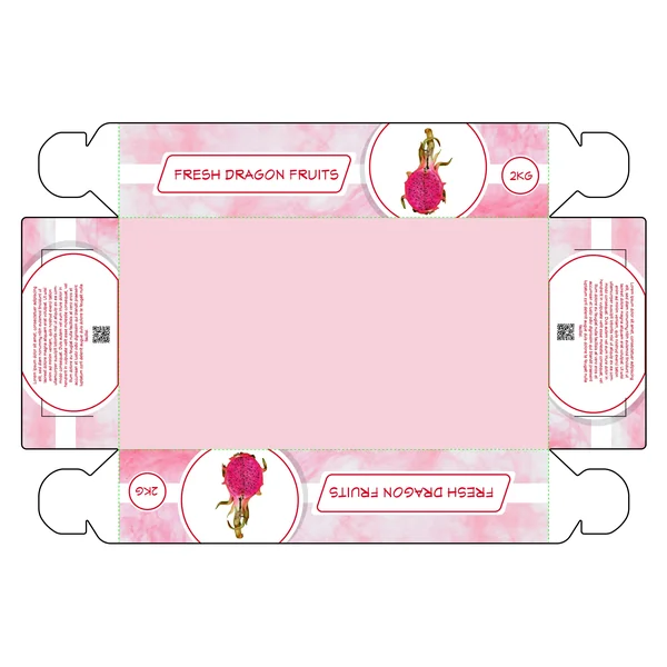
This design captures the vibrant, “electric” aesthetic of the dragon fruit, using a palette that immediately signals high-end, exotic quality.
Exotic Color Story: The background features a dreamy, ethereal pink-and-white texture that mirrors the unique fuchsia-and-white interior of the fruit.
Minimalist Boutique Branding: Utilizing the “Refined” design language, this tray uses a thin-stroke, outlined “Fresh Dragon Fruits” badge, giving it a modern and sophisticated retail edge.
Visual Precision: By showcasing a high-definition image of a vibrant, cut dragon fruit within circular frames, the design provides an immediate “quality check” for the consumer.
Consistent Retail Logistics: Despite the exotic shift in product, the design maintains your series’ standard 2KG weight indicator and integrated QR code for easy traceability and consumer engagement.
12. The Fresh Dragon Fruit

This design captures the vibrant essence of dragon fruit through a bold, high-contrast color palette. By leaning into the fruit’s natural neon-pink tones, the packaging creates an immediate emotional connection with the consumer, signaling sweetness and exotic flair.
Color Strategy: A marbled pink background provides texture and depth, while the deep red “Fresh Dragon Fruit” banner creates a sharp focal point.
Minimalist Clarity: The design uses clean, white circular frames for the product imagery and weight indicators (2KG), ensuring that key information doesn’t get lost in the bold colors.
Modern Utility: Integrated QR codes on the side panels suggest a brand that values transparency, allowing customers to easily trace the fruit’s journey from farm to table.
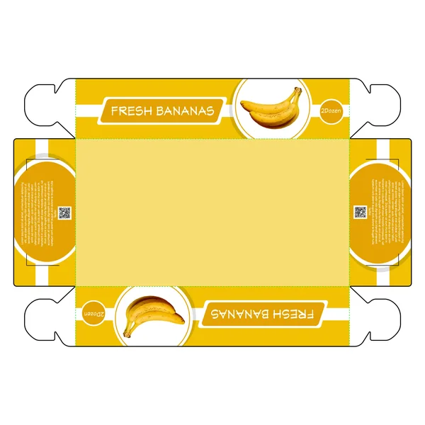
13. Golden Banana (Bright Concept)

This design focuses on a sense of cheerfulness and health, ideal for a staple fruit that families reach for daily.
Color Psychology: The bright yellow background reinforces the “ripeness” of the product, creating an immediate psychological association with sweetness and quality.
Quantity Focus: The “2 Dozen” callout is placed in a clean circular badge, making it easy for wholesale or bulk shoppers to identify the quantity at a glance.
Framed Imagery: By placing the banana clusters in white circular frames, the design creates a “window” effect that keeps the focus on the actual produce.
14. Golden Banana (Contrast Concept)
This variation of the banana box introduces a deeper mustard-gold on the side panels, providing a more grounded and “organic” feel compared to the brighter version.
Dynamic Contrast: The two-tone yellow approach adds depth to the box’s structure, helping the white text and branding stand out more sharply.
Modern Geometry: The use of slanted lines and geometric badges gives the traditional fruit crate a contemporary makeover.
Retail Ready: The layout is perfectly mirrored, ensuring that no matter how the box is stacked on a retail shelf, the branding and quantity are always visible to the customer.
15. Zesty Fresh Kiwis

The kiwi concept introduces a refreshing lime-green palette that emphasizes the fruit’s tart and juicy profile.
Natural Tones: The light green background is paired with a darker, forest-green base panel, creating a balanced look that feels earthy yet modern.
Cross-Section Imagery: Utilizing a crisp image of a sliced kiwi within the circular frame showcases the interior quality of the fruit, acting as a “visual taste test” for the shopper.
Structural Consistency: By maintaining the same 2KG weight indicator and QR code placement as the dragon fruit box, the brand maintains a unified look across different product lines.
16. The Zesty Kiwi Flat-Pack

This design utilizes a refreshing two-tone green palette that mirrors the transition from the kiwi’s fuzzy skin to its vibrant interior. The layout is structured and modern, using clean white banners to make the “Fresh Kiwis” typography pop against the darker forest green background.
17. Golden Fresh Mangos (Amber Glow)

The newest addition features a rich amber and orange palette, capturing the sweet, juicy essence of the mango.
Tropical Warmth: The swirling yellow and orange background textures suggest the richness of the fruit inside.
Uniform Layout: By keeping the product image and branding in the same circular frames as the previous designs, you’ve ensured that the mango box feels like a natural part of the “Fresh” family.
Retail Ready: The bright, saturated orange is specifically designed to pop against the cooler greens and blues often found in grocery aisles.
18. Tropical Vibrance Mango Box

This packaging leans into a warm, monochromatic orange palette that radiates energy and sweetness. By using a vibrant, saturated orange for the main body and a softer, marbled texture on the side panels, the design captures the tropical essence of the fruit.
19. The Verdant Grape Collection

Moving into a cooler spectrum, this design uses a lime-and-moss green gradient. It feels crisp and refreshing, perfectly matching the “snap” of a fresh green grape.
Why it Works:
Product Synergy: The bright green central panel provides a perfect backdrop that would complement the actual fruit if the box features any cut-outs.
Soft Gradients: The use of soft, light-reflective gradients on the panels gives the packaging a 3D feel, making the “Fresh Grapes” label appear to jump off the shelf.
Balanced Information: Like the rest of the series, the 2KG weight and QR codes are placed in the “corners of interest,” keeping the main face of the box clean and focused on the fruit imagery.
20. The Orchard-Fresh Grape Case

Moving into a cooler spectrum, this design uses a lime-and-moss green gradient. It feels crisp and refreshing, perfectly matching the “snap” of a fresh green grape.
Why it Works:
Soft Gradients: The use of light-reflective gradients on the side panels gives the packaging a 3D feel, making the product appear more dynamic and “alive”.
Balanced Information: The 2KG weight and QR codes are placed in the “corners of interest,” keeping the main face of the box clean and focused on the grape imagery.
Clean Geometry: The use of circular motifs for the product images creates a balanced, symmetrical look that feels organized and reliable.
21. The “Family Pack” Mixed Fruit Gable Box

This design breaks from the flat crate style to offer a tall, “gable-top” handle box. It features a bold, red-and-green “watermelon” color scheme that signals a variety of flavors and a larger quantity.
Why it Works:
Structural Convenience: The integrated handle makes this an easy “grab-and-go” option for families or shoppers buying in bulk.
Abundance Imagery: By showcasing a variety of fruits (pineapple, banana, grapes, berries) at the base, the design immediately communicates value and diversity.
Educational Real Estate: The tall side panels provide significant space for brand storytelling or detailed product descriptions, making the box feel like an premium “experience” rather than just a container.
22. The “Mix Fruits” Premium Vertical Carrier

A sophisticated variation of the gable box, this design uses a deeper “blood orange” and crimson palette. It trades the pile of fruit for a more artistic “deconstructed” look, featuring floating slices of citrus and berries.
Why it Works:
Artistic Appeal: The floating fruit elements create a sense of lightness and freshness, appealing to a more modern, design-conscious demographic.
Clear Categorization: The use of the “Family Pack” sub-branding at the top and “Mix Fruits” in a bold, sans-serif font ensures there is no confusion about the variety contained within.
Dual-Panel Continuity: The design flows seamlessly across the corners of the box, ensuring that even if the box is turned sideways on the shelf, the branding remains cohesive and attractive.
23. The Premium “Deconstructed” Mix

A sophisticated evolution of the “Family Pack,” these versions use a deeper crimson and burnt-orange palette. Instead of a pile of fruit, they feature a creative, floating “ring” of fruit slices (citrus, berries, and bananas).
Why it Works:
Artistic Energy: The floating, deconstructed fruit elements create a sense of lightness and culinary “play,” targeting a more modern, upscale demographic.
Weight Customization: Design 23 specifically highlights a “1kg” callout, showing how the design can be adapted for smaller, premium portions while maintaining the “Family Pack” branding.
Seamless Flow: The artwork wraps around the corners of the box, ensuring that the package looks enticing from any angle on the shelf.