12 Creative BBQ Box Packaging Design Ideas That Stand Out
BBQ isn’t just about flavor — it’s about experience. From smoky aromas to bold sauces, everything starts with the first impression, and that impression comes from your BBQ box packaging design. Whether you’re running a barbecue restaurant, food truck, or packaged BBQ brand, the right packaging can instantly communicate quality, taste, and personality.
In this blog, we’ve curated 12 unique BBQ box packaging design ideas that combine visual appeal, practicality, and brand storytelling. These designs show how smart structure, color choices, and branding elements can turn a simple box into a powerful marketing tool that customers remember — and share.
Top 10 Eye Catching BBQ Packaging Desings
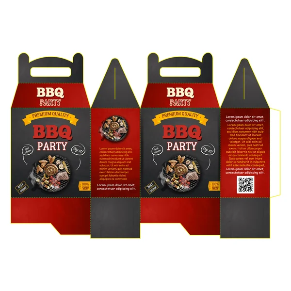
1. The Charcoal Classic
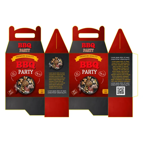
This design leans into a bold, high-contrast palette of deep charcoal and fire-engine red, instantly signaling heat and flavor to the customer. The use of a gable box structure with a built-in handle makes it a practical choice for “grab-and-go” BBQ feasts.
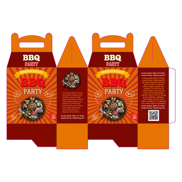
2. The Retro Sunburst
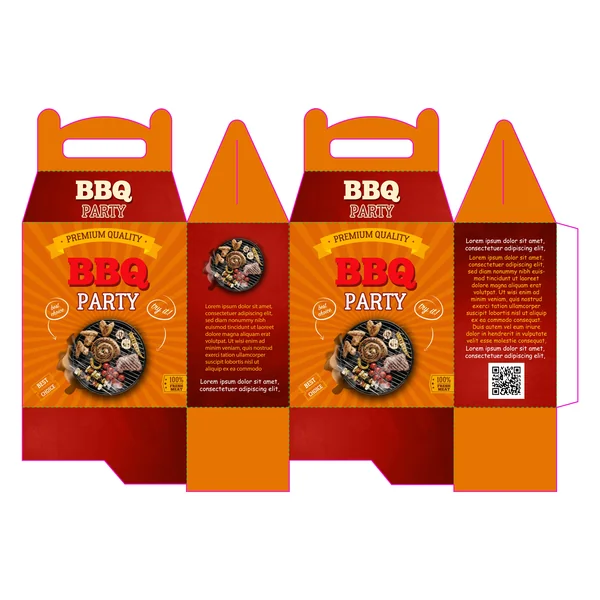
This variation swaps the dark tones for a vibrant orange sunburst pattern, shifting the energy toward a bright, outdoor summer festival feel.
The Aesthetic: The radial sunburst lines draw the eye directly to the center of the package, creating a sense of excitement and “pop-art” energy.
Color Strategy: Orange is known to stimulate the appetite and convey friendliness. This design feels more approachable and “family-style” than the darker version.
Visual Hierarchy: The golden “Premium Quality” ribbon stands out more prominently here, leaning into a traditional, award-winning “Blue Ribbon” BBQ aesthetic.
Best For: Fast-casual takeout, outdoor catering events, or family-sized meal kits meant for daytime picnics.
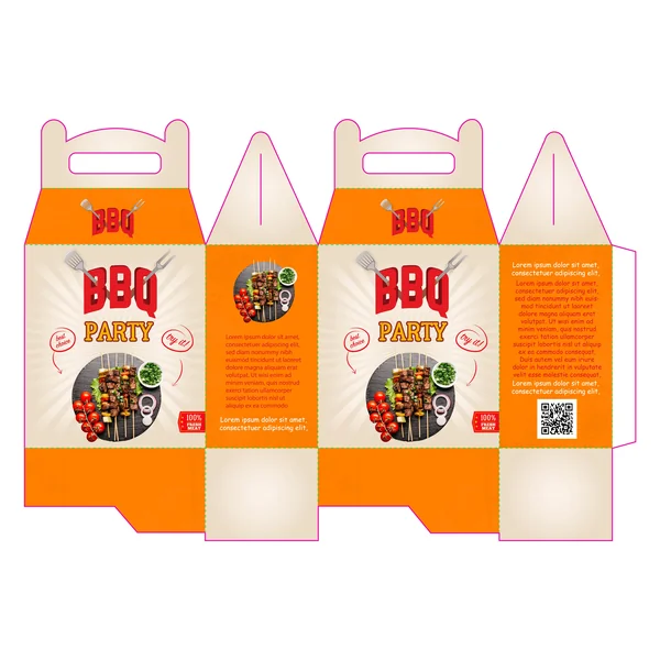
3. The Minimalist Grill
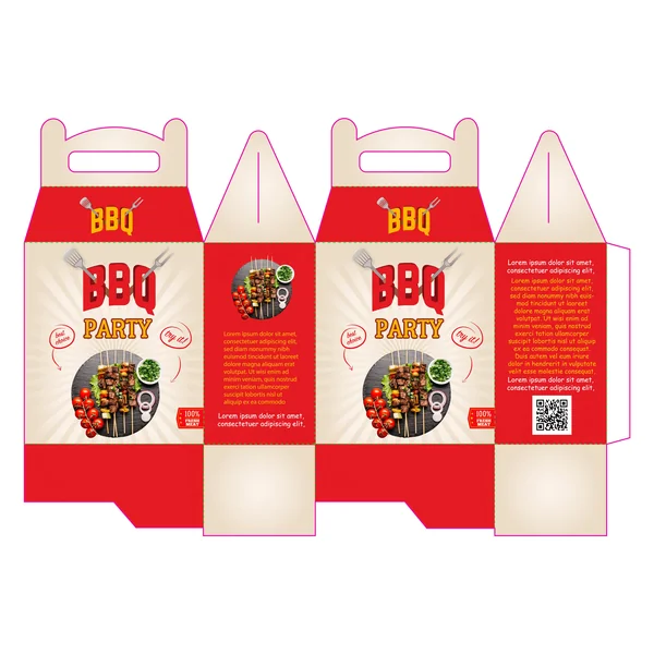
This layout opts for a clean, cream-colored background, giving it a lighter, modern, and perhaps even “healthier” or craft-oriented vibe.
Aesthetic: The design feels “breezy” and less heavy than the darker versions, focusing on freshness and high-quality ingredients.
Key Detail: The addition of grill fork icons and fresh skewer photography emphasizes the “grilled-to-order” aspect of the food.
Functional Space: The clean side panels offer high readability for the QR code and promotional text, making it a very user-friendly design for digital engagement.
Best For: Artisan BBQ brands, skewer-focused menus, or lunch-time catering services.
4. The Family Feast Mascot
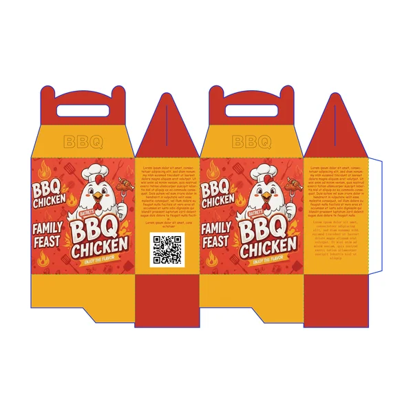
This design moves away from realistic photography in favor of a playful character illustration, making it instantly recognizable and friendly.
The Vibe: Family-oriented, casual, and highly “brandable.”
Visual Strategy: Featuring a cheerful chef-chicken mascot creates a memorable brand identity that appeals to all ages, especially for “Family Feast” meal kits.
Key Detail: The background is filled with subtle “grill tool” icons, adding texture and reinforcing the BBQ theme without cluttering the primary mascot.
5. The “Midnight” Gourmet
A variation of the first design, this version maximizes the dark slate aesthetic by minimizing the red panels, resulting in an even more premium look.
Modern Minimal: By allowing the dark texture to take center stage, the gold and white typography becomes the focal point, creating an “exclusive” feel.
Digital Integration: The high-contrast side panels ensure the QR code is easily scannable, bridging the gap between physical packaging and your digital menu.
Best For: Premium meat delivery services or high-end catering where the unboxing experience needs to feel elite.
6. The “Artisan Craft” Minimalist
This layout swaps heavy textures for a clean, cream-colored sunray background, offering a lighter, more modern “craft” aesthetic.
Design Energy: Fresh and approachable, focusing on “grilled-to-order” freshness rather than heavy smoke.
Visual Strategy: The imagery of skewers and fresh garnishes suggests a menu that is artisan-made and high-quality.
Best For: Health-conscious grill concepts, kebab shops, or modern boutique catering services.
7. The “Golden Grill” Variant
While these share similar layouts, the subtle shift from intense orange rays to soft cream tones demonstrates how a simple color change can move a brand from “Fast-Casual” to “Artisan Craft.”
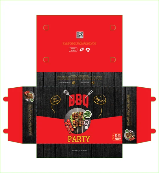
8. The Bold BBQ Party Box
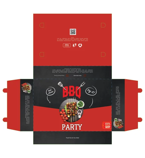
This design leans into a high-contrast red and charcoal-black color palette to instantly trigger the appetite and evoke the feeling of hot coals and grilled meats. The central focus is a high-quality top-down photo of the product, framed by playful, hand-drawn style callouts like “Try it!” and “Best Choice.” This balance of professional food photography with casual typography makes the brand feel approachable yet premium.
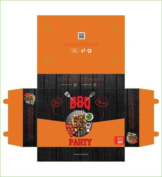
9. The Vibrant Zest (Orange & Charcoal)
By swapping the red for a vibrant orange, this variation shifts the brand’s personality toward a more modern, energetic, and “citrus-fresh” vibe. It feels less like a traditional heavy steakhouse and more like a contemporary, fun BBQ party. The orange creates a brilliant pop against the dark textured background, ensuring the box stands out even in low-light environments.
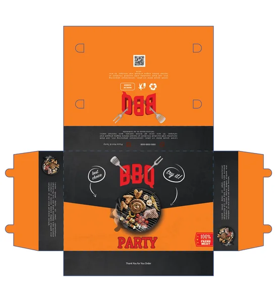
10. The Golden Glow (Yellow-Orange)
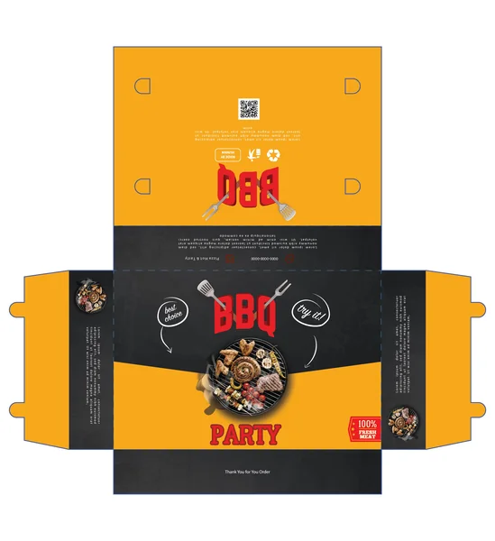
The third design features a warm, yellow-orange hue, offering a softer yet equally eye-catching alternative. It maintains the same professional layout as the previous versions but feels slightly more focused on “golden-hour” backyard gatherings.
Balanced Contrast: The yellow-orange provides a sharp contrast against the dark charcoal center band, making the central grill graphic pop.
Detailed Sidebar: The side panels utilize the same charcoal background to house product descriptions, creating a clean “information zone” that doesn’t distract from the main logo.
Appetite Appeal: By showcasing a diverse mix of grilled meats and vegetables, the design highlights the versatility of the BBQ kit.
11. The Rustic Wood Edition
This premium variation replaces the flat charcoal texture with a vertical dark wood grain. It’s the perfect choice for a brand that wants to emphasize traditional wood-fired grilling and outdoor authenticity.
Texture-First Design: The wood grain adds a tactile quality to the visual, making the packaging feel more high-end and natural.
Enhanced Readability: The yellow “PARTY” text and white hand-drawn arrows pop beautifully against the textured background, guiding the customer’s eye.
Premium Positioning: This design feels less like a “fast food” box and more like a curated kit from a professional pitmaster.
12. The Natural Smokehouse (Orange & Wood)
Combining the energy of vibrant orange with the rustic wood grain, this design offers the best of both worlds. It feels both professional and authentic, perfect for a brand that wants to highlight its organic roots while remaining approachable and fun.