18 Creative Scrub Cream Box Packaging Design Ideas That Stand Out on Shelves
In the skincare industry, packaging does more than protect the product—it shapes the customer’s first impression. A well-designed scrub cream box can instantly communicate quality, ingredients, and brand personality before the product is even opened.
From minimalist layouts to luxury finishes and eco-friendly materials, scrub cream box packaging design plays a key role in standing out in a competitive market. Whether you’re launching a new skincare line or refreshing your brand identity, the right box design can influence trust, shelf appeal, and buying decisions.
In this blog, we’ve curated 18 design ideas that showcase creativity, functionality, and modern branding trends to help you find the perfect direction for your product.
18 Creative & Premium Examples
1. The Organic Energy Concept

This design for Ocean’s Glow Revitalizing Scrub expertly balances raw, natural elements with a clean, modern layout. The use of a deep forest-green watercolor wash at the top provides a lush, botanical backdrop that flows into a minimalist cream base. By placing a high-quality product bowl at the center—flanked by fresh orange slices and coffee beans—the packaging tells a “farm-to-skin” story at a single glance. It’s a design that feels both grounded in nature and professionally curated.
2. Botanical Coffee Body Scrub

The packaging for Verde Scent takes a more coastal, airy approach, leaning into a “natural beauty” aesthetic. It features a soft turquoise and sandy-brown color palette, evoking the refreshing feel of sea salt and rosemary.
Visual Highlights: The central image features a rustic wooden bowl and scoop, emphasizing the artisanal, handmade quality of the product. Sprigs of rosemary and scattered coffee beans reinforce the herbal infusion.
Typography: The design uses a minimalist sans-serif font for “BEAUTY,” giving it a modern, clean, and medical-grade “natural cosmetic” look.
The Vibe: This design feels therapeutic and calming, suggesting a spa-like exfoliation experience at home.
3. Berry Bliss: Fruit Enzyme Scrub
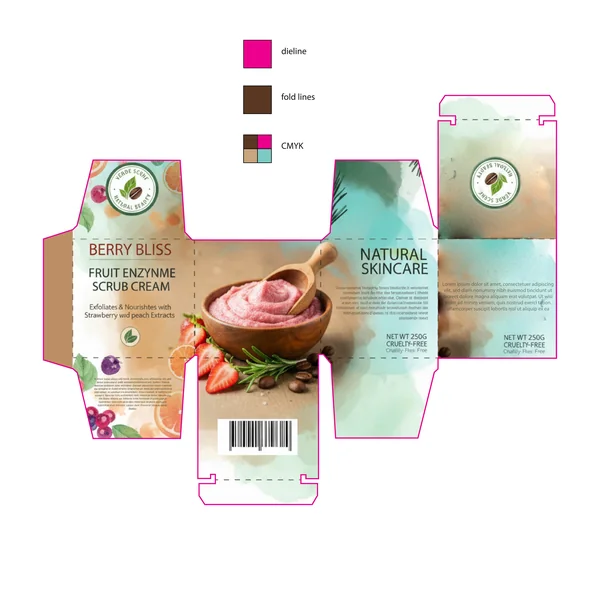
Berry Bliss breaks away from earthy tones for a vibrant, multi-tonal watercolor approach. This design is focused on “Freshness” and “Radiance,” using soft teal washes and warm peach undertones to represent the fruit enzyme formula.
Key Design Element: The imagery transitions from coffee beans to bright strawberries and peach slices, signaling a sweeter, fruit-forward sensory experience. The layout feels more fluid and artistic than the previous two.
Typography: A minimalist approach to the “Natural Skincare” text allows the vibrant product photography and the “Verde Scent” seal to remain the focal points of the box.
4. Tropical Citrus: Citrus Body Scrub

The Tropical Citrus packaging is designed to feel like a burst of sunshine. It uses a bright, mint-green background and vibrant citrus imagery to communicate a message of “Exfoliating & Brightening”.
Key Design Element: The design is highly illustrative, featuring a dynamic arrangement of pineapple slices, limes, and oranges that appear to “float” around the central product bowl.
Typography: This layout utilizes a playful, casual script for “Tropical Citrus,” which pairs with a clean, professional sans-serif for the “BEAUTY natural cosmetic” branding.
5. Natura Labs: Botanical Rosemary Scrub
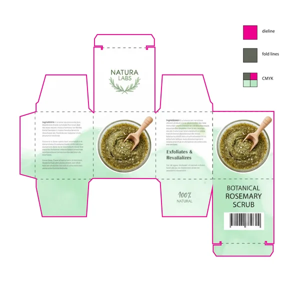
This design for Natura Labs takes a minimalist, “clean beauty” approach. It utilizes a very light, desaturated mint green and plenty of white space to project a sense of purity and laboratory-standard quality.
Design Highlight: The branding is centered around a simple, circular botanical logo. Unlike the other designs, this one uses a top-down “hero shot” of the scrub in a glass bowl, focusing purely on the texture of the formula.
The Vibe: Calm, professional, and 100% natural. It appeals to the “skintellectual” consumer who values transparency and simple ingredients.
6. Revitalizing Aloe & Spirulina Body Scrub

This final design takes a deep dive into aquatic and botanical themes, utilizing a cool-toned palette to emphasize detoxification and hydration. The layout moves away from the earthy browns of previous designs, opting instead for a refreshing blend of teal, seafoam green, and sandy gold accents.
Key Design Element: A large, detailed illustration of an aloe vera plant takes center stage, paired with watercolor “splashes” that suggest a high moisture content. The use of blue and green watercolor washes across the panels creates a fluid, organic feel that mimics the movement of water.
The Vibe: Pure, cooling, and restorative. This packaging is perfectly positioned for a “post-sun” or “deep-clean” product line, appealing to consumers who prioritize skin soothing and natural detox ingredients.
Typography: The design maintains a clean, modern sans-serif for the main titles, ensuring the “Hydrates & Detoxifies” promise is the first thing the customer reads.
7. Royal Glow: 100% Natural Herbal Scrub Cream

The Royal Glow packaging departs from the bright, watercolor aesthetics of the previous designs in favor of a regal, midnight-blue and gold palette. This layout is designed to position the product as a premium, luxury treatment rather than a daily utility.
Design Highlight: The use of intricate gold filigree in the corners and an ornate oval frame creates a “vintage apothecary” feel. The central image of the cream—depicted with a glowing, radiant aura and a gold applicator—promises a high-end results-driven experience.
Typography: The design utilizes a mix of elegant, formal scripts and clean serifs, reinforcing the brand’s identity as “Natural Herbal” luxury.
The Vibe: Prestigious and sophisticated. It targets the “self-care” market where the packaging is meant to look beautiful on a vanity or high-end spa shelf.
8. Ocean Bliss: Calming Sea Salt & Lavender Scrub

The Ocean Bliss packaging is a masterclass in tranquil, airy design. It utilizes a soft, ethereal color palette of seafoam blue and sandy beige, immediately signaling a product designed for stress relief and nighttime rituals.
Design Highlight: The composition features delicate lavender sprigs that frame a rustic wooden surface topped with coarse sea salt. The use of soft watercolor bleeds creates a “misty” effect, reinforcing the theme of pure tranquility.
Typography: The design uses a clean, spaced-out sans-serif for the brand name, paired with an elegant, italicized list of benefits—Relax, Restore, Radiate—that guides the eye downward.
The Vibe: Calming and coastal. It targets the wellness-focused consumer looking for a spa-like experience at home.
9. The Royal Glow Concept

This packaging design leverages a deep midnight blue and gold metallic color palette to immediately communicate luxury and exclusivity. The use of intricate gold filigree in the corners and a classic oval crest creates a “regal” aesthetic that suggests the product is both high-end and time-tested.
10. Botanical Body Scrub (Organic & Fresh)
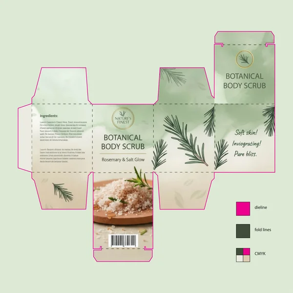
Moving away from luxury and into wellness, this design focuses on transparency, nature, and the raw ingredients inside the jar.
The Aesthetic: A soft, watercolor sage green background paired with crisp rosemary illustrations. It feels “airy” and “breathable,” signaling to the customer that the ingredients are clean and plant-based.
Visual Storytelling: Using a high-quality photograph of the actual salt and rosemary on the side panel manages expectations perfectly. It tells the buyer exactly what the sensory experience will be—gritty, herbal, and refreshing.
Typography: The clean, sans-serif font and the use of “Soft skin! Invigorating! Pure bliss.” acts as a direct, friendly conversation with the consumer, making the brand feel approachable and trustworthy.
11. Royal Glow (Emerald Green)

This variation of the “Royal Glow” concept swaps the navy for a rich emerald green, shifting the brand perception toward an “organic luxury” or “botanical royalty” vibe.
Color Psychology: The emerald green background combined with gold accents provides a more “earth-derived” sense of wealth compared to the midnight blue version.
Design Consistency: It maintains the high-end damask pattern and the glowing product center-piece, ensuring brand recognition while offering a different “scent” or “flavor” profile through color.
Premium Positioning: Like its blue counterpart, this design uses a clear dieline and fold-line structure suitable for high-quality cardstock printing that feels heavy and expensive in the hand.
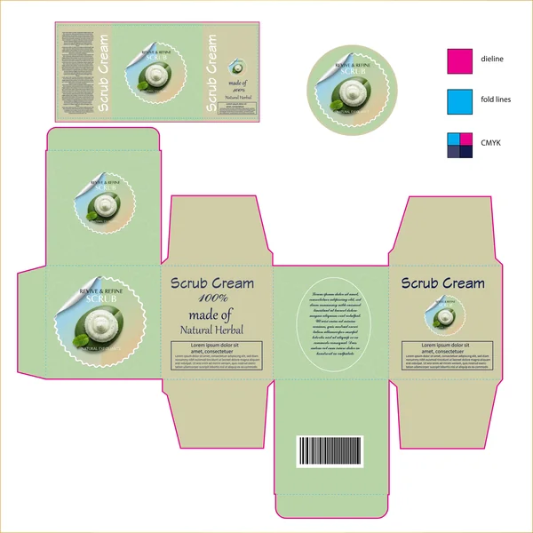
12. Revive & Refine (Contemporary Teal)

This design bridges the gap between luxury and modern clinical skincare. It uses a deep teal background with a unique “peel-back” sticker aesthetic to create a more dynamic and modern feel.
The Vibe: Fresh, professional, and results-oriented.
Key Detail: The central circular graphic features a realistic top-down view of the scrub on a leaf, emphasizing the “natural exfoliant” aspect while keeping the layout clean and centered.
Shelf Appeal: The subtle, swirling pattern in the background adds a tactile visual depth without distracting from the core branding, making it look both sophisticated and accessible.
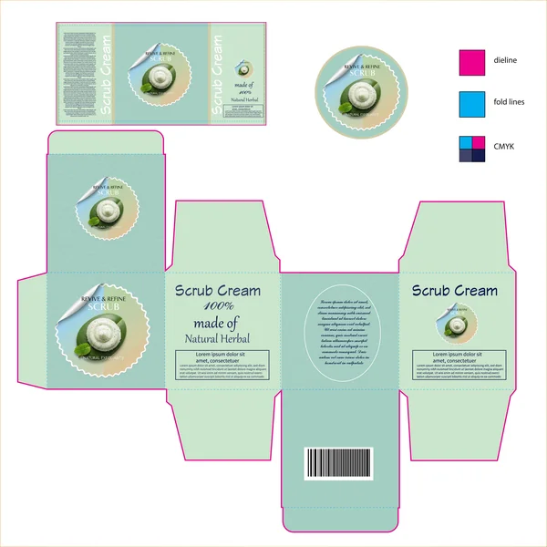
13. Revive & Refine (Teal & Mint)
The Revive & Refine designs utilize a more clinical, modern layout with a unique “peel-back” sticker aesthetic.
Modern Geometry: Utilizing deep teal or soft mint backgrounds with a swirling circular pattern, these designs feel energetic and professional.
Visual Focus: The central graphic—a top-down view of the scrub on a leaf—perfectly illustrates the marriage between nature and science.
Clarity: These designs prioritize clean lines and bold “100% Natural Herbal” text, appealing to the modern consumer who values straightforward, effective skincare.
14. The Botanical Revive: Herbal Scrub Packaging

This design leans heavily into an earthy, organic aesthetic to communicate the “100% Natural” brand promise. Using a dual-tone green palette—a vibrant forest green paired with a muted olive—the packaging immediately establishes a connection to nature and herbal wellness.
15. The Modern Minimalist (Mint Edition)
In this variation, the design shifts toward a soft mint and seafoam palette, evoking a sense of calm, cleanliness, and refreshing hydration. This lighter approach makes the product feel more modern and suitable for a daily skincare routine.
Soothing Color Story: The pale green background feels airy, allowing the dark typography to pop with maximum clarity.
Visual Balance: By maintaining the circular botanical imagery against a lighter background, the ingredient story becomes the vibrant focal point.
Clean Layout: This version highlights how a monochromatic pattern can provide texture while maintaining a minimalist aesthetic that suggests purity.
16. The Bright Apothecary (Mint & Cream)

The design introduces cream-colored panels, creating a high-contrast look that feels bright, airy, and high-end. This is a great example of using “negative space” to make the brand elements feel more prominent.
Warmth and Balance: The cream panels soften the overall look, moving away from a purely “herbal” vibe toward a luxury skincare aesthetic.
Enhanced Legibility: The use of a light background for the main text areas makes the fine-print “Lorem Ipsum” (placeholder for ingredients/usage) much easier to read, which is vital for consumer trust.
Vibrant Imagery: Against the lighter cream and mint backdrop, the green botanical illustration of the scrub becomes a vibrant focal point, making the product look incredibly fresh.
17. The High-End Apothecary (Mint & Cream)

The final design introduces cream-colored panels, creating a high-contrast look that feels bright, airy, and high-end. This is an excellent example of using negative space to make the brand elements feel more prominent.
Warmth and Balance: The cream panels soften the look, moving the brand toward a luxury skincare aesthetic.
Enhanced Legibility: The use of a light background for the main text areas makes the technical details much easier to read, which is vital for consumer trust.
Vibrant Imagery: Against the lighter backdrop, the green botanical illustration of the scrub becomes a vibrant focal point, making the product look incredibly fresh.
18. The Luxury Apothecary (Mint & Cream)
This design introduces cream-colored panels, creating a high-contrast look that feels bright, airy, and sophisticated. This version highlights how “negative space” can make brand elements feel more prominent.
Warmth and Balance: The cream panels soften the overall aesthetic, moving the brand away from a purely herbal vibe toward a prestige skincare look.
Trust Through Detail: Using a light background for the technical text areas makes the technical details much easier to read, which is vital for building consumer trust.
Vibrant Focal Point: Against the muted cream and mint backdrop, the green botanical illustration becomes a vibrant pop of color, making the product look incredibly fresh.