15 Stunning Vanilla Ice Cream Packaging Design Ideas for Modern Brands
Vanilla may be classic, but when it comes to ice cream packaging design, there’s nothing ordinary about standing out on the shelf. From minimalist tubs to playful, premium, and eco-friendly concepts, the right vanilla ice cream packaging design can instantly influence buying decisions and brand perception.
In this blog, we’ve curated 15 creative vanilla ice cream packaging designs that showcase how color, typography, materials, and storytelling can transform a simple flavor into a strong visual brand. Whether you’re a startup, a D2C brand, or a packaging designer looking for inspiration, these designs highlight what works in today’s competitive ice cream market.
1. The Modern Classic
This packaging leans into a vibrant, refreshing aesthetic by swapping traditional cream tones for a bold teal and gold palette. The design uses a playful “dripping cream” border at the top to create immediate visual appetite appeal, while the halftone dot patterns and vertical stripes give it a subtle retro-pop vibe.
By featuring hyper-realistic imagery of vanilla flowers, pods, and a drizzled scoop, the design communicates a “premium-meets-fun” message. The use of gold-outlined typography adds a touch of luxury, ensuring the product feels like an indulgent treat rather than just a basic staple. It’s a perfect balance of contemporary color theory and classic dessert cues.
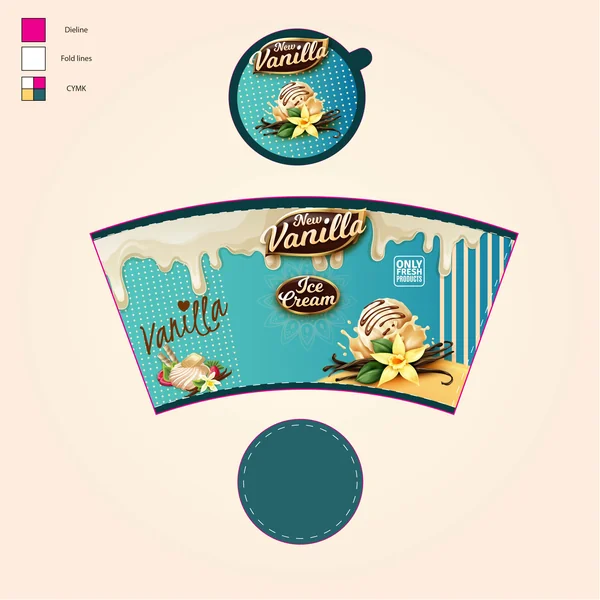
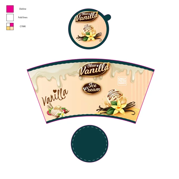
2. The Vibrant Teal Edition

This design breaks away from the traditional, muted “cream” colors of the vanilla category by introducing a bold teal and gold palette. The visual energy is driven by a mix of halftone dot patterns and vertical stripes, giving it a playful, diner-inspired feel.
The “melting cream” border at the top serves as a functional and appetizing frame, leading the eye down to hyper-realistic imagery of vanilla pods and blossoms. By using a bright, saturated background, this packaging is designed to pop off the shelf and appeal to a younger, more adventurous demographic looking for a fresh take on a classic flavor.
3. The Soft Rose Cream
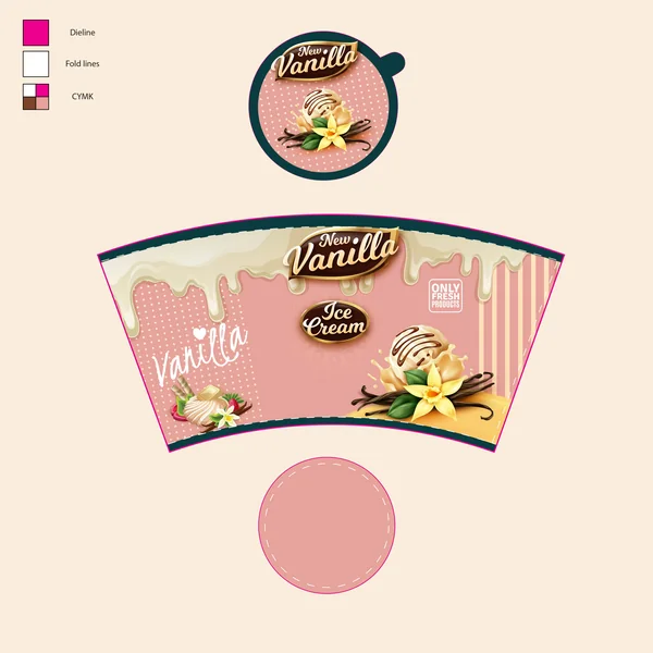
This design takes a nostalgic, “sweetheart” approach by using a soft rose-pink palette. The gentle color scheme evokes a sense of warmth and comfort, leaning into the creamy, floral notes of the vanilla bean. Combined with the dripping cream border and script lettering, this packaging feels whimsical and approachable, making it an ideal fit for a family-friendly brand or a specialty dessert boutique.
4. The Classic Cacao-Vanilla
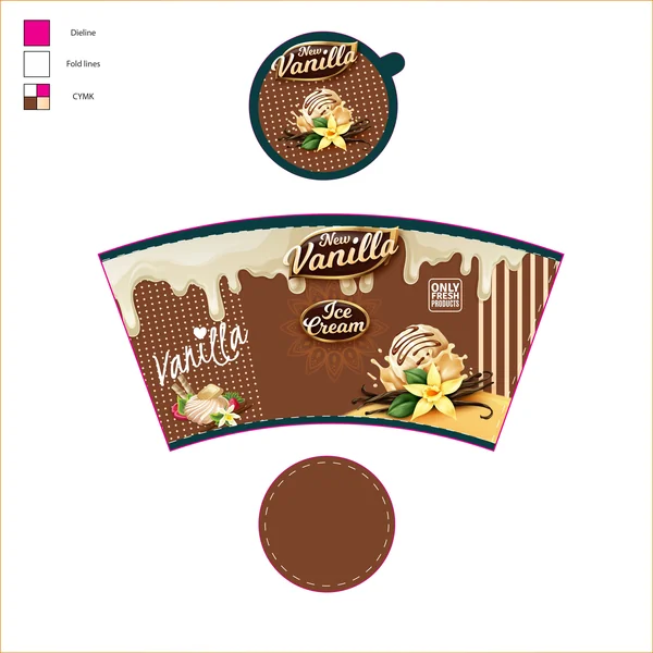
This variant utilizes a rich, chocolate-brown background to emphasize the organic and earthy roots of the vanilla bean. The deep earth tones create a high-end, “bean-to-tub” aesthetic that feels grounded and authentic. By pairing the dark backdrop with white script and gold emblems, the design communicates a mature, intense flavor profile that appeals to true vanilla connoisseurs who appreciate the spice’s complex, smoky undertones.
5. The Classic Custard
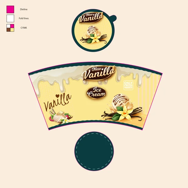
This version returns to a traditional warm yellow palette, reminiscent of rich, egg-based vanilla custard. The monochromatic approach—using shades of cream and gold—creates a seamless, harmonious look that feels timeless and sunny. It is the most “purist” design in the collection, focusing on the simplicity and purity of the flavor while maintaining the series’ signature playful patterns and textures.
6. The Minimalist Parchment
The final design in the series uses a muted, parchment-cream background for a sophisticated, “clean label” look. By reducing the color saturation, the focus shifts entirely to the quality of the photography and the elegance of the typography. This palette feels refined and understated, suggesting a light, airy, and natural product that doesn’t need loud colors to prove its quality.
7. The Spiced Amber
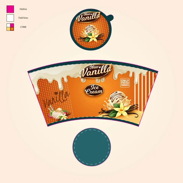
The final design in the series introduces a warm, glowing orange-amber palette. This color choice evokes thoughts of warmth, harvest, and spice, suggesting a vanilla flavor that is exceptionally rich and aromatic. The amber glow creates a cozy, comforting visual experience, making it perfect for a “homestyle” or “extra-creamy” product line that promises a deeply satisfying treat.
8. The Summer Edition (Dual-Tone)
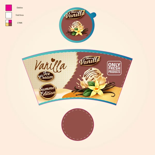
The final design in the series introduces a sophisticated split-panel layout, combining a cream-textured side with a rich cocoa-brown section. This “Summer Edition” badge signals a limited release. The scalloped divider adds a layer of elegant craftsmanship, making it stand out as the flagship premium offering of the entire collection.
9. The Oceanic Summer Edition
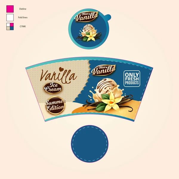
The final iteration in the collection utilizes a striking deep navy and cream pairing. This dual-tone approach offers a sharp, modern aesthetic that feels both refreshing and upscale. The dark blue panel provides a bold backdrop for the high-fidelity imagery of the vanilla scoop, making the textures look exceptionally crisp. This design is perfect for a “Cooling Summer” campaign, standing out with a sophisticated “boutique” look that differentiates it from standard grocery aisle offerings.
10. The Sunset Summer Edition

The final design in the series features a vibrant orange and cream split-panel. This combination creates a “Golden Hour” vibe, perfectly capturing the essence of summer. The bold orange side adds a burst of energy, while the cream side maintains the brand’s sophisticated roots, making it an eye-catching flagship for the seasonal collection.
11. Deep Forest Summer

The final iteration uses a sophisticated forest green and cream dual-tone, emphasizing craftsmanship and the natural purity of the ingredients.
12. The Rose-Quartz Summer

The final design in the series uses a delicate rose-pink and cream split-panel. This soft, dual-tone approach maintains the whimsical charm of the earlier pink variant while adopting the premium structural layout of the “Summer Edition
13. The Pure Cream Edition

The final design returns to a monochromatic, minimalist cream palette. By stripping away secondary colors, this variant highlights the “Only Fresh Products” promise, presenting a clean, light, and high-end aesthetic that speaks to the purity of the vanilla bean itself.
14. The Slate & Stone Edition

The final design in the series uses a cool, muted grey and cream split-panel. This urban-inspired palette offers a sleek, contemporary feel that positions the product as a sophisticated, modern treat for those who prefer an understated, high-end look.
15. The Golden Sun Edition

The final design features a bright, sunny yellow split-panel. This combination radiates positivity and warmth, utilizing a high-energy yellow to create an eye-catching “Summer Edition” that feels light, creamy, and indulgent.