22 Creative Confectionery Packaging Designs That Inspire Sweet Branding
Great confectionery packaging does more than protect sweets—it creates memorable first impressions, strengthens brand identity, and encourages customers to pick one product over another. From luxurious chocolate boxes and colorful candy wrappers to elegant macaron packaging and playful gift boxes, thoughtful design can make any confectionery product stand out on crowded shelves. In this collection, you’ll discover 22 confectionery packaging designs that showcase creative branding, eye-catching graphics, premium materials, and innovative structural concepts to inspire your next packaging project.
22 Inspiring Confectionery Packaging Designs to Spark Your Creativity
1. Energetic & Fun (Best for a quick overview)
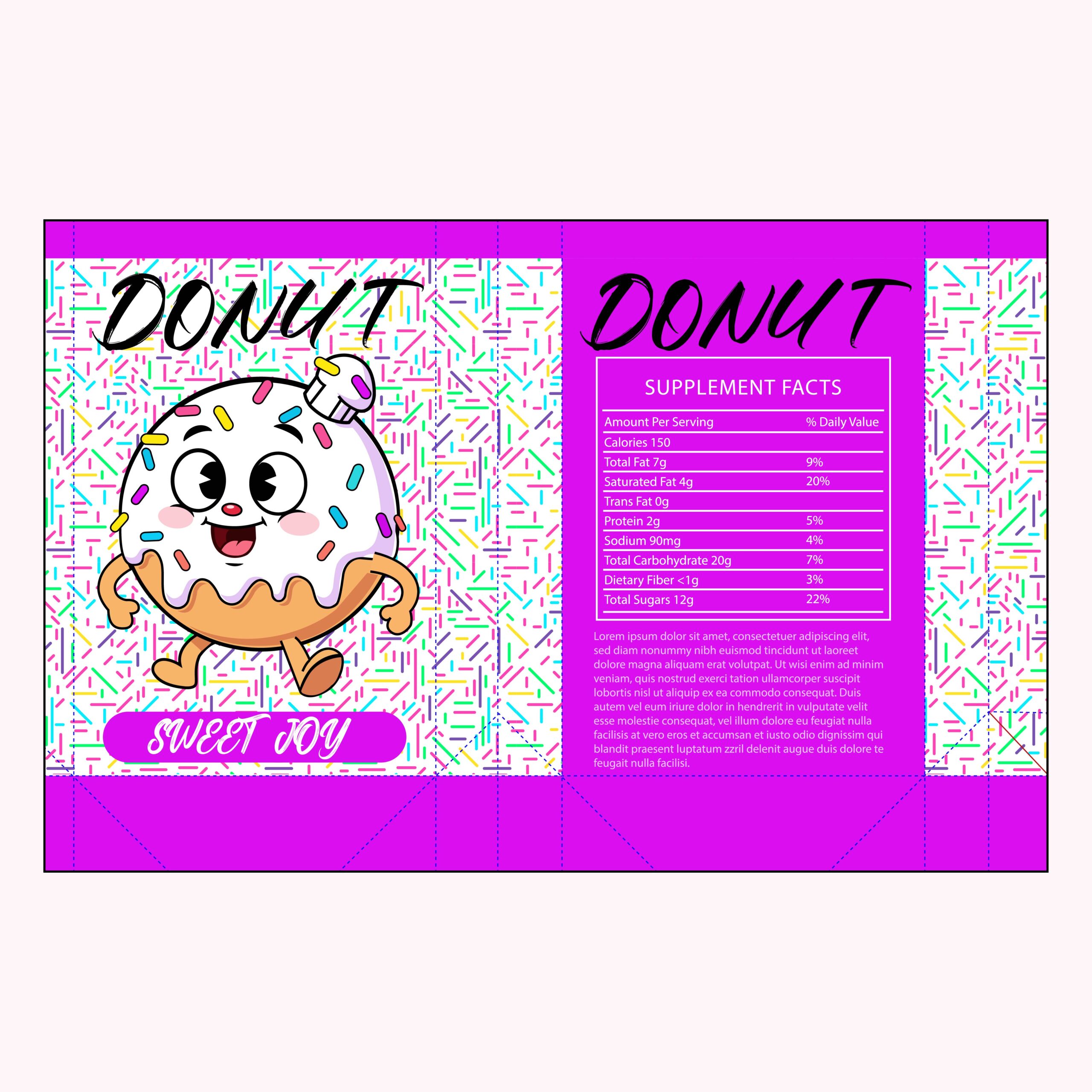
This packaging design for ‘Sweet Joy’ radiates playfulness through its vibrant magenta color palette and retro-inspired mascot. The character, a cheerful donut with a rubber-hose animation style, immediately creates an emotional connection with the consumer. By combining a sprinkle-patterned background with bold, hand-drawn typography, the design captures the chaotic fun of a bakery while maintaining a clean, modern layout that pops on the shelf.
2. Soft & Whimsical (Best for a “Sweet” vibe)
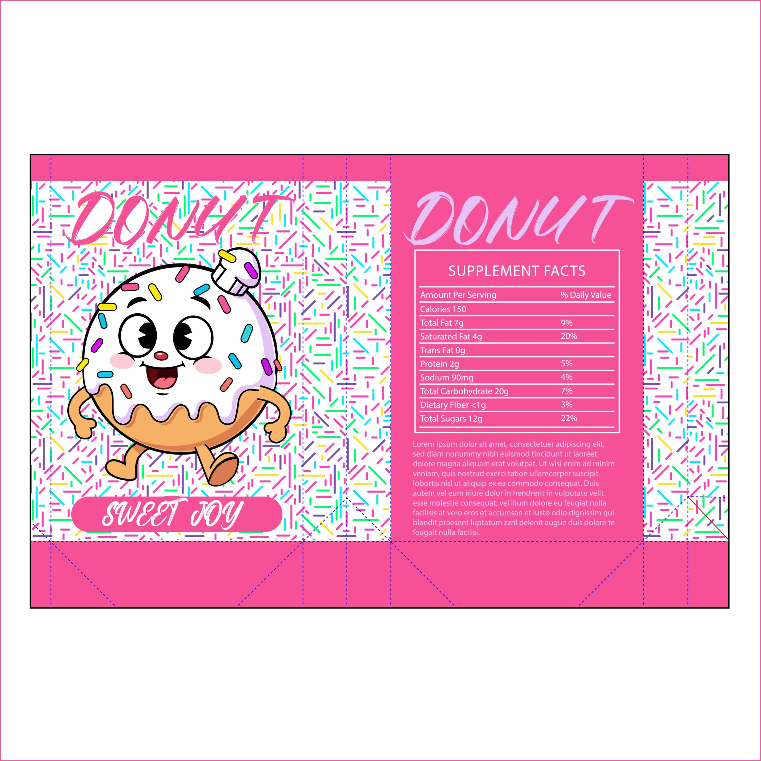
In this version of the ‘Sweet Joy’ packaging, the high-voltage energy of magenta is traded for a delicate bubblegum pink. This color shift transforms the brand’s personality, leaning into a classic, nostalgic candy-shop aesthetic. The softer palette makes the design feel more approachable and airy, while the colorful sprinkles provide just the right amount of visual pop against the pastel background.
3. Warm & Inviting (Focus on the “Bakery” feel)
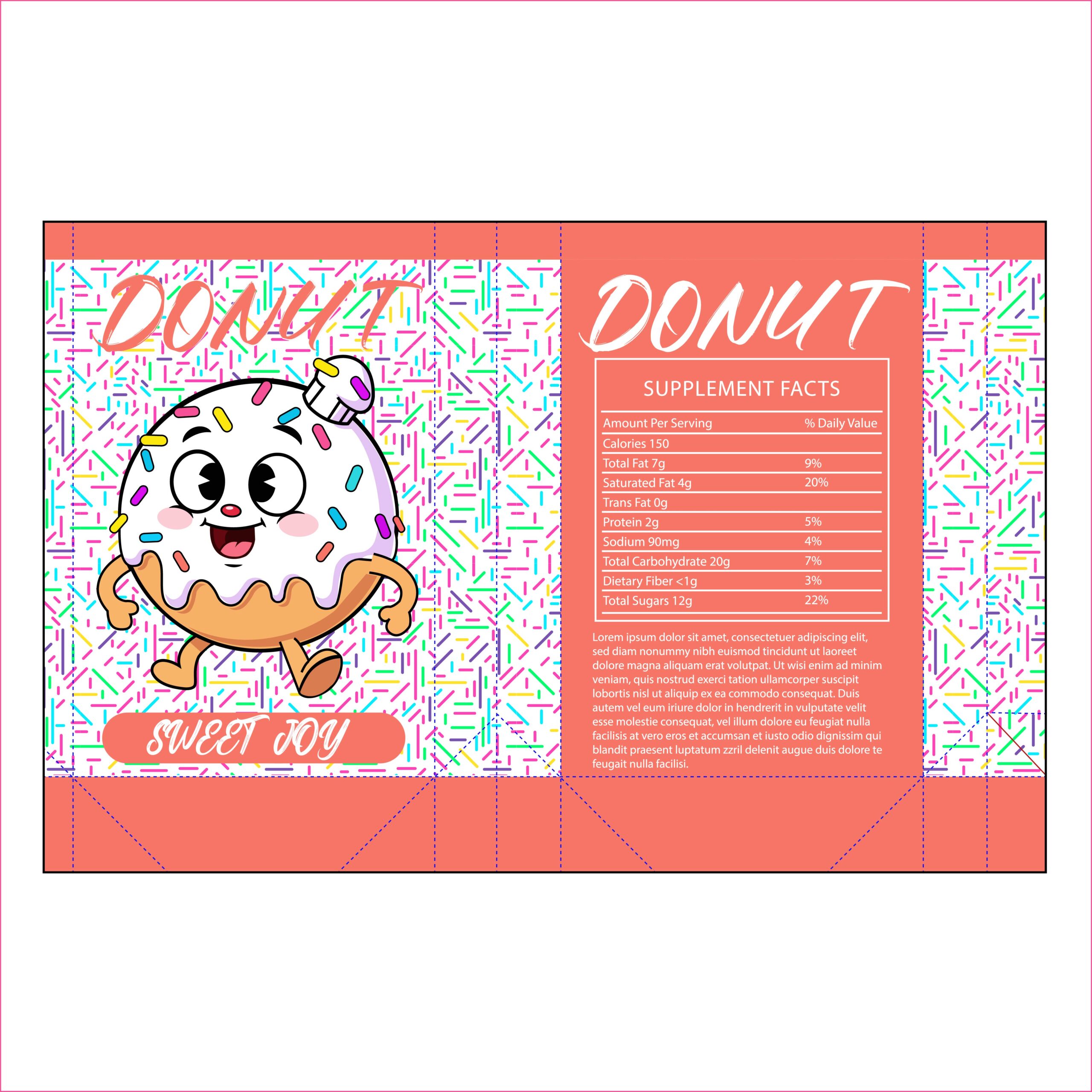
This coral-hued version of the ‘Sweet Joy’ packaging brings a warm, sun-kissed energy to the brand. Moving away from traditional candy pinks, this salmon-orange shade feels fresh and sophisticated, reminiscent of a boutique bakery at sunrise. The crisp white typography provides a high-contrast, clean look that makes the branding feel premium while maintaining the playful spirit of the illustrated mascot.
4. High-Energy & Joyful (Focus on brand psychology)

Nothing communicates ‘Sweet Joy’ quite like a vibrant, sunshine-yellow palette. This design iteration uses the psychology of color to evoke feelings of happiness and morning energy. The bold yellow panels act as a beacon on the shelf, instantly drawing the eye. It’s a high-impact choice that perfectly matches the enthusiastic personality of the retro donut mascot, making the packaging feel like a celebration of flavor.
5. Sophisticated with a Twist (Focus on Brand Personality)
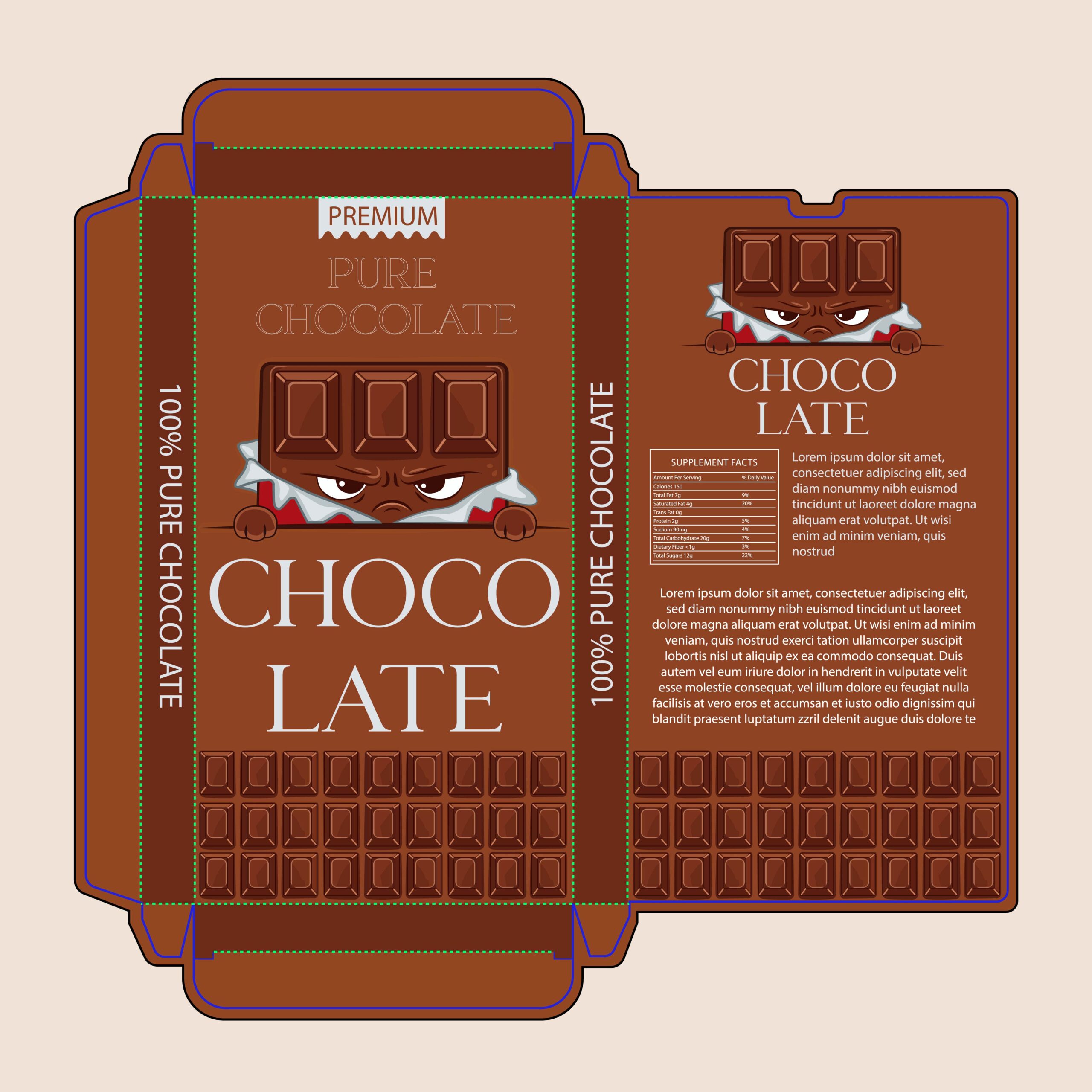
This packaging for ‘Choco Late’ masterfully balances high-end elegance with a touch of edge. While the deep cocoa-brown palette and classic serif typography signal a premium, ‘100% Pure’ product, the character illustration adds a surprising layer of personality. The intense, peeking chocolate bar mascot disrupts the typically serious premium chocolate market, giving the brand a rebellious, ‘dark’ attitude that appeals to a modern audience looking for more than just a sweet treat.
6. The Power of Character (Focus on Brand Story)
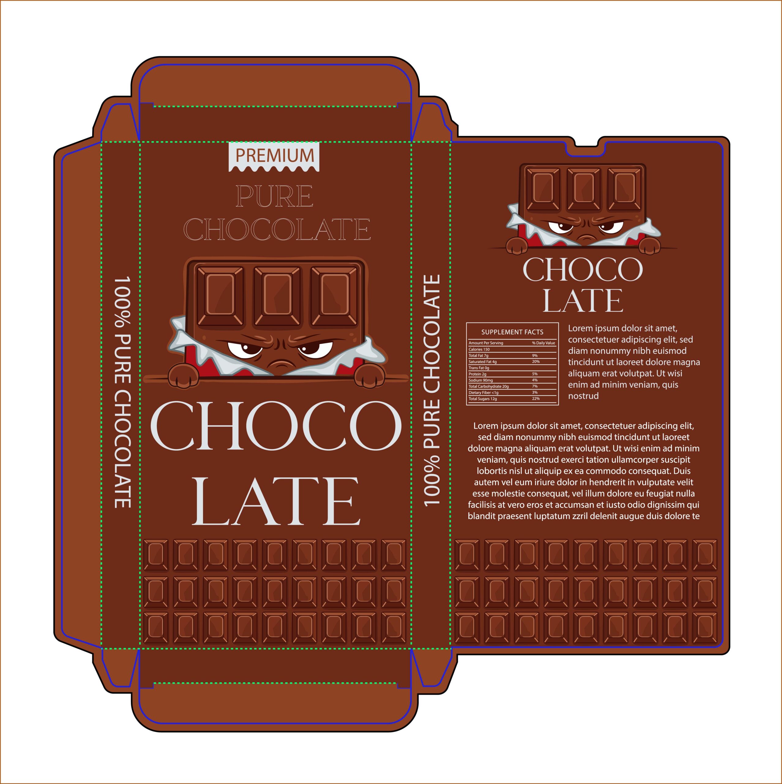
In this iteration of the ‘Choco Late’ packaging, the character illustration takes center stage to redefine what ‘premium’ looks like. By moving away from typical imagery of rolling cocoa fields or liquid splashes, this design uses a mischievous mascot to create a sense of mystery and intensity. The ‘peeking’ effect suggests that the chocolate inside is bursting with flavor, creating a high-impact visual that feels both artisanal and rebellious.
7. Premium Dark Aesthetics (Focus on Luxury)
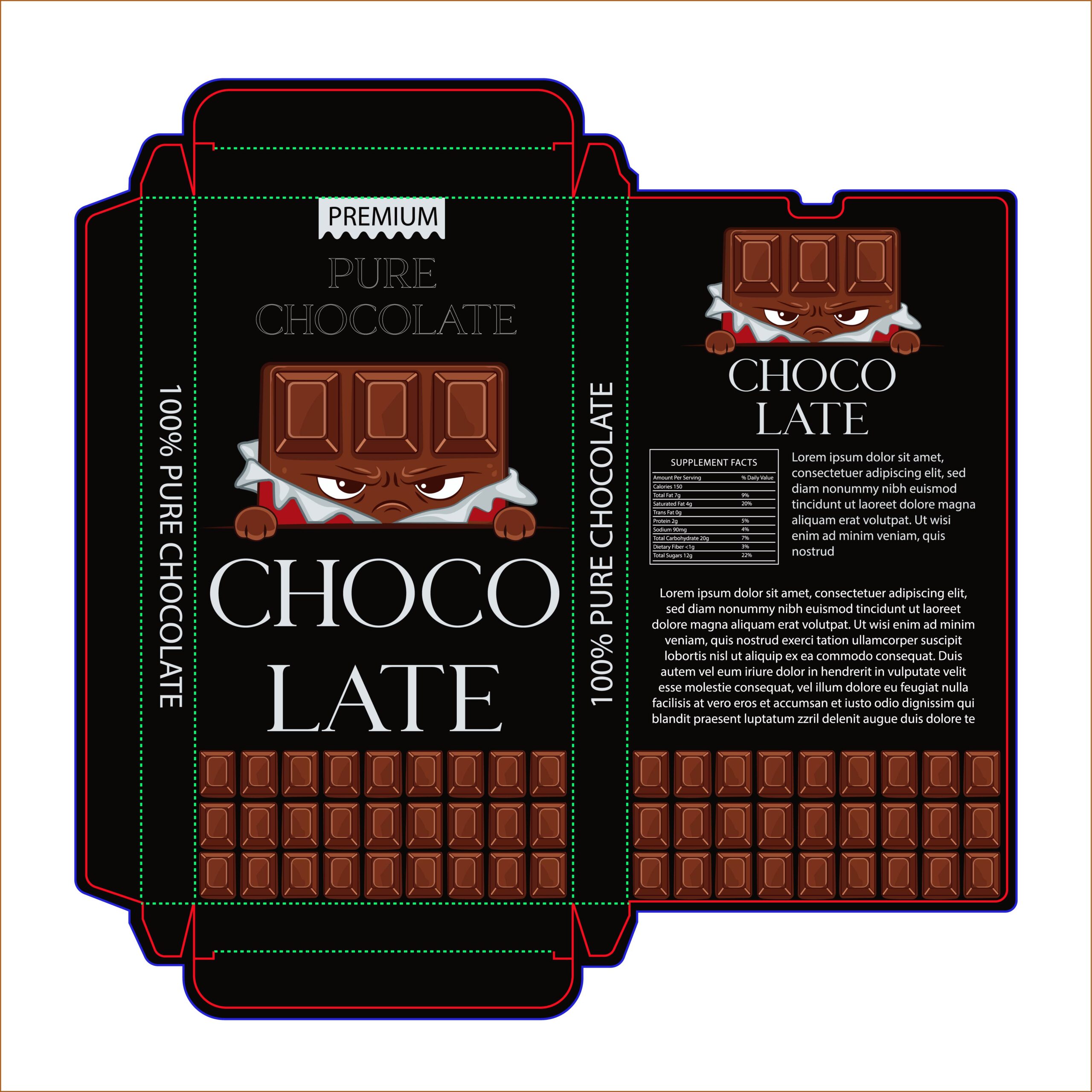
The shift to a black background instantly transforms ‘Choco Late’ into a premium, high-intensity product. In packaging design, black is often synonymous with luxury and dark chocolate varieties. This colorway allows the brown tones of the mascot and the chocolate grid at the base to ‘glow’ with more vibrancy. It’s a sophisticated look that signals a richer, more intense flavor profile to the consumer, while the white serif typography provides a crisp, clean finish that screams quality.
8. The “Rich Cocoa” Aesthetic (Focus on Flavor Perception)
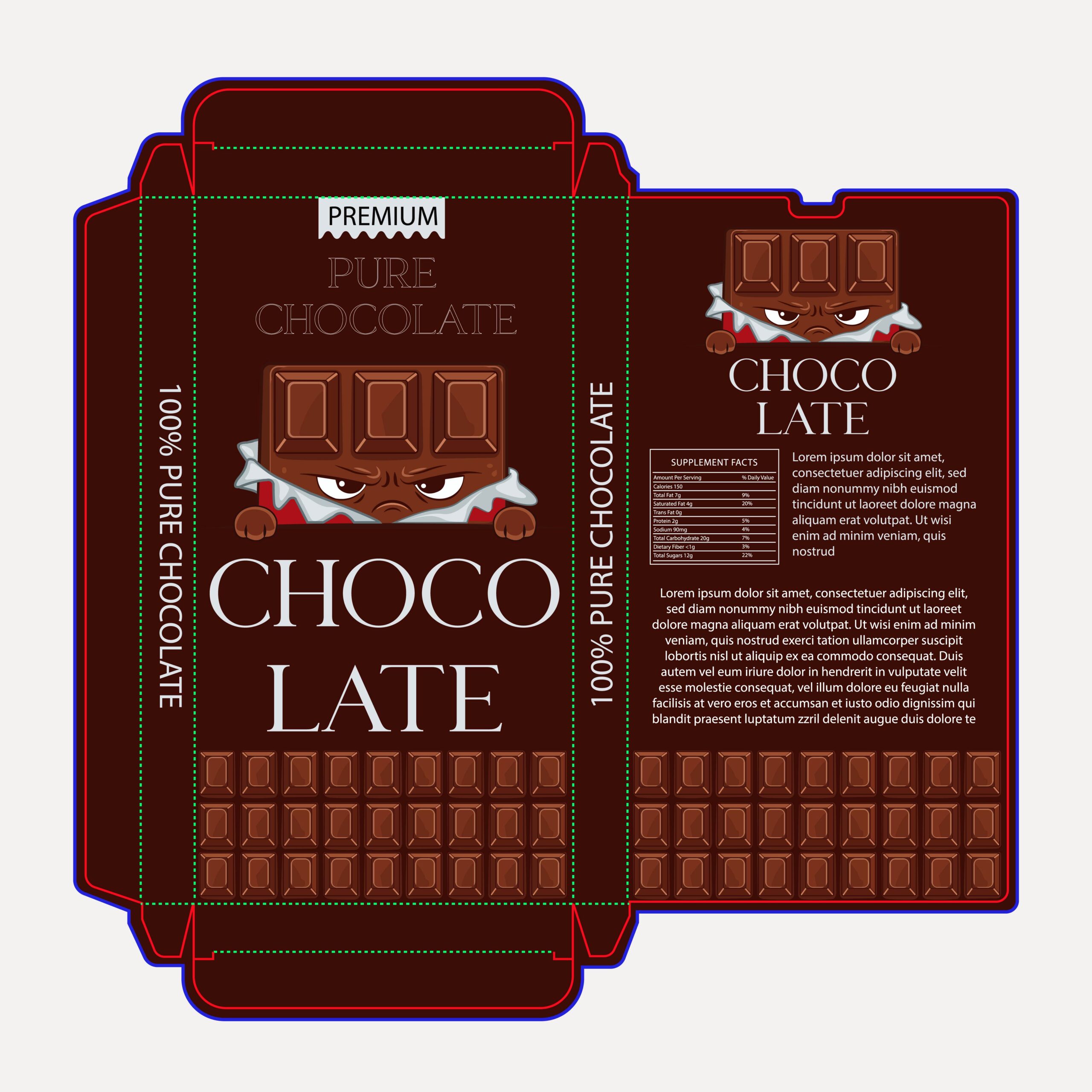
This design utilizes a deep, velvety espresso brown to immediately communicate richness and depth of flavor. In confectionery packaging, this specific shade of dark brown often signals a higher cocoa percentage, appealing to chocolate purists. By pairing this earthy background with crisp white serif typography, the brand maintains a ‘premium’ status while the mischievous mascot ensures the product doesn’t feel too unapproachable or stiff.
9. Retro-Modern Charm (Focus on Character & Vibe)
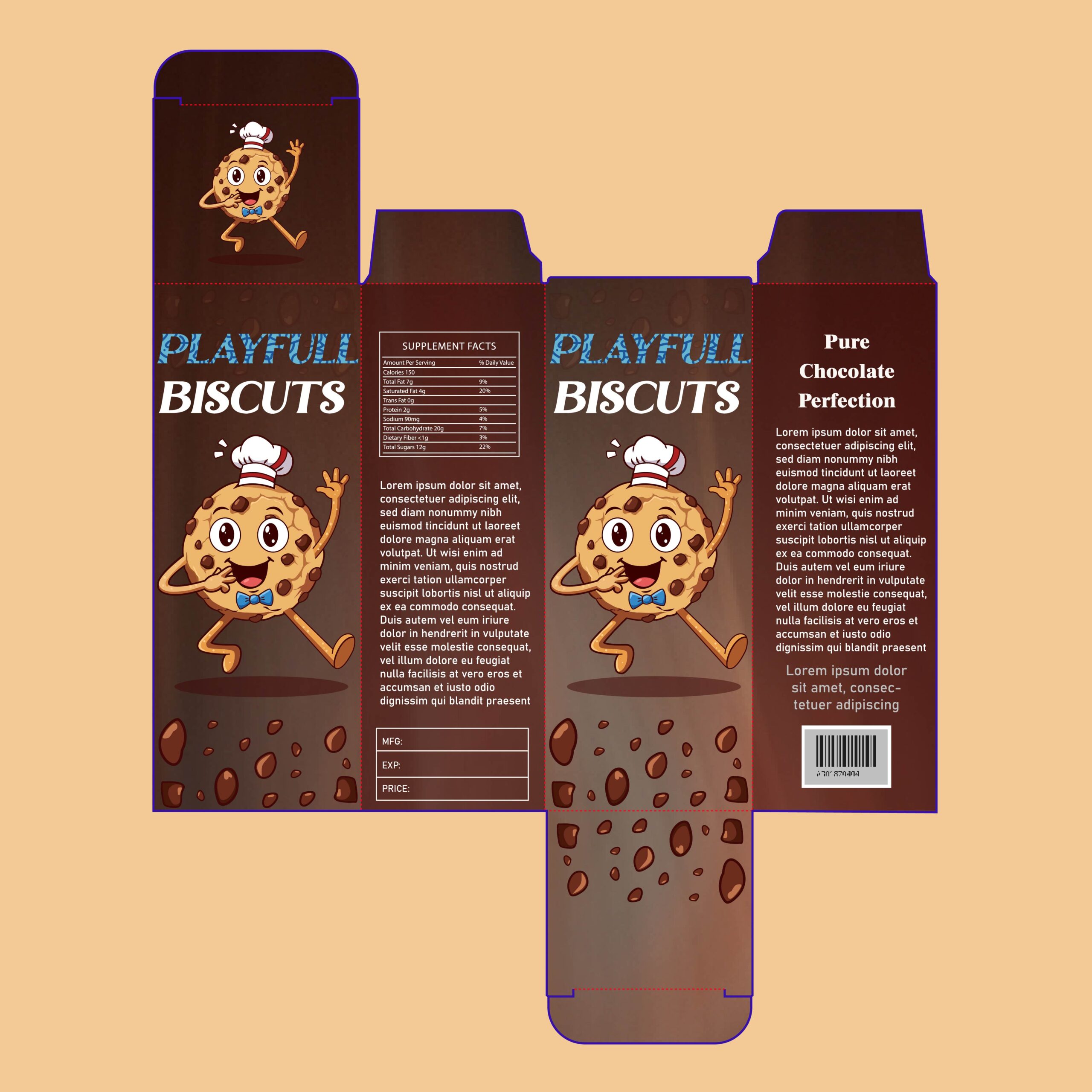
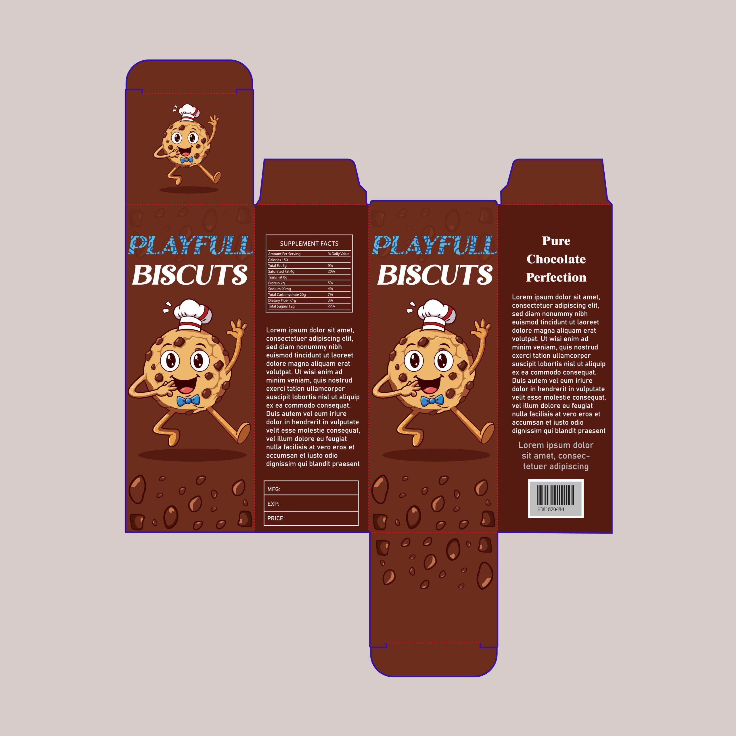
The ‘Playfull Biscuits’ packaging design is a masterclass in nostalgic branding with a modern twist. At the center is an infectious, retro-style cookie mascot—complete with a chef’s hat and bowtie—that immediately builds a friendly, trustworthy connection with the consumer. By using a deep, cocoa-brown background, the design ensures that the warm golden tones of the biscuit and the scattered chocolate chip illustrations ‘pop’ with appetite appeal, making the product look as delicious as it is fun.
10. Light & Airy Freshness (Focus on Visual Balance)
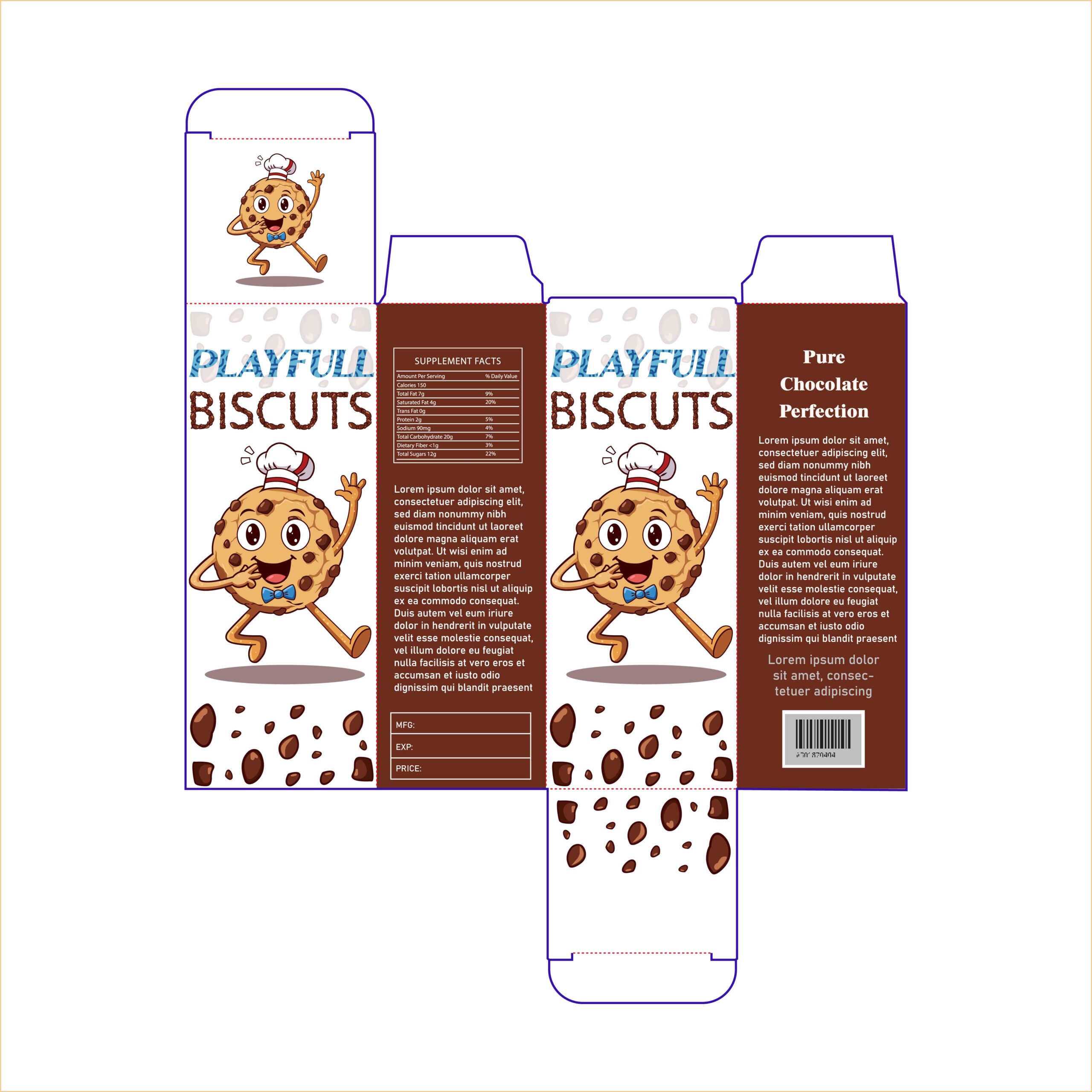
This iteration of the ‘Playfull Biscuits’ design demonstrates the power of white space. By utilizing a clean white background for the upper half of the box, the cheerful cookie mascot becomes the undisputed star of the show. This ‘airy’ approach suggests freshness and a light, crunchy texture, while the deep chocolate-brown base grounds the design and reinforces the rich flavor profile. It’s a perfect balance of modern minimalism and classic character-driven branding.
11. Artisan & Muted Tones (Focus on the Unique Palette)
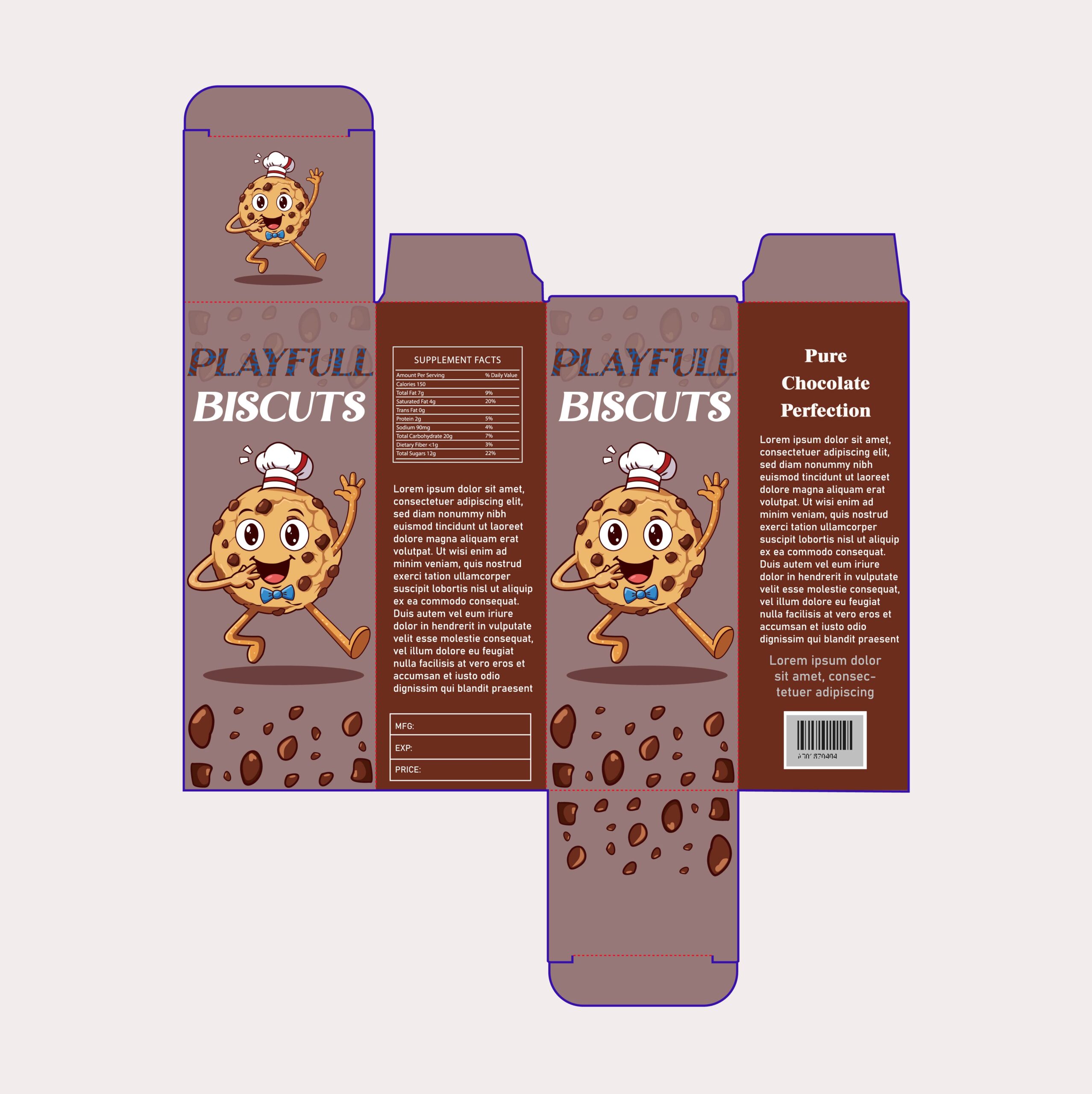
In this iteration, the ‘Playfull Biscuits’ brand takes a more sophisticated turn by utilizing a muted, taupe-grey background. This unconventional color choice for the bakery aisle creates an instant sense of ’boutique’ quality, making the product feel like an artisanal treat rather than a mass-market snack. The neutral top half allows the vibrant blue textures in the ‘PLAYFULL’ typography and the warm golden tones of the mascot to shine with a more refined, understated elegance.
12. The Boutique Bakery Aesthetic (Focus on Tone)
This iteration of ‘Playfull Biscuits’ moves away from high-contrast colors and leans into a more sophisticated, muted palette. By utilizing a warm taupe-grey background, the design achieves an ‘artisan’ feel that reminds consumers of a high-end boutique bakery. The neutral top half provides a calm backdrop that allows the vibrant blue textures in the branding and the golden tones of the cookie mascot to really shine without feeling overwhelming.
13. Fresh & Energetic (Focus on Color Palette)
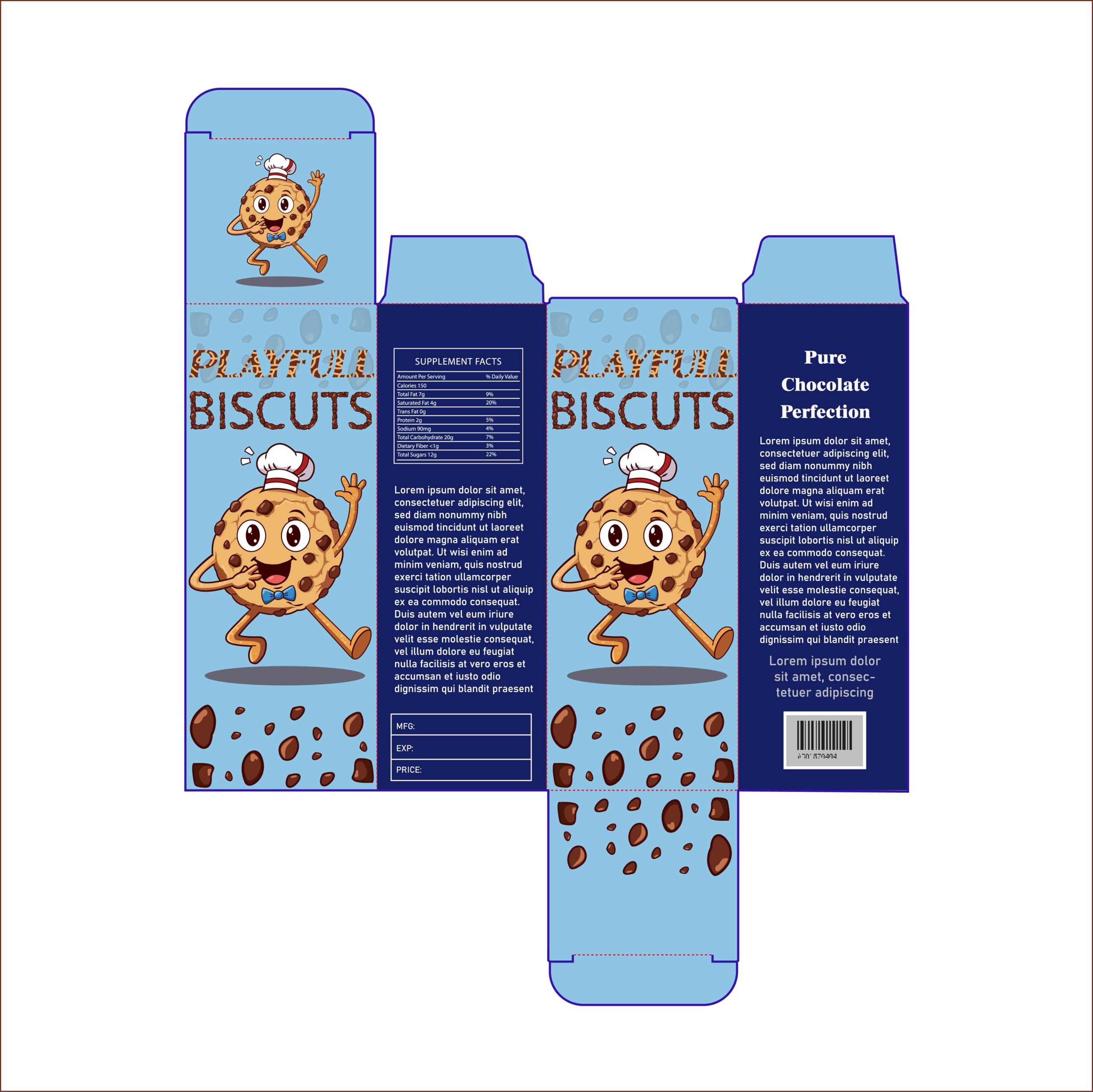
This iteration of ‘Playfull Biscuits’ breaks away from the traditional browns of the cookie aisle by using a vibrant sky-blue and deep navy palette. The use of blue creates a sense of ‘freshness’ and modern energy, making the golden-brown tones of the mascot pop with incredible intensity. By grounding the design with a dark navy base, the packaging maintains a premium weight while the lighter top half keeps the brand feeling approachable and fun for a younger audience.
14. Sweet & Sophisticated (Focus on the Trendy Palette)
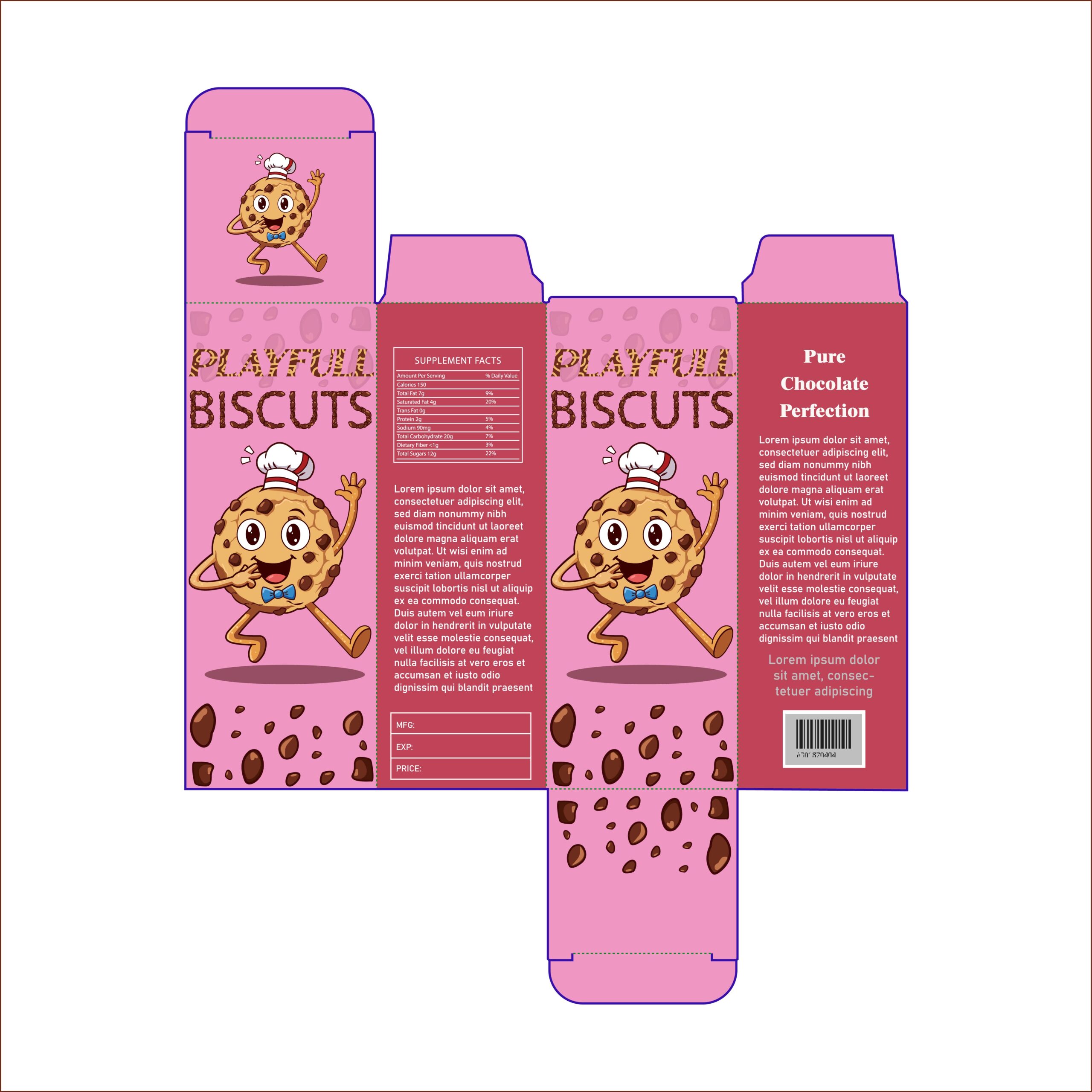
This iteration of ‘Playfull Biscuits’ leans into a whimsical, ‘sweet-shop’ aesthetic by utilizing a dusty pink and rich maroon color palette. The soft pink background creates an instantly welcoming and friendly vibe, making the golden biscuit mascot feel even more approachable. By grounding the design with a deep burgundy base, the packaging maintains a sense of premium quality, signaling to the consumer that these biscuits are a high-end treat rather than just a basic snack.
15. High-Energy & Dynamic (Focus on the Mascot)
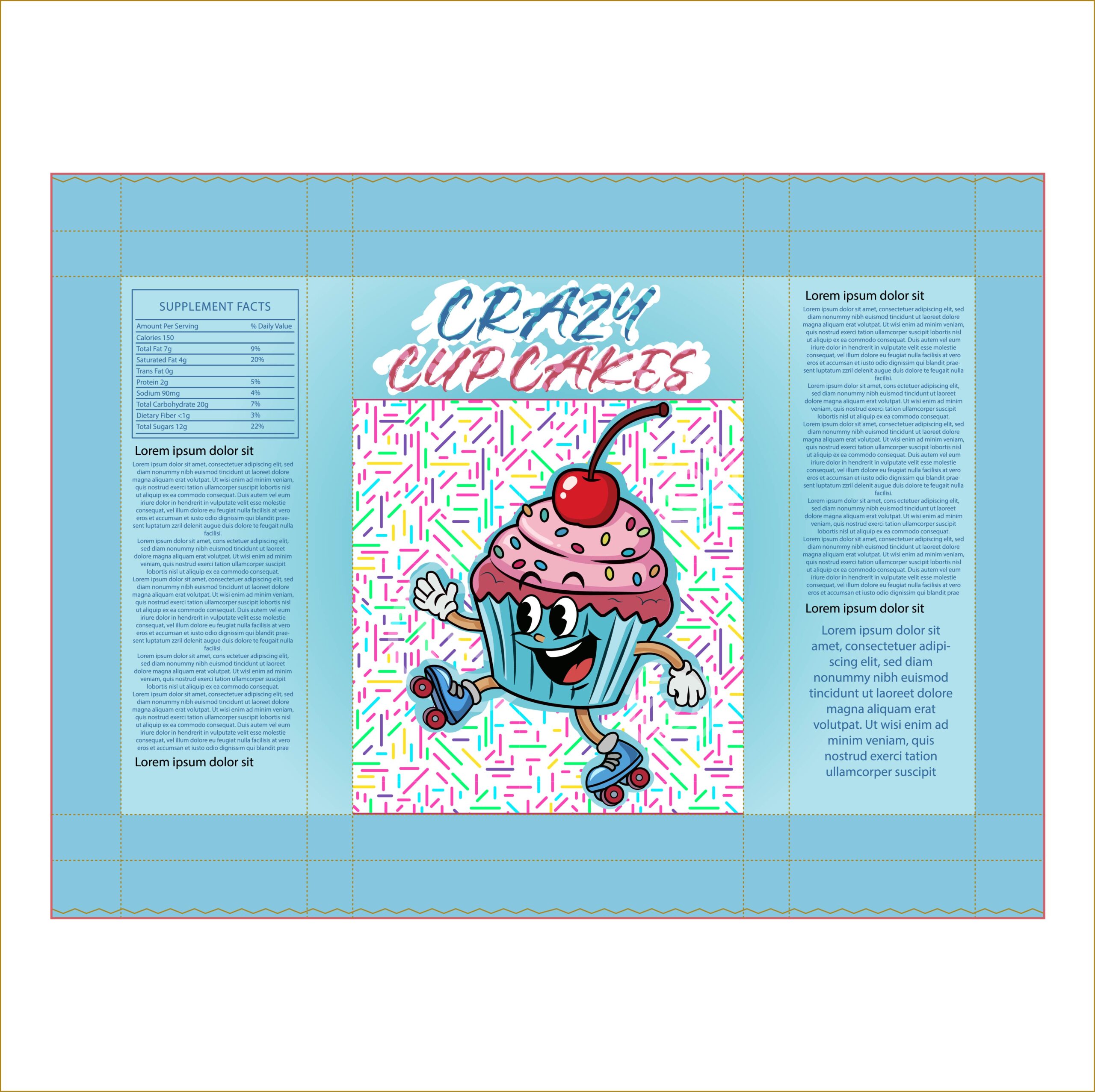
The ‘Crazy Cupcakes’ packaging design is a masterclass in capturing motion and excitement. By featuring a cheerful cupcake mascot on roller skates, the brand immediately communicates a sense of fun and active energy. The use of a vibrant, multi-colored sprinkle pattern as a foundational element adds a festive, ‘party-in-a-box’ vibe that is guaranteed to catch the eye of younger consumers and those looking for a celebratory treat.
16. Clean & Kinetic (Focus on Visual Focus)
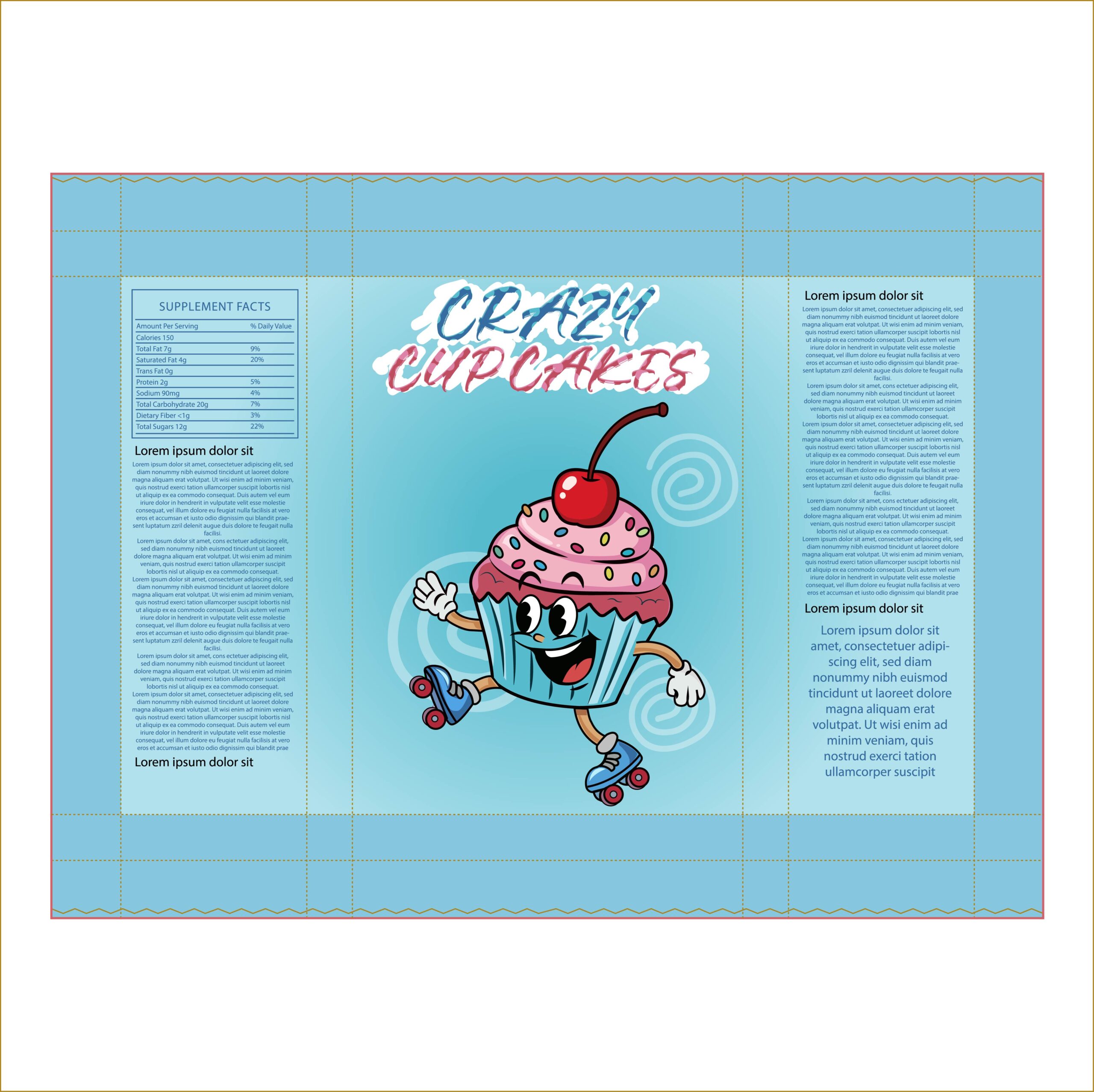
In this iteration of the ‘Crazy Cupcakes’ design, the visual story is streamlined to put the spotlight entirely on the brand’s high-energy mascot. By replacing the multi-colored sprinkle background with subtle, swirling graphic accents, the skating cupcake becomes the undisputed hero of the layout. The solid sky-blue backdrop provides a modern, clean canvas that makes the magenta frosting and deep red cherry pop with even more vibrancy, signaling a brand that is both fun and professionally polished.
17. Bold & Atmospheric (Focus on the Gradient)
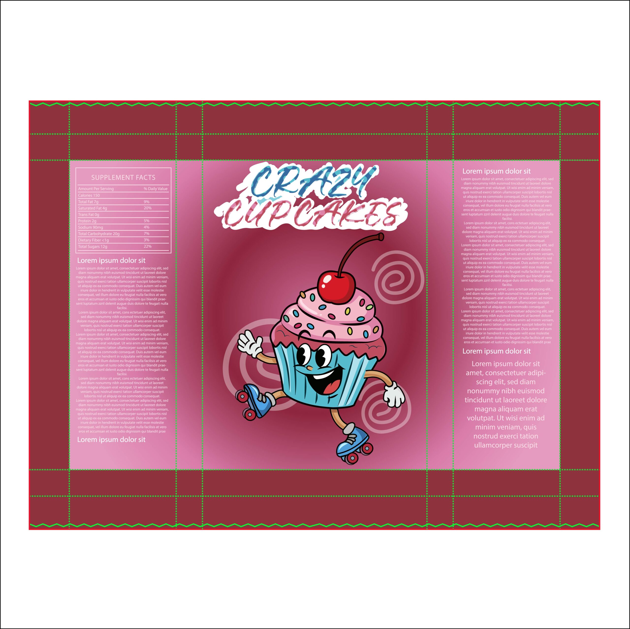
This design takes the ‘Crazy Cupcakes’ concept into a deeper, more atmospheric territory. By swapping the light blue for a rich burgundy and mauve gradient, the packaging feels like a premium evening treat while maintaining its high-energy soul. The dark-to-light transition creates a beautiful visual depth that makes the light blue cupcake wrapper pop with neon-like intensity, ensuring the mascot remains the primary focal point against the moody background.
18. The Power of Contrast (Focus on Color Theory)
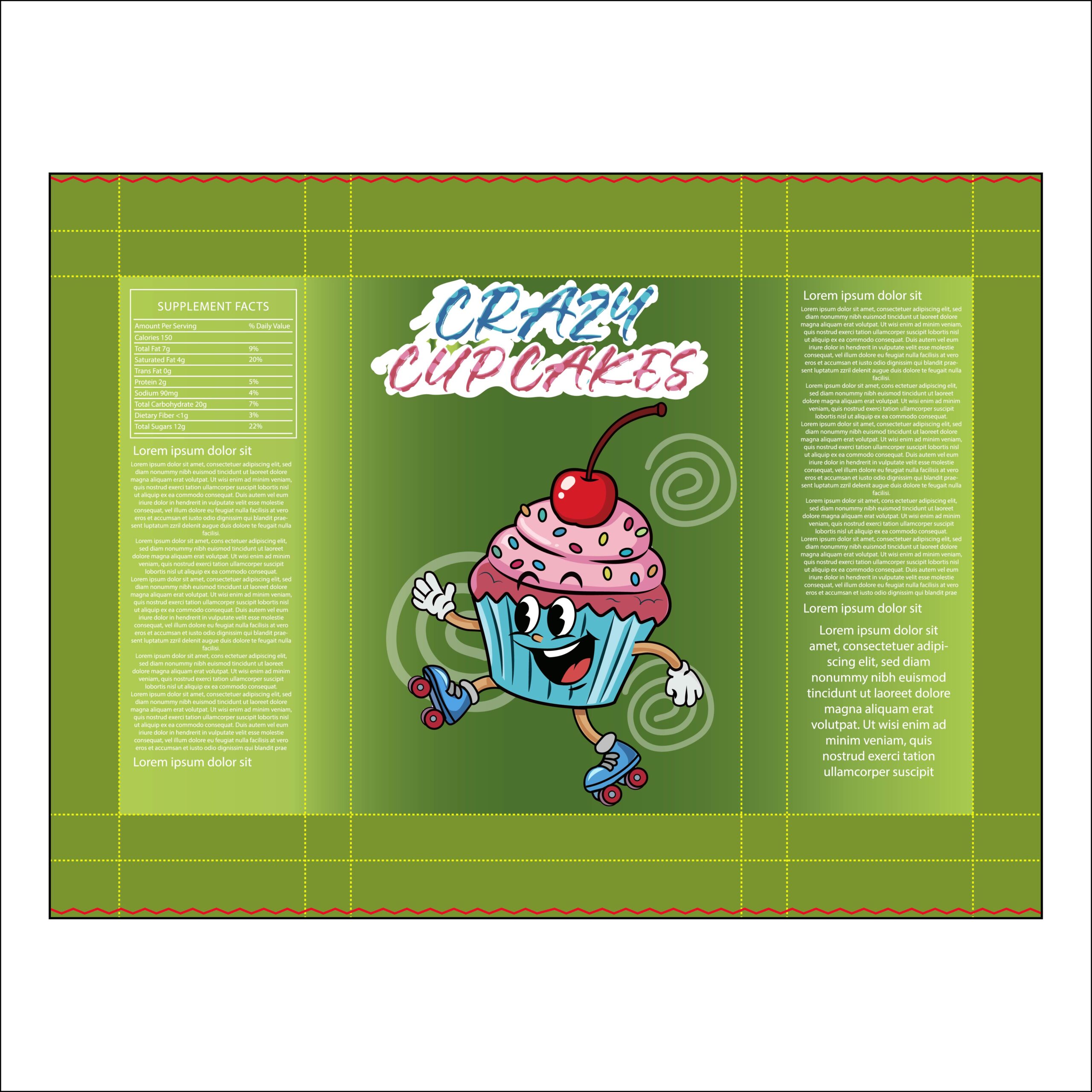
This iteration of ‘Crazy Cupcakes’ takes a daring approach by utilizing an unconventional olive-green backdrop. While green is rare in the cupcake category, it acts as the perfect complementary color to the vibrant pink frosting and deep red cherry of the mascot. This ‘color disruptor’ strategy ensures that the packaging pops with maximum intensity on the shelf, instantly grabbing the consumer’s attention by offering something unexpected and visually striking.
19. Sweet & Approachable (Focus on the Mascot)
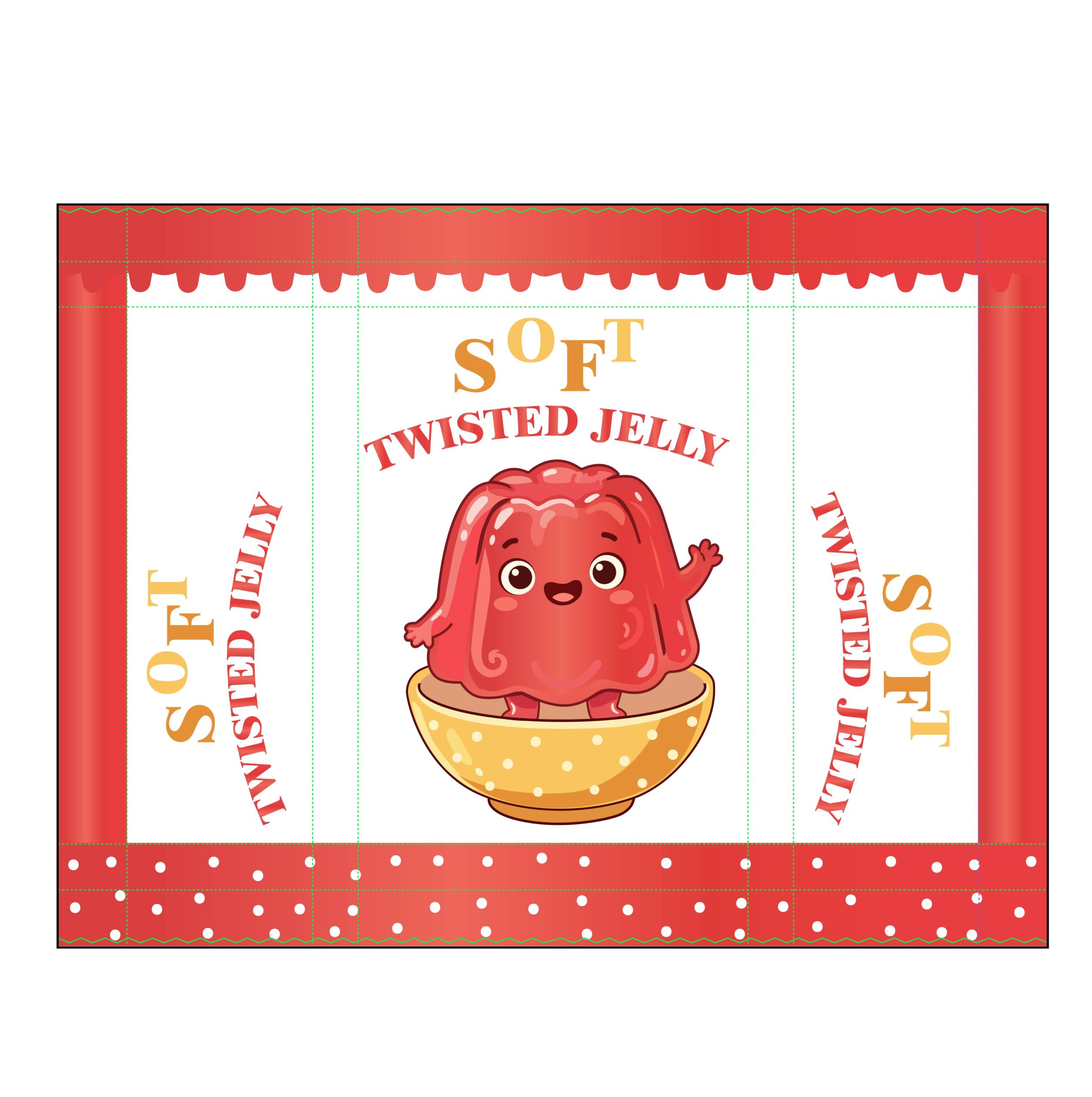
The ‘Soft Twisted Jelly’ packaging is a masterclass in ‘kawaii’ (cute) design. At the center is a cheerful, wobbly jelly mascot sitting in a charming polka-dot bowl, which immediately makes the product feel like a fun, served dessert rather than just a snack. The use of a clean white central panel framed by bold red borders creates a high-contrast look that is both professional and inviting, perfectly capturing the sweet and lighthearted nature of the treat.
20. Warm & Golden (Focus on Color Psychology)
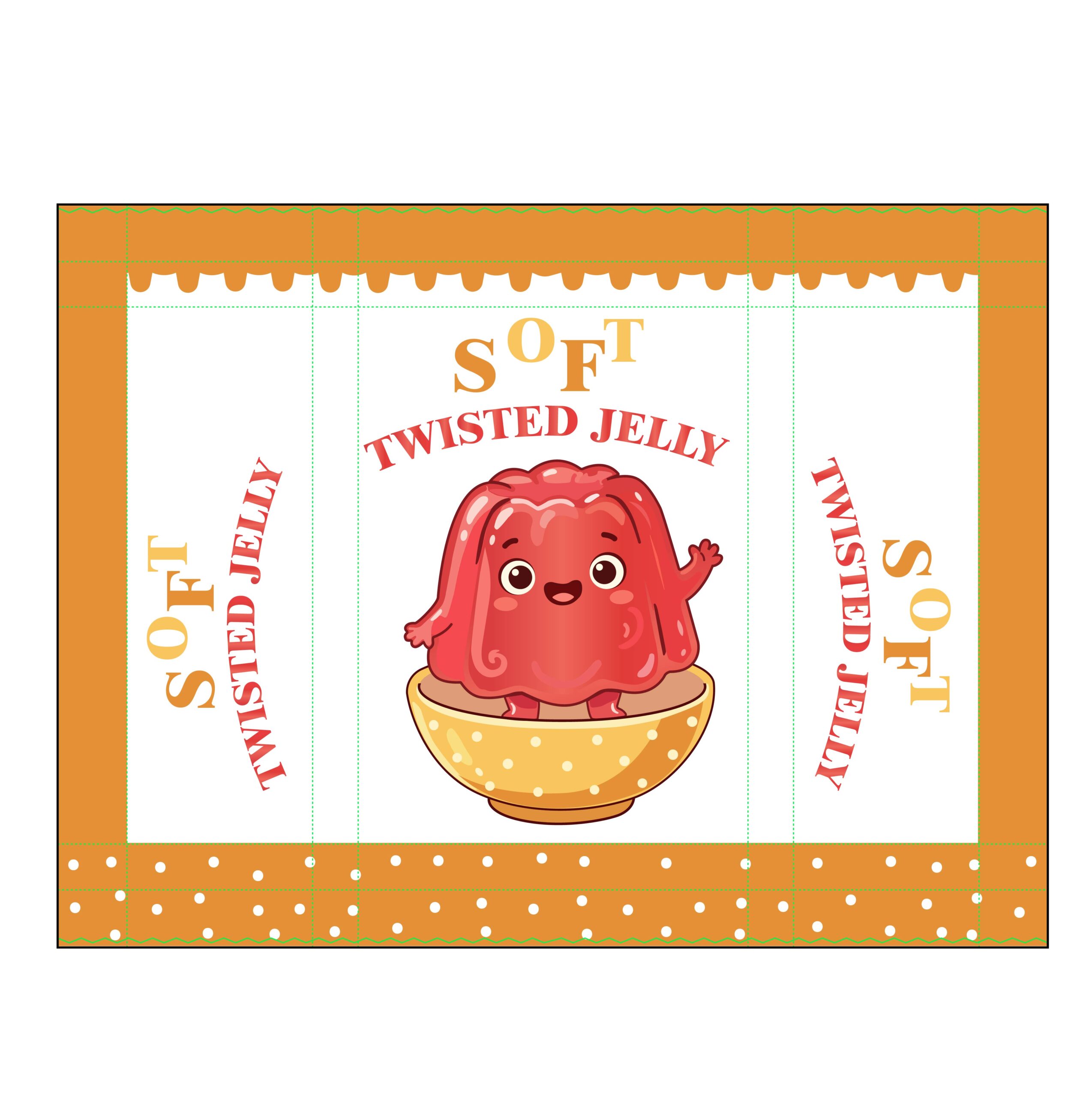
This iteration of ‘Soft Twisted Jelly’ trades bold reds for a warm, amber-orange palette. In packaging design, orange is often used to evoke feelings of friendliness and vitality. By framing the cheerful red mascot with these golden tones, the design feels more like a ‘treat for anytime’—warm, inviting, and sweet. The contrast between the cool red of the jelly and the warm orange borders creates a beautiful visual balance that makes the mascot feel even more vibrant.
21. Harmonious & Sweet (Focus on Tonal Design)
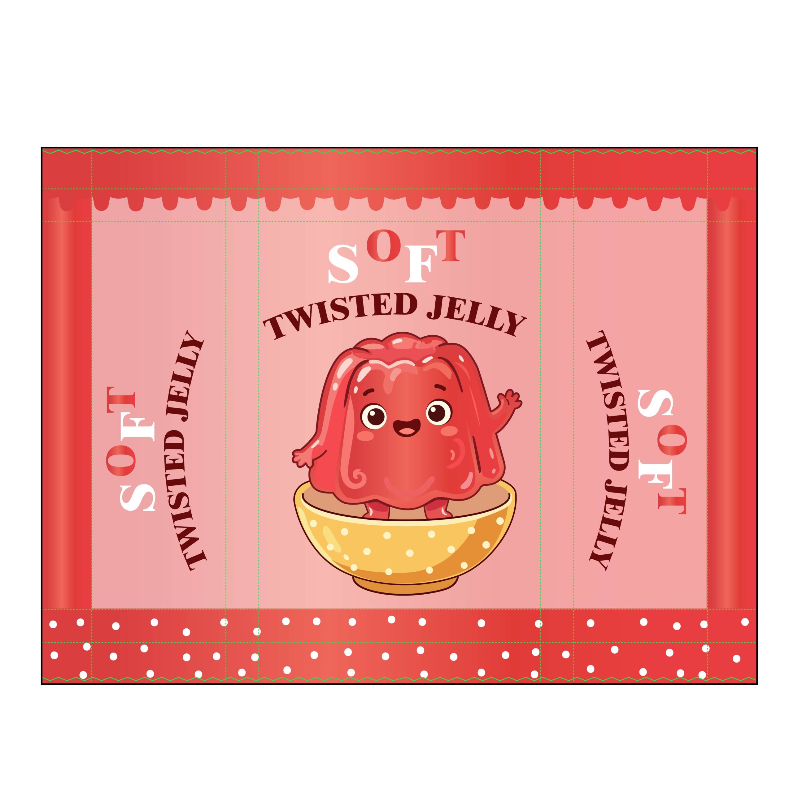
This version of the ‘Soft Twisted Jelly’ packaging utilizes a monochromatic pink and red palette to create a sense of visual harmony. By trading the crisp white center for a soft peach-pink background, the design feels warmer and more integrated. It’s a perfect example of how a ‘tonal’ approach can make a brand feel more artisanal and boutique, while the cheerful jelly mascot remains the charming, vibrant focal point of the brand story.
22. High-Impact & Appetizing (Focus on Color Gradient)
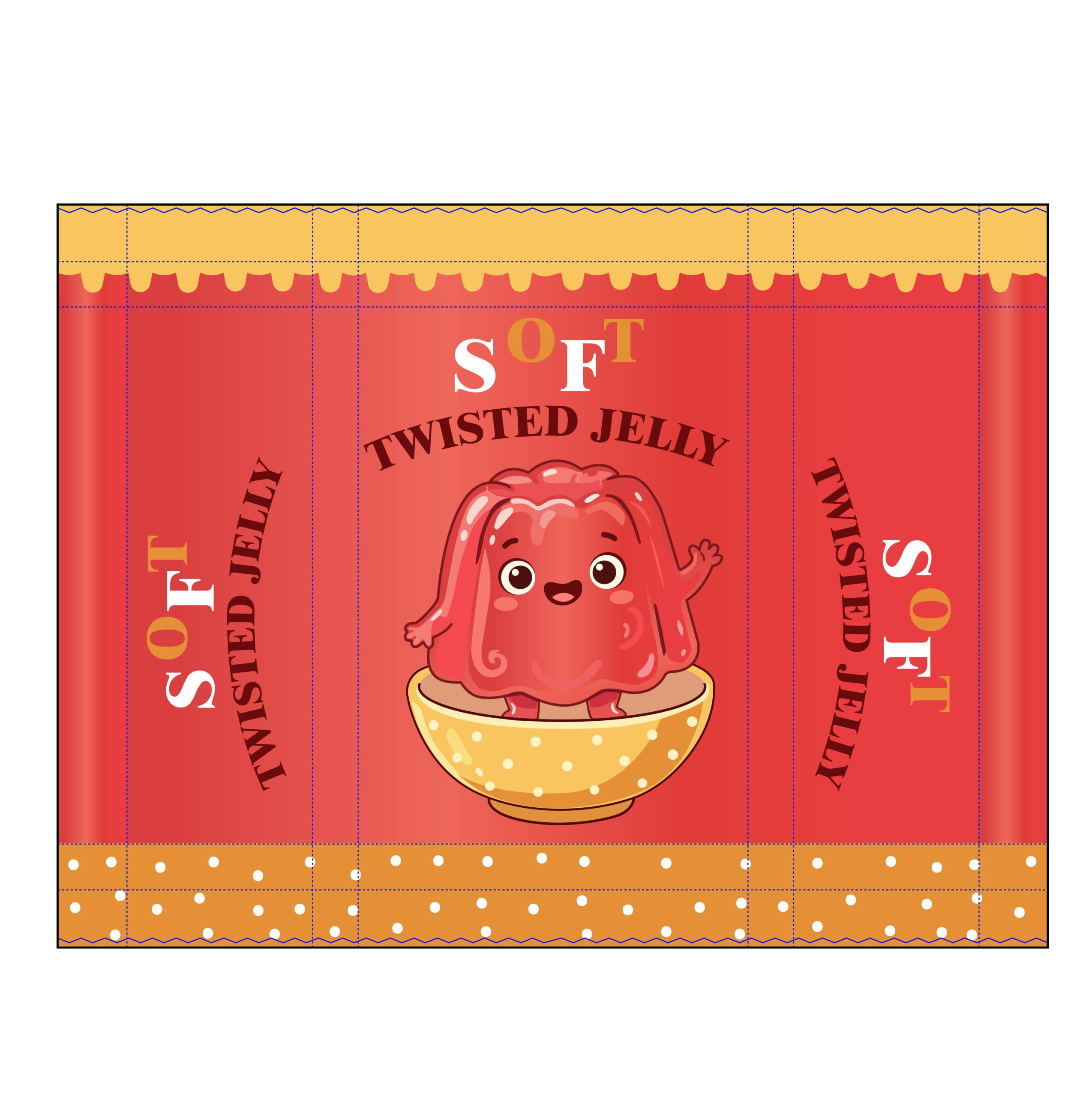
This design takes ‘Soft Twisted Jelly’ to a new level of visual depth. By utilizing a subtle gradient on the red side panels, the packaging achieves a cylindrical, tactile look that mimics the shape of the product itself. The warm pairing of tomato red and golden orange creates a high-energy, food-forward palette that is scientifically proven to boost appetite appeal. It’s a bold, professional choice that makes the friendly jelly mascot stand out with incredible vibrancy.