Shopping Bag Packaging Designs: 20 Creative Ideas for Every Business
Shopping bag packaging is more than just a way to carry products—it’s an extension of your brand identity and a powerful marketing tool. From luxury paper bags and eco-friendly kraft options to vibrant retail shopping bags with custom prints, the right design can leave a lasting impression on customers. In this collection, you’ll discover 20 shopping bag packaging designs that showcase creative branding, premium finishes, and practical functionality to inspire your next packaging project.
20 Shopping Bag Packaging Designs to Inspire Your Next Branding Project
1. Focuses on the trendy/fashion vibe
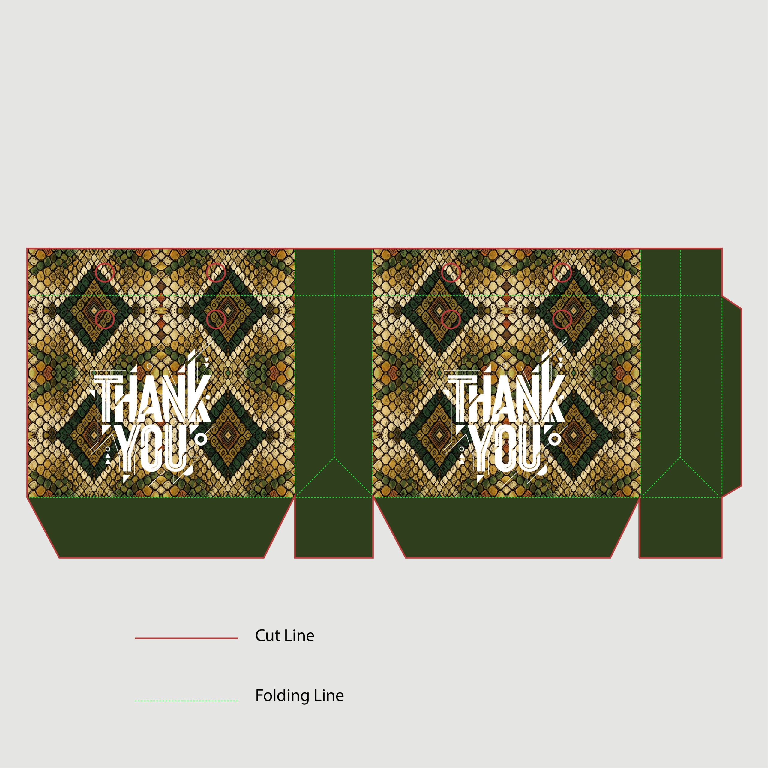
This design makes a fierce statement by pairing an exotic, earthy snakeskin pattern with edgy, street-style typography. The bright white, distressed text really pops against the rich greens and yellows of the reptile print, while the solid dark green side panels keep the whole look balanced. This layout would be absolutely perfect for an edgy boutique or a streetwear fashion brand.
2. Focuses on the fierce/trendy vibe
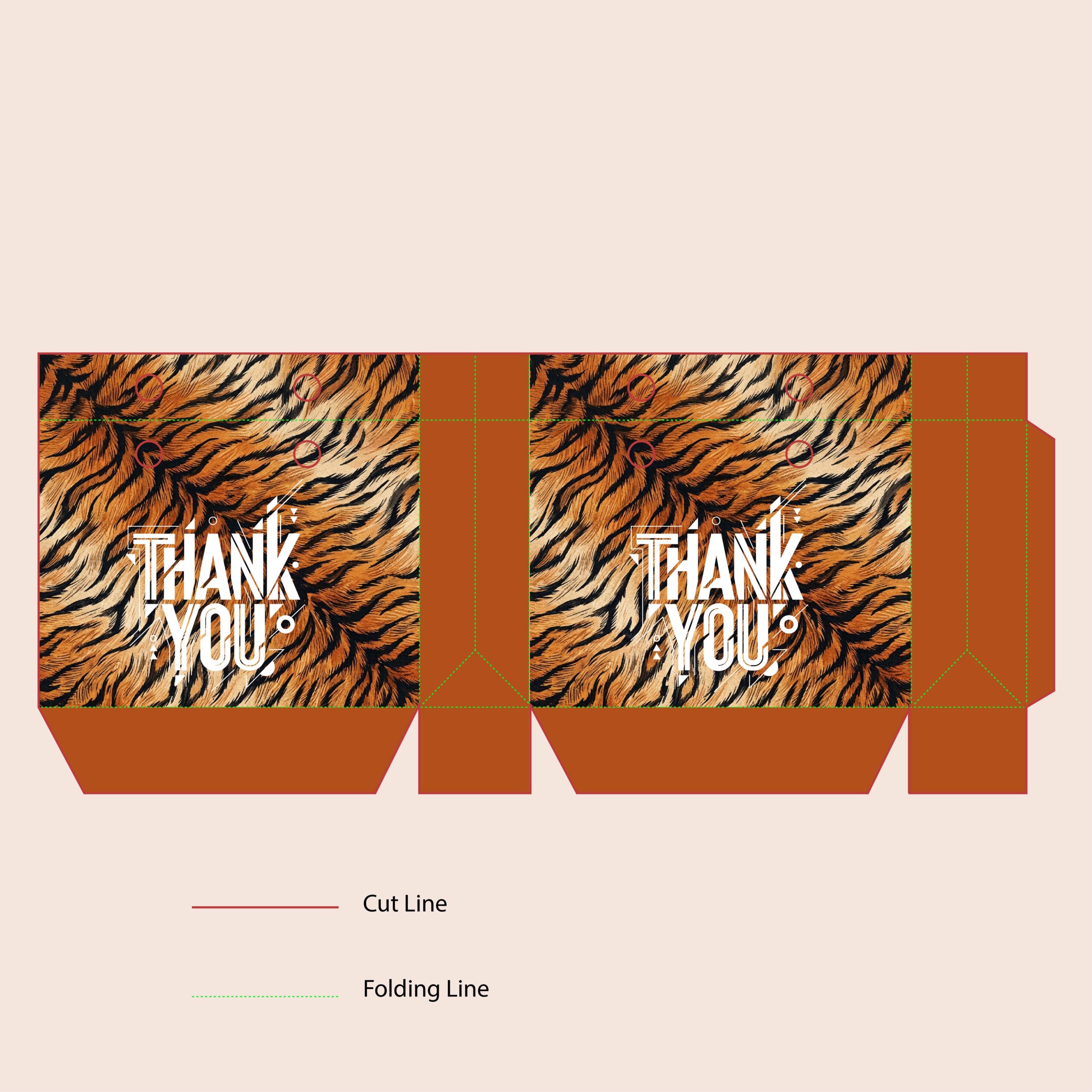
This shopping bag design leans fully into the animal print trend with a fierce, photorealistic tiger stripe pattern. The rich, warm tones of the fur are beautifully tied together by the solid rust-orange side panels and base. By keeping that same distressed, street-style white typography for the ‘Thank You,’ the design maintains an edgy, modern feel. This would be an incredible statement bag for a trendy boutique, cosmetics brand, or streetwear label.
3. Focuses on the fashion/glamour vibe
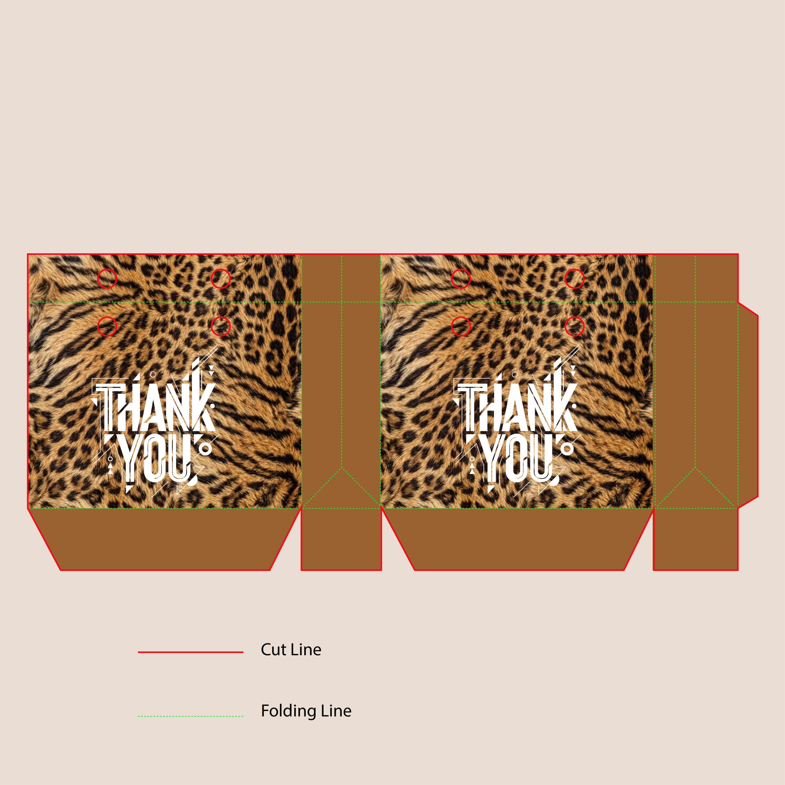
Leopard print is an absolute fashion staple, and this shopping bag design brings it to life with stunning, photorealistic fur textures. By pairing a traditionally glamorous pattern with that gritty, streetwear-inspired ‘Thank You’ typography, the design creates a really cool, unexpected contrast. The solid, warm-brown side panels keep the whole aesthetic grounded and cohesive. This is a must-have look for chic boutiques, beauty brands, or bold accessory lines
4. Focuses on the luxury/premium vibe
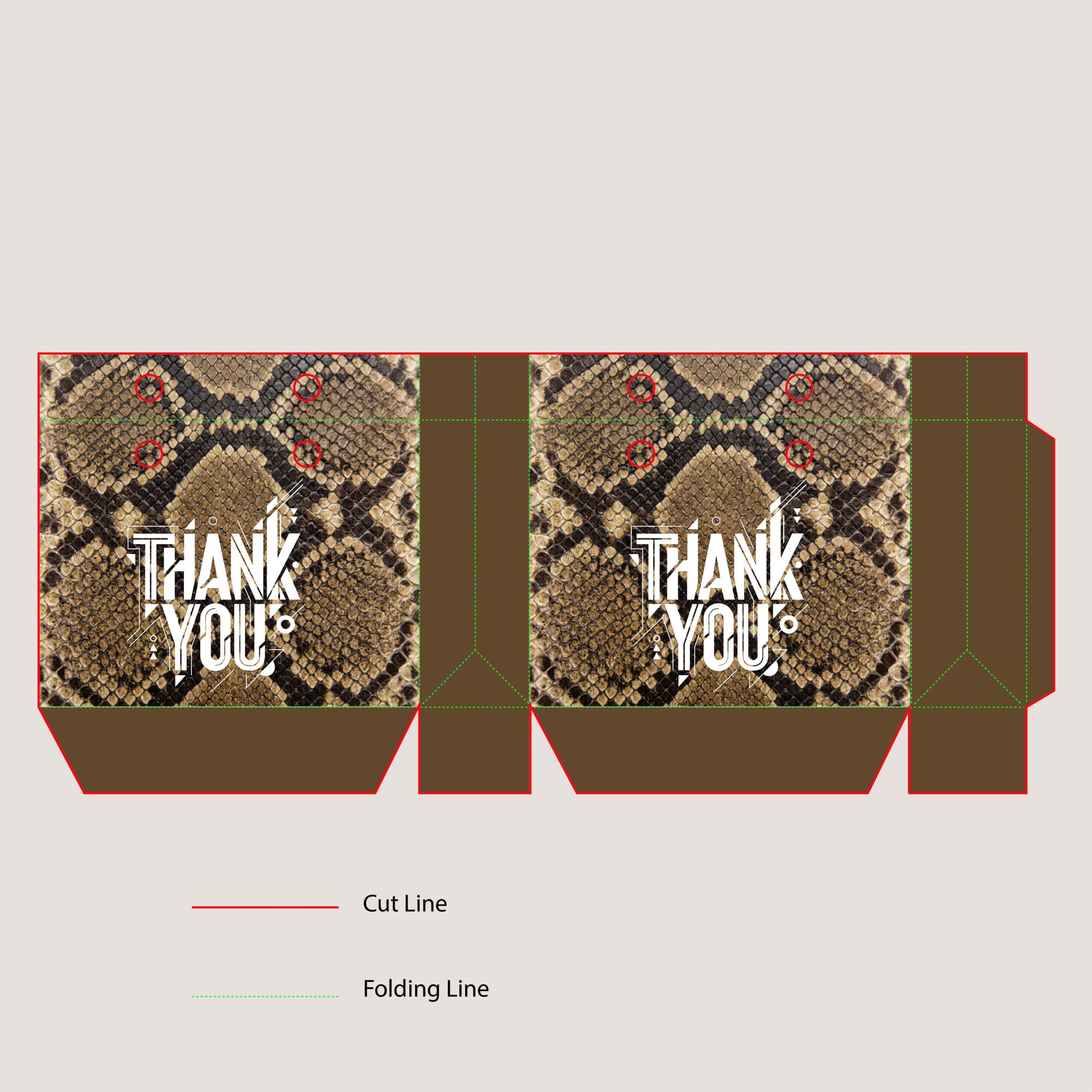
Bringing a touch of high-end luxury to the lineup, this design features a strikingly realistic python skin pattern. The earthy brown and tan scales give off a premium, sophisticated vibe, while the solid mocha-brown side panels keep everything looking sleek and unified. Paired with that signature edgy, street-style ‘Thank You’ text, it creates a perfect bridge between high fashion and urban streetwear. This layout would be incredible for luxury accessories, high-end shoe stores, or chic boutiques.
5. Focuses on the earthy/bohemian vibe
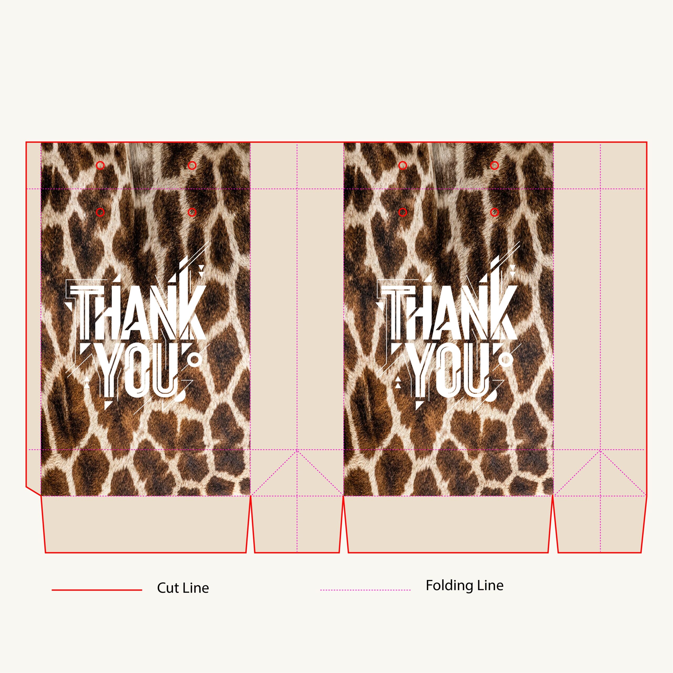
Adding a unique twist to the animal print lineup, this design features a beautiful, photorealistic giraffe pattern. The warm brown spots against the creamy background give off an earthy, slightly bohemian vibe. To keep the look modern and cohesive, the side panels and base use a soft beige that perfectly matches the lighter tones of the fur. Paired with that signature edgy white typography, this bag is a fantastic choice for boutiques or lifestyle brands looking for an exotic but slightly softer aesthetic.
6. Focuses on the warm, graphic vibe
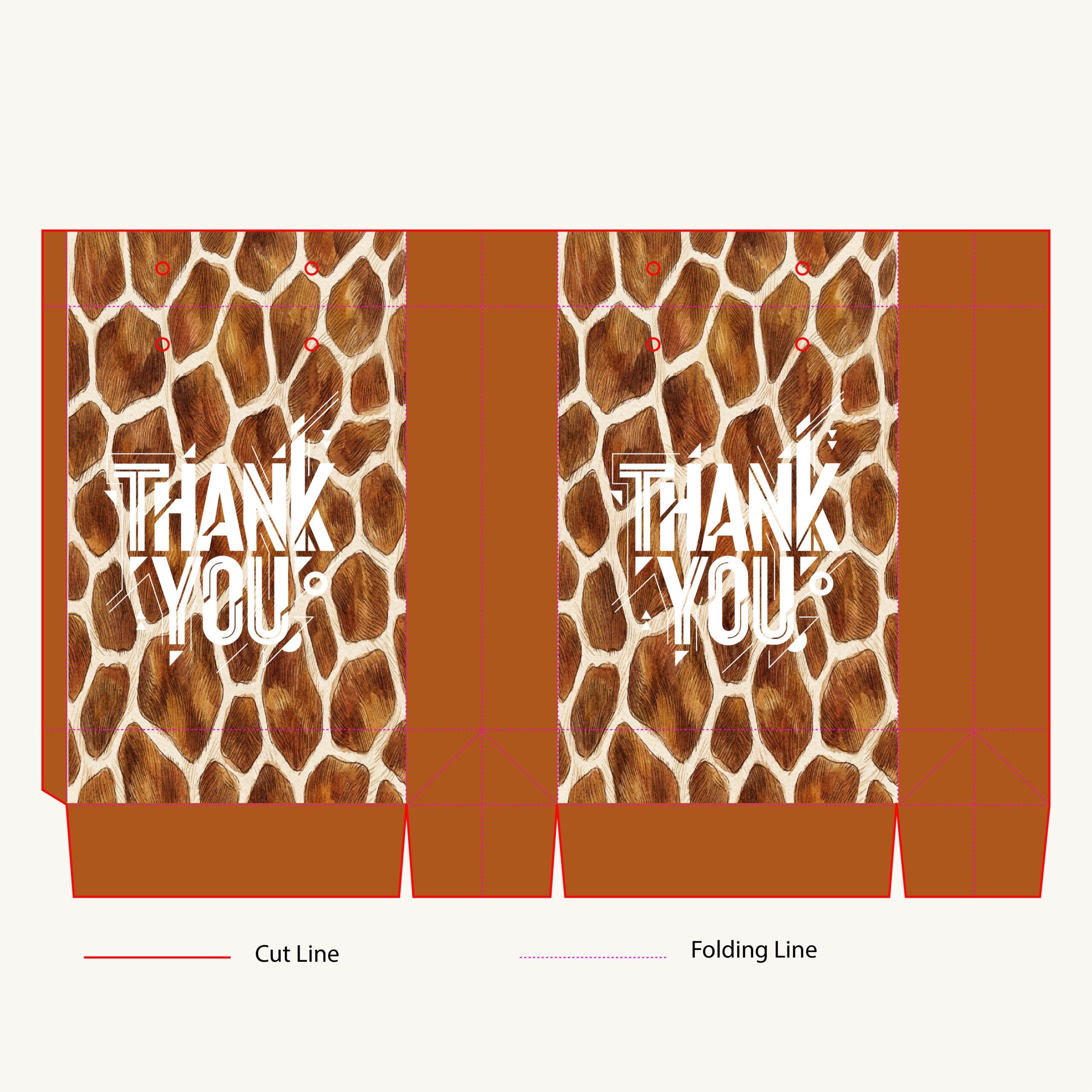
This design offers a bolder, warmer take on the classic giraffe print. Featuring large, stylized spots with rich, honey-brown textures, the pattern almost feels like a beautiful natural mosaic. The deep, warm terracotta-brown side panels anchor the design perfectly, giving the bag a sturdy and cohesive feel. Topped off with that signature edgy white ‘THANK YOU’ typography, it’s a fantastic blend of rustic warmth and modern street style.
7. Focuses on texture and the trendy vibe
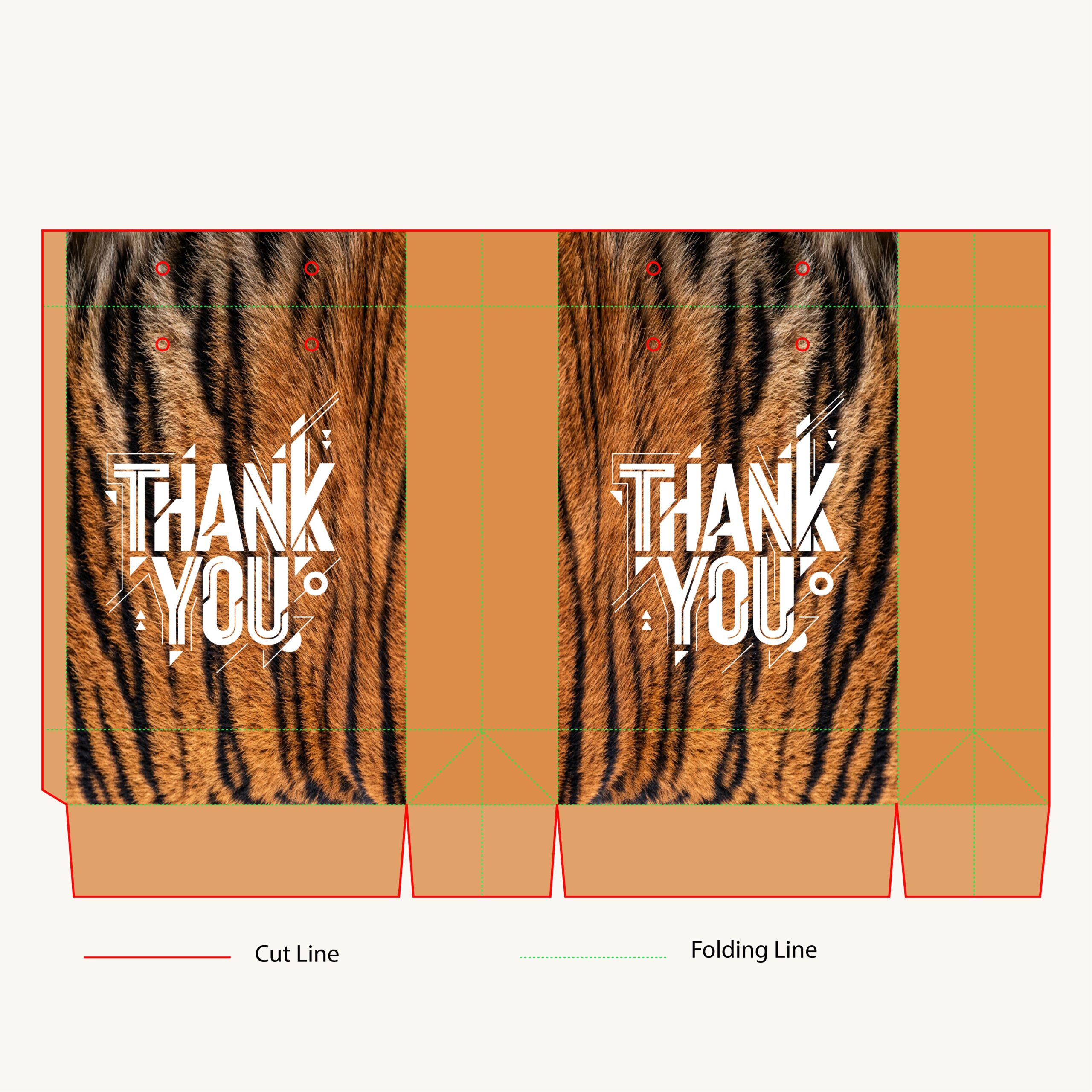
This design takes a closer look at the wild side! It features a stunning, macro-level tiger fur texture that looks so realistic you almost want to reach out and touch it. To balance the bold stripes, this variation uses lighter, muted-tan side panels that give the bag a slightly softer, warmer feel. The bright white ‘Thank You’ text still provides that signature urban edge, making it a fantastic choice for trendy apparel brands or boutique cosmetic lines.
8. Focuses on the chic, monochromatic fashion vibe
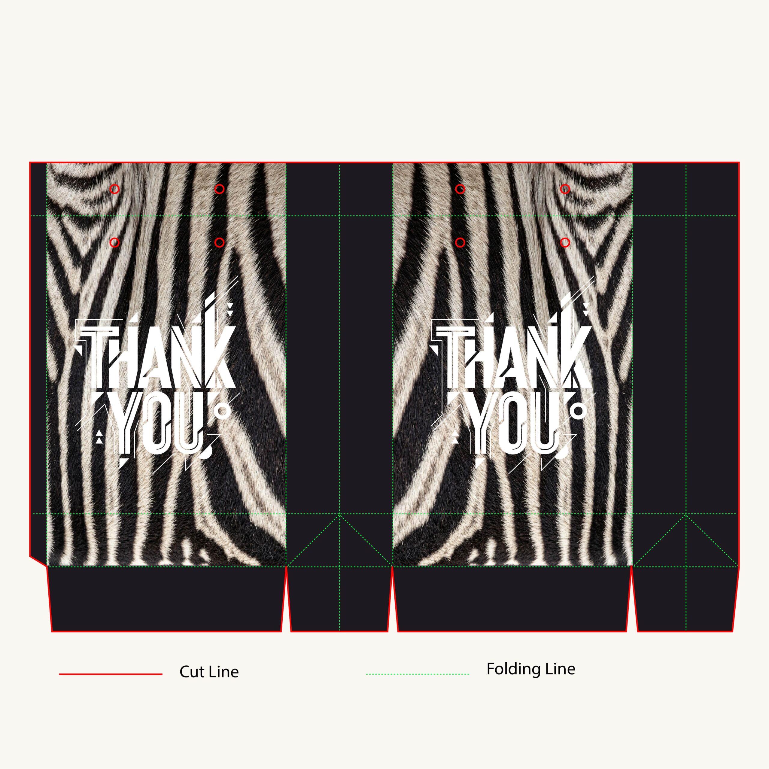
Bringing some monochromatic magic to the lineup! This zebra print design is incredibly chic, featuring a highly realistic black-and-white fur texture that creates an instant visual impact. The solid black side panels and base frame the wild pattern perfectly, giving the bag a very sleek, sophisticated feel. The crisp white street-style ‘Thank You’ text pops brilliantly against the dark stripes, making this the ultimate packaging choice for modern fashion brands, edgy boutiques, or anyone who loves a bold black-and-white aesthetic.
9. Focuses on the vibrant, retro-modern vibe
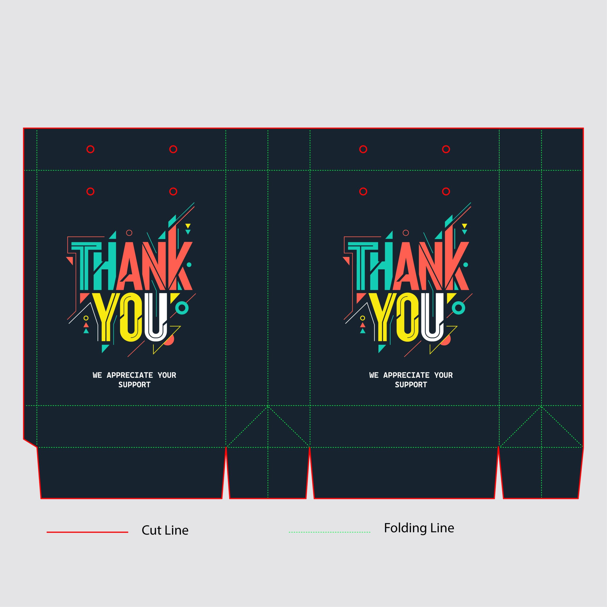
Stepping away from the wild animal prints, this design brings a totally different kind of energy! It features a sleek, deep navy blue background that serves as the perfect canvas for a massive pop of color. The ‘Thank You’ typography is bold and geometric, using playful shades of teal, orange, and yellow. Paired with those floating abstract shapes and lines, the whole bag gives off a really cool, retro-modern Memphis design vibe. This would be absolutely perfect for a creative agency, a tech-forward brand, or a quirky indie boutique.
10. Modern & Concept-Focused
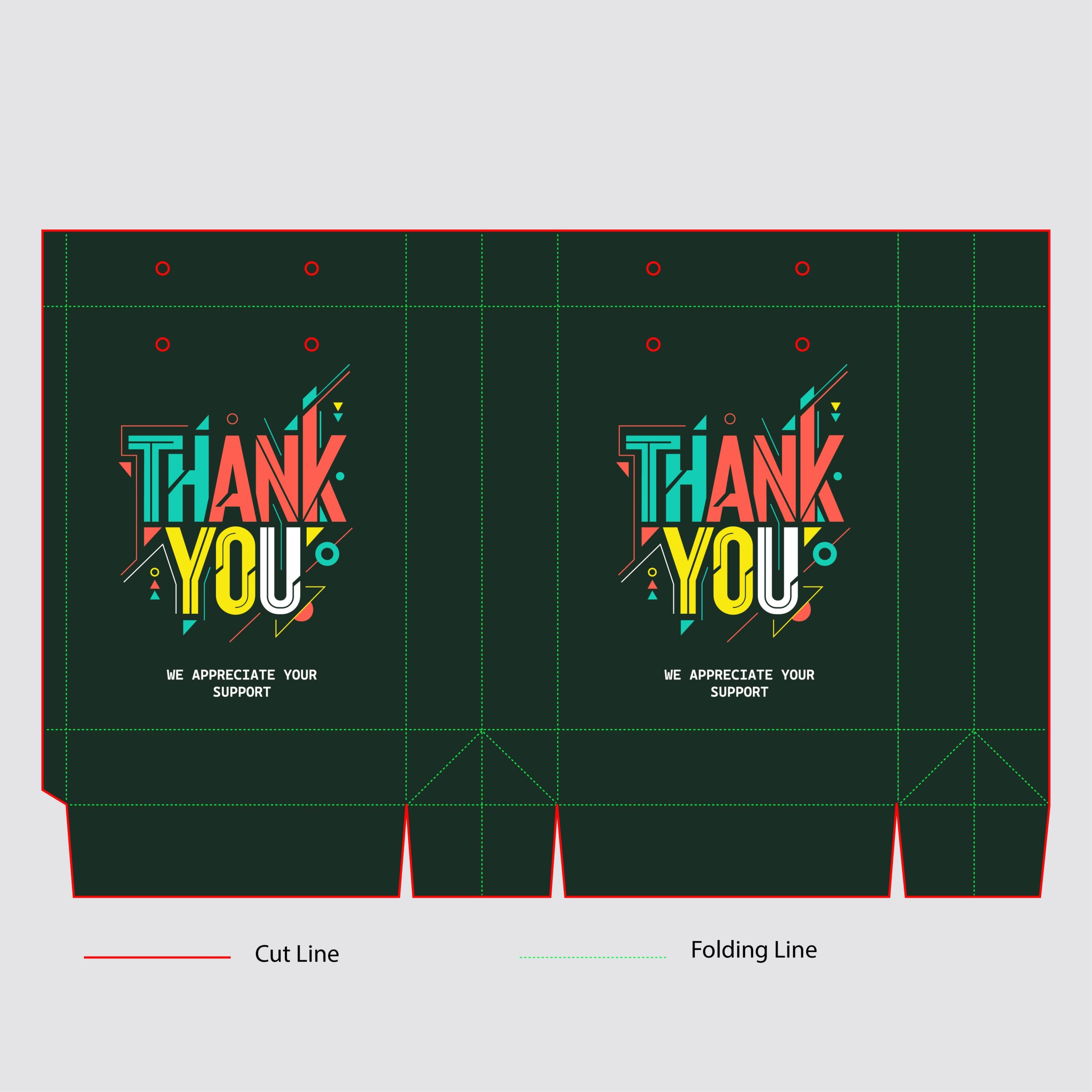
For this shopping bag dieline, I wanted to move away from predictable retail branding and lean into something highly energetic and contemporary. Set against a deep, muted forest green canvas, the “Thank You” typography takes center stage with a bold, retro-futuristic geometric style. By combining sharp angles, overlapping block letters, and a vibrant palette of teal, coral, and yellow, the design turns a simple expression of gratitude into a striking visual statement. It’s a retail packaging concept designed to make the unboxing or carrying experience feel like an extension of a trendy, high-energy brand.
11. Premium & Elegant
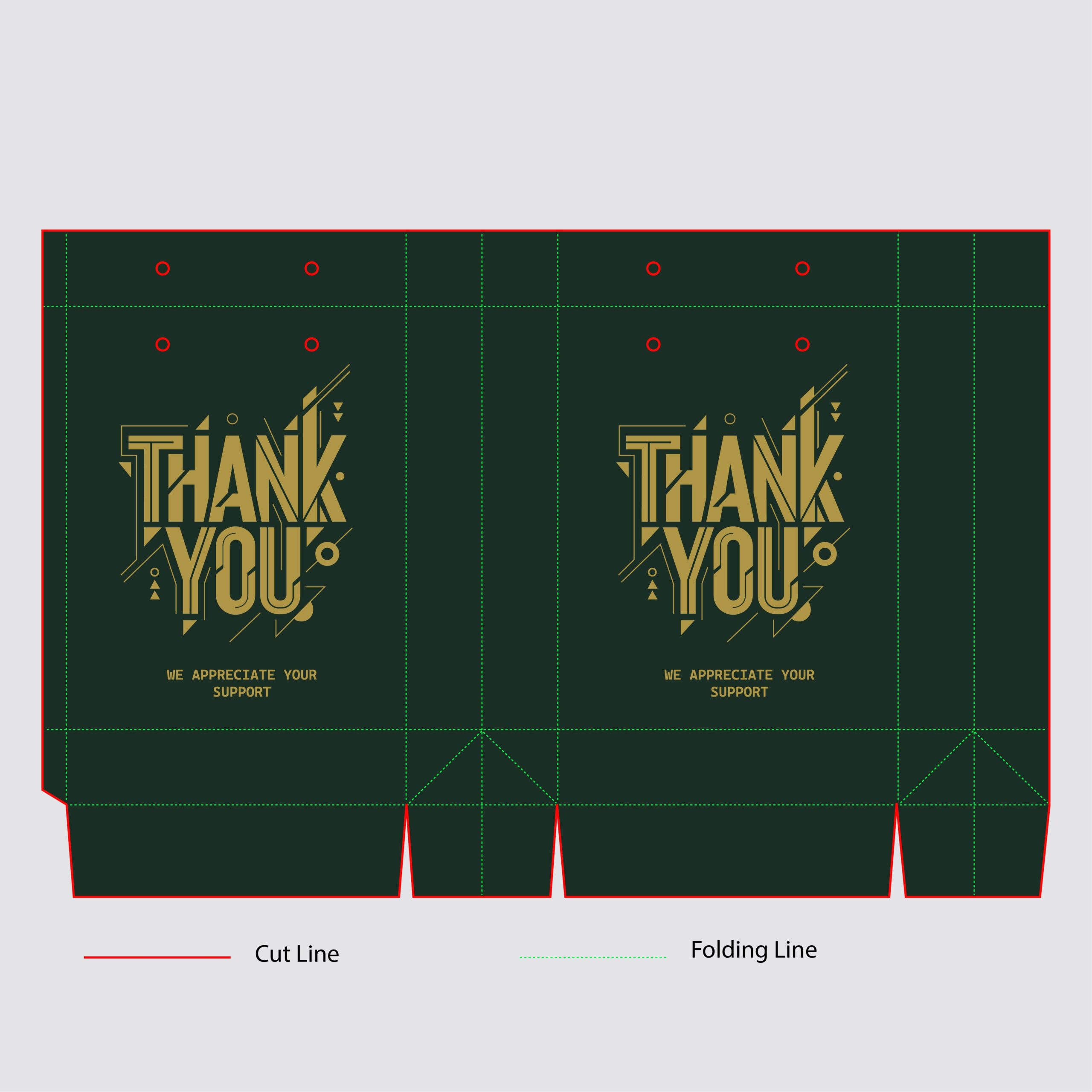
For this variation, I wanted to transition the energetic layout into something distinctly high-end and sophisticated. By shifting the complex geometric typography to a single, refined metallic gold tone, the design instantly adopts a luxury aesthetic. The contrast between the deep, muted forest green background and the clean gold linework gives the shopping bag an upscale, premium feel. It’s a great example of how changing the color strategy alone can pivot a design from playful and urban to sleek, minimal elegance perfectly suited for high-end retail.
12. Modern & High-Contrast
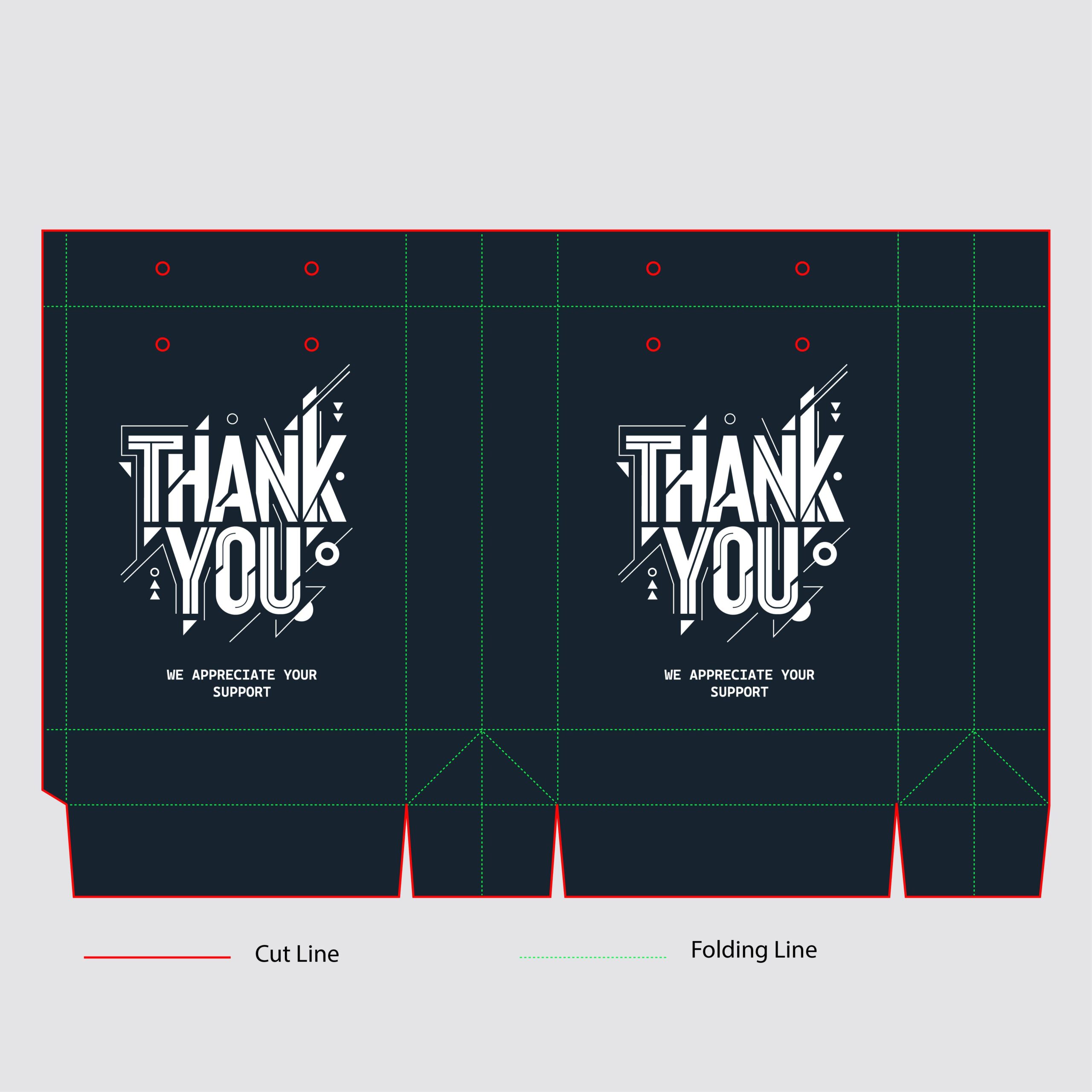
For this version, I wanted to strip back all color complexity and focus purely on high-contrast minimalism. By switching the canvas to a deep midnight navy and rendering the entire geometric typography layout in stark white, the design takes on a crisp, modern, and slightly urban edge. The intricate linework and sharp angles of the custom lettering really get to shine here without any visual distraction. It’s a clean, high-impact aesthetic that works incredibly well for contemporary lifestyle, tech, or streetwear brands looking for packaging that feels both bold and understated.
13. Artistic & Heritage-Focused
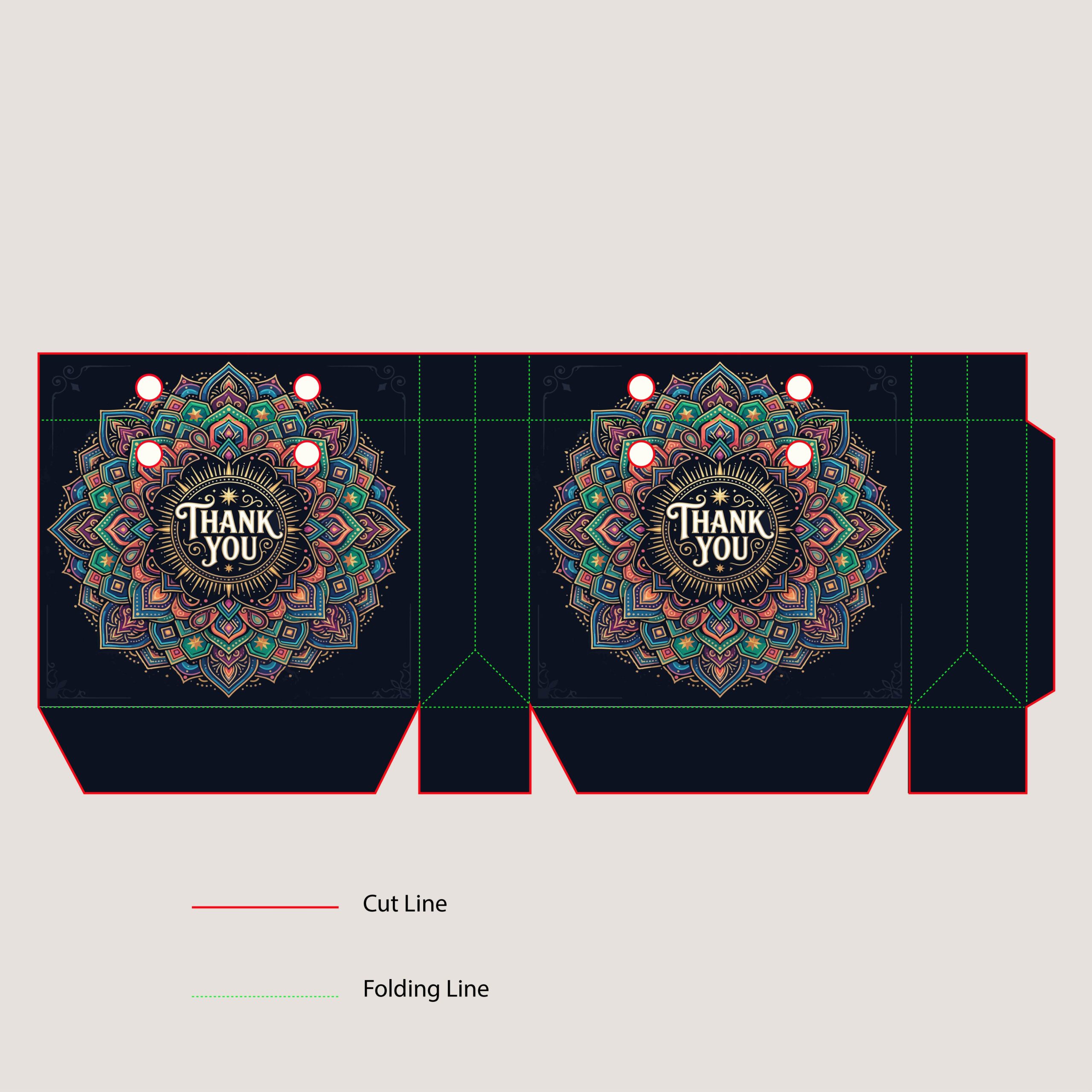
For this shopping bag concept, I wanted to completely pivot away from modern minimalism and dive into something deeply decorative and artistic. The design centers on a highly intricate, hand-illustrated mandala that radiates outward from a vintage-inspired “Thank You” script. By pairing a rich, dark navy background with an ornate palette of jewel tones—teal, terracotta, and soft gold—the packaging takes on a sense of craftsmanship and luxury heritage. It’s a design intended for premium boutique brands, artisanal products, or gift packaging where the bag itself feels like a keepsake.
14. Character-Driven & Vintage
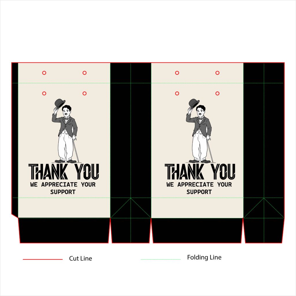
For this design, I wanted to lean into a classic, nostalgic aesthetic by introducing a character-driven mascot concept. The shopping bag features a vintage, hand-drawn illustration inspired by Charlie Chaplin, politely tipping his bowler hat as a literal, charming visual translation of the “Thank You” message. By pairing a warm, cream-toned canvas with bold black side panels and retro, Art Deco-inspired typography, the packaging captures the essence of early cinema. It’s a playful yet sophisticated design that adds a distinct personality and storytelling element to the retail experience.
15. Fashion-Forward & Graphic
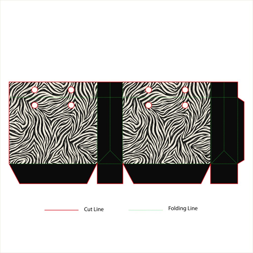
For this layout, I wanted to step away from text-heavy branding entirely and let a high-impact pattern do all the talking. The design utilizes an organic, beautifully textured zebra print that dominates the main panels of the shopping bag. By framing this wild, wavy pattern with stark, solid black side panels and a clean black base, the overall look stays grounded, balanced, and incredibly chic. It’s a runway-inspired retail concept tailored specifically for trendsetting apparel brands, high-end footwear boutiques, or luxury cosmetics where the packaging itself acts as a bold fashion statement.
16. Playful & Structural
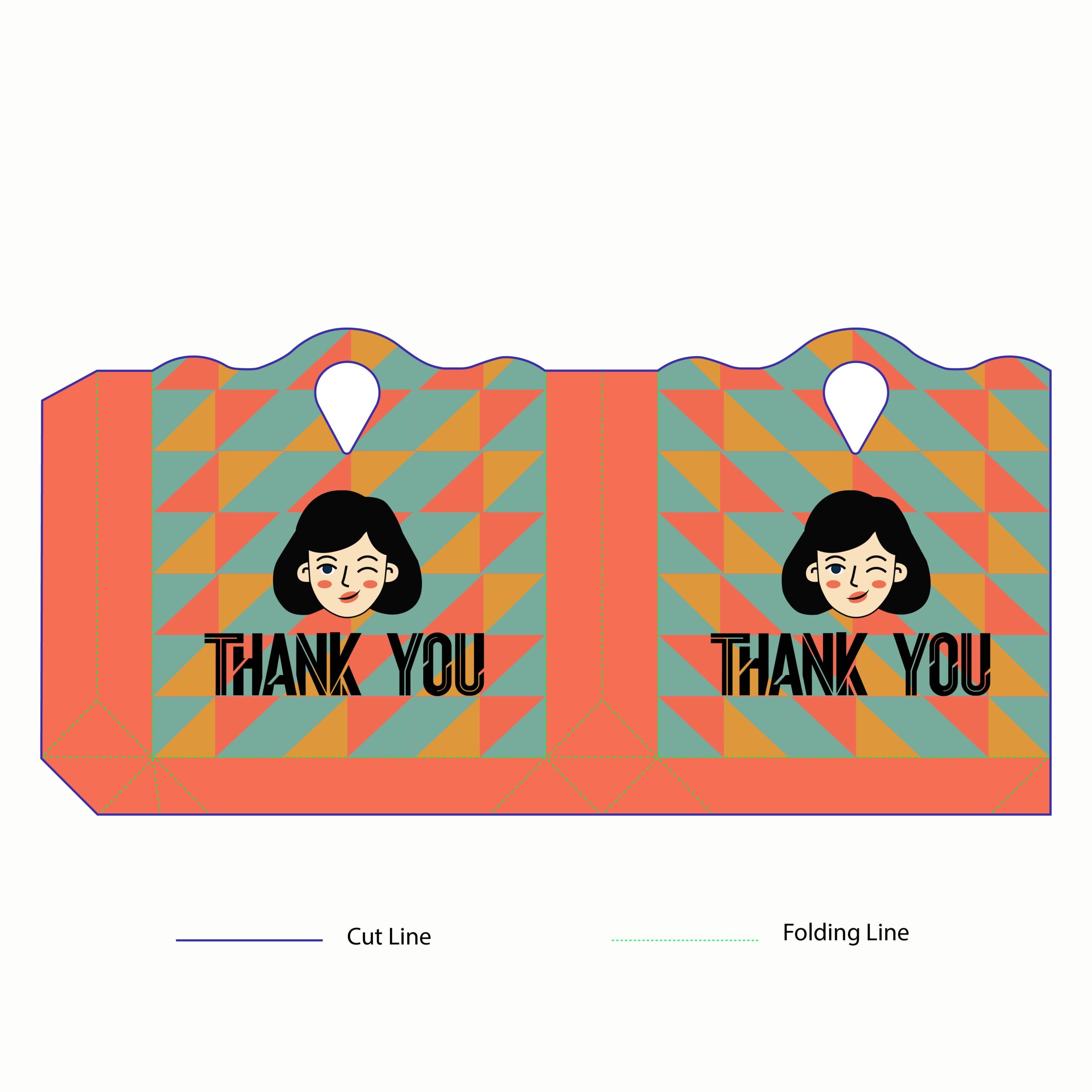
For this concept, I wanted to experiment with both shape and character. Moving away from a standard rectangular top, this shopping bag features a custom, wavy cut line that frames a die-cut handle for a unique structural silhouette. The surface design leans into a playful retro aesthetic, utilizing a geometric harlequin pattern of muted teal, coral, and mustard triangles. Centered on the main panels is a charming, winking character mascot that pairs beautifully with the bold, stylized “Thank You” typography. It’s a fun, vibrant retail packaging solution that feels youthful and immediately catches the eye on the street.
17. Clean & High-Contrast Retro
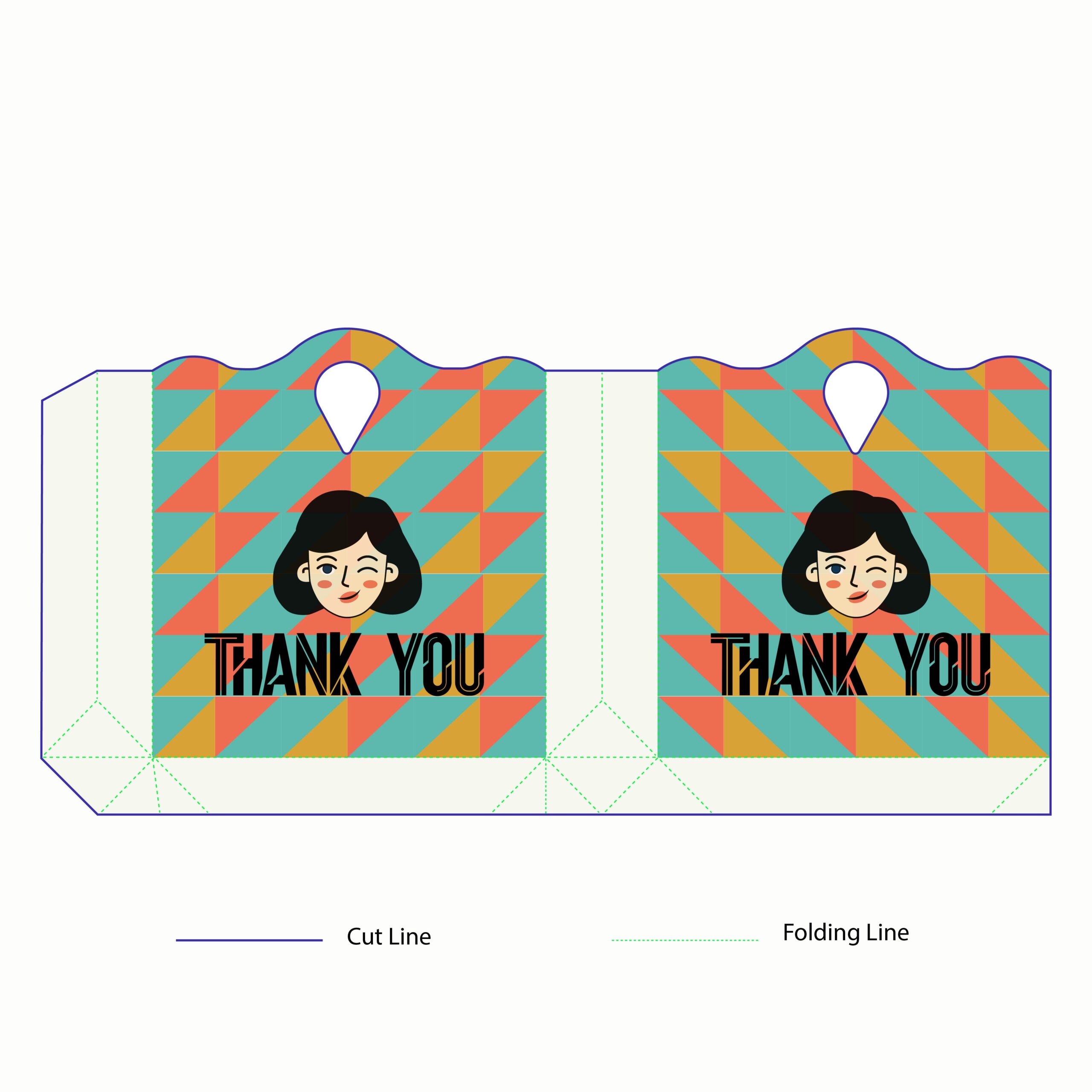
In this design iteration, I wanted to explore how negative space could clean up a highly energetic pattern. While keeping the unique wavy die-cut top edge and retro harlequin background on the face of the bag, I switched the side gussets and bottom base to a crisp, minimal white. This simple structural update acts as a frame, isolating the vibrant teal, coral, and mustard triangles so the winking mascot and bold “Thank You” text pop even more. It’s an ideal packaging choice for lifestyle brands wanting a look that balances playful vintage aesthetics with clean, modern minimalism.
18. Bold & Kid-Core Color Blocking
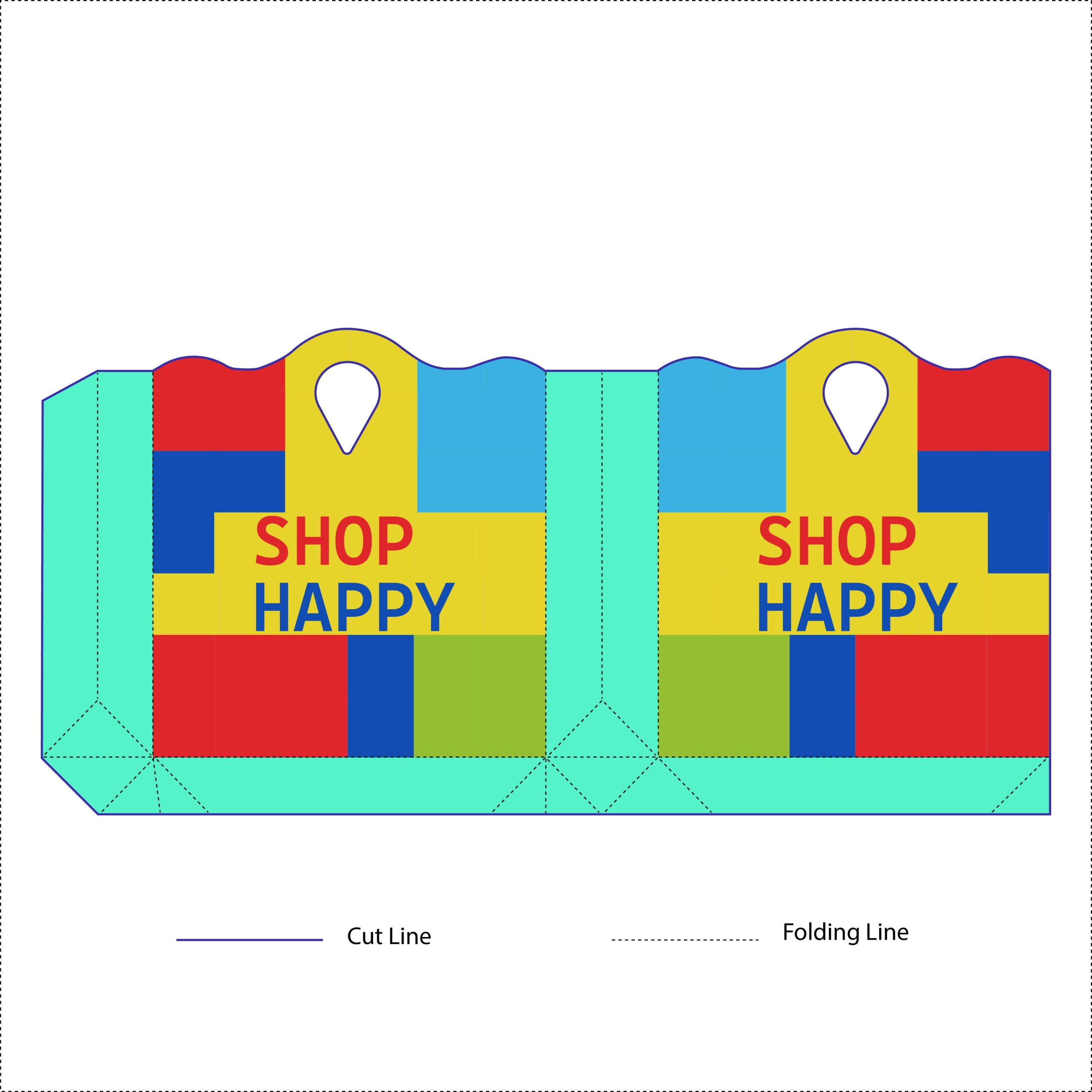
For this design variant, I wanted to completely max out the color energy and embrace a playful, color-blocked aesthetic. Keeping the custom wavy top silhouette and integrated handle, the artwork shifts into a bright, bold palette of canary yellow, sky blue, candy red, lime green, and teal. By arranging these colors in clean, chunky block shapes, the layout achieves a striking “kid-core” or pop-art vibe that is impossible to miss. The cheerful “Shop Happy” messaging anchors the central yellow stripe, making this concept perfect for children’s toy brands, creative stationary shops, or any candy and confectionery retailer looking for ultra-expressive packaging.
19. Character-Driven & Kinetic Minimalism

For this layout, I wanted to combine our custom wavy-top dieline with a high-energy, illustrative concept. Shifting away from heavy color blocks, the design embraces clean minimalism with a warm cream canvas and deep charcoal side panels. The true hero is the hand-drawn monkey mascot, illustrated with expressive, frantic motion lines that give the packaging an instantly playful, comic-book rhythm. By leaving out standard corporate typography, the focus falls entirely on the storytelling character. It’s a memorable, personality-forward retail template perfectly optimized for streetwear boutiques, indie comic shops, or trendy snack and cafe brands looking to leave a lasting impression.
20. Graphic Storytelling & High Contrast
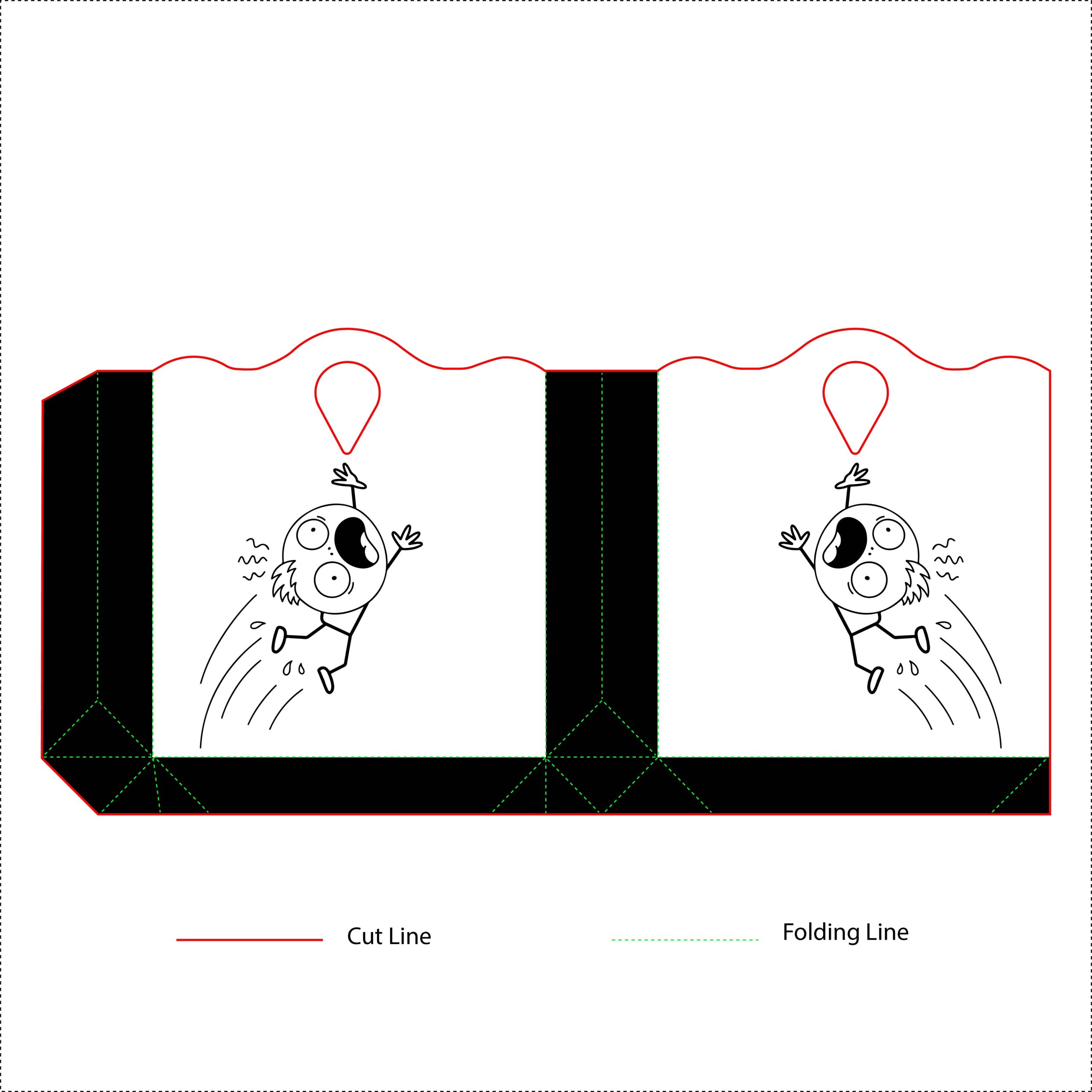
In this design variant, I wanted to explore an even sharper contrast layout while keeping the playful, comic-book energy alive. The main face switches to a crisp, stark white canvas, which is now heavily framed by extending the deep black ink from the side gussets all the way through the bottom base panel. The centerpiece is a wildly expressive, hand-drawn stick-figure boy character leaping through the air with dynamic motion lines. By interacting directly with the negative space and the die-cut handle above him, the illustration turns a standard shopping bag into a piece of interactive graphic storytelling. It’s a bold, youthful retail look built for streetwear labels, trendy bookshops, or creative indie brands.