14 Honey Packaging Designs to Inspire Your Brand
Honey is one of the most visually rich products on any shelf. Its golden color, natural origins, and premium appeal give packaging designers a unique canvas to work with — but standing out in a crowded market still requires deliberate, strategic design choices.
Whether you are developing packaging for an artisan honey brand, a large-scale producer, or a private label product, the design you choose directly influences how customers perceive quality, trust, and value before they ever taste the product.
In this post, we have curated 14 honey packaging designs that go beyond aesthetics. Each one reflects a clear design intent — from label typography and material choice to jar shape and color palette — offering practical inspiration for brands and designers looking to create packaging that both attracts attention and drives purchase decisions.
14 Honey Packaging Designs That Balance Beauty and Function
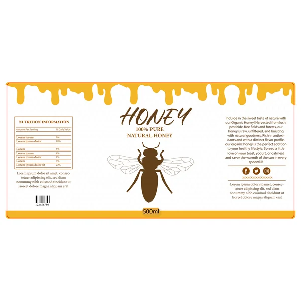
1. Modern & Playful
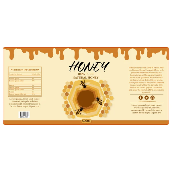
This design captures the sticky, sweet essence of the product through a bold, illustrative approach. The standout feature is the playful ‘honey drip’ border at the top, which immediately communicates flavor and texture to the consumer. By using a layered, geometric honeycomb as the centerpiece—complete with realistic bee illustrations—the design creates a sense of depth and brings the story of the hive to life. The mix of a hand-drawn script for the title and a clean serif for the details balances artisanal charm with modern professional standards.
2. Artisanal & Warm
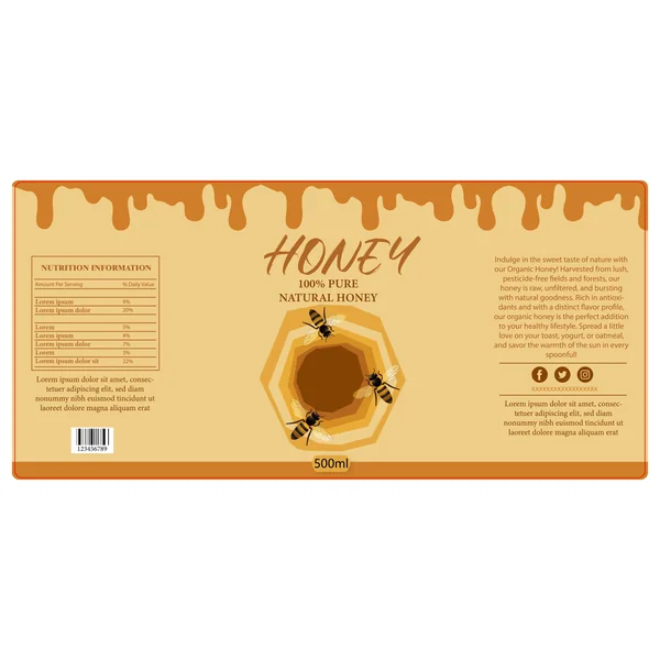
This label design uses a warm, earthy color palette to immediately evoke the feeling of raw, organic honey. The standout feature is the thick ‘honey drip’ illustration at the top, which adds a tactile, mouth-watering quality to the packaging. By pairing a loose, brush-style script for the main title with realistic bee illustrations, the design achieves a perfect balance between artisanal charm and modern shelf appeal. The layered, concentric honeycomb in the center acts as a powerful focal point, drawing the consumer’s eye right to the heart of the product.
3. Sensory & Appetizing
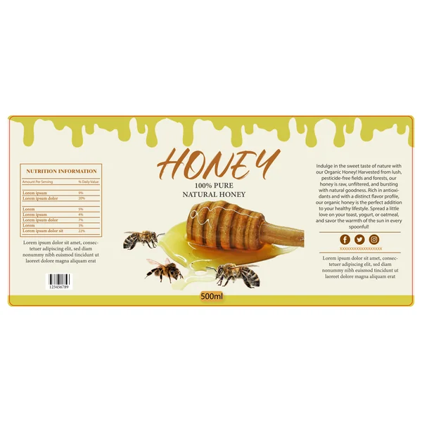
This design prioritizes sensory appeal by using high-quality, realistic imagery as its focal point. The inclusion of a wooden honey dipper and translucent honey spill creates an immediate ‘crave factor,’ making the product feel tangible and fresh. Unlike more abstract designs, this label uses detailed photography of bees to ground the brand in nature, emphasizing a ‘farm-to-jar’ authenticity. The lighter, citrus-yellow dripping border at the top suggests a light, floral, or clover-based honey variety, perfect for a morning breakfast table.
4. Rich & Traditional
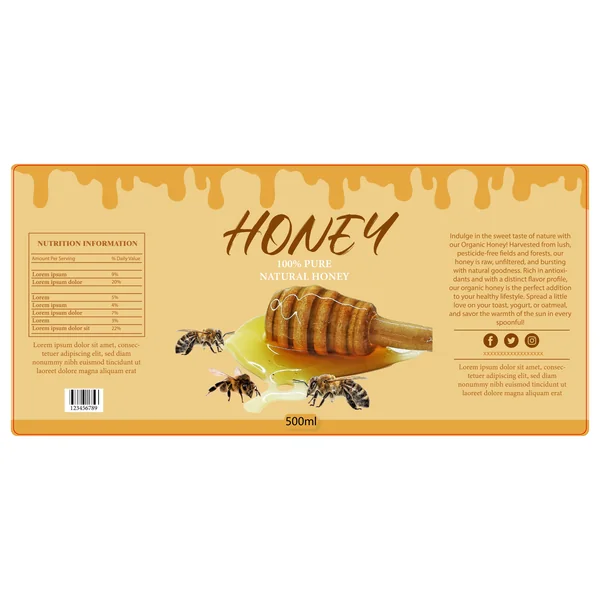
This design leans into a deep, golden-amber color palette, immediately signaling a rich and robust honey flavor. By shifting away from bright yellows to warmer orange tones, the label takes on a more traditional and premium feel. The photorealistic central image—featuring a honey dipper and active bees—perfectly complements the ‘dripping’ border, creating a cohesive visual language that celebrates the harvest. It’s a design that feels right at home in a rustic kitchen or a specialty farm shop.
5. Modern & Minimalist
This design embraces a clean, contemporary aesthetic by utilizing a crisp white background and a bold, centered icon. The large, chocolate-brown bee silhouette acts as a strong brand anchor, giving the packaging a professional and almost ’boutique’ feel. To add subtle depth without cluttering the layout, a faint geometric honeycomb pattern spans the background. The high contrast between the bright yellow honey drip and the white space makes this label look incredibly fresh and premium, signaling purity to the consumer.
6. Bold & Luxurious
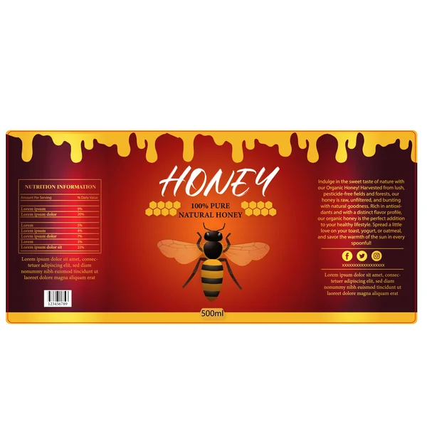
Stepping away from traditional ambers and creams, this design uses a deep burgundy gradient to create an immediate sense of luxury and intensity. This color choice suggests a darker, richer variety of honey—perhaps a forest or buckwheat honey—and makes the bright yellow ‘honey drip’ border pop with incredible contrast. The central bee illustration is detailed and regal, framed by golden honeycomb accents that give the packaging a premium, gift-tier appearance. The use of white, hand-brushed typography adds a modern, artistic touch that balances the dark, moody background.
7. Elegant & Premium
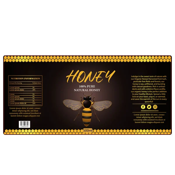
This design exudes a ‘special reserve’ quality by utilizing a striking dark-mode aesthetic. The deep chocolate-black background provides a dramatic canvas for the golden honeycomb borders that frame the label at the top and bottom. By centering a large, detailed bee illustration beneath a gold-scripted title, the packaging feels high-end and artisanal. This approach is perfect for gourmet or rare honey varieties, signaling to the consumer that the product inside is of the highest quality and worth a premium price.
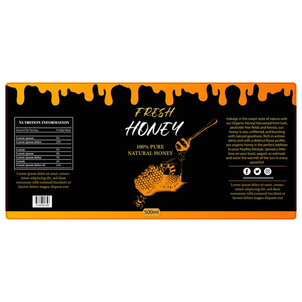
8. Vibrant & Appetizing
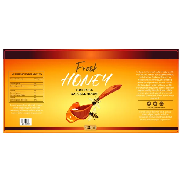
This label design radiates warmth and energy by using a bright yellow-to-orange gradient that mimics the natural glow of liquid honey. The central focal point—a wooden spoon with a glossy, dripping honey bead—creates an immediate ‘ready-to-eat’ appeal for the consumer. By emphasizing the word ‘Fresh’ in a bold, white brush script, the design positions the product as a raw, farm-to-table staple. The deep red borders at the top and bottom act as a strong frame, ensuring the vibrant central colors pop with maximum intensity on a store shelf.
9. Artisanal & Artistic
This label design takes an artistic approach by featuring a beautiful, hand-sketched illustration of a honey dipper and honeycomb. The woodcut-style line art, rendered in a glowing orange, creates a rustic yet sophisticated ‘maker’ vibe. By setting these intricate details against a deep black background, the design feels more like a premium, small-batch artisanal product than a mass-market brand. The high contrast ensures that the vibrant ‘honey drip’ at the top frames the information perfectly, drawing the eye straight to the brand name.
10. Earthy & Eco-Conscious
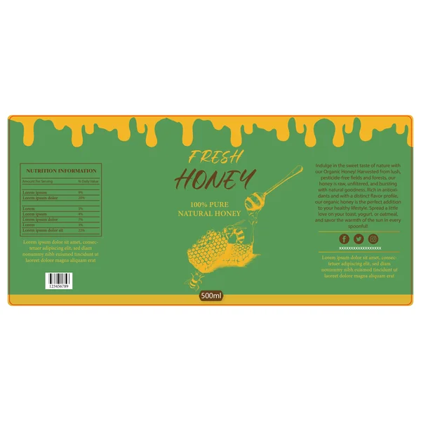
This label breaks away from traditional ambers and creams by utilizing a muted, moss-green background. This choice immediately signals a nature-centric, ‘garden-fresh’ brand identity that leans into organic and eco-conscious values. The intricate, hand-sketched golden illustrations of the honeycomb and bees harmonize perfectly with the earthy tones, creating a sophisticated and calming aesthetic. It’s a design that feels right at home in an upscale organic market or a boutique botanical shop.
11. Clean & Minimalis
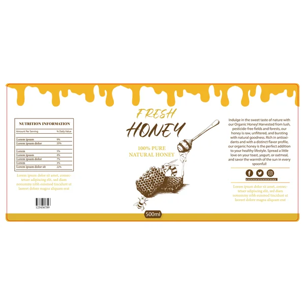
By utilizing a crisp white background, this label design communicates purity and clarity—two highly sought-after qualities in the honey market. The focal point is a beautiful, hand-etched illustration of a honey dipper and honeycomb, which provides a sophisticated, ‘apothecary-style’ look. The vibrant yellow honey drip at the top adds just the right amount of color to catch the eye, while the generous use of white space allows the brand story and nutritional details to breathe. This is an ideal design for a high-end brand that wants to showcase a ‘nothing-to-hide’ approach to its ingredients.
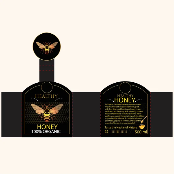
12. Regal & Luxurious
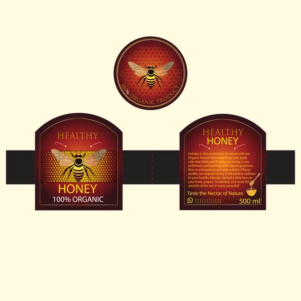
Exuding a sense of royalty and luxury, this label set utilizes a rich burgundy and gold color palette to position the product at the premium end of the market. The distinctive die-cut arch shape of the front label, paired with a matching circular lid sticker, creates a cohesive and high-end brand experience. Subtle honeycomb textures and gold-bordered typography elevate the ‘Healthy Honey’ branding, making it an ideal choice for gift-worthy or specialty organic products that aim to stand out as a luxury item.
13. Modern Luxury
This design masterfully uses a ‘dark mode’ aesthetic to command immediate attention. The combination of a deep black background and delicate gold-lined outlines signals a high-end, premium product. By incorporating a neck-seal design that extends over the lid, the packaging provides a sense of security and a complete brand experience. The central bee illustration, with its warm sunset-toned gradient, provides a glowing focal point that serves as a beautiful metaphor for the golden nectar inside.
14. Sophisticated & High-Contrast
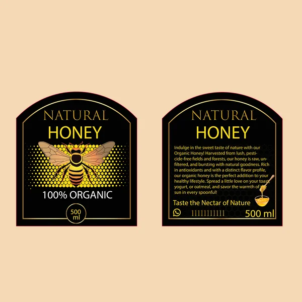
This label design utilizes a bold black-and-gold color palette to create an immediate sense of prestige. The arched die-cut shape of the label adds a custom, high-end feel that differentiates it from standard rectangular packaging. At the center, a detailed bee illustration is framed by a modern halftone honeycomb pattern, blending traditional motifs with contemporary graphic textures. The use of a crisp serif font for ‘Natural Honey’ reinforces the brand’s authority and commitment to quality, making it a standout choice for the premium organic market.