21 Face Serum Packaging Designs to Inspire Your Beauty Brand
Looking for creative face serum packaging ideas? This collection features 21 face serum packaging designs that showcase modern branding, premium aesthetics, and functional packaging solutions. From elegant glass dropper bottles and minimalist labels to luxurious boxes and eco-friendly concepts, these designs highlight the latest trends in skincare packaging. Whether you’re launching a new serum, refreshing your brand identity, or seeking inspiration for cosmetic packaging, these examples offer fresh ideas to help your product stand out on retail shelves and online marketplaces.
21 Creative Face Serum Packaging Designs for Branding Inspiration
1. The Art of Contrast: Botanical Meets Geometric
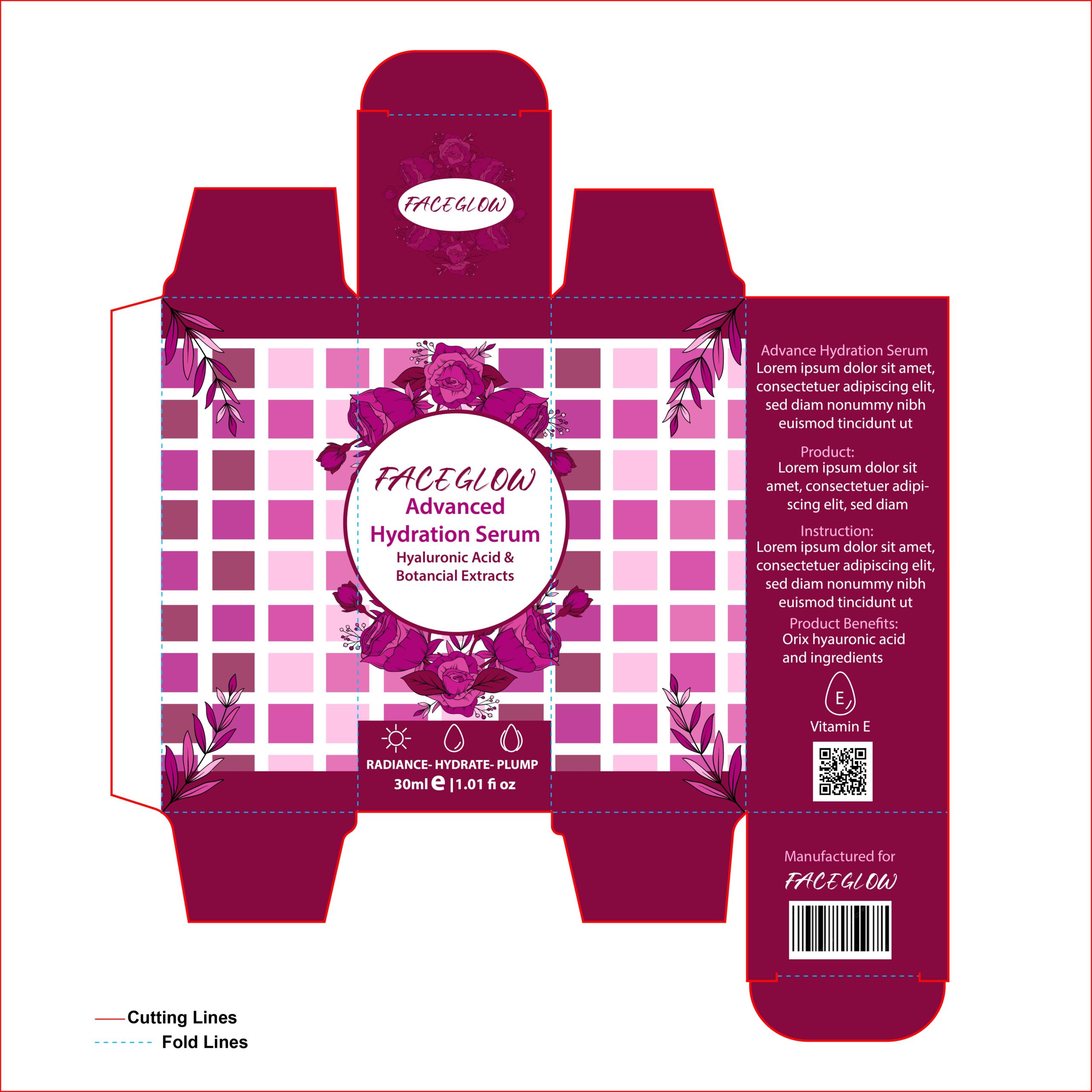
This design for “Faceglow” is a fantastic study in visual balance. It pairs a rigid, modern geometric grid with soft, hand-drawn floral illustrations, creating a look that feels both scientifically advanced and naturally derived. The monochromatic palette of deep magenta and soft pinks gives the packaging a high-energy, feminine appeal that would instantly stand out on a crowded shelf. I especially love the use of clean icons at the bottom and the elegant script typography for the brand name; it adds a personal, “boutique” touch to a professional skincare product. It’s a bold, maximalist approach that manages to stay organized and easy to read.
2. Vibrant Energy: A Punchy Magenta Concept
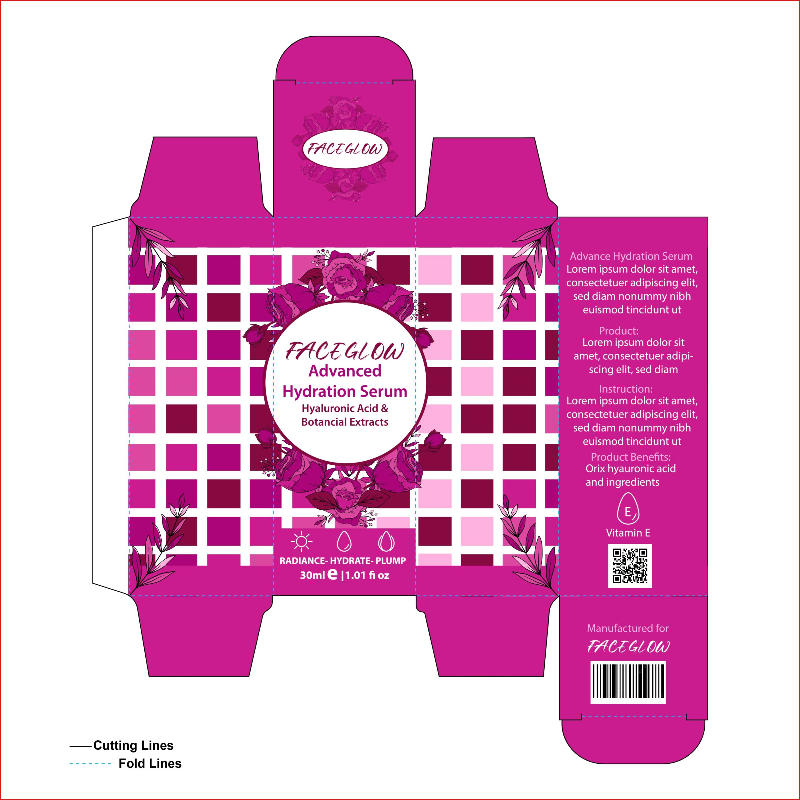
This design iteration leans heavily into a bold, monochromatic magenta palette, giving the “Faceglow” serum a high-energy, youthful presence. By carrying the vibrant pink throughout the flaps and framing, the design achieves a seamless, “dipped-in-color” look that feels incredibly modern and cohesive. The contrast between the rigid, pixelated grid and the delicate floral wreath remains the standout feature, but in this version, the brighter tones make the botanical elements feel even more fresh. It’s a perfect example of packaging that doesn’t just sit on a shelf—it commands attention through pure, saturated color.
3. Earthy Radiance: A Multicolored Botanical Approach
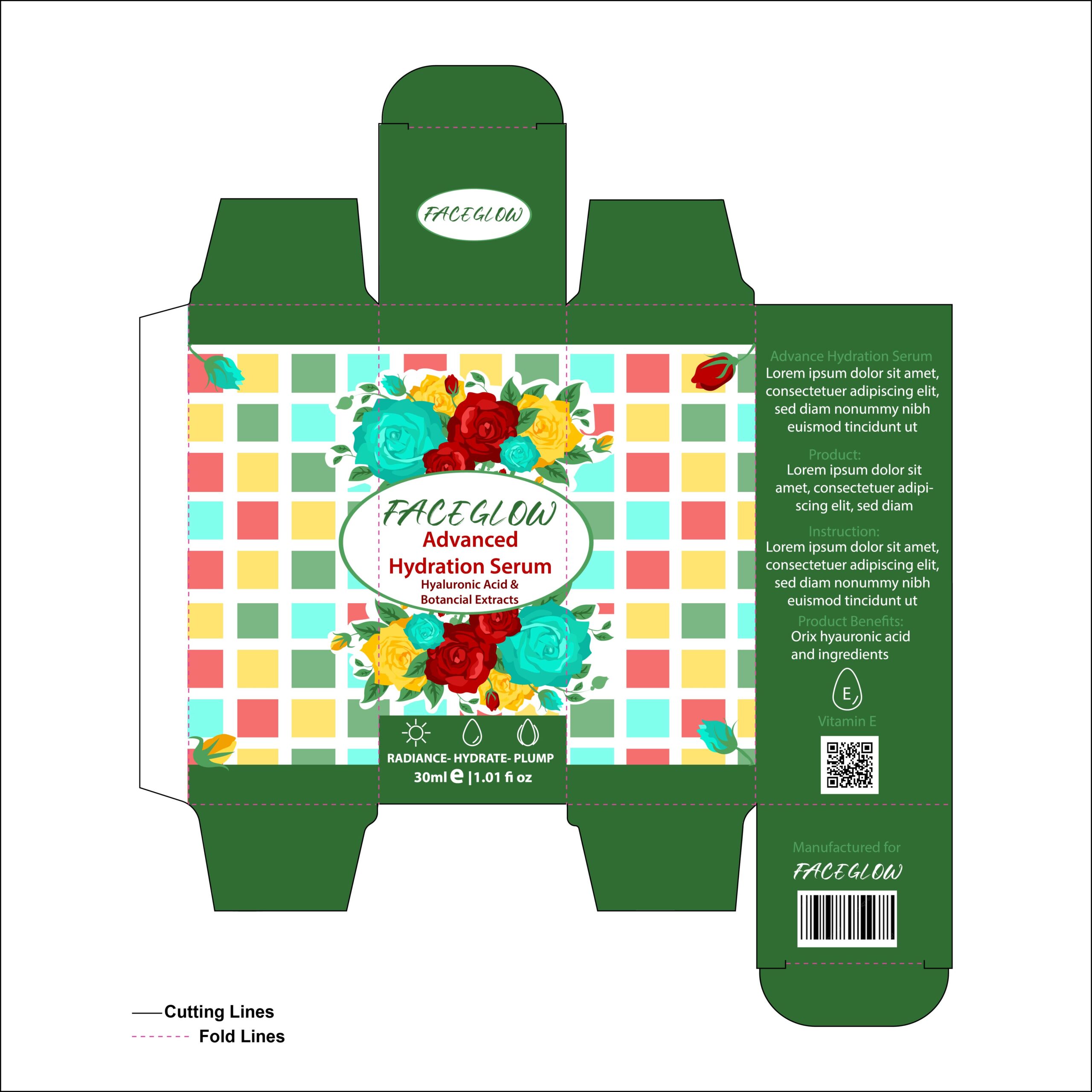
This iteration of the “Faceglow” packaging uses a deep forest green base to create a sophisticated, “natural apothecary” vibe. By moving away from monochromatic tones and introducing a vibrant, multicolored grid of yellow, turquoise, and coral, the design feels eclectic and artistic—almost like a modern mosaic. The floral elements are brought to life with full color, making the central branding pop against the dark background. It’s a brilliant example of how a shift in color palette can completely redefine a brand’s personality, moving from high-fashion glamor to an earthy, botanical-rich identity that feels both premium and approachable.
4. Timeless Luxury: Gold Accents & Emerald Tones
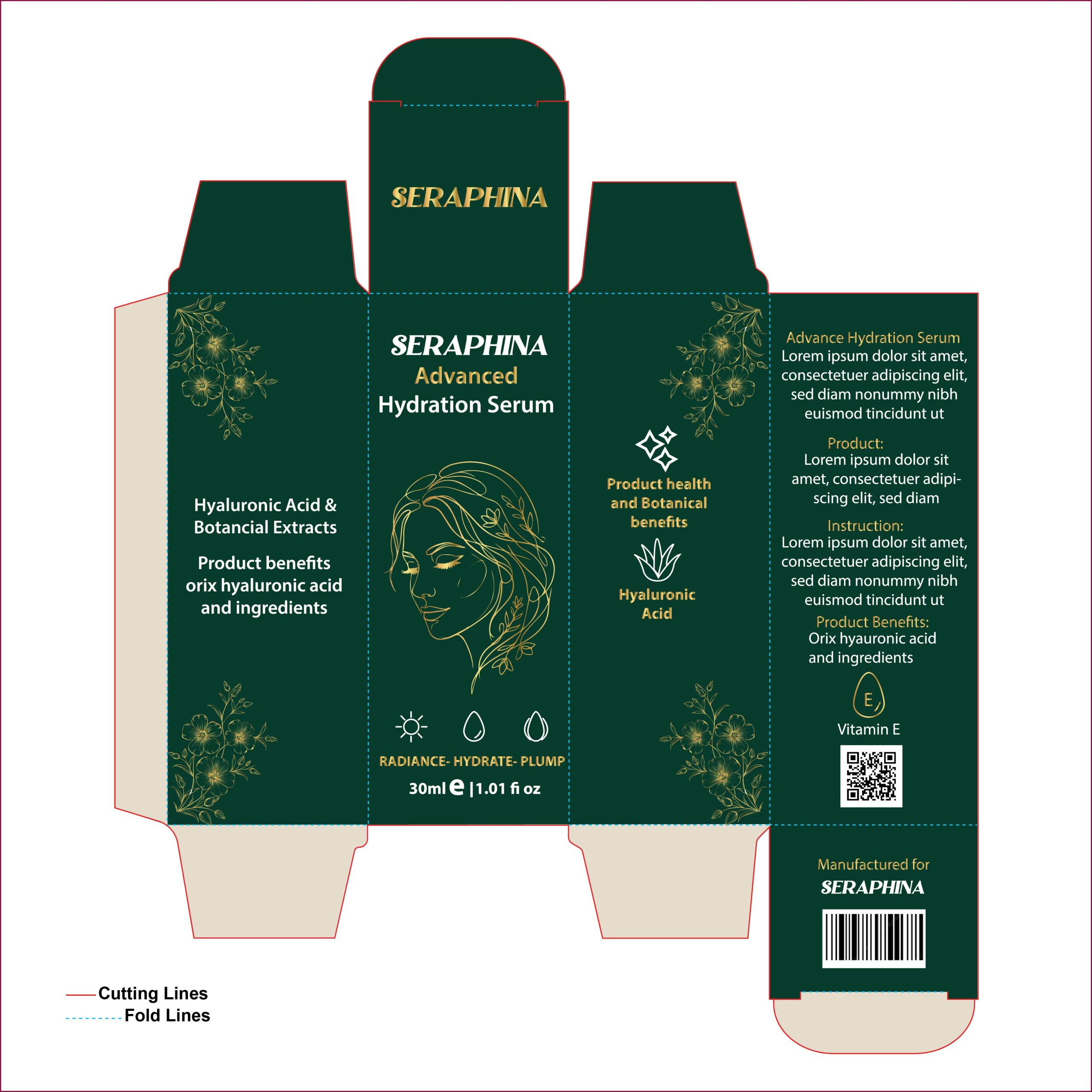
This design for “Seraphina” is a masterclass in understated elegance. By pairing a deep emerald green background with delicate gold line art, the packaging immediately communicates a sense of premium quality and sophistication. The central illustration—a graceful, hand-drawn portrait woven with botanical elements—creates a personal connection and emphasizes the beauty-focused nature of the serum.
5. Emerald Elegance: Mastering Depth and Detail
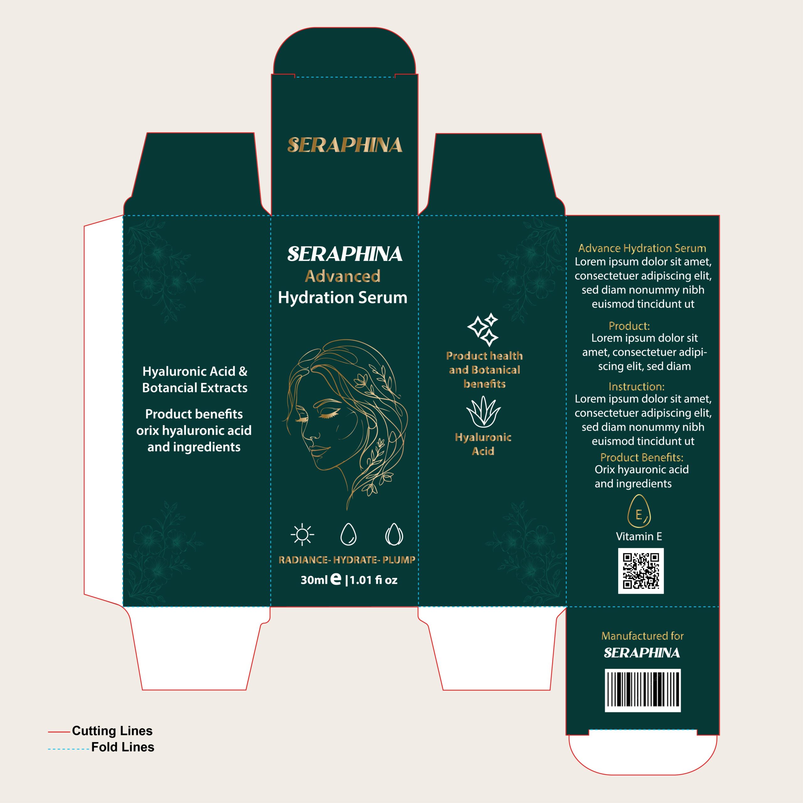
This variation of the “Seraphina” packaging takes sophistication a step further by introducing subtle, tone-on-tone botanical watermarks across the side panels. These faint floral details add a beautiful layer of depth that makes the box feel more “couture” and thoughtfully crafted without cluttering the layout. The deep teal backdrop provides a stunning contrast for the golden line art and crisp typography, maintaining a luxurious, prestige skincare feel. It’s a perfect example of how small, understated details—like the ghosted background patterns and the fine-line portrait—can combine to create a product that looks incredibly premium and exclusive.
6. The Ethereal Glow: Mastering the Iridescent Aesthetic
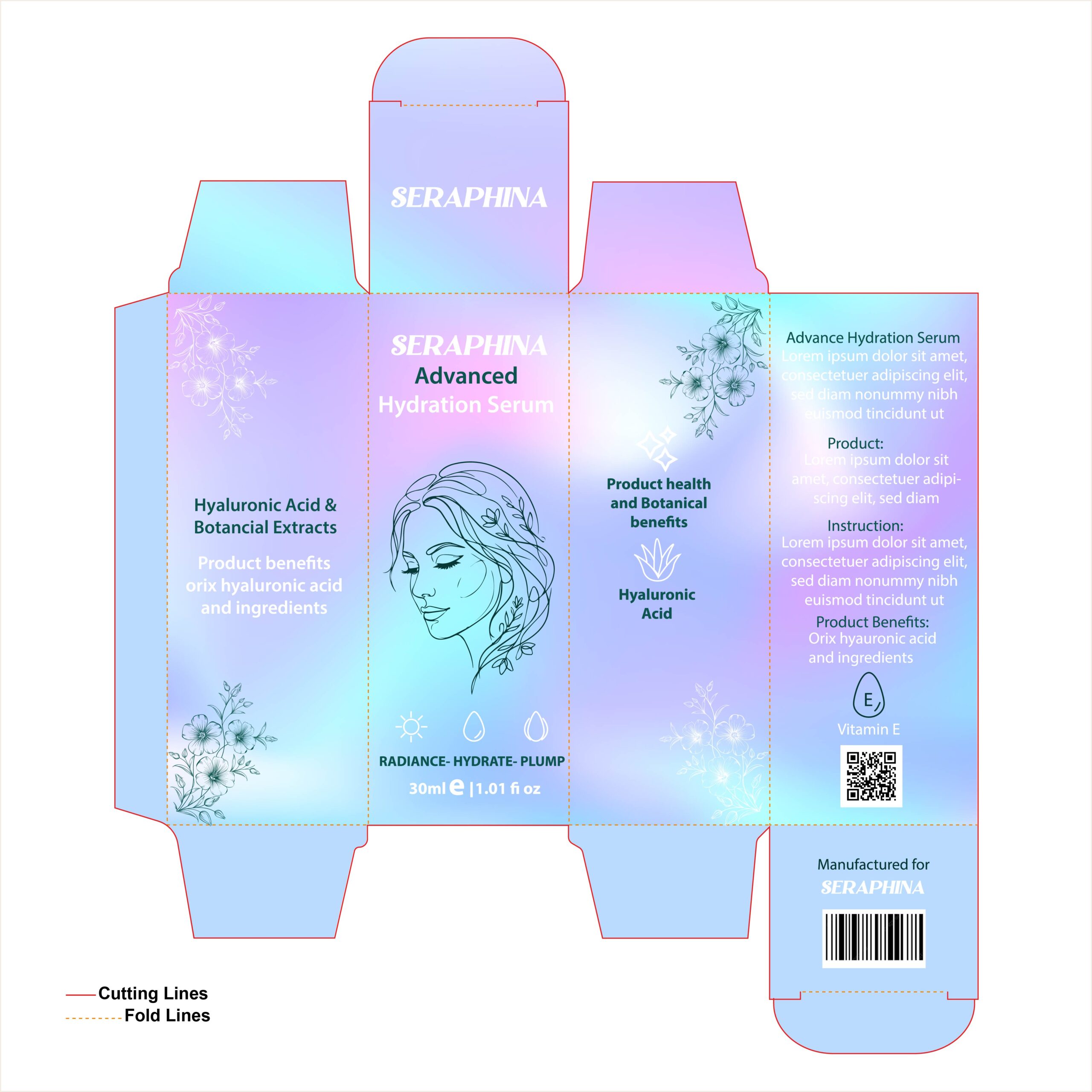
This version of the “Seraphina” packaging is a complete breath of fresh air, shifting from moody luxury to a dreamy, ethereal vibe. The soft, iridescent gradient background—blending hints of lavender, sky blue, and cloud white—perfectly captures that “lit-from-within” radiance that hydration serums promise to deliver. By keeping the fine-line portrait and botanical illustrations in a subtle, dark teal, the design maintains its sophistication while feeling incredibly light and modern. It’s a stellar example of how a “glass-skin” visual approach can make a product feel refreshing, clean, and instantly desirable on a vanity.
7. Midnight Sophistication: A Professional Skincare Aesthetic
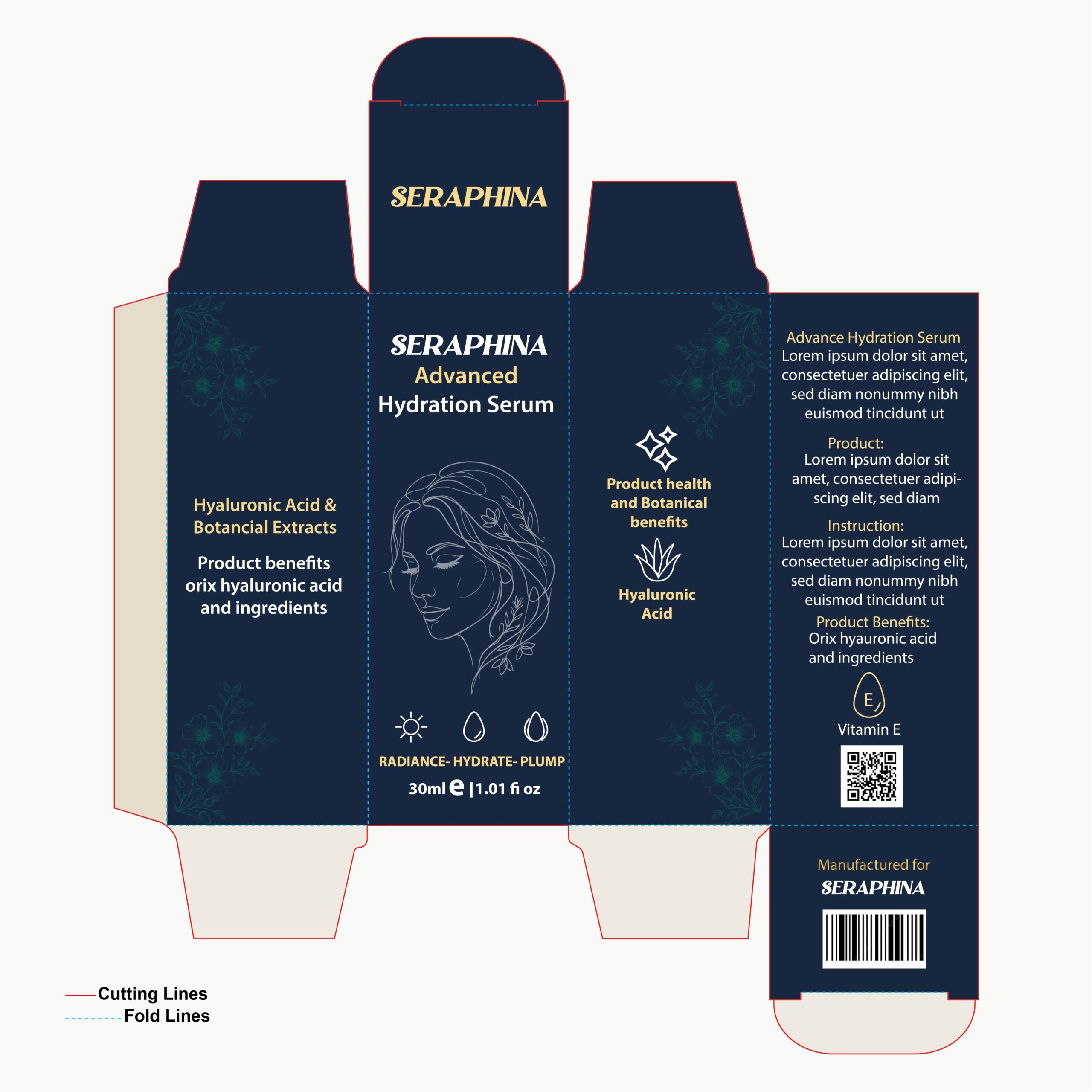
Moving into deeper tones, this navy blue iteration of the packaging leans into the authority of professional-grade skincare. The use of a dark, rich blue instantly evokes thoughts of evening repair and deep hydration, making it perfect for a nighttime serum. What makes this design work so well is the high-contrast silver and gold detailing; it cuts through the dark base with precision, ensuring all information is legible while maintaining an air of mystery and luxury. It’s a bold, confident design that feels high-end, classic, and incredibly trustworthy.
8. Floral Romance: The Art of Botanical Storytelling
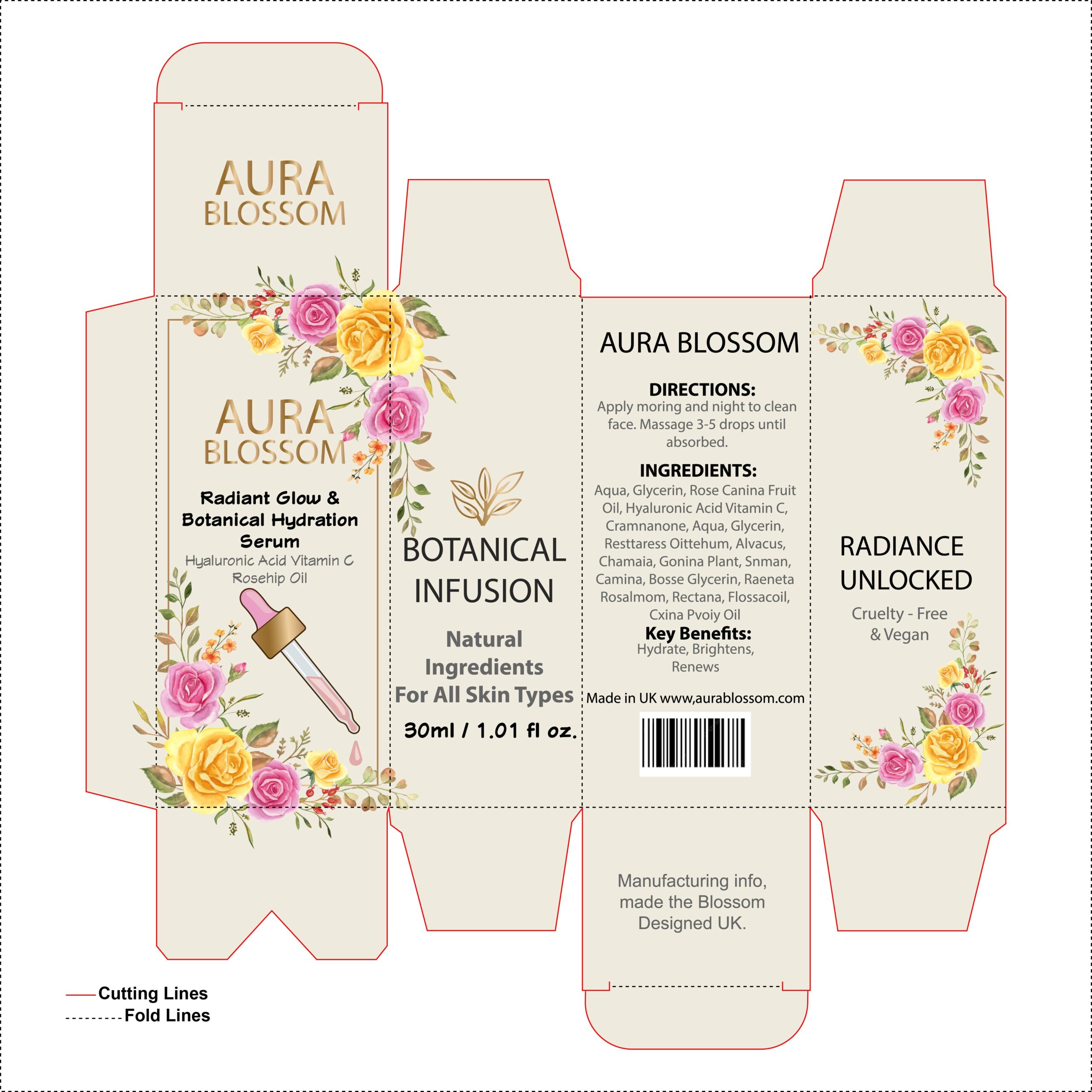
This “Aura Blossom” packaging is a masterclass in using illustration to communicate product ingredients. By moving away from solid dark tones and embracing a warm, cream-colored base, the design feels instantly approachable, gentle, and “clean.” The star of the show is the vibrant watercolor floral arrangement that frames the panels; it doesn’t just look pretty—it visually tells the story of the rosehip and botanical extracts found inside. The addition of a simple dropper illustration is a clever functional touch, making the product’s use clear at a glance. It’s a perfect example of a “boutique” aesthetic that feels handcrafted, premium, and deeply rooted in nature.
9. Blush & Blooms: A Romantic Take on Botanical Care
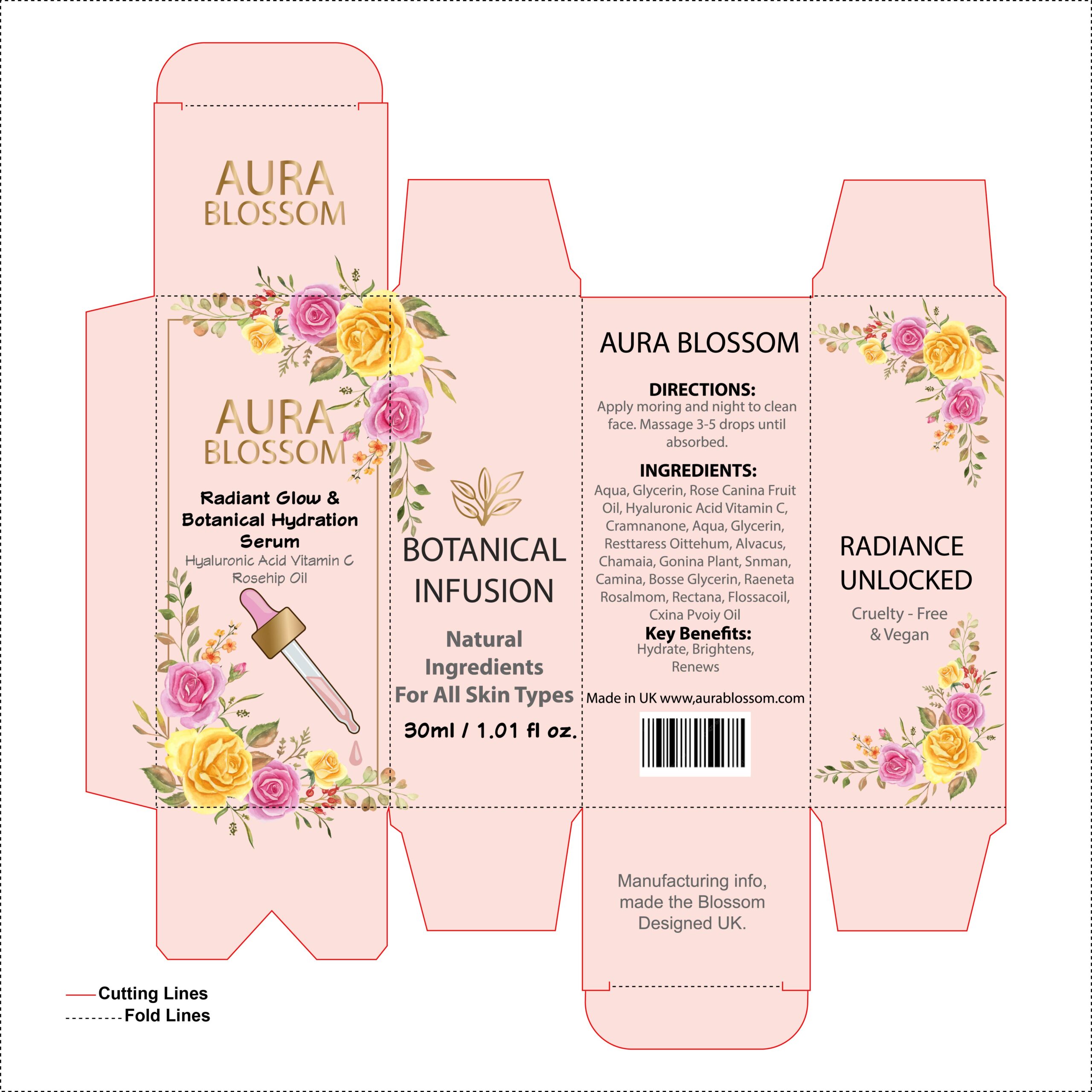
This version of the “Aura Blossom” design shifts the background to a soft, blush-peach tone, instantly making the packaging feel warmer and more “skin-centric.” The change in color provides a beautiful, low-contrast backdrop that allows the vibrant yellow and pink watercolor flowers to truly pop, creating a lush, garden-like frame for the branding. By moving away from a stark cream to this warmer hue, the design leans into a “healthy glow” aesthetic that perfectly matches the promise of a hydration serum. It’s a wonderful example of how a simple shift in background temperature can make a product feel more youthful, romantic, and incredibly inviting to the touch.
10. Sage & Petals: The Earthy Side of Botanical Beauty
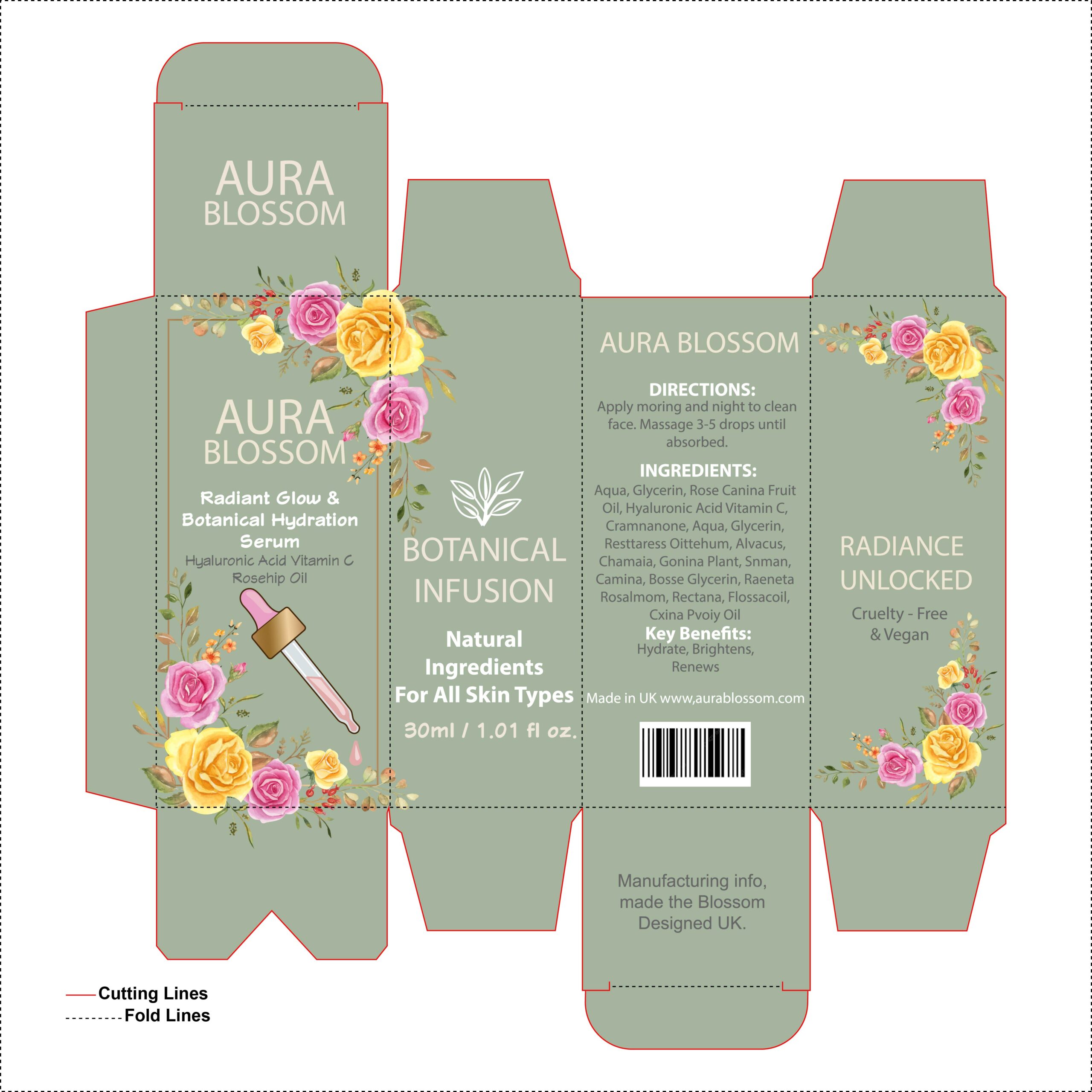
In this design, the choice of a muted sage green background completely transforms the brand identity. By moving away from lighter tones and embracing this earthy, herbal hue, the packaging instantly communicates a “plant-based” and “natural-first” philosophy. The green serves as a sophisticated canvas that makes the gold typography feel more luxurious and the watercolor florals look like they belong in a high-end botanical garden. It’s a perfect example of how “Nature’s Neutrals” can be used to build trust with eco-conscious consumers, making the serum feel both scientifically formulated and harvested directly from the earth.
11. Bold Crimson Luxury: A Statement in Sophistication
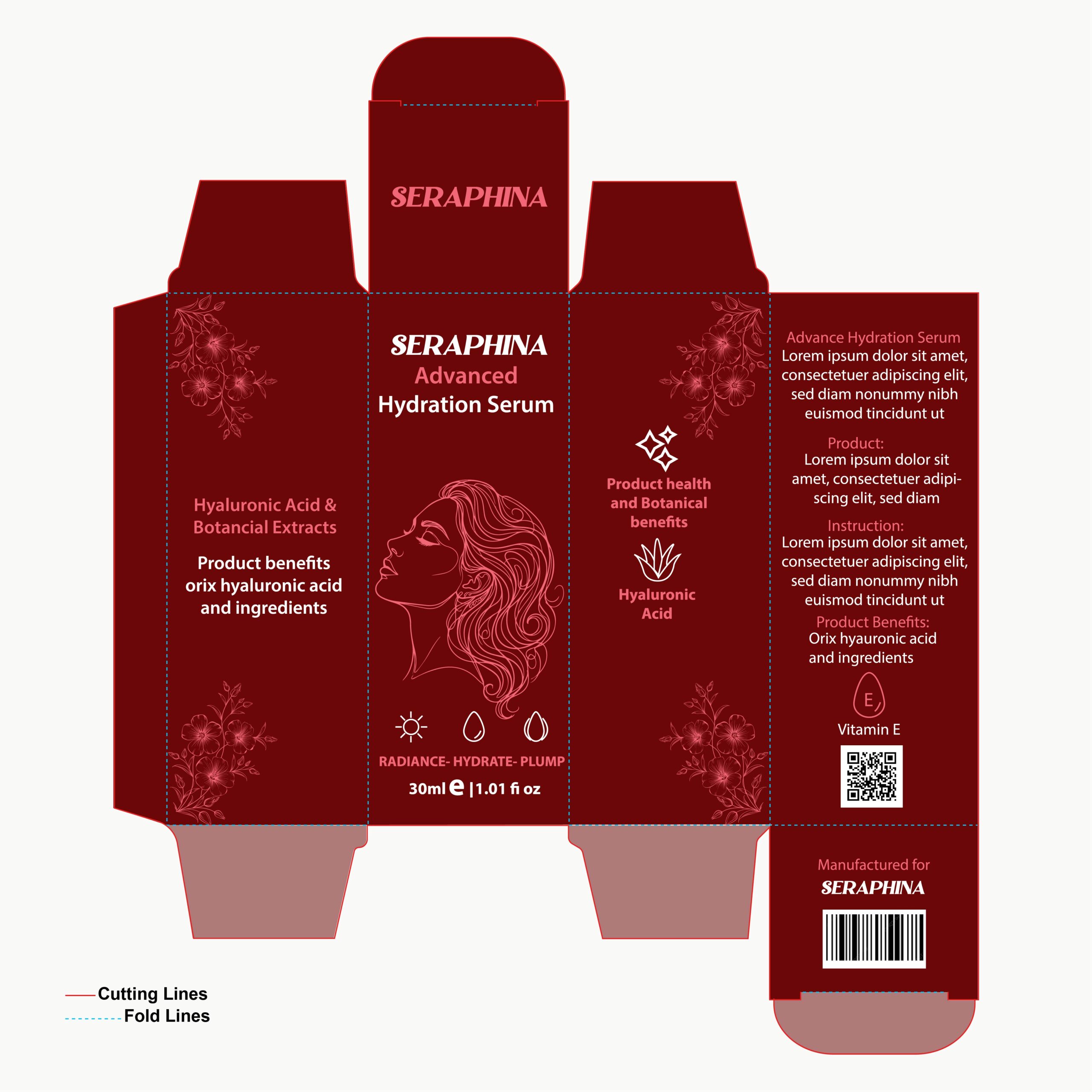
This iteration of the Seraphina packaging moves into a deep burgundy and maroon palette, instantly evoking a sense of maturity, richness, and luxury. The choice of a dark, wine-inspired background allows the fine-line illustration of the woman and the delicate floral accents to shine in a soft, contrasting pink. It’s a design that feels “expensive” and authoritative, making it perfect for a potent anti-aging or nighttime repair serum. By keeping the typography clean and using subtle gold-toned highlights for the brand name, the packaging achieves a perfect balance between bold color and elegant minimalism. It’s a striking look that would feel right at home in a high-end department store or a luxury boutique.
12. Harvest Radiance: A Bold, Botanical Mosaic
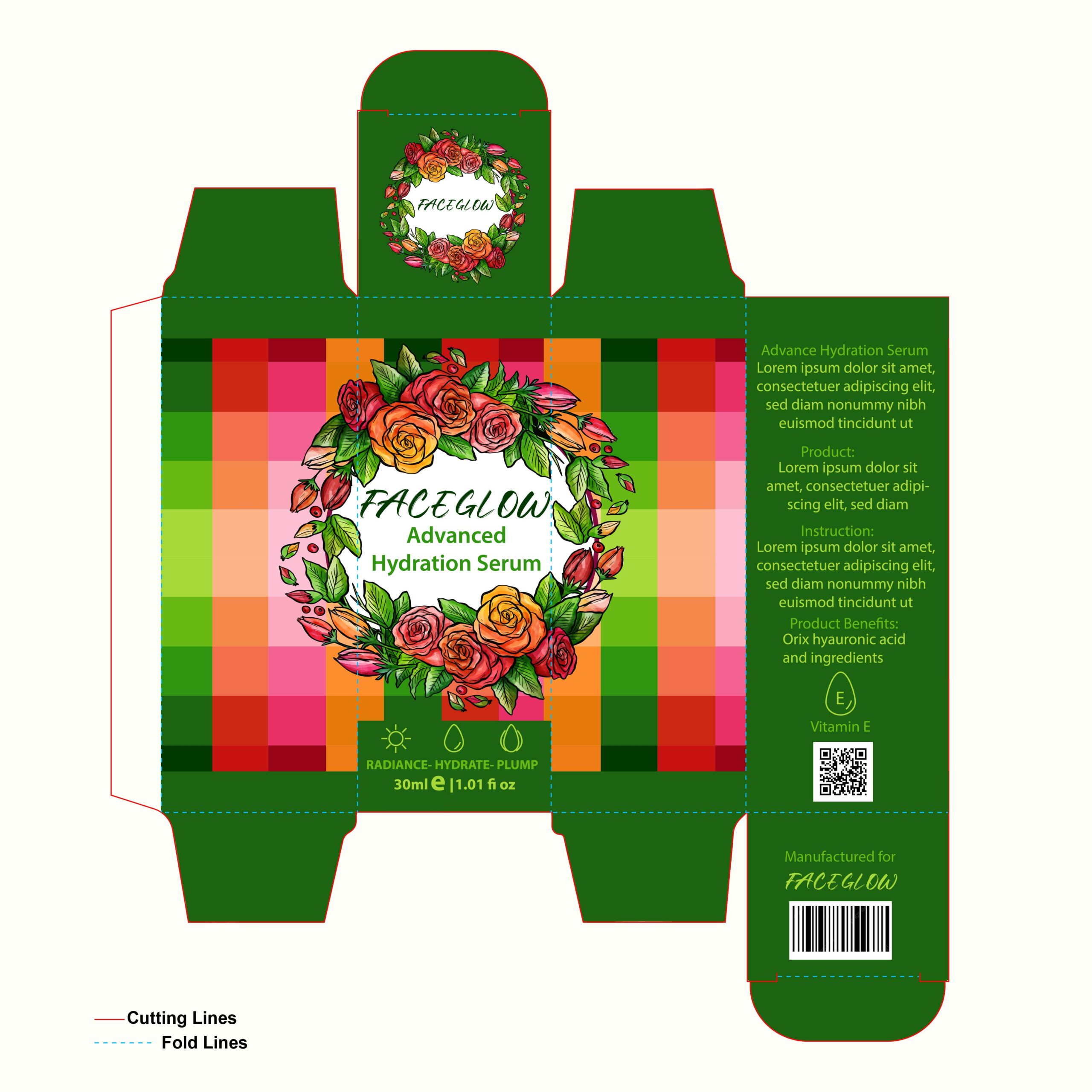
This iteration of the “Faceglow” serum feels incredibly alive and energetic. By pairing a deep forest green base with a pixelated gradient of sunset oranges and reds, the design evokes a sense of autumn harvests and vitamin-rich ingredients. The standout feature is the lush, hand-illustrated floral wreath that surrounds the central branding; it adds a traditional, organic touch that balances out the modern, geometric background. It’s a bold choice that moves away from the typical “minimalist” skincare trend, instead opting for a maximalist look that communicates potency and natural power. This packaging doesn’t just promise hydration—it promises a vibrant, healthy glow through a “botanical infusion.”
13. Vibrant Fusion: Playful Geometrics Meets Soft Florals
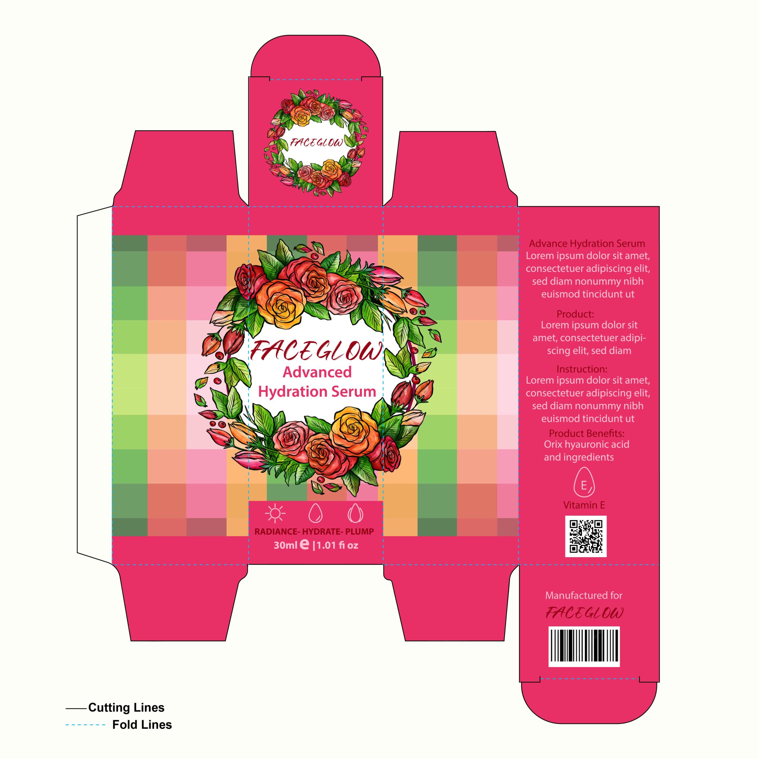
This version of the “Faceglow” packaging is a celebration of high-energy color and texture. By framing the design in a bright, punchy magenta, the box achieves an instant “pop” that feels youthful and social-media-ready. The central panel features a unique pixelated mosaic of soft greens, warm corals, and muted pinks—a clever modern touch that provides a beautiful, textured backdrop for the hand-drawn floral wreath. This contrast between the rigid, digital-inspired grid and the organic beauty of the roses creates a “techno-botanical” vibe that is very trendy right now. It’s a bold, high-contrast design that perfectly captures the brand’s mission to deliver a vibrant, modern glow.
14. Organic Serenity: The Sage & Botanical Concept

This variation of the “Faceglow” packaging takes a sophisticated turn toward the “clean beauty” and natural apothecary aesthetic. By choosing a muted, earthy sage green as the primary base, the design immediately communicates a sense of calm and organic purity. This soft background allows the vibrant, hand-illustrated floral wreath to take center stage, making the roses and greenery look incredibly fresh and natural.
15. Soft Petal Radiance: A Romantic Peach Aesthetic
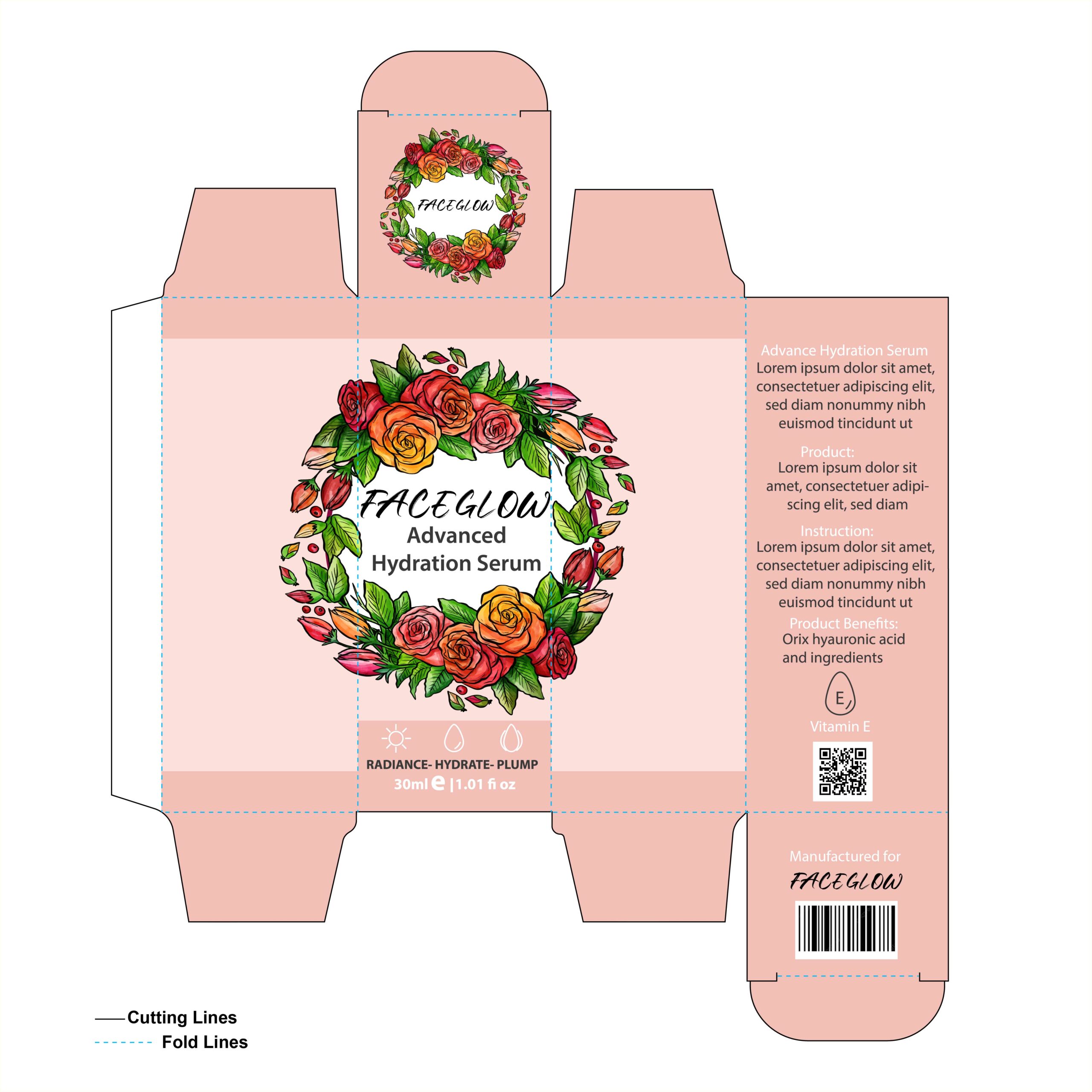
This iteration of the “Faceglow” packaging embraces a soft, blush-peach palette that instantly makes the product feel gentle, skin-friendly, and approachable. By moving away from high-contrast backgrounds and opting for this warm, monochromatic base, the focus shifts entirely to the lush, hand-drawn floral wreath. The vibrant reds, oranges, and greens of the roses pop beautifully against the peach, creating a “garden-fresh” look that feels both boutique and professional. It’s a perfect example of a romantic, “healthy-skin” aesthetic—the kind of packaging that suggests the product inside is as delicate and revitalizing as the flowers on the box.
16. Emerald Luxe: A Modern Botanical Masterpiece
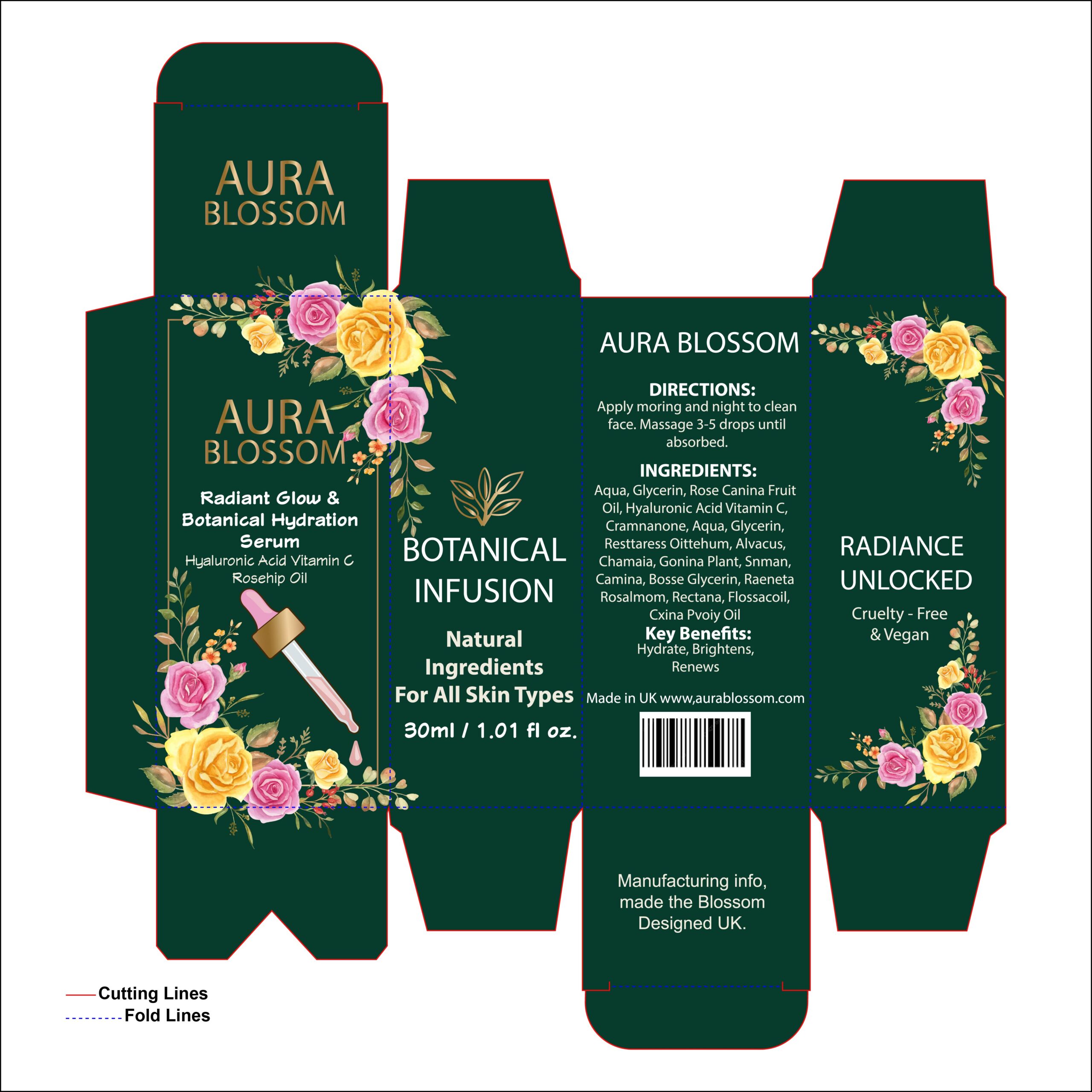
This design for “Aura Blossom” is a perfect example of how to execute the “luxury natural” aesthetic. By using a deep, emerald green as the primary color, the packaging feels immediately premium and authoritative. The contrast between the dark, moody base and the vibrant, hand-painted watercolor florals makes the design feel fresh and alive. I love the addition of the gold-toned branding—it gives the box a high-end apothecary feel that would look beautiful on any vanity. The inclusion of the dropper illustration on the front is a smart functional touch, clearly communicating the product type while maintaining a sophisticated botanical vibe.
17. Midnight Gold: A Masterclass in Premium Minimalism
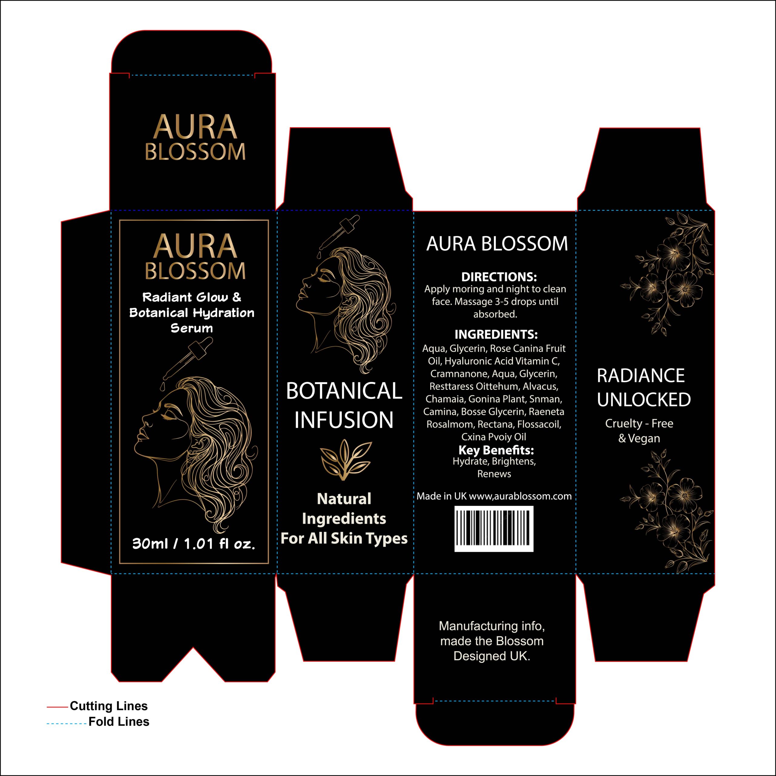
This “Aura Blossom” concept takes a bold leap into high-end luxury by pairing a deep, solid black backdrop with shimmering gold line art. The design feels incredibly sophisticated and exclusive, using fine-line illustrations of a woman’s profile and delicate botanicals to create an artistic, “boutique” aesthetic.
18. Line Art Luxury: The Minimalist “Clean Beauty” Aesthetic
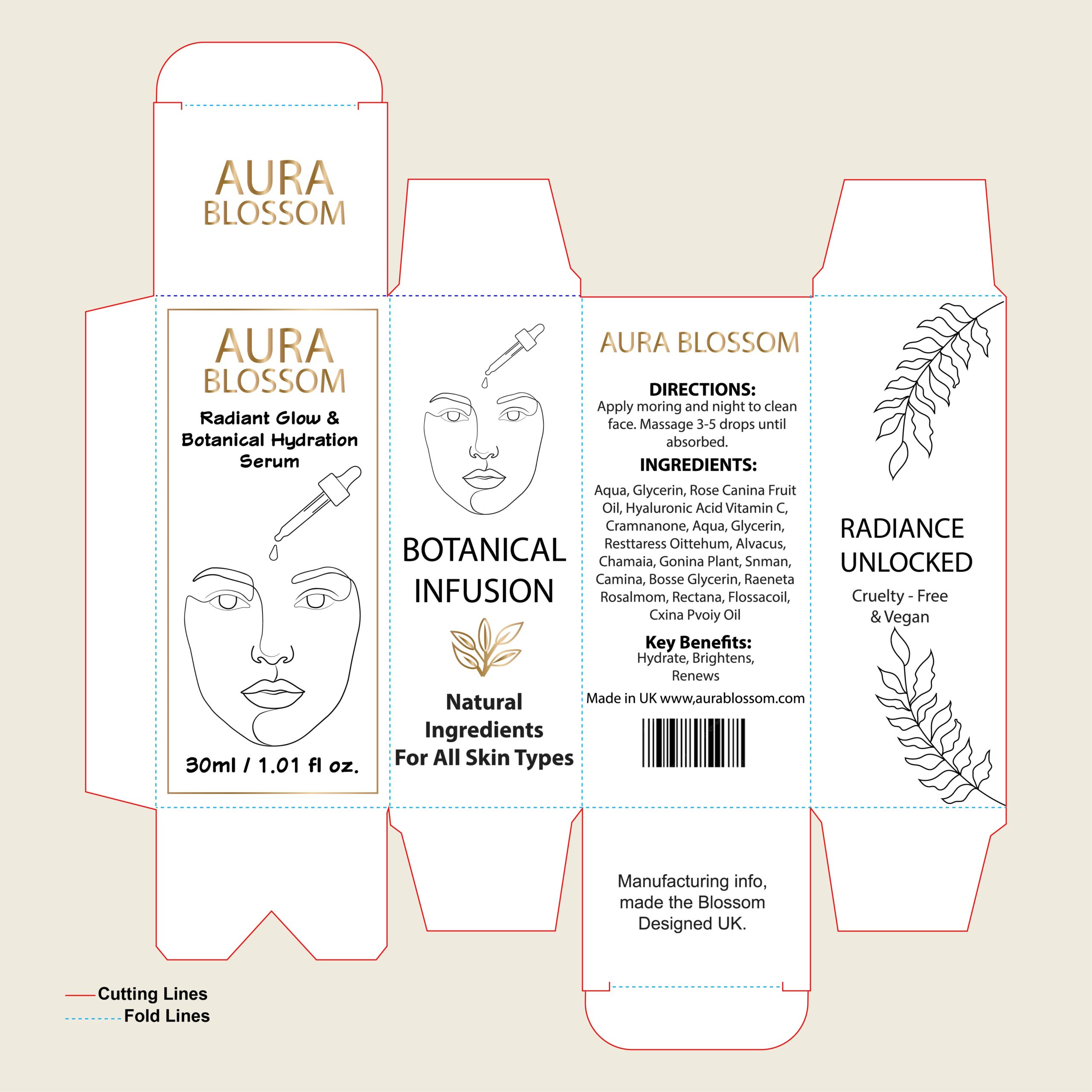
This concept for “Aura Blossom” perfectly captures the “less is more” trend dominating the modern skincare market. By utilizing a soft, neutral cream base and sophisticated gold accents, the design feels incredibly clean, honest, and high-end. The standout feature is the use of minimalist line art—both in the face portrait and the botanical sketches—which gives the packaging a contemporary, artistic soul. It’s a design that appeals to the conscious consumer who values transparency and simplicity. This look doesn’t need loud colors to grab attention; its elegance and clinical-yet-artistic layout communicate a sense of purity and premium quality that feels both timeless and very on-trend.
19. Organic Sophistication: Balancing Minimalism and Nature
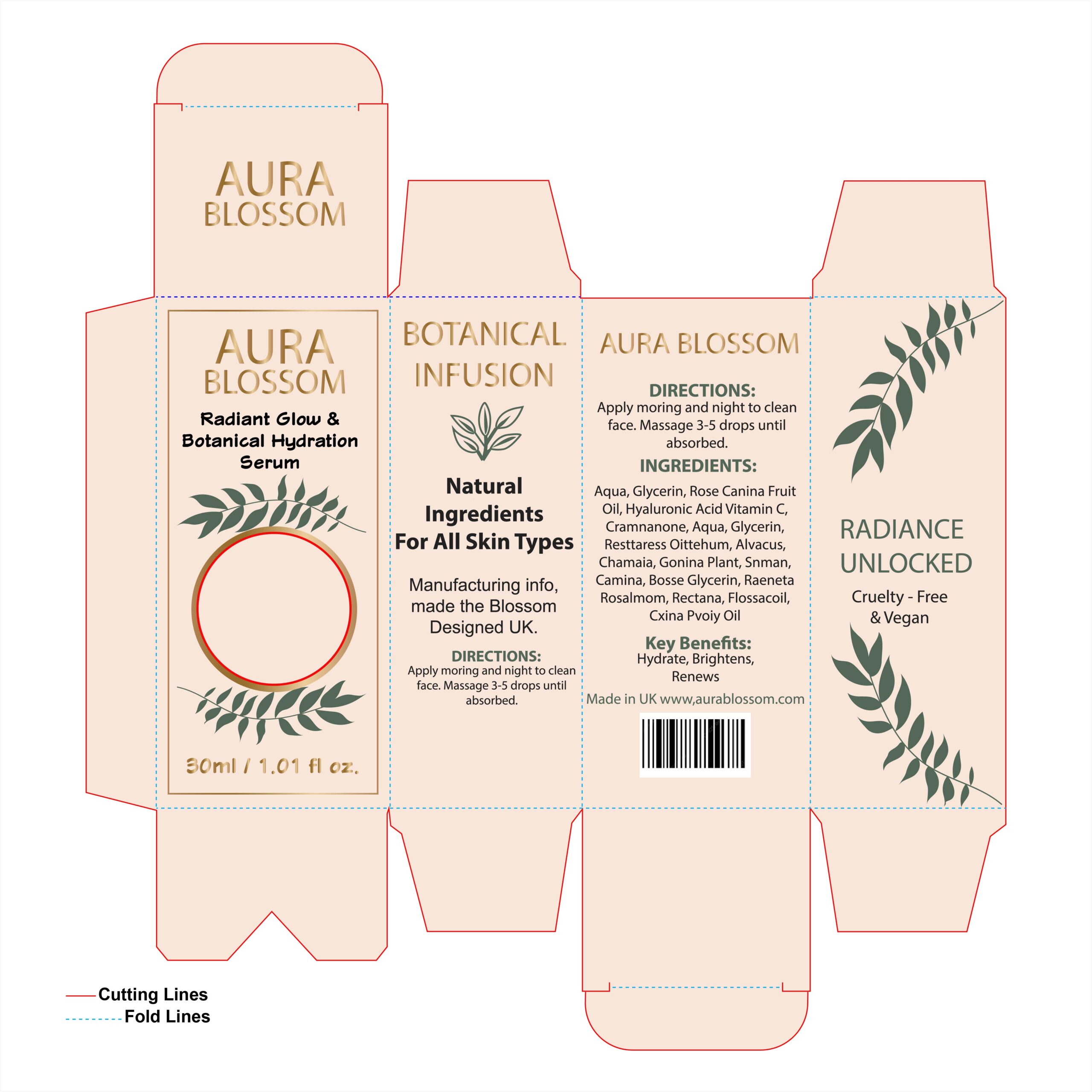
This concept for “Aura Blossom” leans into the “natural luxury” trend with great success. The soft peach-cream background provides a warm, inviting feel, while the gold typography adds a subtle touch of prestige. What really makes this design work is the dark green botanical leaf sketches; they provide a grounding, earthy contrast to the lighter tones and frame the central focus beautifully. The layout is clean and uncluttered, allowing the brand’s message of “Botanical Infusion” to take center stage. It’s a design that feels both high-end and deeply rooted in wellness, making it perfect for a modern skincare brand that wants to appear professional yet gentle.
20. Midnight Radiance: A Masterclass in High-Contrast Luxury
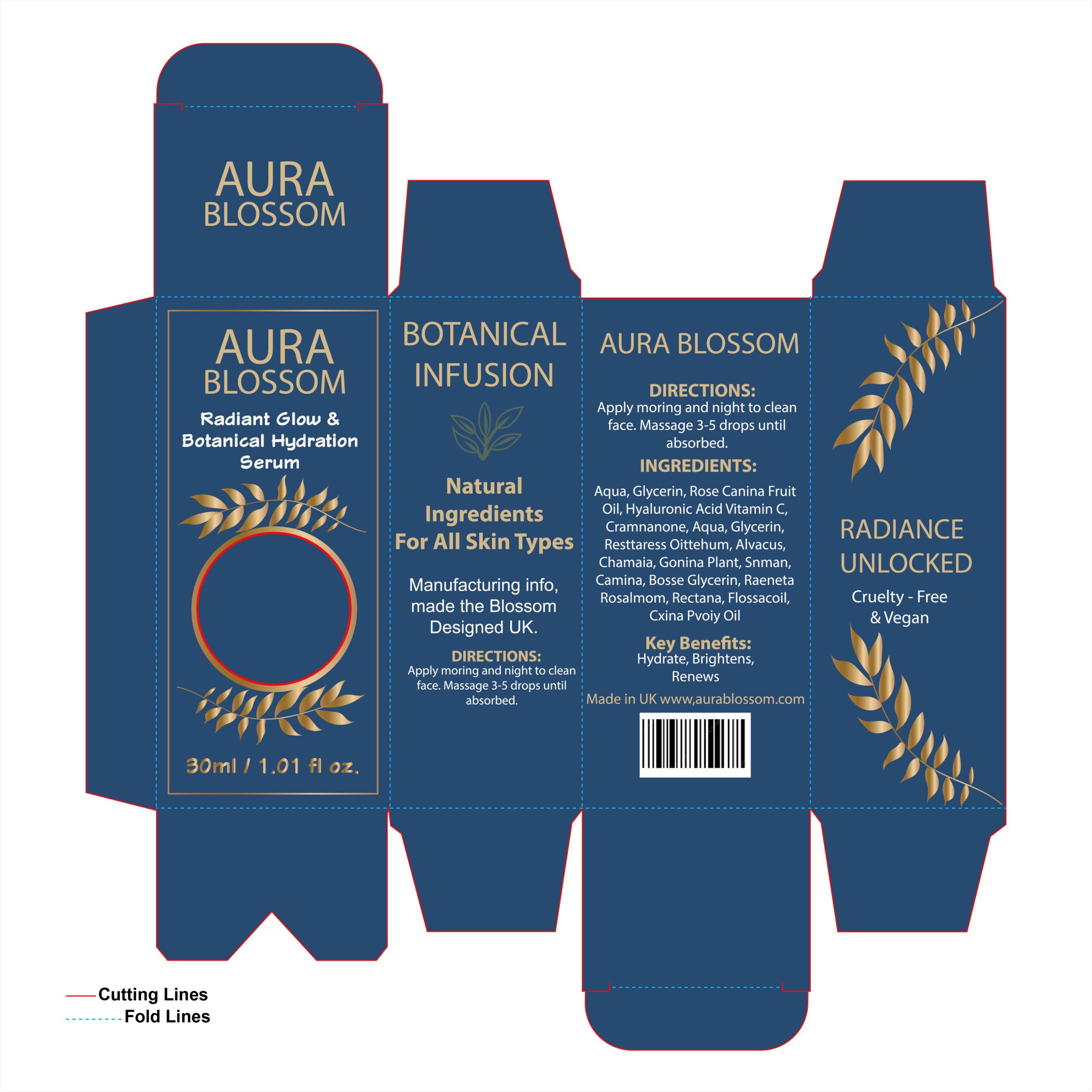
This deep navy iteration of the “Aura Blossom” packaging is a stunning example of how color contrast can define a brand’s authority. By pairing a rich, professional blue with shimmering gold accents, the design moves away from soft botanicals and into the realm of prestige, high-performance skincare. The gold leaf illustrations framing the center add a touch of timeless elegance, while the clean typography ensures the product’s benefits remain the focus. It’s a bold, confident look that suggests a powerful nighttime ritual, making the serum feel like an essential, premium “hero” product in any advanced skincare routine.
21. The Modern Mosaic: Bridging Technology and Nature
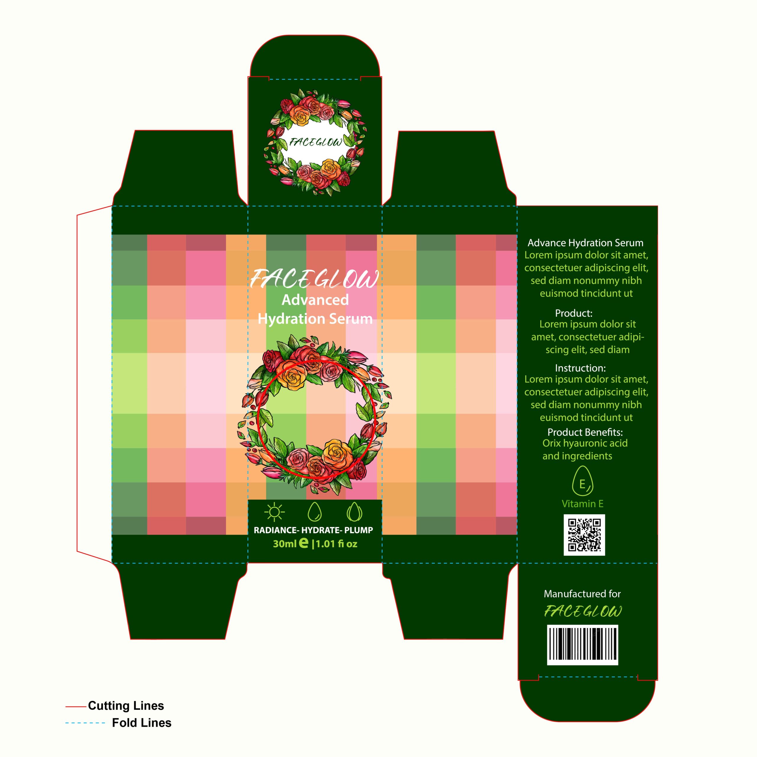
This “Faceglow” design is a fascinating study in contrast, blending a modern, digital-inspired grid with soft, traditional botanical art. The deep forest green framing provides a high-end, grounded feel, while the central panel features a pixelated gradient of “juicy” citrus oranges and soft pinks that suggest a burst of hydration. By pairing this abstract geometry with a lush, hand-illustrated floral wreath, the packaging manages to feel both scientifically advanced and naturally derived. It’s a great example of how a designer can use a textured, multicolored background to create visual energy without overwhelming the core branding.