16 Masala Packaging Designs Every Packaging Designer Should Know
Masala packaging design is one of the most nuanced and competitive spaces in the packaging industry. With hundreds of spice brands vying for shelf presence, the difference between a product that sells and one that gets overlooked often comes down to design precision — from structural format to typography, color psychology, and material choice.
For packaging designers, masala projects present a unique creative challenge: how do you communicate aroma, authenticity, and quality through a visual medium? Whether you’re working on a premium artisan spice brand or a high-volume retail product, the design decisions you make directly influence consumer trust and purchase behavior.
In this blog, we’ve curated 16 masala packaging design ideas that showcase a range of approaches — from minimalist modern to culturally rich traditional styles. Each idea is analyzed from a designer’s perspective to help you draw practical inspiration for your next masala packaging project.
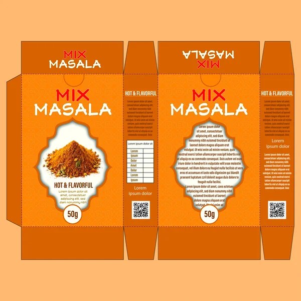
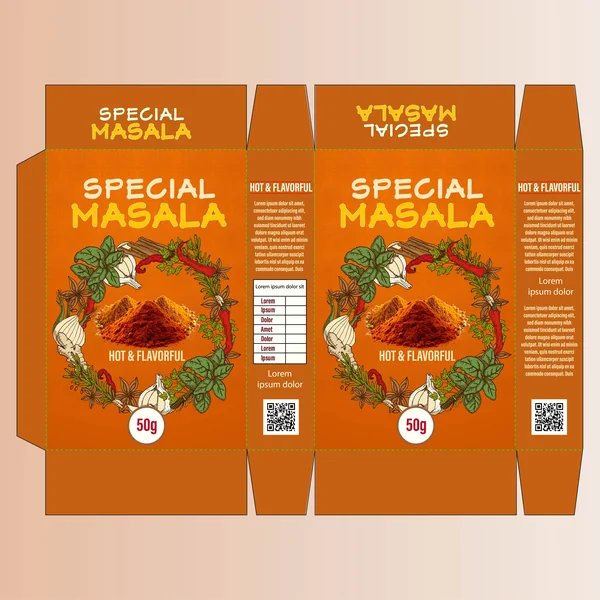
1. Warmth & Heritage
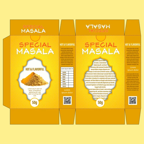
This design leverages a vibrant ochre and amber color palette, instantly signaling the rich, earthy tones of traditional spices. The use of a repeating geometric pattern in the background adds a layer of cultural texture without making the layout feel cluttered.
Key design elements include:
The Focal Window: The central archway—reminiscent of traditional architecture—perfectly frames the product photography, making the spices the “hero” of the package.
Typography: The bold, slightly weathered font for “Special Masala” gives the brand a rustic, handcrafted feel, suggesting a recipe that is both time-tested and “Hot & Flavorful.”
Balance: By keeping the side panels clean with organized typography and a QR code, the design bridges the gap between traditional aesthetics and modern consumer convenience.
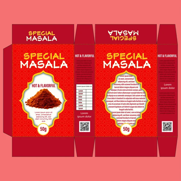
2. Bold Intensity & Spice
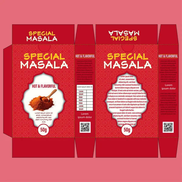
This Design is about fire and flavor. The deep crimson and chili-red base immediately signals a product with kick, making it stand out on a shelf against more muted competitors.
Key design highlights:
High-Contrast Palette: The use of bright yellow and white typography against the dark red background ensures maximum readability. It creates a “warning” of spice while remaining appetizing.
The Hero Graphic: By adding a wooden spoon into the product window, the design adds a human, culinary touch. It suggests the spice is ready to be measured and used in a home-cooked meal, making the product feel more accessible.
Intricate Patterning: The subtle geometric background pattern is more pronounced here than in the first version, giving the packaging a premium, “specialty” feel that justifies the “Special Masala” branding.
3. Freshness & Complex Blends
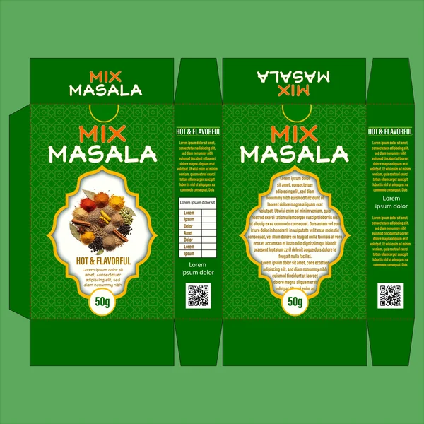
This design utilizes a deep forest green palette, which moves away from the pure heat of red and toward a more natural, herb-forward narrative. It suggests a “Mix Masala” that is balanced, versatile, and grounded in fresh ingredients.
Key design highlights:
The “Whole Spice” Visual: Unlike the previous designs that showed ground powders, this version features an array of whole spices (cinnamon, cloves, peppercorns). This communicates a message of quality and “from-scratch” authenticity, appealing to consumers who value the complexity of a blend.
Color Psychology: The green base, paired with the pops of yellow and orange in the spices, creates a high-end, organic look. It feels less like a “hot” chili powder and more like a sophisticated, multi-purpose culinary tool.
Modern Typography: The clean white and orange text for “Mix Masala” pops beautifully against the dark background, maintaining the brand’s signature style while clearly differentiating this specific product from the rest of the line.
4. Earthy Elegance & Depth
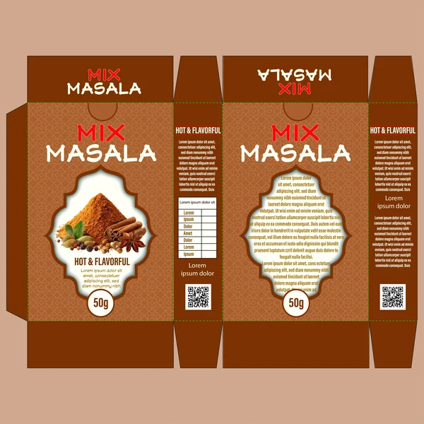
This design shifts the focus toward longevity and richness by using a deep chocolate and terracotta brown base. While the previous designs used color to signal heat or freshness, this palette speaks to the earthy, toasted notes of a slow-roasted masala blend.
Key design highlights:
The “Full Story” Visual: The product window beautifully combines the final ground powder with its raw components—cinnamon sticks, star anise, and green cardamom. This effectively tells a “seed-to-spice” story, reassuring the customer of the blend’s complexity.
Refined Contrast: The choice of muted orange and crisp white typography against the dark brown creates a high-end, artisanal feel. It looks like a product found in a boutique spice shop rather than a generic supermarket aisle.
Warmth Without the Burn: By moving away from aggressive reds, this design appeals to the “gourmet” cook. It promises a flavor profile that is savory, aromatic, and deeply satisfying rather than just “spicy.”
5. Zesty Vibrancy & Kitchen Staples
This design utilizes a bright, citrusy orange palette that sits right between the intensity of the red and the earthiness of the brown. In the world of packaging, this shade of orange is often associated with appetite stimulation and zest, making it an ideal choice for a daily-use “Mix Masala.”
6. Pure Power & Visual Focus
This design utilizes a high-saturation red base, but what sets it apart is the stark, clean presentation of the product. By removing secondary elements (like spoons or whole spices) and focusing on a singular, peaked mound of masala, the design communicates a “no-nonsense” approach to quality.
7. The Artisanal Harvest
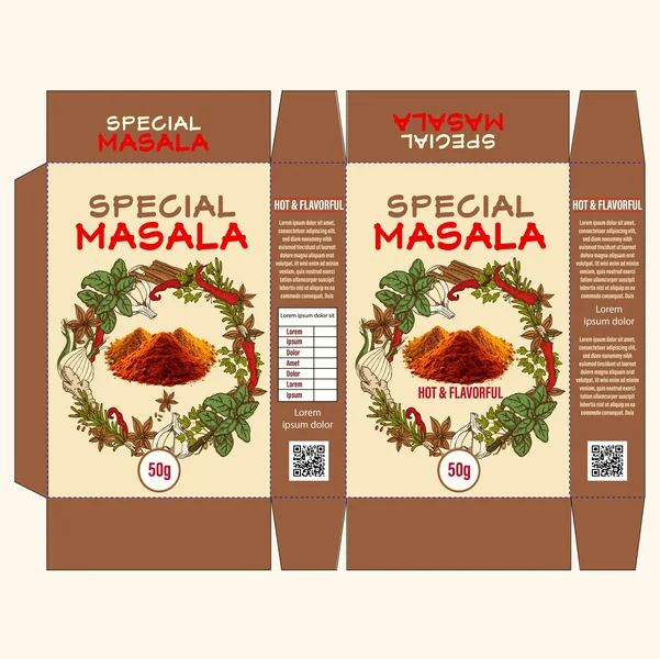
This design breaks away from the geometric patterns of the previous iterations and embraces a cream-colored, parchment-style background. This choice immediately evokes a “farm-to-table” or organic feel, suggesting that the ingredients are sourced directly from nature.
8. Rustic Boldness
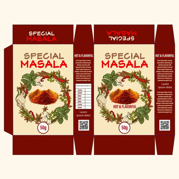
Building on the botanical theme, this design replaces the lighter brown accents with a deep, mahogany red-brown. This simple color shift transforms the “Harvest” concept into something that feels more concentrated and savory, perfect for a spice blend that boasts a smoked or deep-roasted profile.
9. The Vintage Mandala
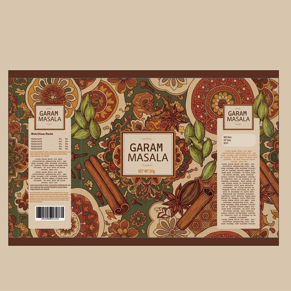
This design is a masterclass in ornate storytelling. By using a full-bleed, hand-illustrated pattern, the packaging stops being just a box and becomes a piece of art. It’s perfect for a “Garam Masala,” which is itself a complex, storied blend of many spices.
10. Crimson Heritage & Warmth
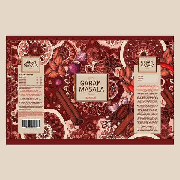
While the previous vintage design felt earthy and calm, this version uses a deep mahogany and crimson palette to evoke a sense of luxury and intense flavor. It is a masterclass in using “warm” colors to suggest a Garam Masala that is both aromatic and potent.
11. Verdant Heritage & Spice
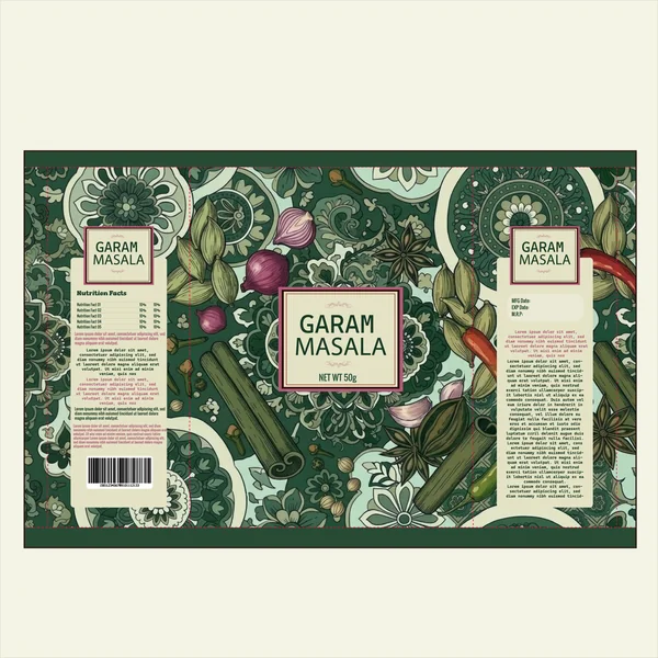
This design utilizes a deep forest and sage green palette, which completely transforms the vintage mandala aesthetic. While the previous red and ochre versions felt “warm” and “roasted,” this green version feels fresh, botanical, and garden-inspired.
12. Golden Earth & Sepia Tones
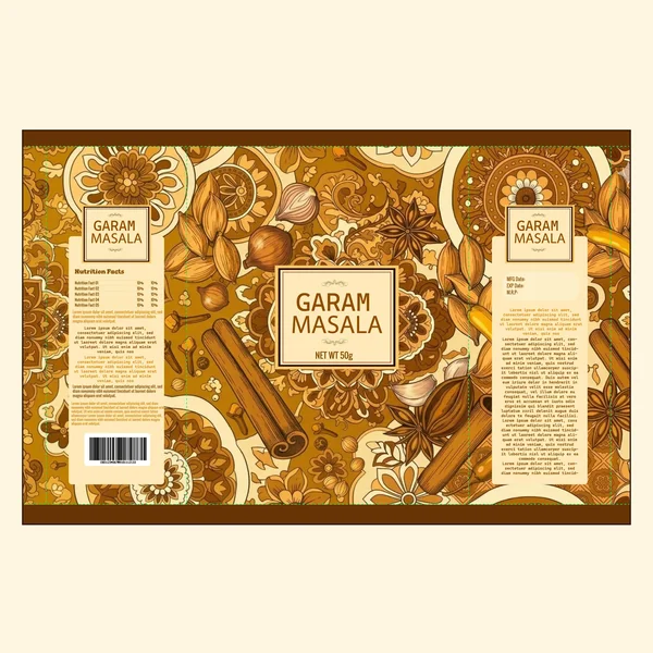
This design returns to a monochromatic sepia and golden-brown palette, stripping away the bright reds or greens to focus on the purity of the spice origin. This specific color scheme mimics the look of vintage botanical journals or aged parchment, lending the brand a sense of “time-honored” expertise.
13. Midnight Spice & Azure Elegance
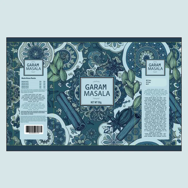
This final design takes the vintage mandala series into a bold, cool-spectrum palette of navy, teal, and slate blue. While spice packaging traditionally leans on warm reds and yellows, this “Midnight” aesthetic positions the Garam Masala as a premium, sophisticated ingredient—perhaps a signature blend meant for special occasions.
14. Sun-Dried Spice & Earthy Botanicals
This design uses a rich ochre-orange base, striking a perfect middle ground between the fiery red of the intense blends and the muted cream of the organic series. This color choice suggests a product that has been sun-dried and slowly processed, emphasizing a natural, traditional warmth.
15. Dark Roast Sophistication
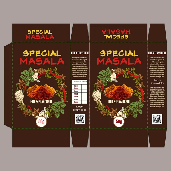
This design utilizes a deep espresso and charcoal background, which provides a stunning, high-contrast canvas for the colorful botanical wreath. In the world of specialty foods, dark packaging is a universal symbol for premium quality and concentrated flavor, signaling that this “Special Masala” is for the serious home chef.
16. Roasted Earth & Rustic Charm
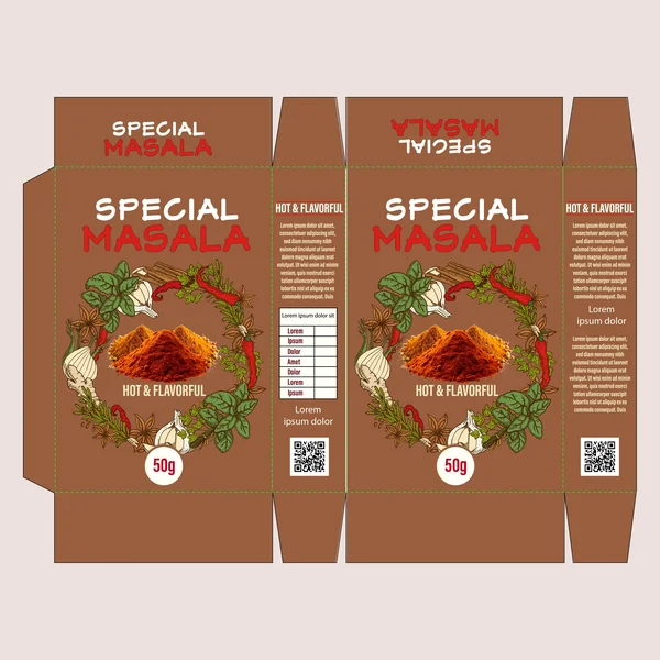
This design utilizes a warm cocoa-brown base, which creates a comforting, grounded feel. Unlike the black background which feels exclusive and luxury, this brown palette feels homely and authentic. It suggests a spice blend that has been slow-roasted to perfection, offering a deep, savory profile rather than just raw heat.