12 Hardware Packaging Designs That Combine Function, Durability, and Brand Impact
When it comes to hardware products, packaging is far more than a protective shell — it is your first handshake with the customer. Whether you are selling power tools, fasteners, electrical components, or hand tools, the right packaging design directly influences purchase decisions, builds brand credibility, and sets you apart on a crowded retail shelf.
In this guide, we have curated 12 of the most effective and innovative hardware packaging designs used by leading brands and emerging manufacturers alike. Each design has been selected based on its practicality, visual appeal, shelf performance, and ability to communicate product value instantly.
If you are a business owner looking to redesign your product packaging or launch a new hardware line, this breakdown gives you real, actionable insight into what works — and why it works.
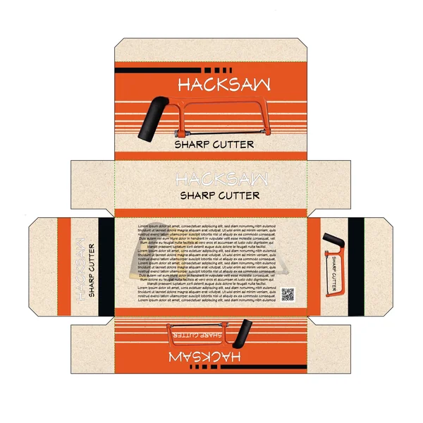
1. Consumer-Centric
Engineered for maximum visibility, this layout uses bold horizontal banding to create a sense of movement and precision. The typography is kept modern and straightforward, making it easy for customers to identify the tool at a glance. It’s a clean, organized approach that moves away from the cluttered look of traditional hardware packaging, leaning instead toward a more curated, “pro-sumer” aesthetic.
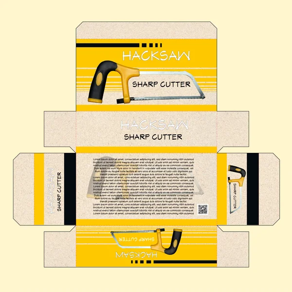
2. Modern Industrial Appeal
This packaging successfully bridges the gap between traditional tool branding and modern graphic design. The use of high-contrast banding and a minimalist dieline approach results in a look that is both functional and shelf-ready. It’s a design that feels authoritative and straightforward, perfect for a professional-grade “Sharp Cutter” that doesn’t need unnecessary gimmicks to sell its quality.
3. Technical & Functional Detail
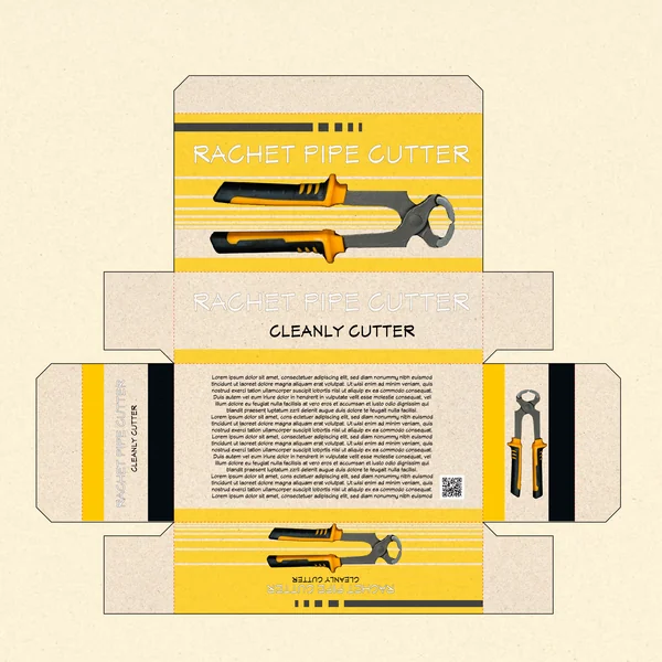
Combining raw materials with high-energy graphics, this layout offers a refreshed look for the plumbing tools category. The contrast between the organic texture of the paper and the sharp, geometric lines of the black and yellow accents creates a professional, “workshop-ready” vibe. It’s a clean, minimal approach that strips away the noise to let the high-quality product photography do the talking.
4. Emphasis on Impact and Power
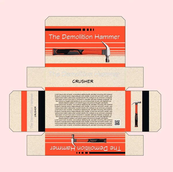
This packaging design utilizes a vibrant orange and deep black palette to mirror the high-intensity nature of demolition work. The bold, white “The Demolition Hammer” typography commands attention, while the horizontal linear accents suggest speed and precision strike-capability. By grounding the vibrant colors with a natural, textured cardboard aesthetic on the side panels, the design achieves a look that is both modern and ruggedly industrial.
5. Bold Vertical Presence
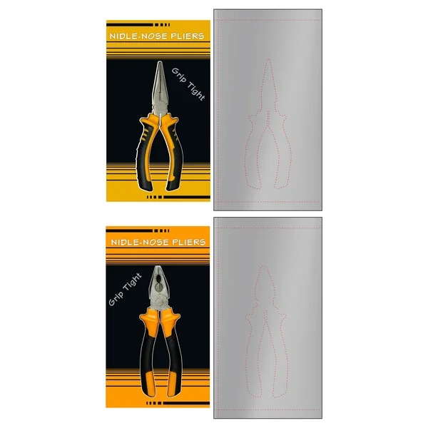
This layout utilizes a striking split-tone background, pairing a deep black core with high-energy yellow headers and footers. The vertical orientation is designed to maximize shelf impact, using the central black space to make the product photography “pop.” The “Grip Tight” tagline is positioned at an angle to create a sense of dynamic action, reinforcing the tool’s primary benefit in a modern, stylish way.
6. Focus on Performance & Strength
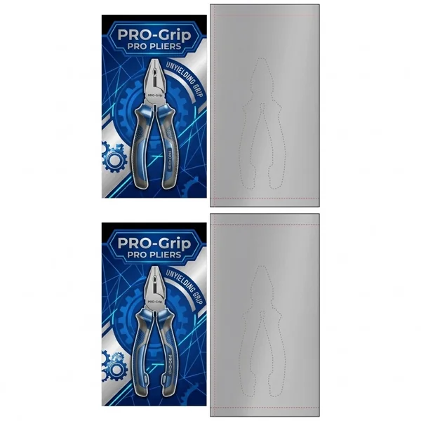
With the “UNYIELDING GRIP” tagline placed along a curved architectural line, this layout emphasizes the product’s primary strength. The use of bold, shield-like branding for the “PRO-Grip” logo suggests protection and durability. This design is clearly aimed at the professional market, where reliability and high-performance specs are the top priority for the consumer.
7. Professional Utility & Retail Appeal
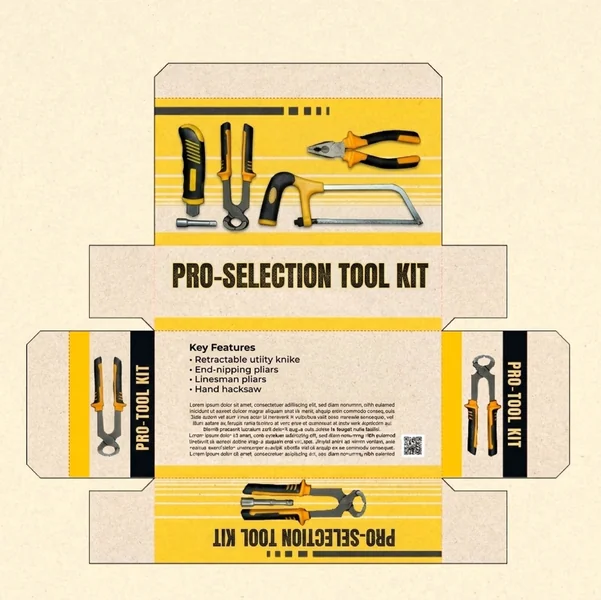
The “Pro-Selection” branding uses a stencil-style font that evokes a sense of heavy-duty workshop equipment. This version excels at balancing technical data with high-impact graphics. It’s a masterclass in “kit branding,” where the packaging feels like a cohesive toolbox itself, suggesting that the items inside are curated for high-performance and professional-grade results.
8. Premium & Elite Positioning
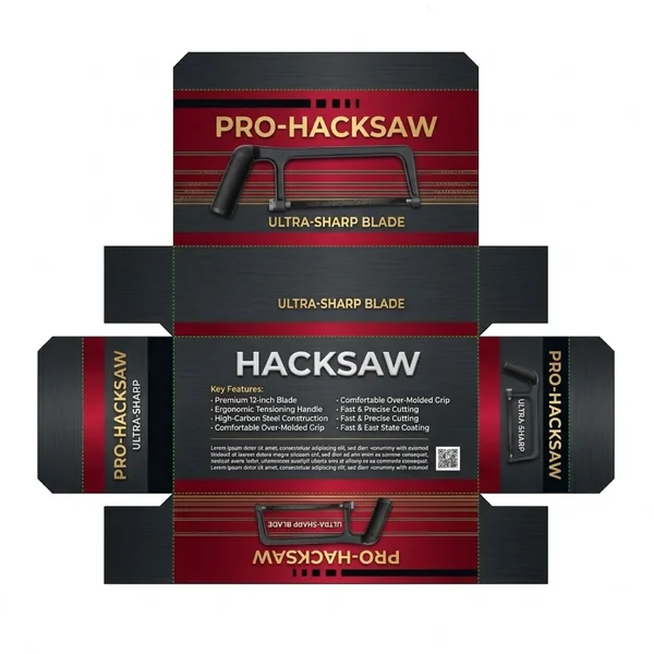
This design elevates the standard hardware look by using a rich, dark burgundy and charcoal palette. The metallic gold accents for the “PRO-HACKSAW” branding and “ULTRA-SHARP BLADE” tagline immediately signal a “top-of-the-line” product. By replacing the raw cardboard texture with a sleek, brushed-metal graphic, the packaging communicates high-end quality and precision, appealing to the professional who wants the best tools in their kit.
9. Sophisticated Metallic Aesthetic
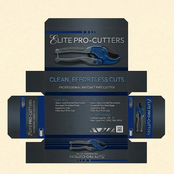
This packaging moves away from traditional safety colors in favor of a deep metallic blue and brushed charcoal finish. The use of a serif font for “Elite” combined with clean sans-serif branding creates a premium, high-tech feel. The dark, textured background allows the product photography to stand out with a 3D quality, signaling to the consumer that this tool is a precision-engineered instrument for professional use.
10. Modern “Pro-Tier” Aesthetic
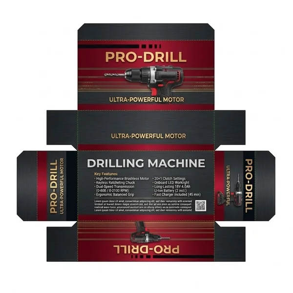
This design moves away from standard DIY packaging by adopting a sleek “Dark Mode” theme. The combination of deep red, gold, and textured black creates an authoritative brand identity that stands out in the power tool aisle. It communicates a message of “professional-grade” strength, utilizing a structured dieline to ensure that key branding and imagery are visible from every angle on the shelf.
11. Technical Graphic Detail
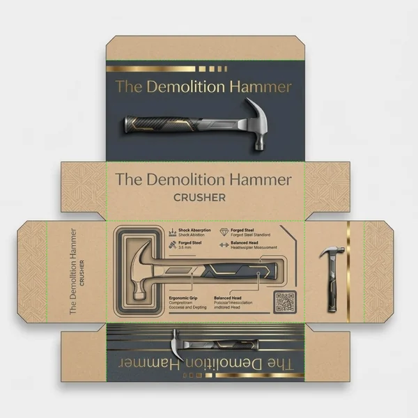
The focus of this layout is the detailed “inner-workings” diagram on the back panel. By using technical callouts to highlight features like shock absorption and forged steel, the packaging acts as an educational tool for the consumer. The clean lines and icon-driven data points provide a modern, organized feel that suggests precision engineering, moving away from the cluttered look often found in standard hardware aisles.
12. Modern Tech-Industrial Aesthetic
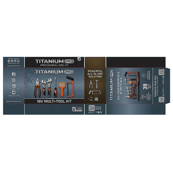
This packaging moves away from traditional hardware textures toward a sleek, tech-inspired design. Utilizing a metallic gradient and a “low-poly” geometric pattern on the main panels, it positions the brand as cutting-edge and precise. The high-contrast combination of silver branding and vibrant orange product accents ensures that the kit is visually striking, while the “5 Year Warranty” badge provides a professional-grade stamp of quality.