14 Brownie Box Packaging Designs to Inspire Your Brand
Brownie packaging is more than a box — it is the first impression of what is inside. For bakeries, confectionery brands, and private label sellers, the right packaging design communicates freshness, quality, and brand personality before the customer even lifts the lid.
From kraft paper boxes with minimalist typography to window-cut designs that let the product speak for itself, brownie box packaging sits at the intersection of functionality and visual appeal. The challenge for designers and brands is finding that balance — packaging that protects the product, reflects the brand identity, and compels a purchase on the shelf or online.
In this post, we have gathered 14 brownie box packaging designs that demonstrate exactly how leading brands and independent bakeries are approaching this challenge — giving you practical, real-world inspiration to apply to your next packaging project.
14 Brownie Box Packaging Designs Worth Studying
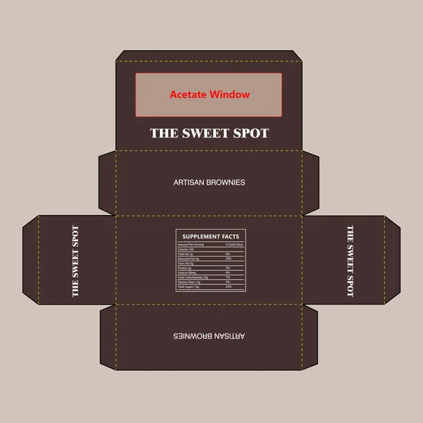
1. Sophisticated & Artisan
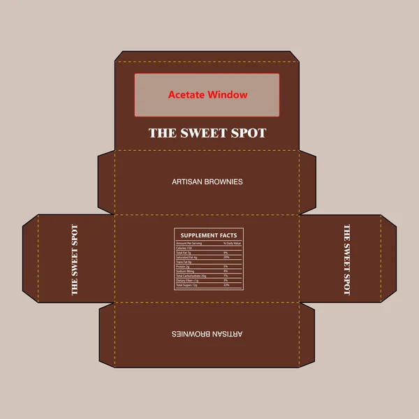
This design for The Sweet Spot leans into a rich, chocolate-inspired color palette that immediately signals quality to the consumer. The use of a bold, elegant serif typeface for the brand name creates a sophisticated ‘artisan’ feel, while the minimalist layout keeps the focus on the product. A key feature is the large acetate window on the top lid, designed to let the texture and decadence of the brownies act as the primary visual draw.
2. Bold & Decadent (Focus on the dark chocolate vibe)
This design steps up the luxury with a deep, dark cocoa color palette that immediately suggests a rich, intense brownie experience. The high-contrast white typography against the near-black background creates a striking, modern look. It’s a perfect example of how a simple shift in color saturation can make a brand feel more premium and indulgent, targeting a sophisticated palate.
3. Illustrative & Appetizing
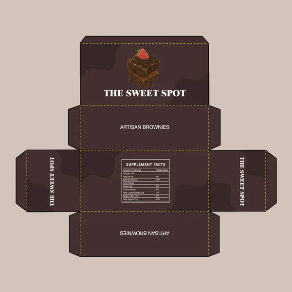
This design trades the window for a high-quality illustration that tells a delicious story. By featuring a stack of brownies topped with a fresh raspberry, the packaging immediately communicates flavor and indulgence. The addition of a subtle, wavy ‘chocolate drip’ pattern in the background adds a layer of custom texture, making the brand feel more artisanal and hand-crafted.
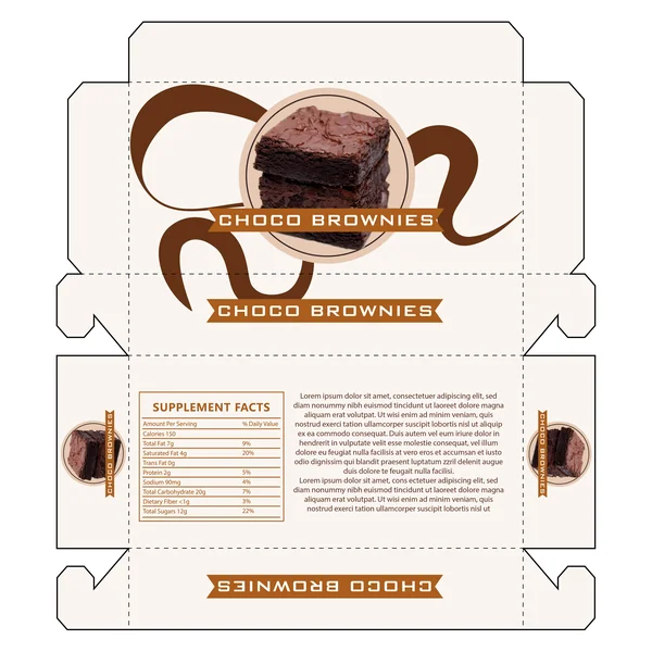
4. Artisanal & Playful (Focus on the hand-crafted feel)
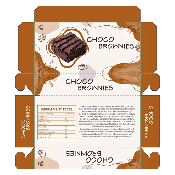
This design for Choco Brownies embraces a whimsical, hand-crafted aesthetic. By blending a high-definition product photo with playful line-art illustrations and organic, abstract shapes, the packaging feels both modern and artisanal. The friendly, handwritten typography reinforces the ‘homemade with care’ vibe, making it a perfect fit for a boutique bakery or a local specialty brand.
5. Rustic & Textural (Focus on the “bakery-fresh” feel)
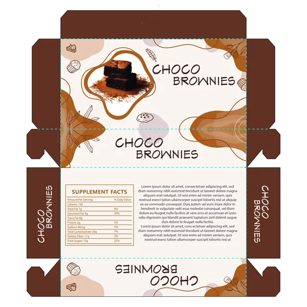
In this variation for Choco Brownies, the focus shifts to texture and tradition. The hero image features a decadent stack of brownies dusted with cocoa powder, immediately evoking the smell of a fresh bakery. This rustic imagery is balanced by modern, organic background shapes and whimsical line art, creating a ‘contemporary-meets-classic’ aesthetic that feels both high-end and homemade.
6. Bold & Modern (Focus on structure and shelf-impact)
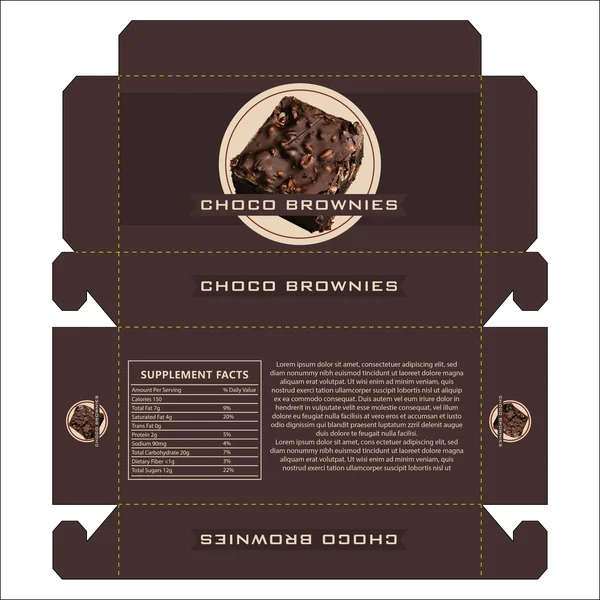
This design for Choco Brownies uses a bold, structured layout that feels both modern and authoritative. By placing a high-definition product image within a neutral circular frame and overlaying it with a sharp dark banner, the branding takes center stage. The deep cocoa background provides a rich, monochromatic base that allows the warm tones of the brownie to pop, creating a high-impact look perfect for a competitive retail shelf.
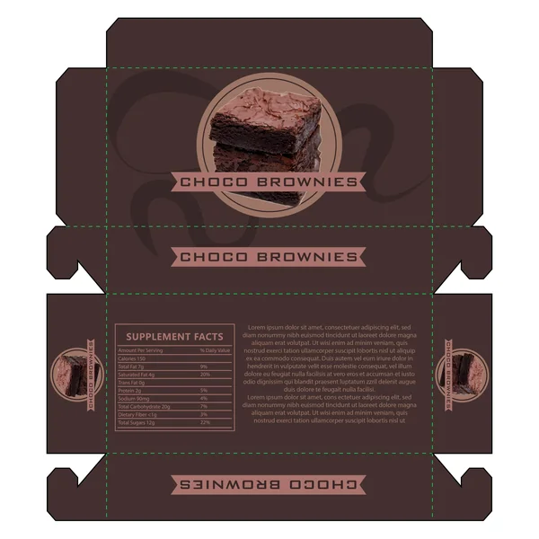
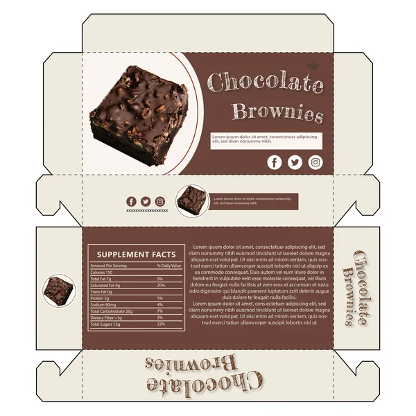
7. Warm & Inviting (Focus on the color palette)
By shifting to a lighter, warmer brown and utilizing a soft tan for the brand banner, this design creates an instantly inviting and approachable look. The color scheme feels natural and earthy, perfectly complementing the ‘hero’ image of a nut-topped brownie. It’s a great example of how subtle changes in color temperature can shift a brand from ‘high-end luxury’ to ‘comforting and homemade.
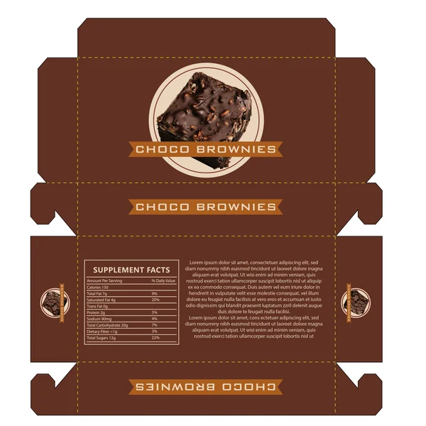
8. Moody & High-End (Focus on the luxury feel)
This design for Choco Brownies embraces a sophisticated, dark aesthetic. The deep charcoal-brown background is accented by subtle, fluid wavy patterns that add a layer of modern texture without distracting from the branding. By featuring a tall stack of two fudgy brownies, the visual storytelling emphasizes decadence and premium quality, positioning the product as a high-end gourmet treat.
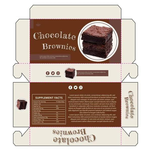
9. Modern & High-Contrast (Focus on the “fresh” look)
Breaking away from traditional dark packaging, this design uses a light, creamy canvas to create a fresh and modern aesthetic. The focal point is a decadent brownie stack, framed by bold, fluid chocolate-toned ‘swooshes’ that add a sense of movement and artistic flair. This high-contrast approach ensures that the product image is the undeniable hero, while the clean background gives the brand an approachable, ’boutique’ feel.
10. Rustic & Hand-Crafted (Focus on the artisanal feel)
This design for Chocolate Brownies leans into a charming ‘chalkboard’ aesthetic, using a textured, hand-drawn font that evokes the feeling of a local neighborhood bakery. The warm cream background provides a soft contrast to the rich chocolate-brown panels, creating a welcoming and nostalgic look. It’s an excellent example of how typography can be used to communicate a ‘handmade’ brand promise while maintaining a professional retail layout.
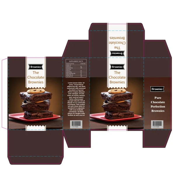
11. Artisanal & Story-Driven (Focus on the brand narrative)
This design for Chocolate Brownies uses a charming chalkboard-style typeface to evoke the warmth of a local, handcrafted bakery. Unlike more minimalist boxes, this layout prioritizes brand storytelling, featuring dedicated space for product descriptions and ingredient narratives. The warm cream and deep cocoa palette creates a comforting, artisanal feel that makes the product feel like a curated treat rather than a mass-produced snack.
12. Modern & Hero-Focused
This design makes a bold statement by utilizing a high-definition, full-bleed vertical photograph of a brownie stack as its primary ‘hero’ element. The contrast between the deep chocolate background and the crisp white vertical stripe—complete with scalloped ‘bakery-style’ edges—creates a sharp, professional look. This approach ensures that the decadent texture and visual appeal of the product are the first things a customer notices, making it highly effective for shelf-impact.
13. Sophisticated & Bold
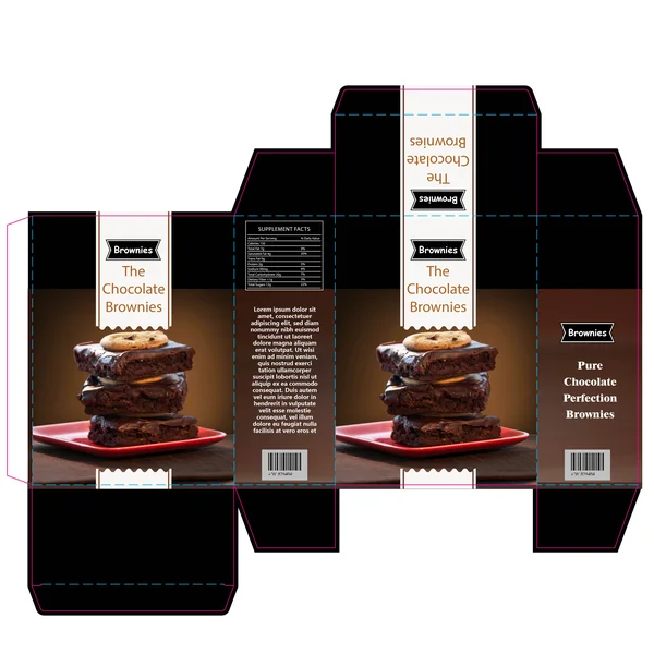
This design for The Chocolate Brownies utilizes a sleek black background to create a ‘gold-standard’ or ‘black-label’ gourmet feel. The extreme contrast between the dark base and the crisp white vertical label makes the product imagery practically jump off the box. It’s an ideal choice for a brand looking to position itself as a modern, premium dessert option that stands out from more traditional, earthy-toned bakery packaging.
14. Classic & Elegant (Focus on the “bakery-traditional” feel)
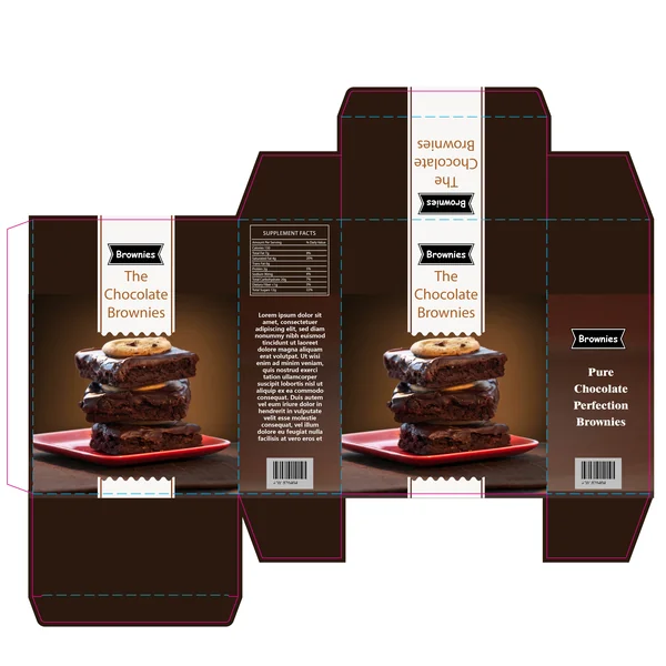
This design for The Chocolate Brownies strikes a perfect balance between traditional bakery charm and modern retail professionalism. By utilizing a rich, espresso-brown background, the packaging creates a warm and inviting feel that feels high-quality and reliable. The vertical white ribbon with scalloped edges serves as a clean anchor for the branding, ensuring the product name is legible while the mouth-watering brownie stack remains the undisputed star of the layout.