Street Food Packaging Designs
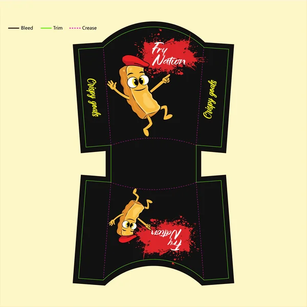
1. Design-Focused (Focuses on style and character)
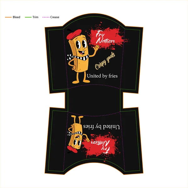
This concept utilizes a high-contrast palette of charcoal black and crimson red to create an immediate visual impact. Central to the design is a custom “rubber-hose” style mascot—a playful, beret-wearing fry that adds a sense of nostalgia and brand personality. The “Fry Nation” logo is anchored by a dynamic red splatter effect, injecting a raw, urban energy into the layout, while the mix of brush-script and serif typography balances “street-style” grit with a premium finish.
2. Design-Focused (Warmth and Cohesion)
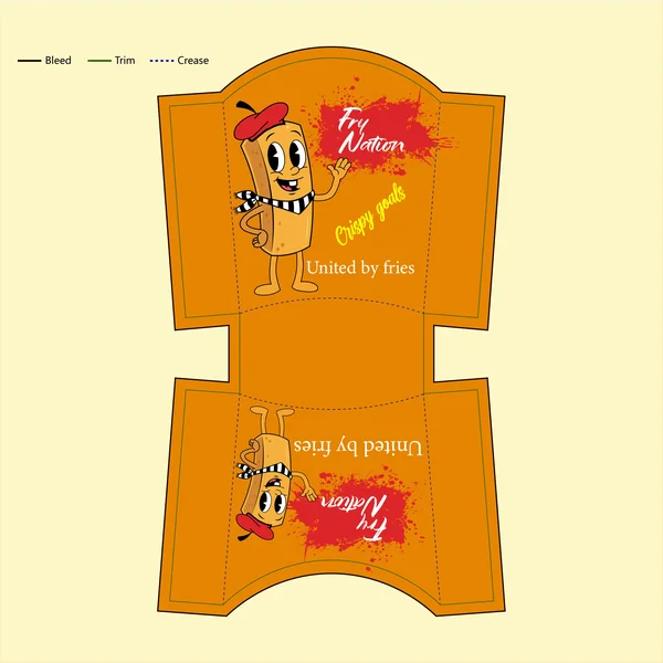
In this iteration, the design moves toward a “monochromatic-plus” palette, using a saturated orange base to evoke warmth and stimulate appetite. By removing the high-contrast black, the mascot and the red splatter branding feel more integrated into the overall packaging surface. The use of yellow for the “Crispy Goals” tagline creates a subtle, layered hierarchy that rewards closer inspection without competing with the primary “Fry Nation” logo.
3. Design-Focused (Movement & Composition)
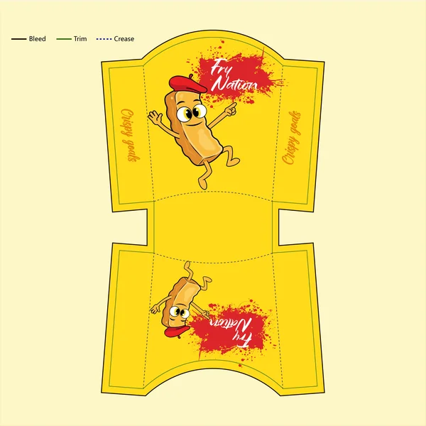
In this variation, the design shifts focus toward dynamic action. The mascot is reimagined in a more energetic, “mid-motion” pose, which adds a layer of playfulness to the packaging. By utilizing a vibrant yellow background, the composition feels more open and airy. The “Crispy Goals” tagline has been moved to the side panels in a vertical orientation, creating a clever use of the package’s 3D structure that ensures the brand messaging is visible from multiple viewing angles.
4. Design-Focused (Integration and Balance)
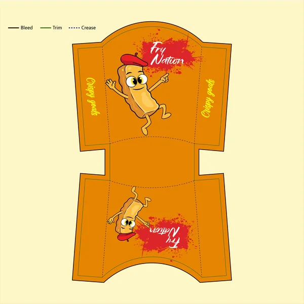
This design variation achieves a perfect balance by integrating the energetic “mid-air” pose of the mascot with the rich, warm orange color palette. The vertical orientation of the “Crispy Goals” tagline on the side panels is maintained, creating a professional 3D presentation that maximizes brand surface area. Crucially, the removal of the high-contrast yellow text ensures the entire composition feels refined and unified, allowing the character and the primary red-splatter branding to take center stage.
5. Design-Focused (Contrast and Composition)
This iteration maximizes visual impact through extreme contrast. By placing the energetic, “pointing” mascot against a deep charcoal-black background, the warm golden tones of the character and the vibrant crimson of the logo “pop” with cinematic intensity. The decision to use a neon-yellow script for the “Crispy Goals” tagline on the side panels adds a layer of urban, “street-sign” aesthetics, ensuring the packaging feels balanced and legible from a 360-degree perspective.
6. Design-Focused (Composition & Palette Shift)
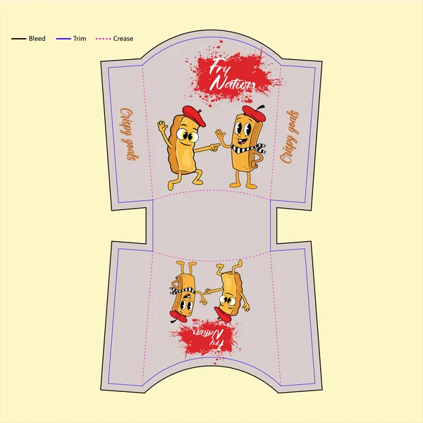
This variation takes a significant turn by utilizing a neutral, warm-grey background. This color shift allows the vibrant crimson-red paint splatter logo—now moved to the top center—to command immediate attention. The composition is uniquely symmetrical, featuring a pair of mascots who work together as a cohesive brand ‘duo’ rather than a single character. By simplifying the color palette and balancing the character placement, this design achieves a layout that feels both clean and highly collaborative.
7. Brand Story (Freshness and Modernity)
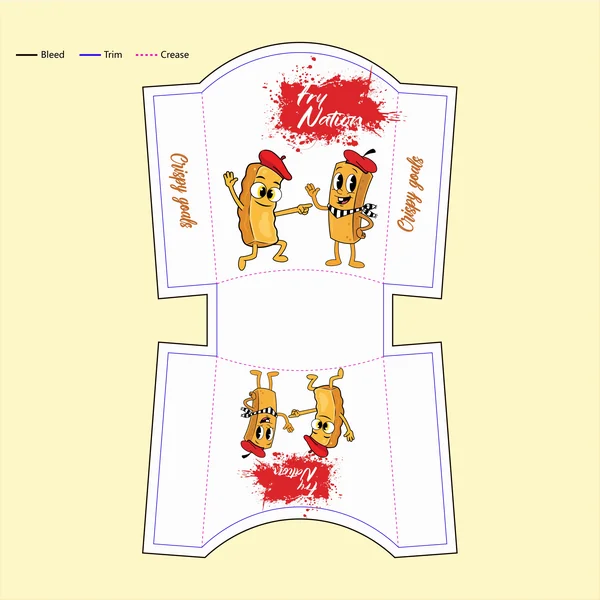
Fresh, clean, and modern. This iteration of the Fry Nation packaging leans into a “light” aesthetic that suggests a cleaner, high-quality street food experience. The white background acts as a spotlight for the brand’s personalities—the beret-wearing fry duo—and emphasizes the bold red splatter of the logo. This design feels particularly suited for high-end pop-ups or modern food halls where a minimalist, “less-is-more” branding strategy helps the product stand out from the noise.
8. Short & Punchy (Bold & Character-Driven)
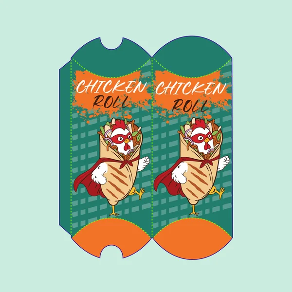
Heroic flavor in every bite. This design combines a unique teal textured background with a high-energy “Super Chicken” mascot to create a memorable brand identity. The high-contrast orange branding ensures the product name is visible from a distance, while the playful character illustration promises a snack that is as fun as it is delicious.
9. Design-Focused (Warmth and Visual Vibrancy)
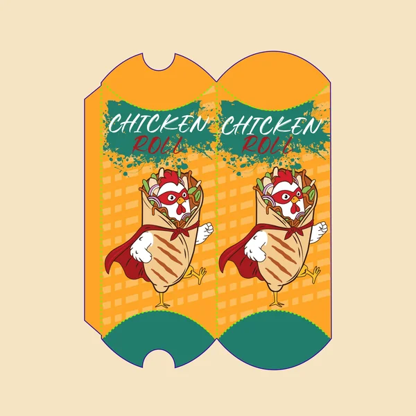
By inverting the previous color palette, this design maximizes appetite appeal with a dominant, sunny orange background. The teal “splatter” behind the branding provides a sharp, cool contrast that anchors the “Chicken Roll” typography, making it highly legible even from a distance. The geometric grid pattern is subtly integrated into the orange field, adding a layer of professional finish that prevents the bright color from feeling flat, while the teal end-caps provide a clean visual “stop” to the packaging’s silhouette.
10. Design-Focused (Natural Tones & Contrast)
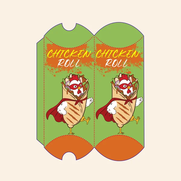
In this concept, the design shifts to a vibrant lime-green palette, which provides a fresh, organic backdrop that makes the warm orange and red tones of the mascot truly stand out. The use of yellow for the primary “Chicken Roll” typography adds a bright, sunny highlight that cuts through the orange splatter effect for improved legibility. This color combination creates a high-visibility package that feels both energetic and appetizing, using the green to suggest freshness and the orange to signify heat and flavor.
11. Design-Focused (Maximum Contrast)
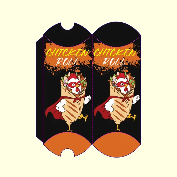
This design leans into a high-contrast aesthetic to create a “premium-urban” look. By using a matte black background, the warm golden tones of the chicken roll and the vibrant orange splatter logo are pushed to the visual foreground. The yellow and white typography offers a clean, dual-tone hierarchy that ensures the product name is legible even in low-light environments. This palette feels sophisticated and edgy, effectively modernizing the traditional street food container.
12. Design-Focused (The High-Energy Palette)
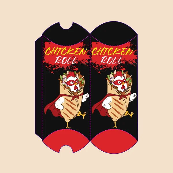
This concept utilizes the ultimate fast-food color power duo: bold red and deep black. Against the black field, the red caped superhero and the primary red splatter logo create an extreme visual punch, instantly drawing the eye. The bright yellow typography has been used strategically to create high-contrast legibility, while the red end-caps frame the package with professional, energetic boundaries. This design variation is a classic, high-visibility application that feels aggressive, fast, and satisfying.
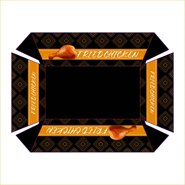
13. Design-Focused (Pattern and Cultural Motif)
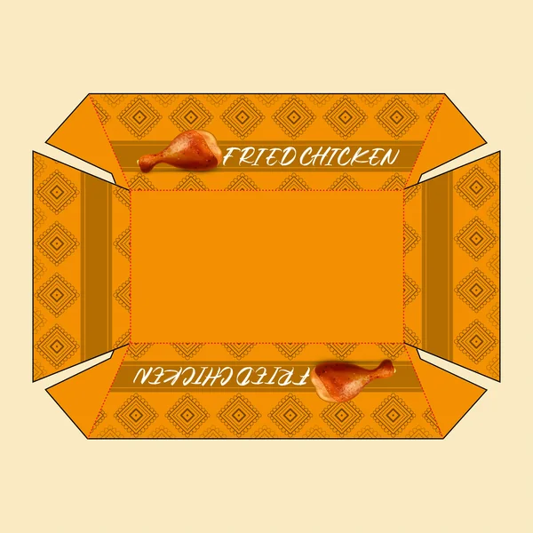
This packaging for Fried Chicken moves away from character-heavy branding in favor of a sophisticated, rhythmic pattern. The design utilizes a diamond-grid geometric motif that provides a textured, premium feel across the entire dieline. By using a warm, ochre-orange base with chocolate-brown accents, the palette feels earthy and traditional. The realistic product rendering—a glistening chicken drumstick—acts as the primary visual anchor, immediately signaling quality and taste against the structured background.
14. Design-Focused (Cool Tones & Geometric Contrast)
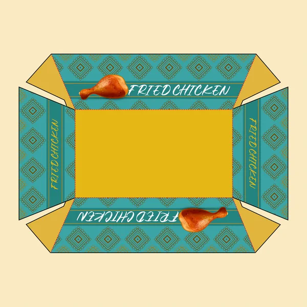
This iteration explores a striking teal-and-gold color story, offering a modern twist on traditional food packaging. The intricate diamond-grid motif remains the centerpiece, but when rendered in teal, it provides a “cool” backdrop that allows the warm, golden-brown tones of the chicken drumstick illustration to truly radiate. The side-panel branding is vertically aligned to maximize the box’s 3D real estate, ensuring the “Fried Chicken” typography is legible from every angle while maintaining a balanced, symmetrical composition.
15. Design-Focused (Minimalism & Texture)
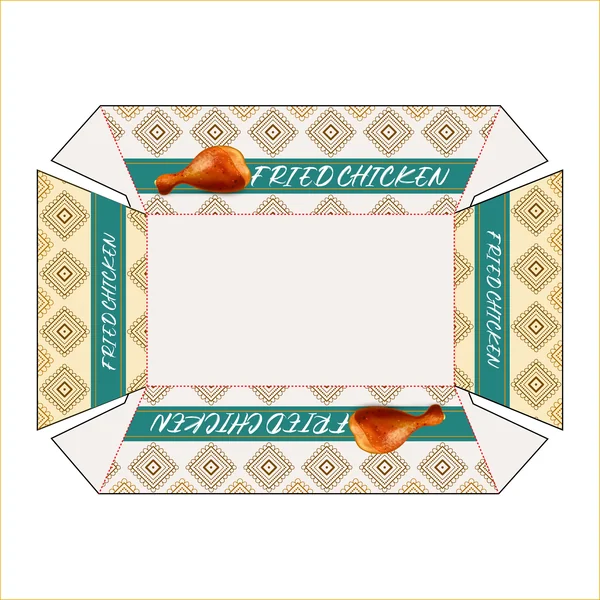
By opting for a light, cream-colored background, this design prioritizes visual clarity and elegance. The lack of a heavy saturated color allows the fine linework of the diamond geometric pattern to take center stage, creating a textured look that feels tactile and premium. The teal horizontal bands provide a sharp, modern contrast, while the realistic drumstick imagery gains a heightened “3D” effect against the neutral backdrop. It’s a sophisticated layout that balances traditional motifs with contemporary minimalism.
16. Design-Focused (Monochromatic Warmth & Pattern)
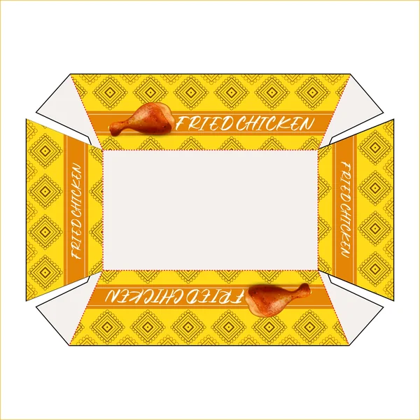
This iteration utilizes a monochromatic yellow-and-gold palette to create a high-energy, high-visibility package. By bathing the geometric diamond motif in a bright citrus yellow, the design achieves a cohesive, sunny aesthetic that feels naturally appetizing. The horizontal and vertical branding bands use a deeper ochre to provide contrast, while the realistic drumstick graphic serves as a warm focal point. It is a masterclass in using a single color family to create depth and brand recognition.
17. Design-Focused (Contrast and Premium Finish)
This iteration utilizes a deep matte black background to create maximum visual impact. By placing the gold-toned geometric patterns against such a dark field, the intricate details of the diamond motif are highlighted with exceptional clarity. The vibrant orange horizontal bands anchor the “Fried Chicken” typography, creating a warm focal point that complements the realistic drumstick graphic. This choice of colors results in a professional, high-end presentation that elevates the perception of the product.