15 Creative Vitamin C Packaging Designs That Inspire & Sell
Walk into any store today, and you’ll notice one thing immediately — the shelves are crowded. Dozens of Vitamin C products compete for the same customer, the same glance, the same purchase. So what makes one bottle get picked up while another stays on the shelf?
The answer is packaging design. Great Vitamin C packaging doesn’t just protect the product — it communicates trust, quality, and health at a single glance. Whether it’s a bold minimalist tube, a premium amber glass bottle, or a playful supplement pouch, the right design speaks directly to the buyer before a single word is read.
In this blog, we’ve curated 15 of the most impressive Vitamin C packaging designs from around the world — each selected for its creativity, functionality, and ability to connect with the modern health-conscious consumer.
Whether you’re a designer, a brand owner, or simply someone who appreciates great design, this list will give you fresh ideas and real inspiration.
Let’s dive in.
1. Energetic & Fresh
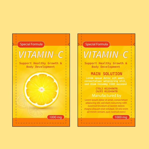
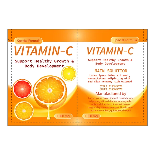
This design leverages a high-energy color palette of citrus oranges and sunny yellows to instantly communicate the product’s core benefit: vitality. The central focal point is a hyper-realistic orange slice, which grounds the design in nature and freshness. By using a subtle sunburst background, the packaging creates a sense of ‘radiance,’ making it stand out on the shelf as a premium, health-boosting supplement
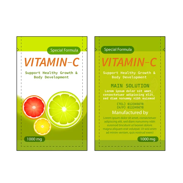
2. Clean & Natural (Focus on Wellness)
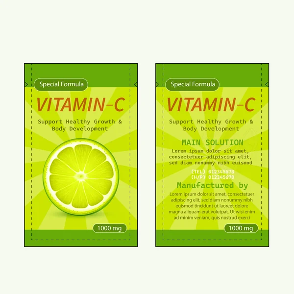
Shifting toward an organic aesthetic, this version uses shades of leaf green and bright lime to emphasize health and natural purity. The high-contrast orange typography for the ‘Vitamin-C’ title ensures the brand remains the focal point against the cool green backdrop. This design is highly effective for a product line extension, allowing customers to easily distinguish between different flavors or formulas while keeping the brand identity consistent
3. Bold & High-Impact (Focus on Color Strength)
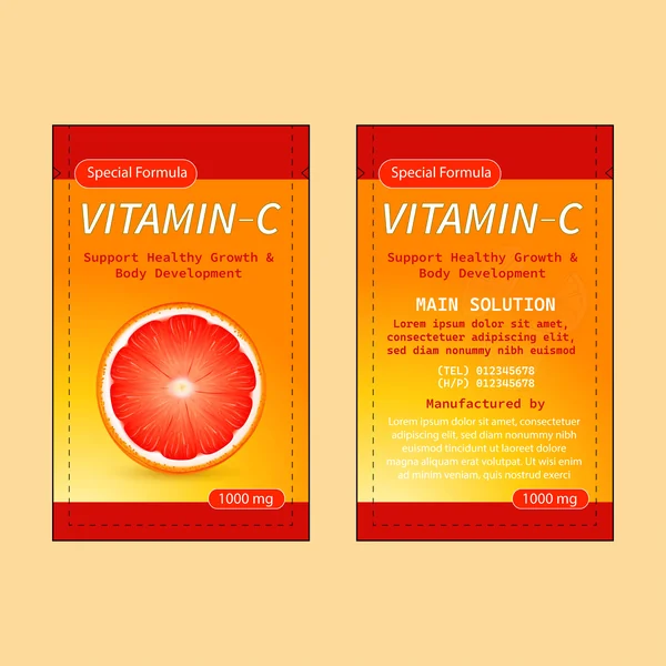
This design takes a bolder approach by introducing deep red accents into the citrus color palette. The use of a rich, ruby-toned orange slice signals a more intense flavor profile and suggests a ‘super-strength’ formula. The high contrast between the saturated red borders and the bright orange center creates a powerful visual frame that commands attention, making it an ideal choice for a premium or high-potency product line
4. Sunny & Invigorating (Focus on Visual Depth)
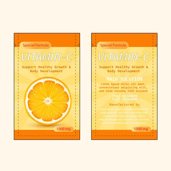
In this variation, the sunburst effect is emphasized to create a sense of ‘radiating’ health. The layers of soft yellow and deep orange add visual depth, ensuring the sachet doesn’t look flat on a retail shelf. The layout is intentionally clean, prioritizing the 1000mg dosage and the ‘Special Formula’ badge to build immediate consumer confidence through a professional and well-organized information hierarchy.
5. Visually Delicious (Focus on the “Drip” Effect)
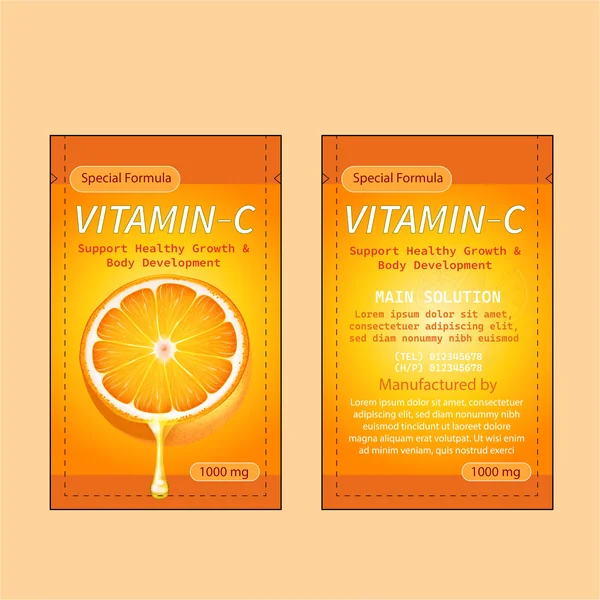
This design takes a sensory approach by incorporating a prominent juice drop falling from the central orange slice. This small but powerful detail instantly communicates the product’s liquid potency and ‘mouth-watering’ freshness. By using a deep orange border and a radiant golden center, the packaging feels rich and full-bodied, suggesting a premium, high-absorption formula that goes beyond a standard supplement.
6. Modern & Breathable
By introducing a crisp white background for the main body, this design creates a high-contrast ‘breathable’ layout that makes the citrus imagery truly pop. The use of negative space allows the vibrant orange header and footer to frame the content effectively, giving it a clinical yet approachable feel. It’s a perfect example of how a ‘less is more’ philosophy can enhance a pharmaceutical brand’s premium appeal.
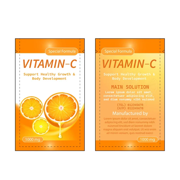
7. The “Full Spectrum” Look
This design celebrates a fusion of flavors by showcasing a trio of citrus slices—lime, grapefruit, and orange. The dominant lime-green borders give the packaging an organic, botanical feel, while the white central body keeps the layout clean and clinical. By featuring multiple fruits, the design suggests a ‘full-spectrum’ vitamin source, appealing to consumers who want the comprehensive benefits of a natural citrus blend.
8. Dynamic Continuity
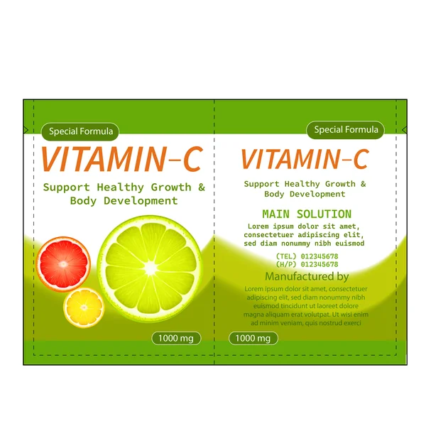
This layout showcases the importance of continuity in packaging design. A dynamic, soft green wave flows seamlessly from the front panel to the back, connecting the high-impact fruit imagery with the technical product details. By using the lime as the primary ‘hero’ fruit, the design leans into a more refreshing, botanical aesthetic that differentiates itself from standard orange supplements. It’s a perfect example of using a wrap-around element to create a sense of movement and energy.
9. Liquid Energy & Radiant Glow
This full-spread design captures the essence of vitality with a warm, sun-drenched orange and gold palette. The ‘hero’ element—a juicy orange slice with a realistic juice drip—immediately communicates a sense of liquid potency and freshness. A glowing, dynamic wave flows across both panels, seamlessly bridging the vibrant front imagery with the structured informational layout on the back. It’s a high-energy design that signals a premium, fast-acting health supplement.
10. Artistic & Dynamic
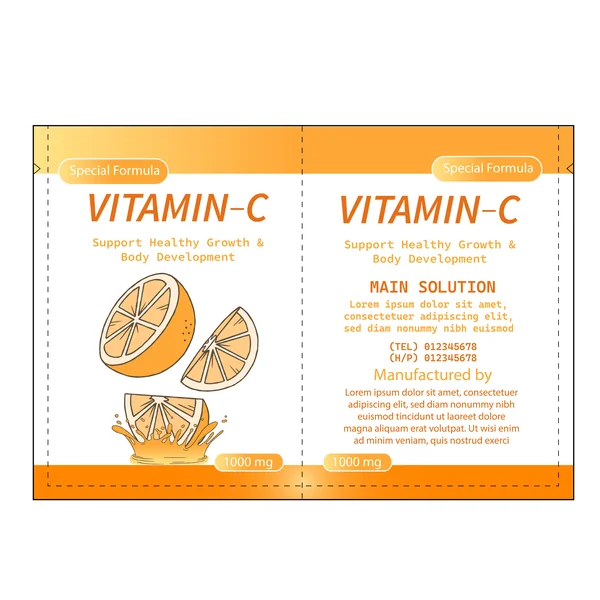
This variant pivots toward a stylized, illustrative aesthetic. By using clean vector-style orange wedges falling into a dynamic juice splash, the design emphasizes action and ‘bursting’ freshness. The more graphic approach makes the packaging feel modern and approachable, while the soft orange gradient at the top maintains the warm, sunny vibe characteristic of the brand family.
11. Sunny & High-Energy
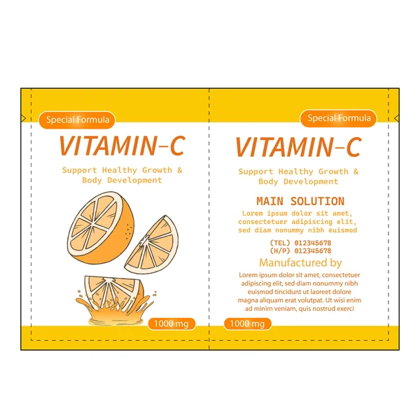
This design leans heavily into the psychology of yellow—the color of sunshine, optimism, and energy. By pairing a bright yellow frame with white-space-heavy panels, the packaging feels light and invigorating. The stylized ‘splash’ illustration adds a sense of action and liquid freshness, making this a perfect choice for a morning-ritual supplement designed to kickstart the day with a burst of vitality.
12. Bold & High-Potency
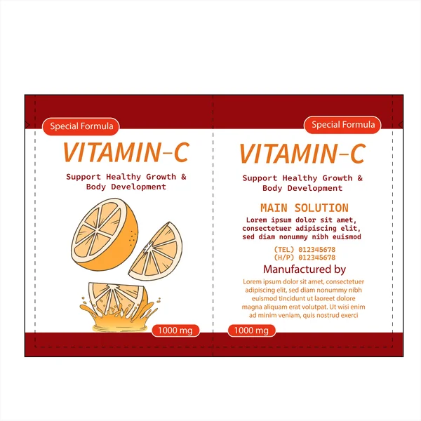
By introducing a deep burgundy color palette, this design signals a ‘super-strength’ or high-potency formula. The rich, dark red borders provide a sophisticated frame for the clean illustrative elements, creating a sense of authority and premium quality. It’s an excellent example of how a shift in color can elevate a brand from a standard daily supplement to a professional-grade health solution while maintaining a consistent visual language.
13. Minimalist & Clean
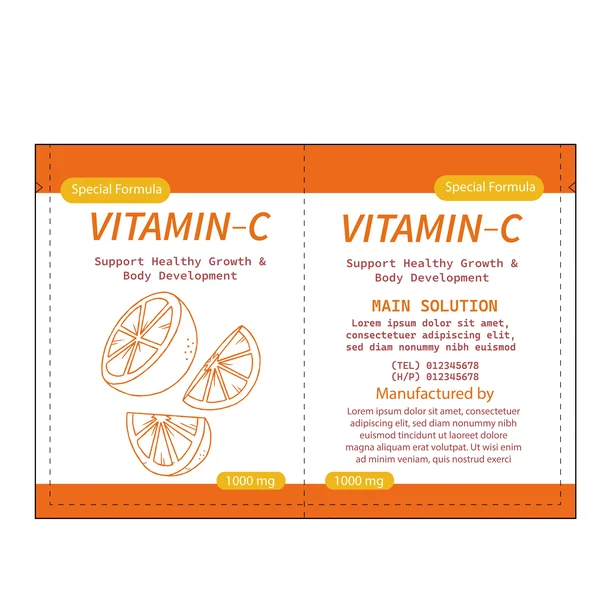
This design leans into a minimalist aesthetic, using delicate orange line art to represent the citrus fruit. By removing heavy colors and gradients, the packaging emphasizes a ‘pure’ and ‘clean’ product experience. The generous use of white space makes the layout feel light and breathable, while the bold orange borders provide a professional frame that keeps the brand identity strong. It’s a sophisticated take that appeals to the health-conscious consumer who values simplicity and transparency.
14. Organic & Botanical
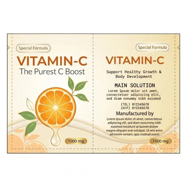
This design takes an organic approach, utilizing a soft cream and beige color palette to evoke a sense of natural purity. The addition of delicate green leaves to the central orange illustration emphasizes the botanical origins of the product. By pairing muted earth tones with the tagline ‘The Purest C Boost,’ the packaging feels more like a high-end wellness elixir than a standard pharmaceutical, appealing to the sophisticated, health-conscious consumer.
15. Lush & Botanical
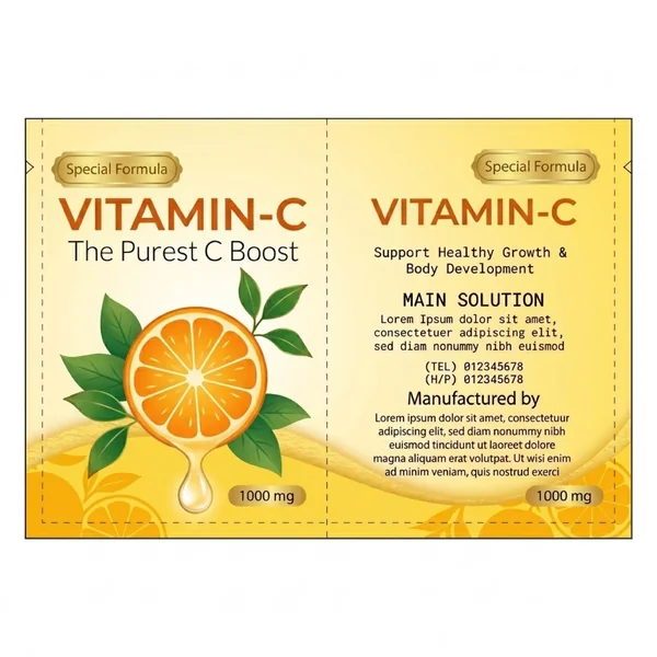
This design emphasizes the ‘whole-fruit’ origin of the product by surrounding the central orange slice with lush green leaves. The golden-yellow background acts as a spotlight, highlighting the freshness of the botanical elements. By using a soft, textured wave along the bottom and a muted orange-slice silhouette in the background, the packaging creates a rich, multi-layered visual experience that speaks to the holistic health benefits of a ‘pure’ vitamin boost.