Creative Children Soap Package Design Ideas: Fun, Safe & Kid-Friendly Inspirations
Designing soap packaging for children is about more than just bright colors and cute characters. Parents look for safety, trust, and gentle care, while kids are drawn to playful visuals, fun shapes, and familiar themes. A well-designed children’s soap package needs to speak to both—without overwhelming either.
In this blog, we’ve curated 25 creative children soap package design ideas that successfully balance fun, functionality, and brand trust. From animal-themed boxes to pastel wrappers and interactive illustrations, these designs show how thoughtful packaging can turn a daily hygiene product into something kids actually enjoy using.
Whether you’re a soap brand owner, packaging designer, or marketer, these examples will give you practical inspiration for creating packaging that stands out on shelves and connects with young users and their parents.
List of 25 Children Soap Package Design Ideas
1. The “Joyful Bath” Concept
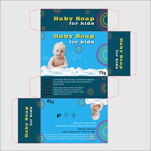
This design takes a classic, approachable route by focusing on a relatable central image. Here is a concise description you can use for your blog:
The “Joyful Bath” Concept
This packaging design centers on emotional connection by featuring a high-resolution, cheerful image of a baby during bath time. The use of a bright sky-blue primary palette instantly evokes feelings of cleanliness, freshness, and water, making it immediately recognizable as a bath product.
To balance the realism of the photography, the design incorporates playful geometric elements—concentric circles in contrasting teals and purples—that mimic floating bubbles. The bold, yellow-and-white typography adds a retro, high-contrast touch that ensures the product name pops against the deeper blue panels. It’s a design that prioritizes visual trust for parents while maintaining a lighthearted energy perfect for the nursery shelf.
2. Design 2: The “Playful Explorer” Concept
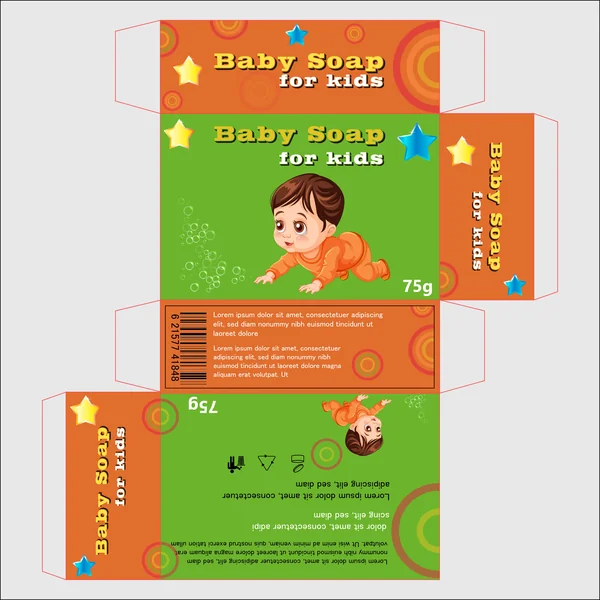
Switching to an illustrative style, this design uses a high-energy color palette of vibrant orange and lime green to capture a child’s imagination. The central character—a cute, wide-eyed cartoon toddler—makes the product feel more like a “bath time toy” than just a hygiene staple, which can help reduce “bath-time resistance” in older toddlers.
The addition of sparkling stars and glowing circular patterns adds a sense of magic and fun. This design is perfect for brands that want to stand out on a crowded retail shelf through high-contrast colors and a friendly, approachable mascot that children can personally relate to.
3. Design 3: The “Sunset Energy” Concept
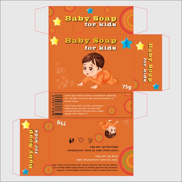
Focusing on a warm, monochromatic orange palette, this design is all about high visibility and “shelf pop.” In color psychology, orange represents energy, warmth, and happiness, creating a cheerful presence in any bathroom.
The consistent use of color across all panels creates a very cohesive brand identity. Like Design 2, it features a friendly mascot, but by keeping the background a singular, bold tone, the illustrative details and blue star accents stand out even more. It’s a confident, high-contrast design intended to grab the eye of both the parent and the child.
4. Design 4: The “Soft Pastel” Concept
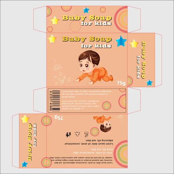
In contrast to the bold colors of the previous versions, this design utilizes a soft peach or pastel apricot tone. This choice is much more calming and “low-stimulus,” making it an ideal fit for bedtime bath routines. The softer colors allow the yellow “Baby Soap” typography to glow, emphasizing the product’s gentle nature. This is a great example of how simply shifting a color’s saturation can change a product from “high-energy play” to “quiet evening care
5. The “Magic Night” Concept
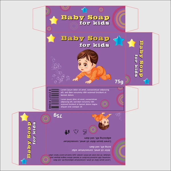
Aesthetic: Whimsical, Creative, Regal The final design uses a rich purple palette, which adds a touch of “magic” and whimsy to the brand. Purple is often associated with creativity and premium quality; here, it makes the yellow-and-blue stars shine brightly, creating a dream-like atmosphere. It’s a unique color choice for the category that helps the product stand out as a special, high-quality treat for bath time.
6. The “Ocean Splash” Concept
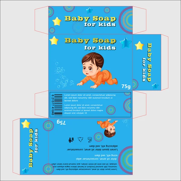
Style: Classic & Aquatic This version returns to a bright cyan-blue while maintaining the playful illustrative character. It bridges the gap between the “clinical blue” of the first design and the “playful energy” of the others. It feels inherently aquatic and traditional for soap packaging, providing a safe yet fun visual language that appeals to a wide demographic.
7. The “Berry Sweet” Concept
Style: Energetic & Modern The seventh design utilizes a bold magenta/pink background, offering a high-energy alternative to traditional blues. This palette feels modern and “sweet,” suggesting a pleasant, fruity fragrance profile. The deep red-orange circles on the side panels create a sophisticated color harmony that feels trendy and eye-catching for the modern parent.
8. The “Golden Glow” Concept
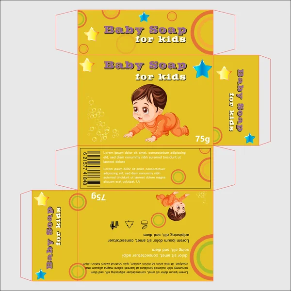
Style: Radiant & Warm The final design features a bright golden-yellow palette, symbolizing sunshine and positivity. This color is highly visible from a distance, making it a “shelf-shouter” that demands attention. The purple typography provides a complementary color pop that is both legible and playful, rounding out the collection with a sense of pure joy.
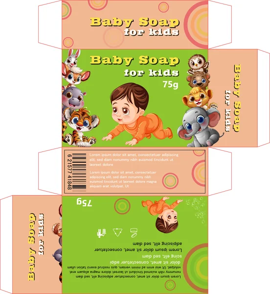
9. The “Forest Fresh” Concept
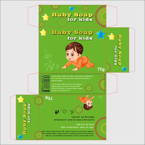
Aesthetic: Earthy, Healthy, Balanced The final design uses a monochromatic lime green theme. This is the ultimate “organic” look, signaling freshness and health-conscious ingredients. The green creates a calming yet vibrant backdrop that allows the orange-clad character to stand out, making it perfect for a brand focused on eco-friendly or plant-based soap formulas.
10. The “Sunset Harmony” Concept
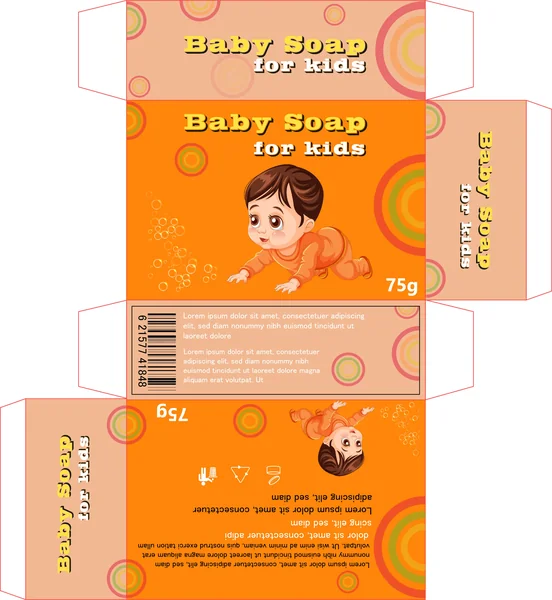
Style: Sophisticated & Warm The final design features a warm orange-to-peach transition. By using a slightly more muted orange than Design 3, it achieves a sophisticated, glowing aesthetic. The colorful concentric circles on the side panels are particularly prominent here, reinforcing the “bubble” theme while maintaining a warm, inviting presence.
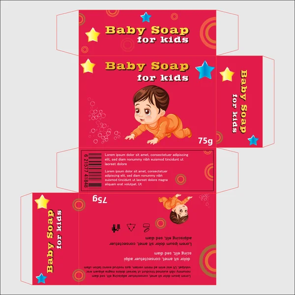
11. The “Ruby Bright” Concept
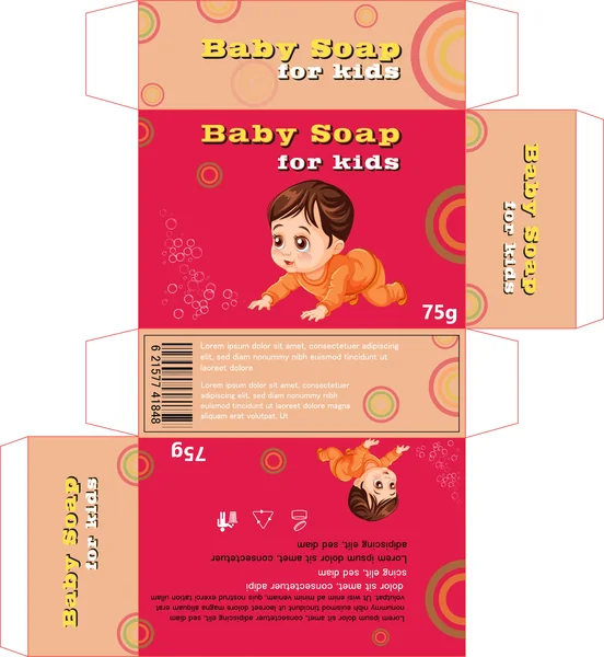
Style: High-Impact & Vivid The final design uses a vivid ruby-red backdrop contrasted with soft peach panels. This creates an intense visual impact that suggests strength and efficacy while the illustrations maintain a gentle heart. It is a bold choice for a brand that wants to disrupt the typical pastel-colored baby aisle.
12. The “Royal Dream” Concept
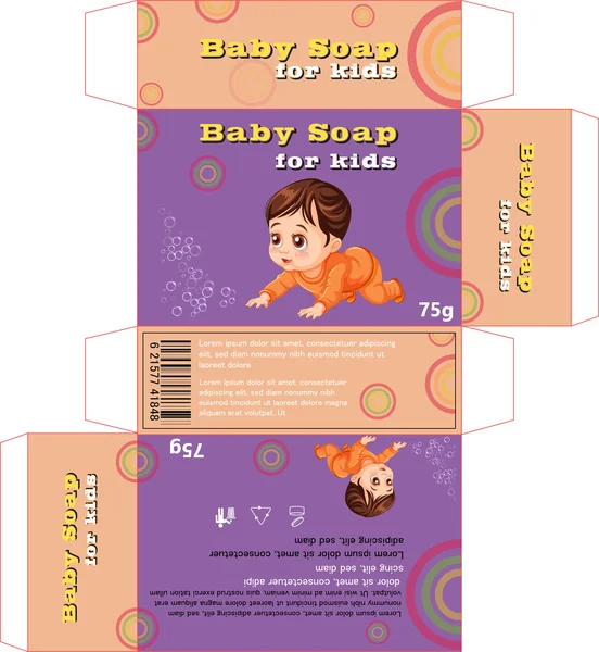
Style: Creative & Calm The final design pairs a regal purple front with soft peach accents. This combination offers a unique balance: the purple suggests high quality and imagination, while the peach side panels keep the overall feel light and appropriate for a nursery environment.
13. The “Sky Explorer” Concept
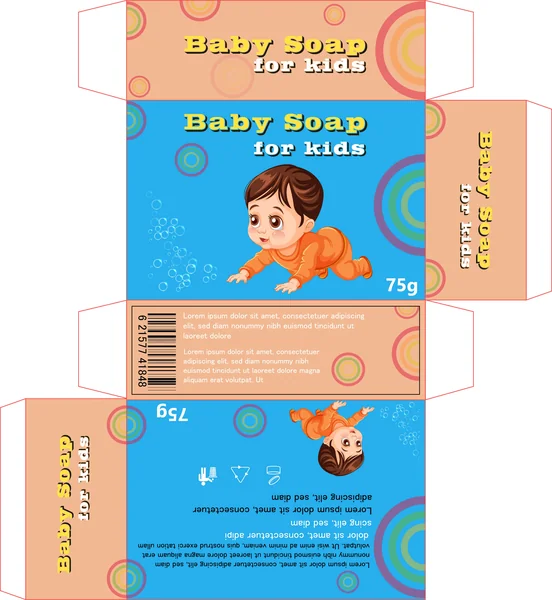
Style: Balanced & Airy The final design uses a vibrant blue front with soft peach side panels. This mix provides the traditional “clean” feeling of blue but softens it with the warmth of the peach accents. It’s a well-balanced look that feels both professional and incredibly inviting for young families.
14. The “Sunlight Meadow” Concept
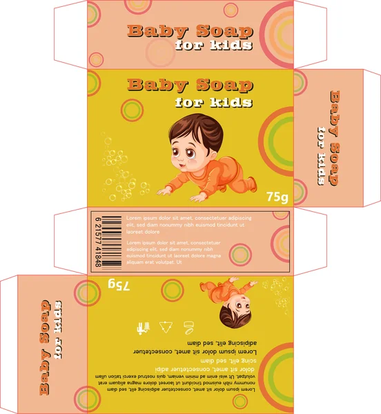
Aesthetic: Radiant, Positive, Joyful The final design in the series features a bright golden-yellow palette that symbolizes pure joy and positivity. By using a high-visibility primary color, the packaging acts as a “shelf-shouter” that grabs attention from a distance. The green and orange bubble accents reinforce a natural, healthy vibe, making it perfect for a daytime, “happy-skin” product line.
15. The “Soft Periwinkle” Concept
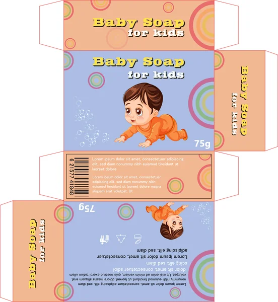
Style: Gentle & Dreamy The final design uses a soft, dusty blue that feels more modern and “lifestyle” oriented than standard baby blue. Paired with peach sides, it creates a muted, sophisticated palette that appeals to the modern parent’s desire for aesthetic products that look beautiful on their bathroom counter.
16. The “Playful Magenta” Concept
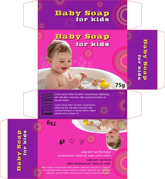
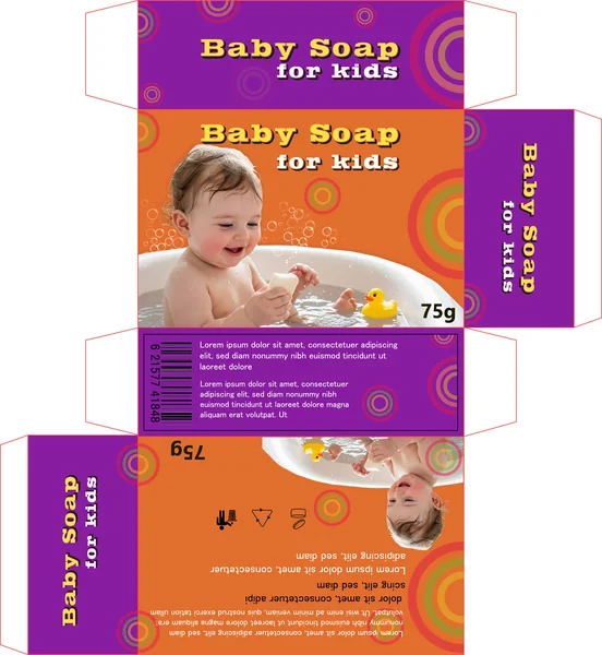
Style: Energetic & Trustworthy The final design returns to photorealistic imagery but sets it against a high-energy magenta and purple backdrop. This combination merges the visual trust of a real baby during bath time with a bold, creative color story that stands out as a premium, fun-loving brand.
17. The “Warmth & Trust” Concept
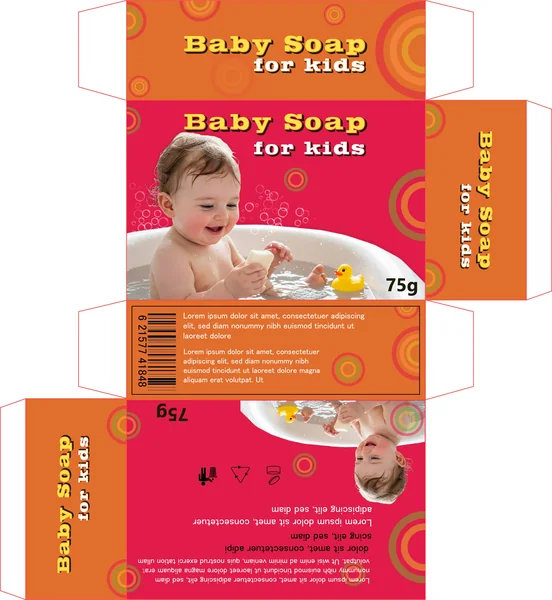
Aesthetic: Heartfelt, Reliable, Inviting The final design combines photorealistic imagery with a vibrant red and orange palette. This combination evokes warmth and love, using the visual of a baby at bath time to ground the high-energy colors in a scene of gentle, authentic care.
18. The “Vivid Nurture” Concept
Aesthetic: Creative, Bold, Caring The final design pairs photorealistic bath imagery with a deep purple and orange split palette. The purple top section suggests a premium or “nighttime” quality, while the orange main panel keeps the overall mood energetic and optimistic.
19. The “Golden Nurture” Concept
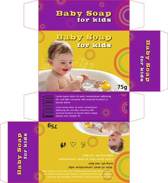
Aesthetic: Positive, Sunny, Genuine The final design uses a bold yellow main panel with purple accents and a photorealistic baby. This merges the attention-grabbing power of high-visibility yellow with the emotional resonance of real photography, creating a brand that feels both sunny and deeply sincere.
20. The “Petal Soft” Concept
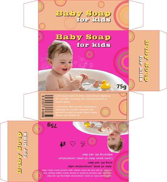
Aesthetic: Trendy, Sweet, Gentle This version pairs real photography with a hot pink and peach palette. It targets the trend-conscious parent, offering a sweet and gentle visual story that feels contemporary and stylish, perfect for a modern nursery aesthetic.
21. The “Jungle Friends” Concept
Aesthetic: Engaging, Fun, Educational This design adds a collection of animal characters alongside the main toddler illustration. This creates an engaging, story-filled world on the packaging, turning the soap into a tool for play and education during bath time. It is a fantastic choice for a brand that wants to be the “fun” option in the aisle.
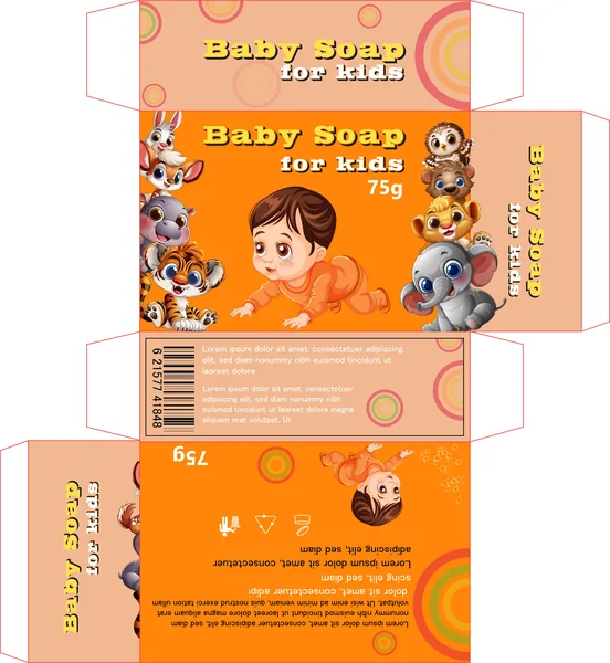
22. The “Friendly Jungle” Concept
This packaging leverages a vibrant, multi-animal illustration style to create an instant sense of fun and companionship during bath time. By surrounding the central “crawling baby” character with a diverse cast of wide-eyed animals—including a tiger, elephant, lion, and owl—the design transforms a routine hygiene product into a storytelling tool.
23. The Silhouette & Transparency Concept
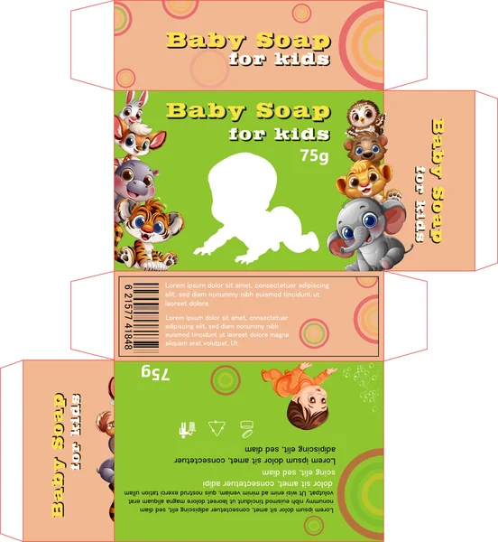
This variation introduces a strategic silhouette in place of the central character, hinting at a “window” or die-cut design. This is a brilliant move for brands that want to show the physical soap bar inside, allowing the color or texture of the soap to complete the character’s body.
Interactive Design: The white silhouette creates a focal point that breaks up the busy animal illustrations, drawing the eye immediately to the center of the box.
Versatility: This layout allows the brand to swap out different soap scents (e.g., pink for strawberry, white for milk) without changing the entire box art, as the color of the soap fills the baby’s silhouette.
Modern Aesthetic: By removing one illustrated element, the design feels slightly more balanced and “breathable,” offering a clean look that stands out amongst more traditional, fully-rendered packaging.
24. The “Tropical Tiger” Palette
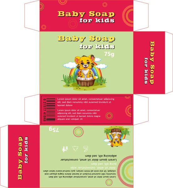
This design shifts away from the multi-character “zoo” approach to focus on a singular, high-impact mascot—the tiger cub—set against a serene outdoor backdrop. It swaps the softer peach tones for a striking, energetic magenta, creating a more vivid presence on the shelf.
Vibrant Contrast: The use of a deep magenta for the side panels and top flaps acts as a bold frame for the light sage green front panel. This high-contrast pairing makes the product look energetic and modern.
Scenic Storytelling: Unlike the previous patterns, this layout includes a small “environment” for the character, featuring a rainbow, clouds, and grass. This adds a layer of depth and whimsy, suggesting the soap is as fresh and natural as the outdoors.
Centralized Focus: By featuring only one large character in the center, the design feels more organized and less “busy.” This allows the rainbow motif to draw the eye directly to the brand name and product type.
25. The “Bold Adventure” in Crimson
In stark contrast to the softer designs, this version uses a vibrant crimson and lime green combination to grab immediate attention. The central tiger cub mascot, perched playfully under a rainbow, communicates energy, fun, and a “tear-free” adventurous spirit.
Maximum Shelf Presence: The use of high-saturation red is a bold choice for baby products, designed to be the first thing a parent notices on a shelf.
Whimsical Imagery: The rainbow and cloud elements create a “joyful world” around the character, reinforcing the idea that bath time is a highlight of the day.
Cohesive Branding: Despite the change in primary color, the consistent use of the “target” circle patterns and bold slab-serif font maintains a strong, recognizable brand identity across the entire product line.