Jasmine Tea Packaging Designs
1. Focus on the aesthetic and feeling
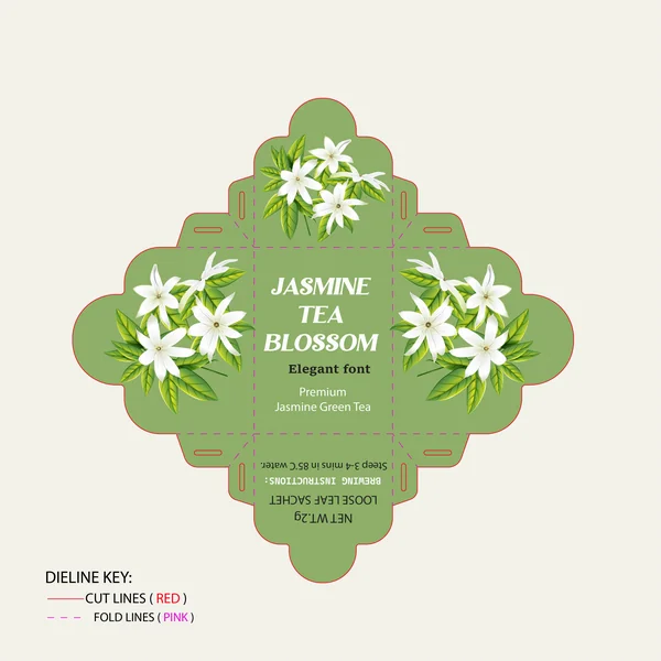
This elegant packaging design for a premium Jasmine Green Tea leans perfectly into a calming, organic aesthetic. The soft, sage green background provides a beautiful, earthy canvas that really makes the realistic illustrations of the white jasmine blossoms pop. By pairing a classic, sophisticated serif font with clean modern text, the design strikes a perfect balance between traditional charm and high-end quality. It’s a design that immediately evokes a sense of serenity before the tea is even brewed.
2. Focus on the energy and freshness
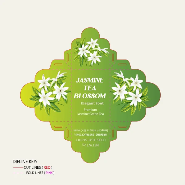
This variation takes the jasmine tea packaging in a much more vibrant direction. By introducing a bold green gradient—sweeping from a bright, zesty lime on the left to a deep, rich forest green on the right—the design feels incredibly fresh and energetic. The classic, lifelike white jasmine illustrations really pop against this dynamic background. It’s a brilliant example of how swapping a solid color for a gradient can completely shift a product's mood from quiet and calming to bright and invigorating.
3. Focus on the warm, inviting vibe
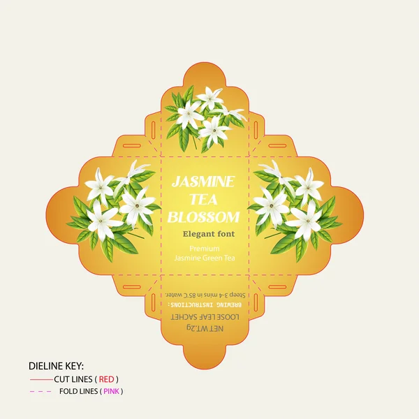
For this variation, the design moves away from traditional greens and embraces a radiant, golden-orange gradient. This completely shifts the mood of the packaging to feel like a warm, comforting, sun-drenched morning. The sunset-inspired background provides a stunning, high-contrast canvas that makes the delicate white jasmine blossoms and crisp white typography look more vibrant than ever. It perfectly evokes the comforting warmth of a freshly brewed cup of tea.
4. Focus on purity and minimalism

Taking a more minimalist approach, this variation strips back the background color to a soft, clean cream. This understated canvas allows the vibrant green leaves and delicate white jasmine blossoms to become the true focal point of the packaging. By switching the typography to a deep, rich forest green, the design gains a beautiful contrast that feels classic and refined. It immediately evokes a sense of natural purity and simplicity, perfect for an organic, calming tea.
5. Focuses on the elegant and traditional feel
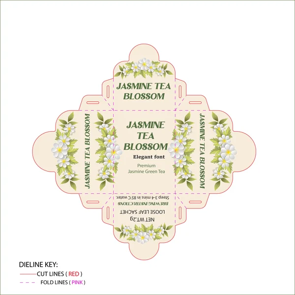
This design takes a beautiful, botanical approach that instantly feels calming. Set against a soft, warm cream background, detailed jasmine flower illustrations perfectly frame the edges of the packaging. The designer paired the artwork with a classic, deep green serif font that ties the whole earthy palette together, giving it a premium and traditional feel. Even looking at the flat dieline, you can tell the unique scalloped edges will make this a really elegant little box to unbox.
6. Focuses on how color communicates the flavor
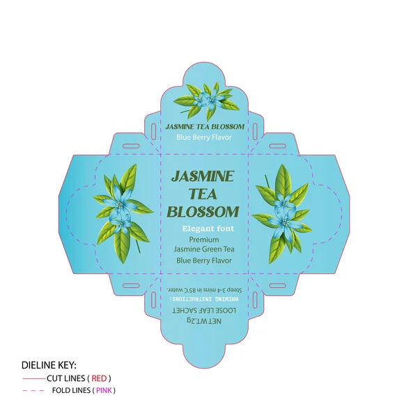
This design takes a bright, refreshing approach to highlight the tea's Blueberry flavor profile. By swapping a traditional neutral background for a vibrant, cool aqua blue, the packaging instantly feels playful and summery. The designer brilliantly updated the botanical artwork to feature blue blossoms, giving the buyer a visual hint of the berry infusion inside. By keeping the classic green serif typography, the brand maintains its premium, elegant identity while letting these new, vibrant colors pop.
7. Focuses on the new label design and warmth
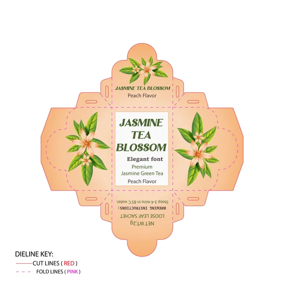
For the Peach flavor, this packaging design embraces a warm, inviting color palette that instantly gives off a sweet, summery vibe. The soft orange background perfectly complements the delicate peach-tinted blossoms. What really stands out in this variation is the addition of a clean white block in the center panel. This is a smart design choice—it acts as a crisp label that makes the elegant green typography pop, ensuring the text remains perfectly readable against the warmer, colorful background.
8. Focuses on mood and color psychology
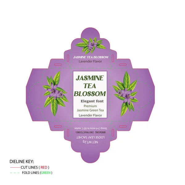
For the Lavender flavor, the design embraces a soothing, muted purple palette that instantly signals relaxation. The botanical illustrations are beautifully updated with rich purple blossoms to match the herbal profile, creating a really calming visual. Just like the Peach variation, this box utilizes a crisp white center panel. This is a smart layout choice that ensures the brand's signature dark green serif font stays legible and striking against the deeper background color, keeping the overall look very premium.
9. Focuses on the amazing structural design

This design completely changes the game with its structural packaging! The absolute standout feature here is the custom die-cut top flap, shaped like a giant, beautiful jasmine blossom. When this box is assembled, it won't just be a standard rectangle—that top flower will create a stunning 3D effect on the shelf. Paired with a warm, glowing golden background and a realistic photo panel in the center, this concept feels vibrant, bold, and incredibly unique.
10. Focuses on layout and information design
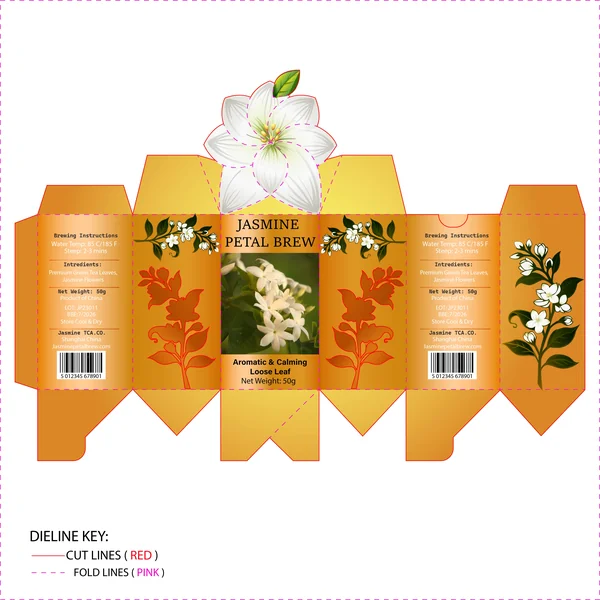
Great packaging design isn't just about looking pretty—it's also about how the information is organized. This template does a fantastic job utilizing the side panels. By neatly arranging the brewing instructions, ingredients, and barcodes against the solid golden background on the sides, the front of the box remains entirely focused on the bold artwork and striking die-cut flower. It keeps the design feeling uncluttered while giving the customer all the details they need.
11. Focus on Short & Story-Driven
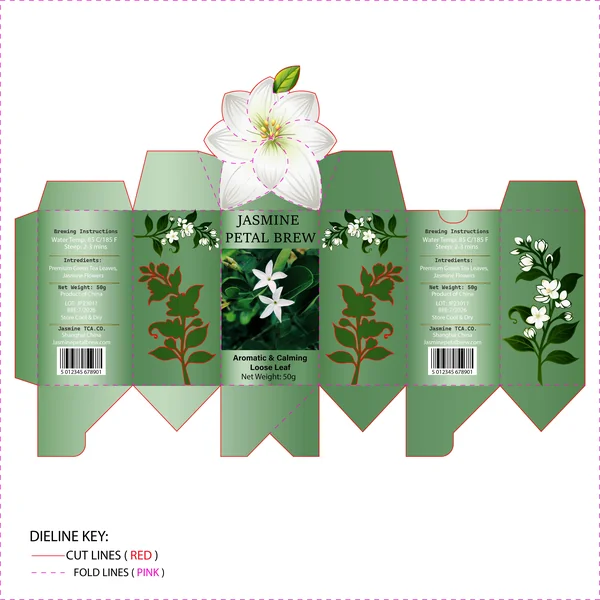
Designed for Jasmine Petal Brew, this concept pairs a calming, earthy green background with delicate white botanical illustrations. The real hero here is the structural top: when assembled, the top closure blooms into a 3D jasmine flower that doubles as both a visual feature and a seal. It’s a smart, elegant dieline design that reflects the soothing, natural essence of loose-leaf tea while creating a memorable unboxing moment.
12. Focus on Descriptive & Engaging
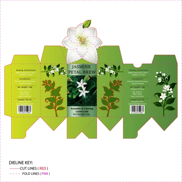
What immediately stands out about the Jasmine Petal Brew concept is its clever structural design. The hero feature is undoubtedly the custom die-cut top flap shaped like a blooming jasmine flower, which gives the box an interactive, gift-worthy feel before it's even opened. The designer used a vibrant, garden-fresh green color palette layered with botanical leaf silhouettes. By combining a crisp photograph of jasmine blossoms on the front with soft serif typography, the packaging achieves a nice balance between natural authenticity and a classic, relaxing tea-brand aesthetic.