Beef Packaging Designs
1. A Bold, Illustrative Approach to Premium Beef
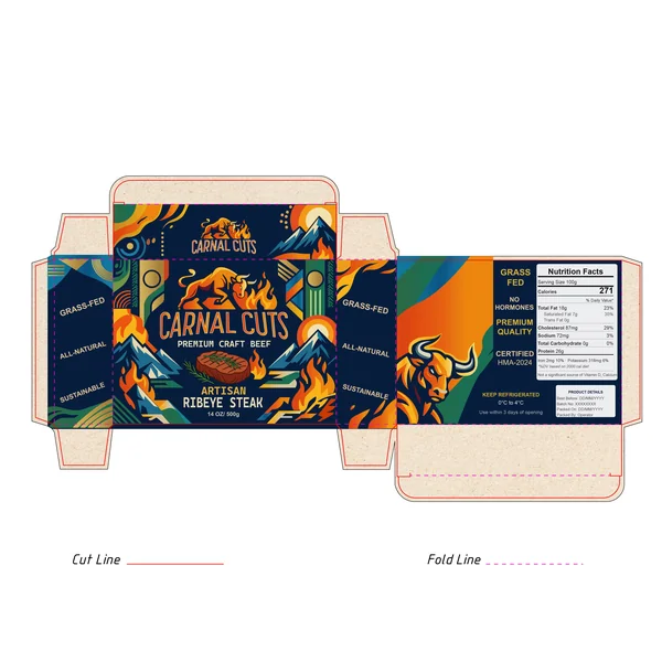
The packaging for Carnal Cuts immediately stands out by ditching the typical "clear plastic and white foam" look in favor of a vibrant, illustrative story. The design uses a high-contrast palette—deep navy blues paired with fiery oranges and cool teals—to create a "mountain-to-table" narrative. By using stylized graphics of mountains and flames, the brand emphasizes both the natural origin of the grass-fed beef and the primitive, fiery art of grilling. The bold, modern typography and the charging bull mascot give it a "craft" feel similar to high-end microbreweries, successfully positioning this ribeye as a premium, artisanal product rather than just another grocery store staple. It’s a design that doesn't just sell meat; it sells an outdoor, adventurous lifestyle.
2. A Pastoral and Whimsical Take on Heritage Beef
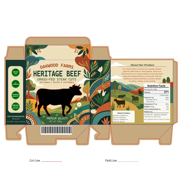
The packaging for Oakwood Farms Heritage Beef leans into a "pastoral-chic" aesthetic that feels both premium and approachable. Instead of the aggressive imagery often found in meat branding, this design uses soft, hand-drawn illustrations of rolling hills, wild flowers, and oak trees. The warm, earthy palette of forest greens, terracotta, and mustard yellow creates a nostalgic, organic feel that speaks directly to the "grass-fed" and "sustainably raised" claims. The bold black silhouette of the cow provides a strong anchor for the design, ensuring the product is instantly recognizable. By choosing a cream-colored background over a sterile white, the brand achieves a "heritage" look that reminds the consumer of a local, boutique farm rather than a mass-production factory. It is a beautiful example of how illustration can be used to build trust and tell a story of animal welfare and quality.
6. Minimalist Luxury and Bold Contrast
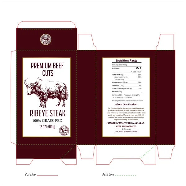
In this design, the brand moves away from patterns and textures to embrace the power of solid color and clean composition. The deep, oxblood-red background is a strategic choice; it feels rich, mature, and premium, much like a well-aged steak. By using a stark white central label, the design achieves a high-contrast look that is incredibly easy to read and feels medically clean. The focal point is the intricate, long-horned cattle etching, which adds a sense of "wild-raised" heritage and rugged authenticity. This is a "quiet luxury" approach to meat packaging—it doesn’t need flashy graphics to convince the buyer of its quality; the bold, confident use of color and classic typography do all the talking.
10. Bold Illustration Meets High-End Craft Beef
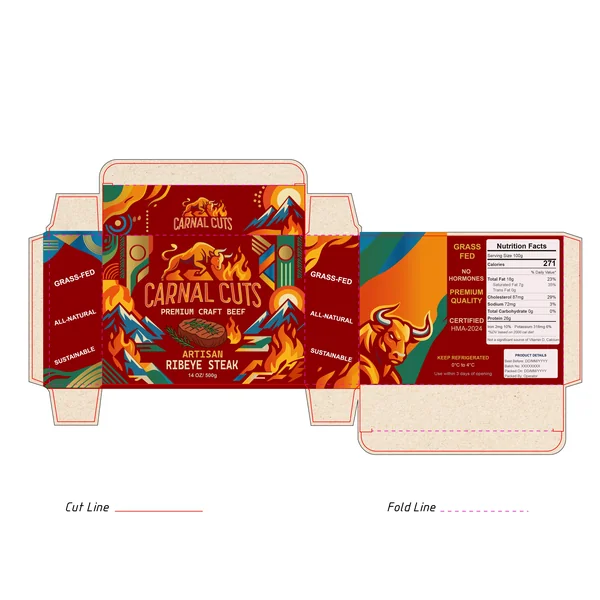
This design for Carnal Cuts is a total visual explosion and a complete departure from the "quiet" look of traditional butcher brands. It feels less like a standard grocery item and more like a limited-edition craft beer label. By using a high-contrast palette of fiery oranges, deep reds, and striking teals, the packaging immediately grabs your attention from across the room. The illustrative style—featuring a powerful bull silhouette surrounded by flames and stylized mountain landscapes—beautifully taps into the primitive, high-energy spirit of grilling over an open fire.
11. A Masterclass in Classical Elegance and Culinary Art
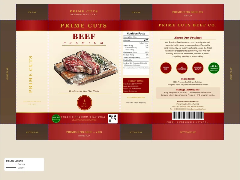
This design for Prime Cuts feels like a return to the "golden age" of gourmet branding. It swaps out aggressive marketing for a sophisticated, old-world aesthetic that uses a rich burgundy and warm cream color palette. This combination, accented with subtle gold lettering, instantly signals to the consumer that this is a high-end, premium product meant for a serious home cook.
12. A Clean, Minimalist Approach to Premium Beef
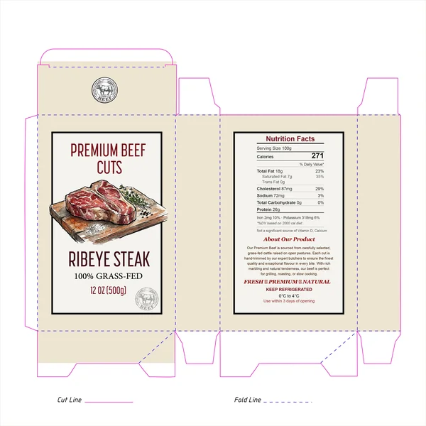
Sometimes, less really is more. This design for Premium Beef Cuts leans into a minimalist aesthetic that lets the product's quality speak for itself. By using a soft cream background instead of stark white, the packaging gains an organic, "butcher-wrapped" feel that feels much more approachable and high-end than standard plastic packaging.
13. Celebrating the Beauty of the Cut

This design takes a very literal and daring approach by making the marbling of the meat the hero of the entire package. Using a high-resolution meat texture as an all-over background pattern is a bold move—it's unapologetic and visceral. It immediately communicates the richness and quality of the ribeye, giving the customer a "what you see is what you get" feeling before they even open the box.
14. Elevating Texture to Graphic Art
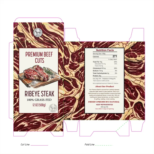
This design takes the concept of "show, don't tell" to a new level. By using a highly stylized, almost topographical marbling pattern as the primary background, the packaging celebrates the intrinsic quality of a high-grade ribeye. It transforms the physical product into a graphic element, making the beef feel both raw and intentionally curated.
15. The Premium Quality Beef Co. – A Study in Heritage and Authority
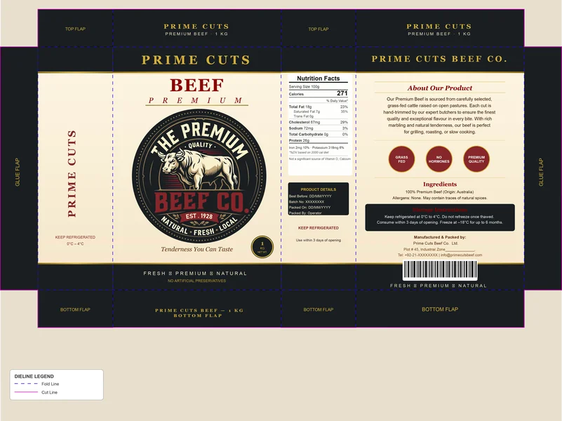
This design for The Premium Quality Beef Co. feels like an official seal of excellence. By leaning into a deep navy and cream color palette with gold-toned accents, the packaging immediately positions itself as a luxury "legacy" brand. It doesn’t just look like a product; it looks like a tradition, especially with the "EST. 1928" mark prominently displayed.
16. Dark Elegance Meets Timeless Tradition
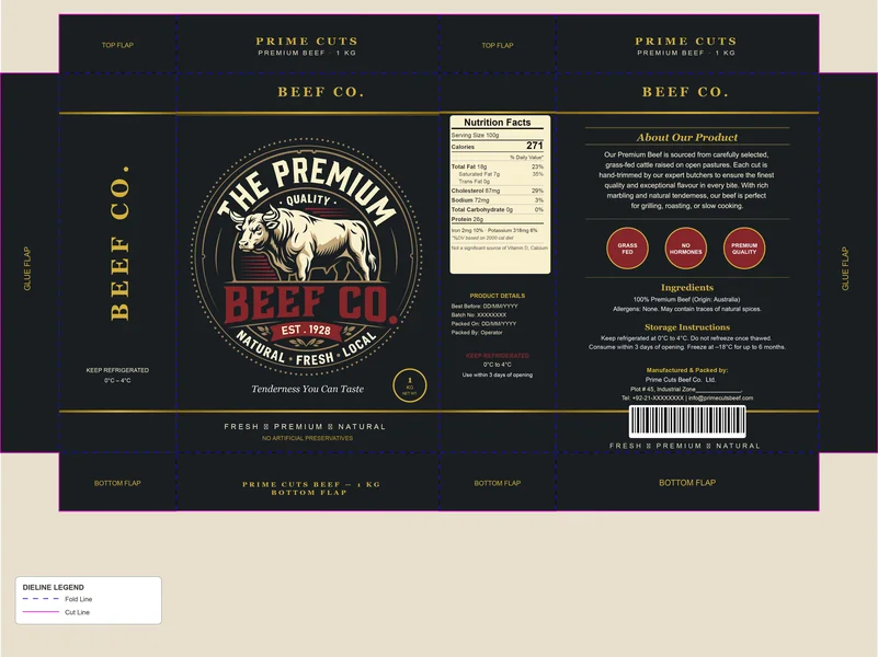
There’s something about the combination of deep charcoal and gold that just screams "premium." This design for Beef Co. takes that classic luxury palette and applies it perfectly to the world of high-end meat. By using a dark background, the central emblem really pops, acting like a gold-standard seal of authenticity that demands attention on the shelf.
19. The Artisanal Appeal of the Packaging Sleeve

This design takes a more minimalist and tactical approach by utilizing a cross-sleeve format. In the world of premium meat, sometimes "less is more," and this layout allows the actual product to remain the star of the show while the branding provides a high-quality frame. The choice of a deep forest green is a clever psychological nod to the "Grass-Fed" nature of the beef—it feels organic, fresh, and grounded.
20. Bold Contrast in Minimalist Packaging
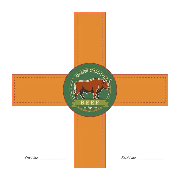
This design is a fantastic twist on the classic cross-sleeve format. The choice of a vibrant, terracotta orange for the straps is a bold move that instantly differentiates the product from the more muted tones usually found in the meat aisle. It feels high-energy and modern, yet the forest green central emblem keeps it grounded in nature, visually reinforcing the "Grass-Fed" messaging.
21. A Bold, Steakhouse-Inspired Sleeve Concept
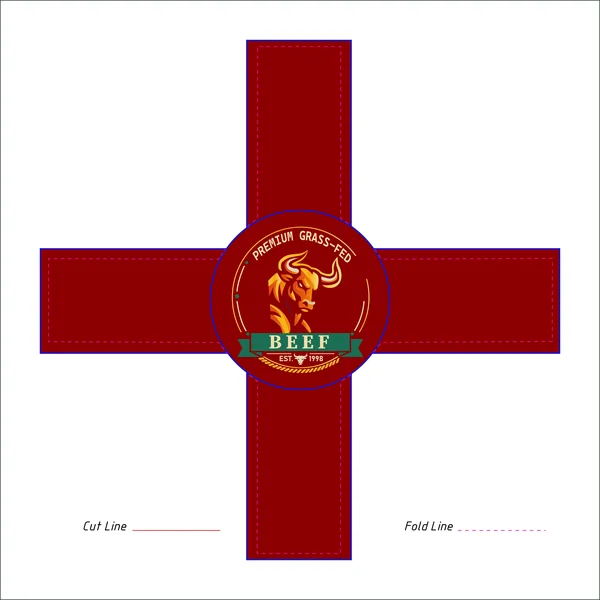
This design takes the minimalist cross-sleeve format and injects it with a sense of high-end authority. By choosing a deep, rich burgundy for the bands, the packaging immediately signals a "Reserve" or "Aged" quality, making the beef feel like a luxury selection. It’s a color palette that wouldn't look out of place in a premium city steakhouse.
22. Black Label Sophistication in a Minimalist Frame
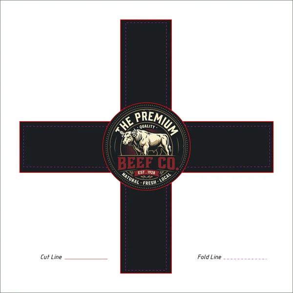
This design for The Premium Beef Co. is the definition of "black label" quality. By utilizing a deep charcoal cross-sleeve, the packaging acts as a sophisticated frame for the product, allowing the natural quality of the meat to be the primary focus while providing an authoritative brand presence.
23. Clean, Organic Elegance in a Heritage Package
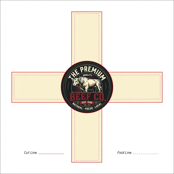
This variation of the cross-sleeve for The Premium Beef Co. swaps out the dark, moody tones for a fresh, cream-colored palette. It’s amazing how a simple color shift can change the entire brand story—where the previous dark version felt like a high-end city steakhouse, this lighter version feels more like a premium, organic farm shop. The off-white background gives the packaging an honest, natural feel that allows the color of the meat to really stand out.
24. A Bold Fusion of Land and Legacy
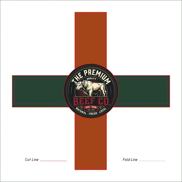
This iteration of the cross-sleeve for The Premium Beef Co. is a masterclass in using color to tell a story. By pairing a deep forest green with a warm terracotta vertical band, the packaging creates an immediate visual connection to the earth and the ranch. It’s a sophisticated, "outdoorsy" palette that feels much more artisanal than standard retail branding, signaling to the customer that this product is natural, local, and rooted in tradition.