Mobile Charger Box Packaging Designs: 16 Creative Packaging Ideas for Electronics Brands
Mobile charger box packaging designs play a key role in creating a strong first impression while protecting electronic accessories during storage and shipping. Whether you’re designing packaging for fast chargers, USB adapters, wireless chargers, or premium charging kits, the right box design can enhance your brand identity and influence customer purchasing decisions. From sleek minimalist packaging to bold retail-ready concepts, creative charger box designs combine functionality with visual appeal.
16 Mobile Charger Box Packaging Designs to Inspire Your Next Electronics Packaging Project
1. Focused on Aesthetic & “Tech” Feel
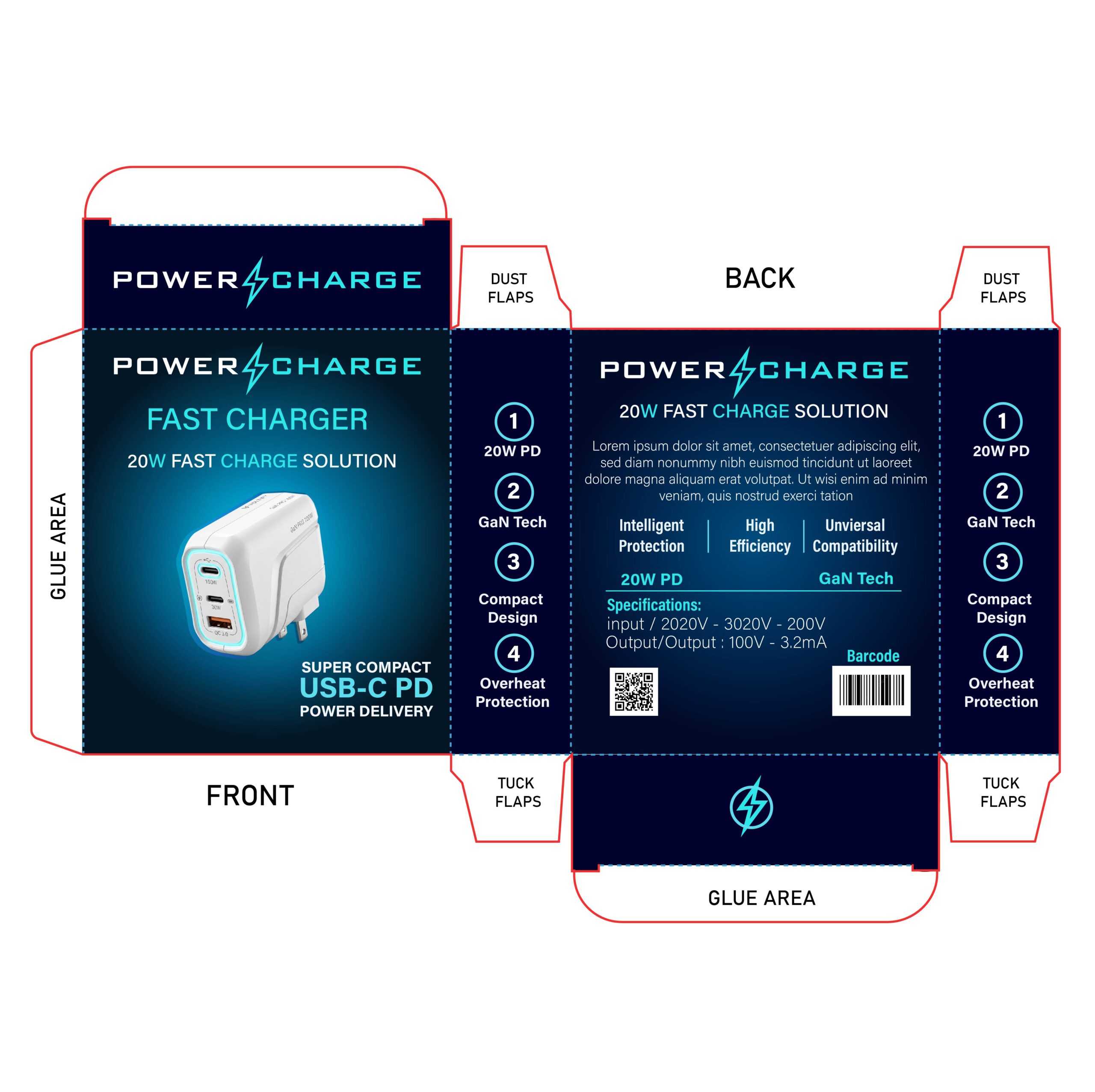
This design utilizes a high-contrast “dark mode” aesthetic, pairing a deep midnight blue background with vibrant electric-cyan accents. This color palette immediately conveys a sense of speed, energy, and advanced technology. The use of a clean 3D product rendering on the front panel acts as a strong visual hook, while the futuristic typography reinforces the brand’s identity as a modern, high-performance tech accessory.
2. Focused on Trends & Iridescence
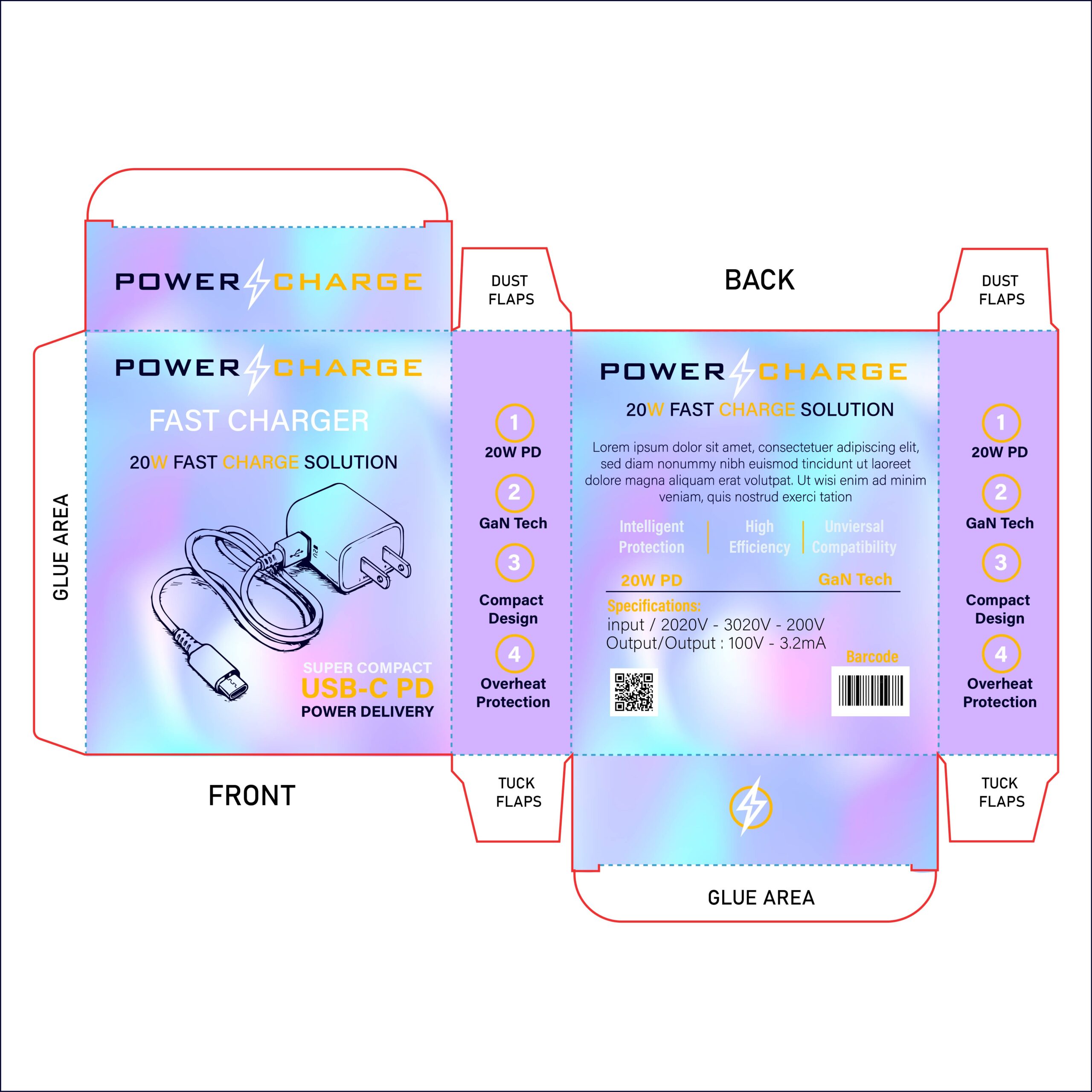
This design leans heavily into current “Gen-Z” aesthetics with its vibrant, holographic gradient background. The shifting pastel palette of purples, cyans, and pinks creates a dynamic, eye-catching effect that transforms a standard utility item into a stylish accessory. It’s a bold choice designed to stand out on a shelf crowded with traditional, plain tech packaging.
3. Focused on Professionalism & Premium Feel
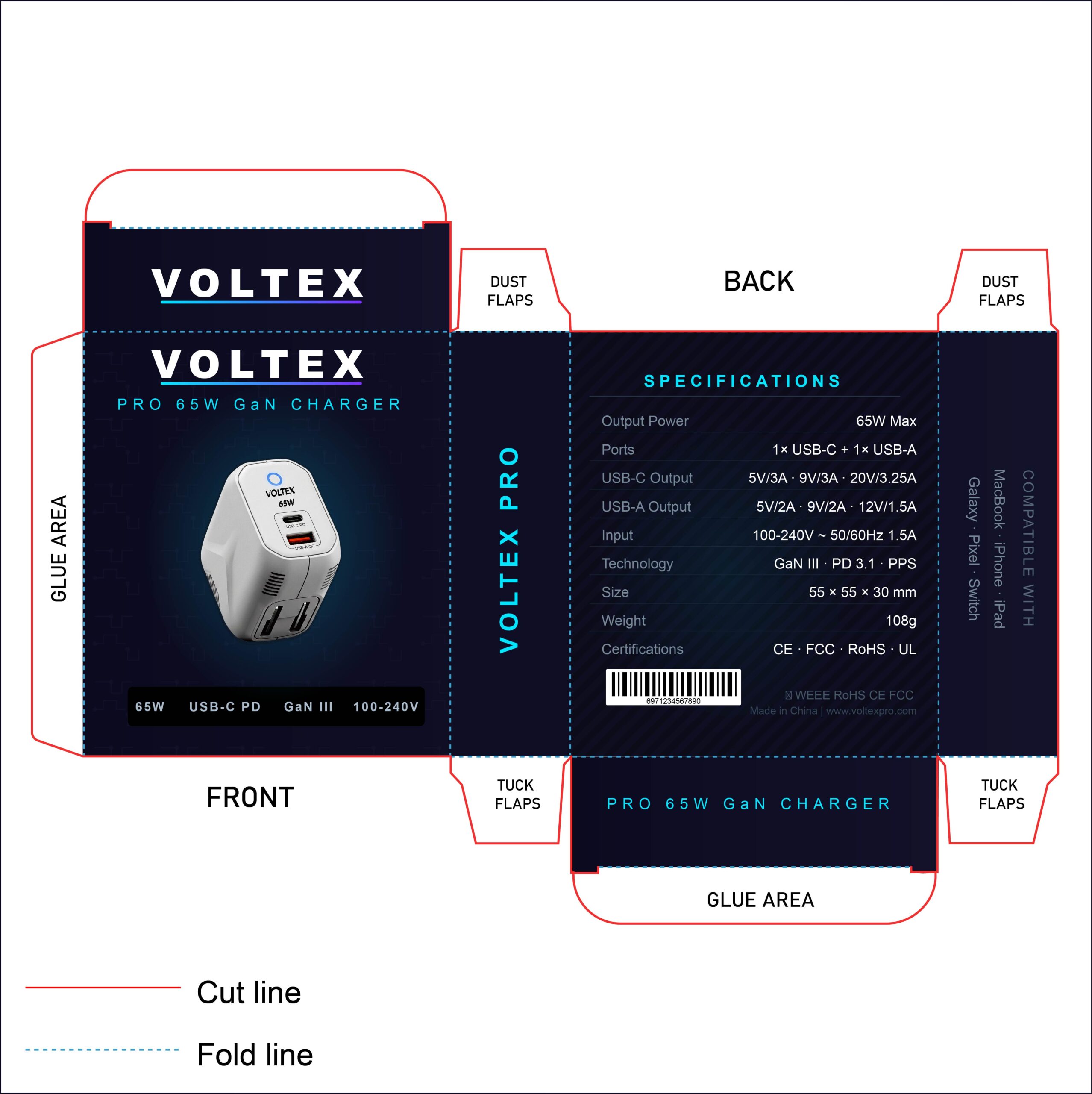
The VOLTEX 65W GaN Charger packaging is a masterclass in “Pro” tech branding. By utilizing a deep navy background overlaid with a subtle, circuit-inspired geometric pattern, the design feels sophisticated and high-end. The bold, wide-set typography of the brand name conveys authority, while the electric cyan accents provide just enough “pop” to signify energy without feeling toy-like. It’s a design that looks right at home in a high-end electronics boutique.
4. The “Neon-Future” Aesthetic
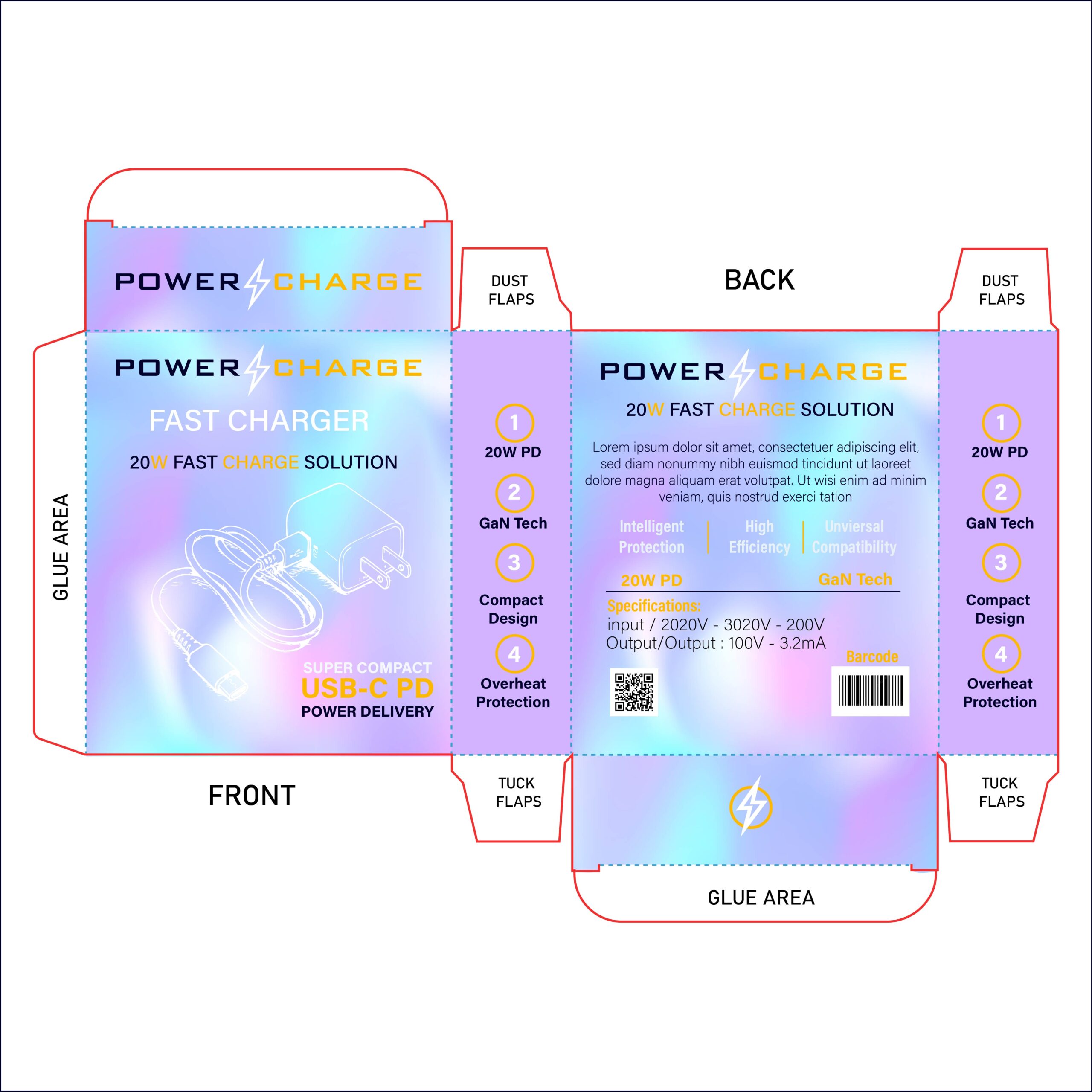
This packaging design takes the trendy iridescent background and elevates it with a glowing, neon-style illustration. By using white line art with an outer glow effect for the product image, the design creates a striking sense of luminosity. The contrast between the soft pastel gradient and the sharp, glowing white lines makes the product feel like a high-energy, next-gen piece of technology. It’s a perfect example of how to use “vaporwave” and “cyberpunk” influences to create a standout retail presence.
5. Focused on Geometric Dynamics & Precision
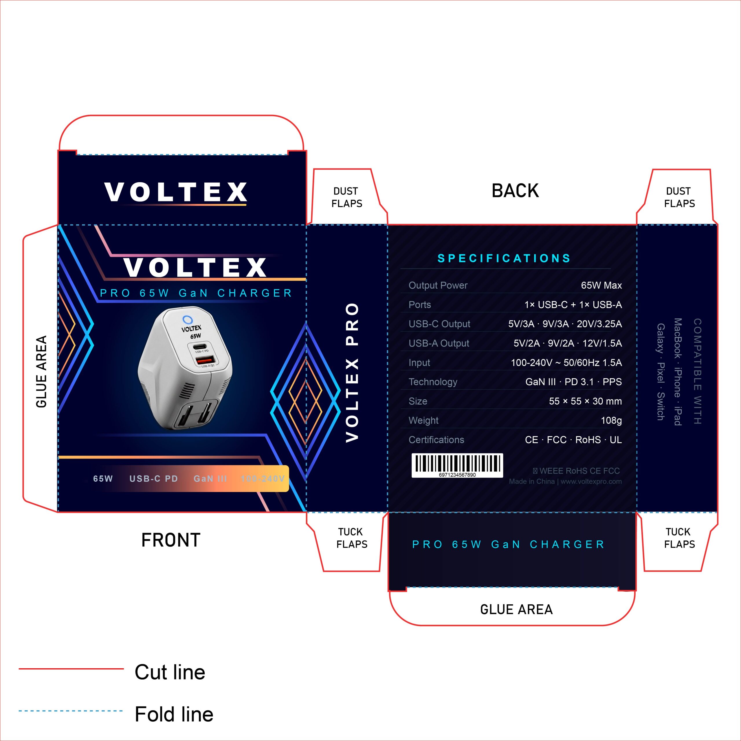
This iteration of the Voltex Pro packaging utilizes sharp, diamond-shaped geometric patterns to frame the product, creating a sense of precision and architectural structure. The introduction of orange-to-pink gradients alongside the signature electric cyan adds a “heat and energy” metaphor, perfectly representing the 65W high-power output. The intersecting lines draw the eye directly to the product render, making the charger the hero of the composition.
6. Focused on Modern Abstract Aesthetics

This packaging utilizes a “Memphis-inspired” design language, using soft mint greens, deep blues, and playful orange accents. The use of abstract geometric shapes—like dots, waves, and circles—creates a friendly and accessible vibe that appeals to a wide range of consumers. By combining a clean white base with organic patterns, the design feels more like a lifestyle product than a utility tool, making it perfect for a modern retail environment like a department store or a boutique tech shop.
7. Focused on Warmth & Color Psychology
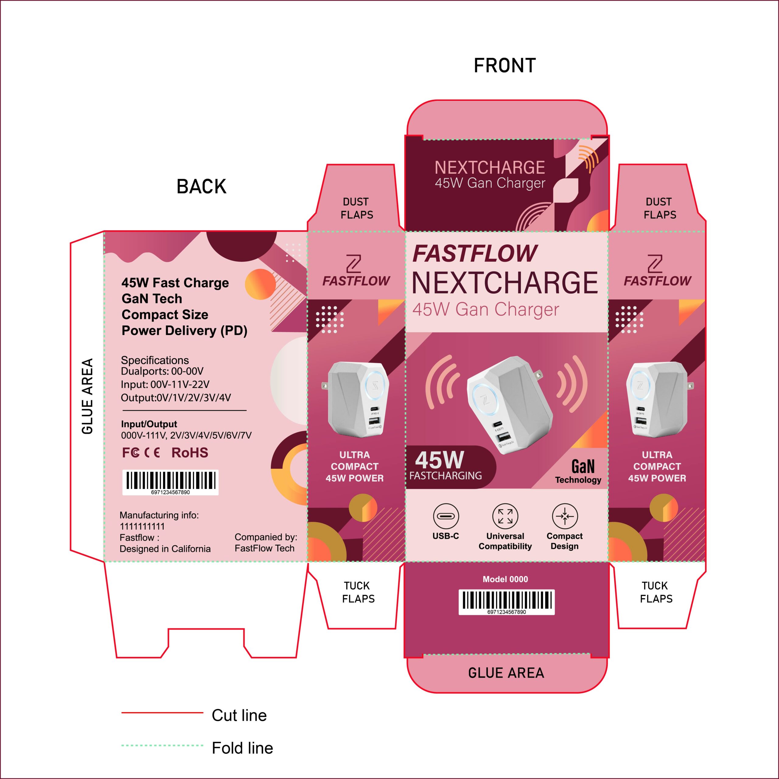
This design breaks the “tech-blue” stereotype by utilizing a sophisticated warm palette of deep maroon, rose pink, and sunset orange. In a retail environment dominated by cold blues and grays, this berry-toned gradient immediately grabs attention and feels more “human” and “lifestyle-centric.” The use of warm tones suggests energy and heat (power), while the clean white front panel keeps the product looking premium and high-tech.
8. Focused on “High-Energy” Tech
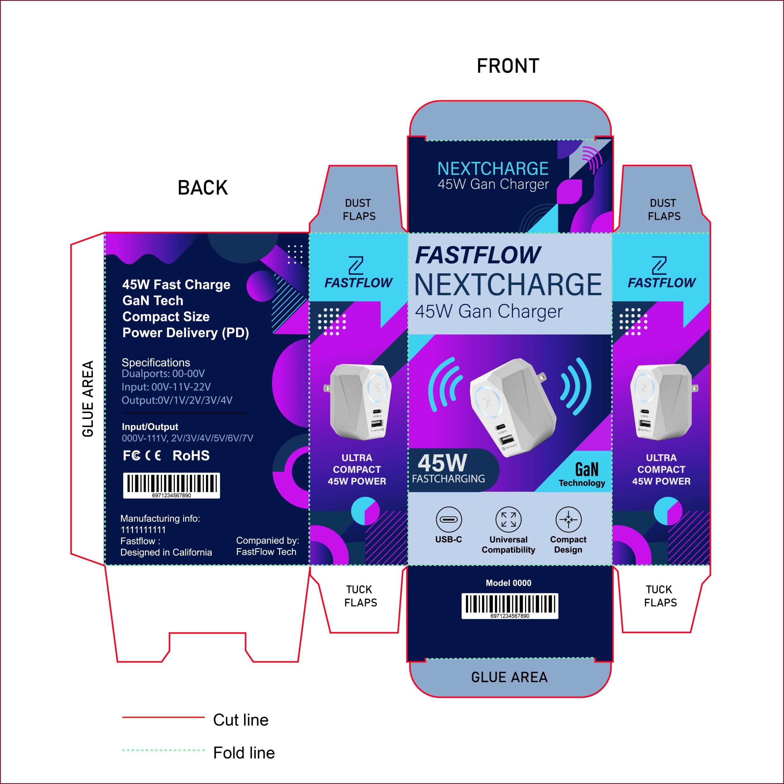
This “Night-Mode” inspired version of the Nextcharge packaging uses a high-contrast palette of electric purple and cyan blue. This color combination is synonymous with high-speed performance and modern digital culture (often seen in gaming and futuristic tech). Against the deep navy background, the cyan “energy waves” and geometric shapes feel luminous, making the product appear as a powerful, cutting-edge accessory that belongs in a high-tech setup.
9. Focused on Luxury & Sophistication
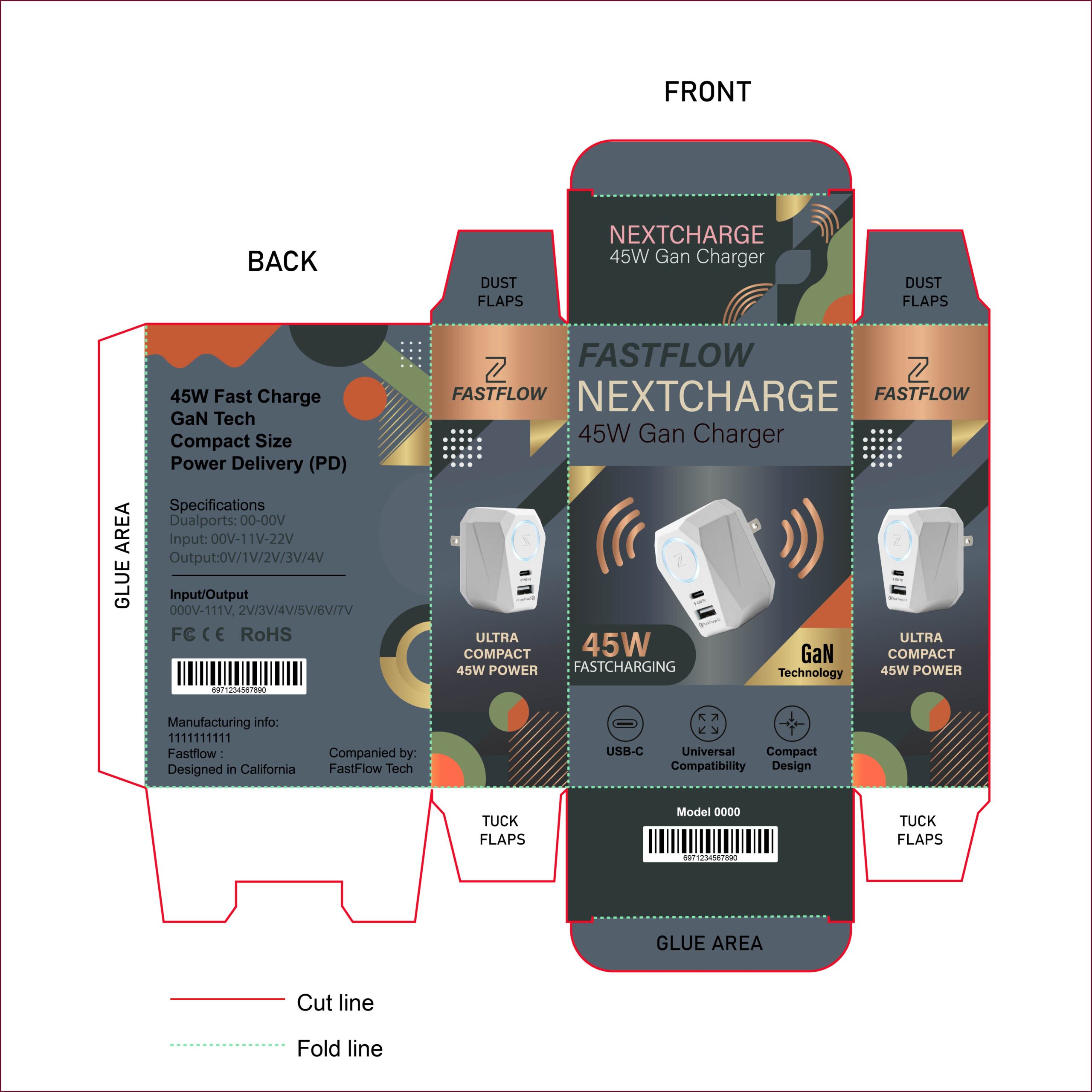
This design utilizes a refined “Slate & Copper” palette, creating an immediate sense of high-end quality. By pairing a deep charcoal gray base with metallic rose gold and bronze accents, the packaging moves into the realm of luxury lifestyle tech. The muted orange and sage green geometric shapes add an organic touch, making the product feel like a thoughtfully designed accessory for a modern professional. It is an excellent example of how color choice alone can elevate a standard tech product into a “Pro” or “Luxury” category.
10. Focused on Executive Elegance
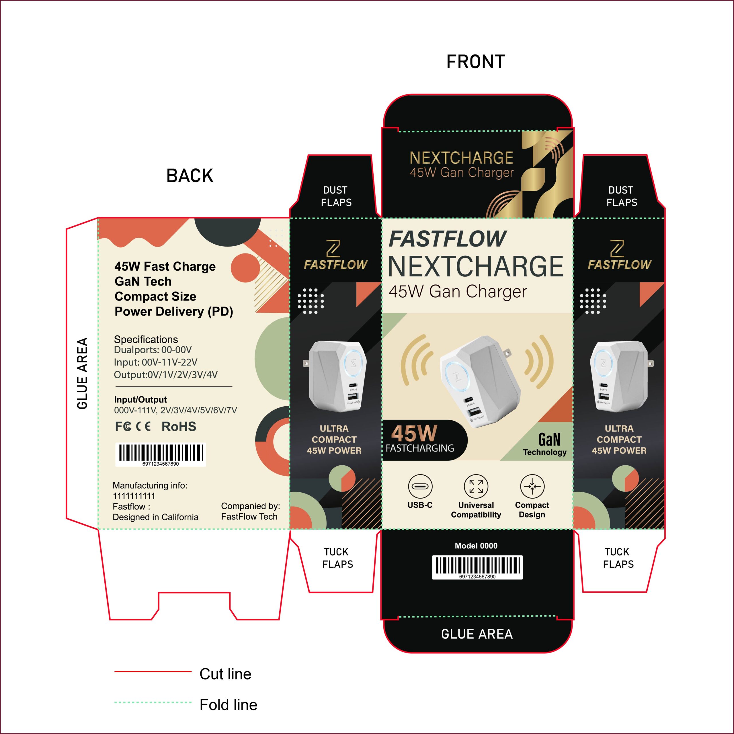
This design utilizes a classic “tuxedo” color palette—pairing deep charcoal black with a warm cream center. The use of metallic gold for the “Fastflow” branding and energy waves creates an immediate association with high-end, “Gold Standard” performance. By replacing bright colors with muted earth tones like sage green and soft clay in the background geometry, the packaging achieves a “boutique” look that feels professional, mature, and undeniably premium.
11. Focused on Rugged, High-Tech Aesthetics
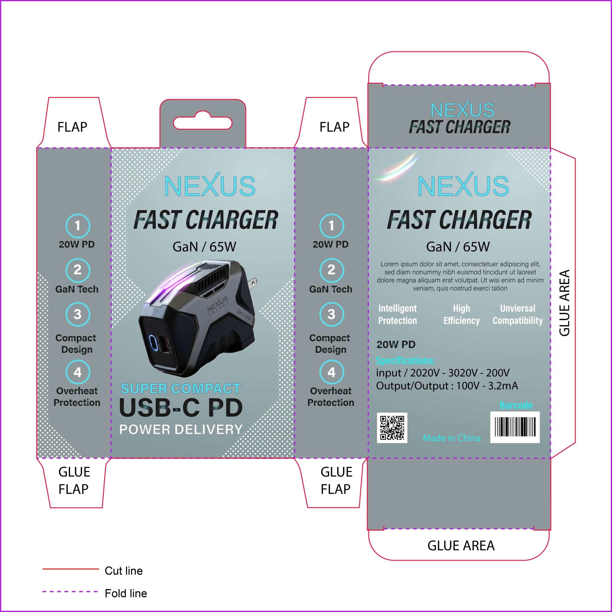
This design utilizes a “Concrete & Cyan” palette, creating a rugged, industrial feel that suggests durability and power. The use of a halftone dot pattern in the background adds a sense of tech-inspired texture, while the high-contrast cyan typography ensures the brand name is visible from a distance. The product render itself, featuring glowing purple accents, gives the packaging a “gaming” or “enthusiast” vibe, signaling that this charger is built for high-performance devices.
12. Focused on High-Contrast Visuals
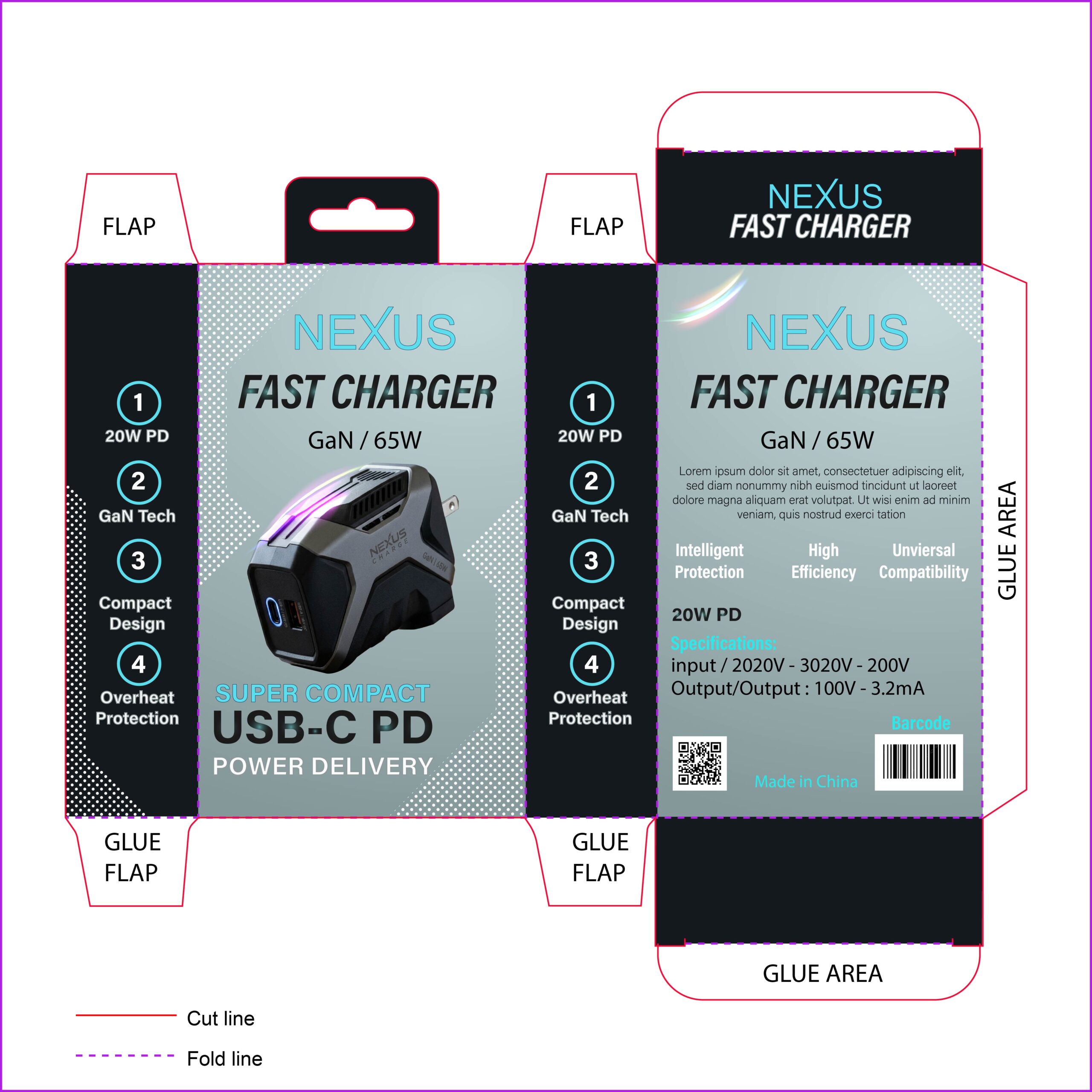
This design iteration utilizes a stark “Black-on-Grey” contrast to define its visual hierarchy. By opting for deep black side panels against a cool grey front face, the packaging achieves a “pro-tech” aesthetic that feels both rugged and sophisticated. The electric cyan typography provides a sharp, energetic pop, while the halftone dot gradients in the background add a layer of digital texture, reinforcing the brand’s identity as a cutting-edge tech solution.
13. Focused on High Visibility & Energy

This design iteration utilizes a high-energy “Caution Yellow” palette to signal power, speed, and efficiency. In a retail environment where most tech packaging is white or black, this vibrant yellow acts as a massive visual disruptor that demands attention. The contrast between the bright yellow background and the sharp teal typography creates a modern, energetic “pop-art” tech aesthetic. The use of halftone dot patterns adds a layer of depth, making the packaging feel dynamic and next-gen.
14. Focused on Industrial Strength & Technical Grit
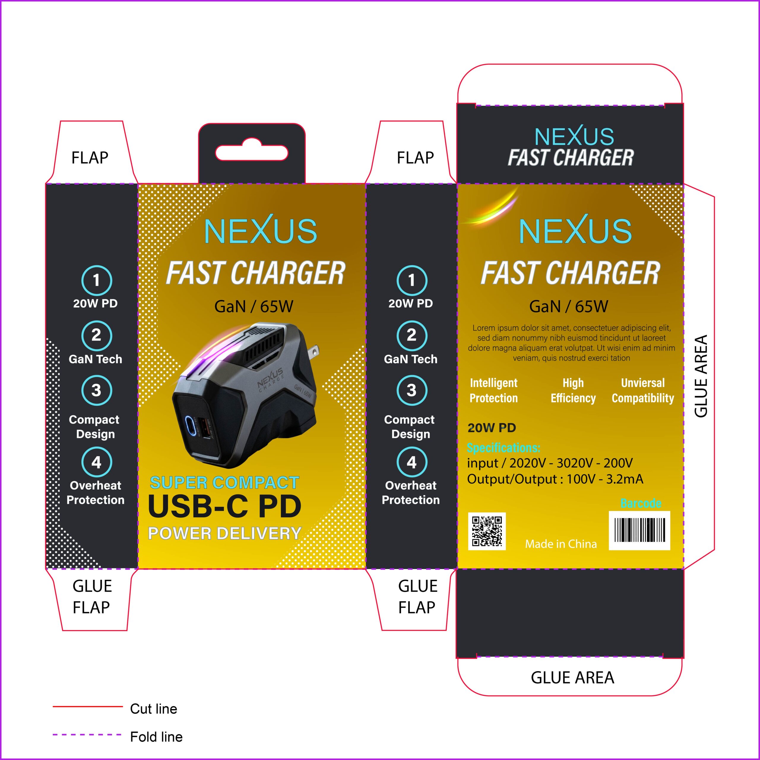
This design utilizes a classic “Industrial Power” palette—pairing a vibrant yellow front face with deep charcoal/black side panels. This combination is often associated with high-performance tools and heavy-duty engineering, which translates perfectly to a high-wattage GaN charger. The halftone dot gradients bridge the gap between the black and yellow sections, adding a modern, technical grit that makes the packaging feel rugged and reliable.
15. Focused on “Gamer” & Enthusiast Aesthetics
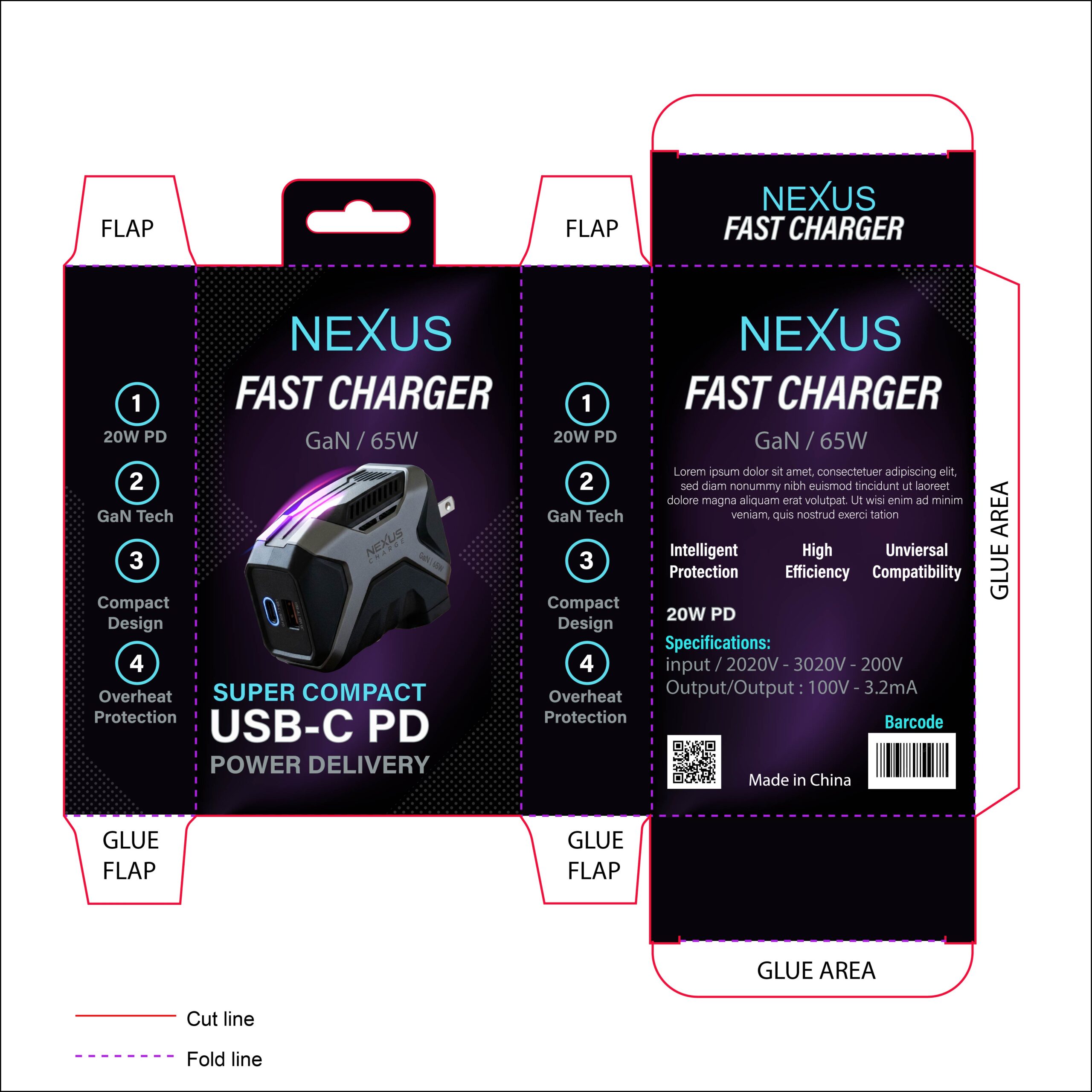
This design utilizes a “Stealth & Neon” palette, pairing a deep charcoal base with vibrant electric cyan and magenta gradients. The purple-to-blue glow effects on the product render and typography mirror the RGB lighting found in high-end gaming setups. By incorporating a subtle halftone pattern that fades into the black background, the design achieves a sense of digital movement and high-tech energy, positioning the charger as a must-have accessory for power users and tech enthusiasts.
16. Focused on “Cool Tech” & Efficiency

This design utilizes a sophisticated Teal-to-Charcoal gradient, creating a central “digital glow” that suggests cooling and high efficiency—key selling points for GaN technology. The palette of deep greys and bright cyan feels professional and trustworthy. By pairing the vibrant center with solid black side panels, the design achieves a balanced visual hierarchy that frames the product perfectly, making it look like a premium, high-performance tool for the modern office or home setup.